|
| Group |
Round |
C/R |
Comment |
Date |
Image |
| 87 |
Oct 20 |
Reply |
Thanks Chan! |
Oct 19th |
| 87 |
Oct 20 |
Reply |
Thanks Lance! |
Oct 19th |
| 87 |
Oct 20 |
Reply |
Thanks Jennifer! |
Oct 19th |
| 87 |
Oct 20 |
Reply |
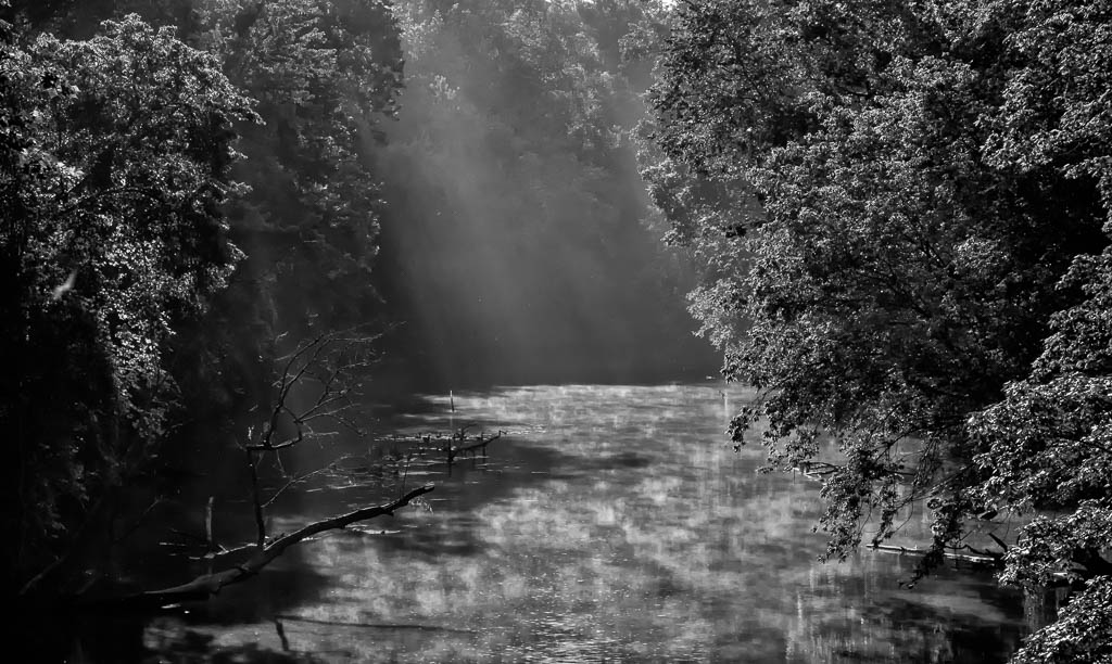
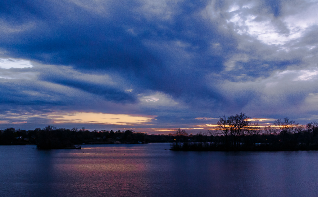
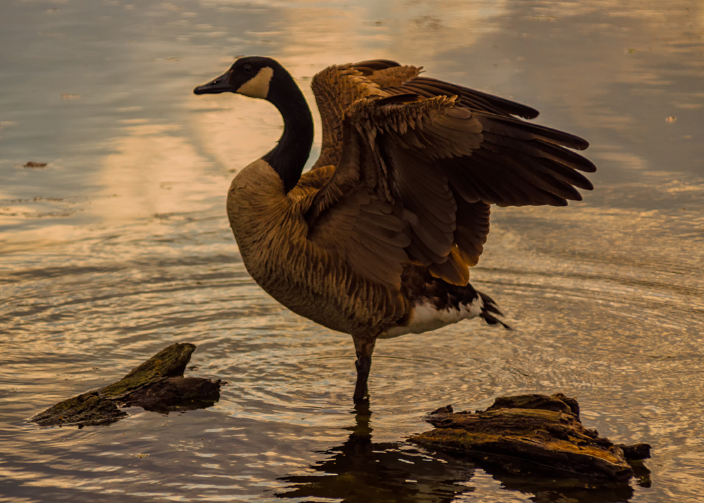
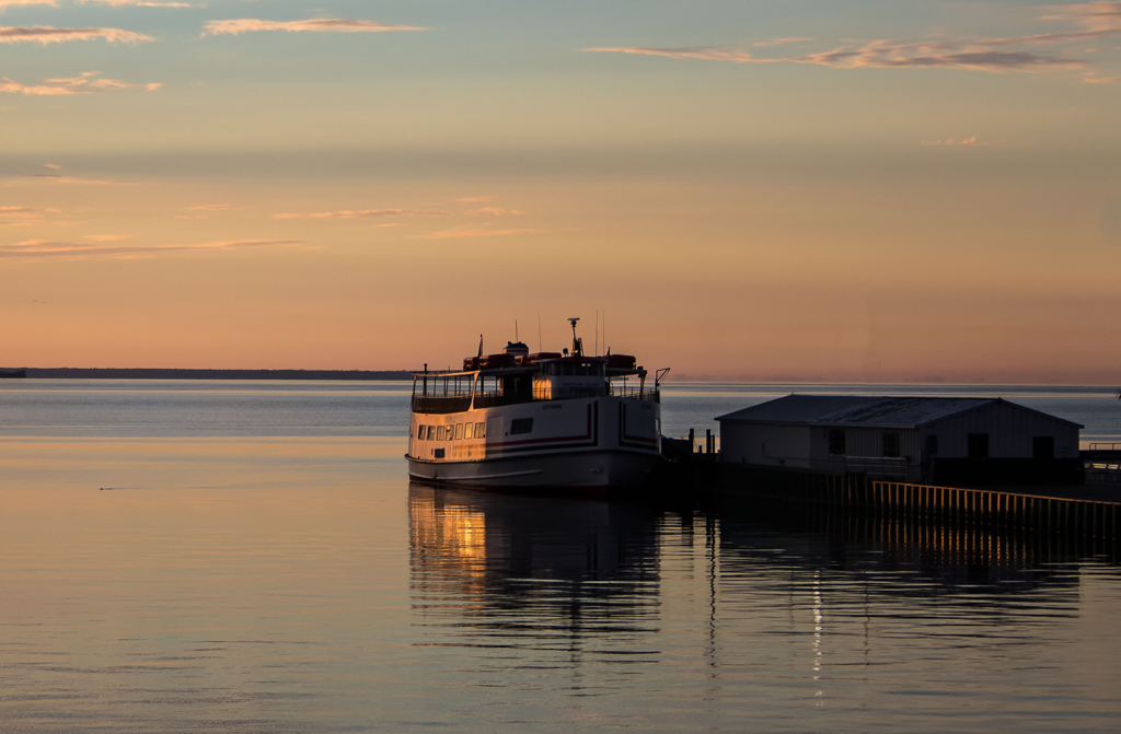
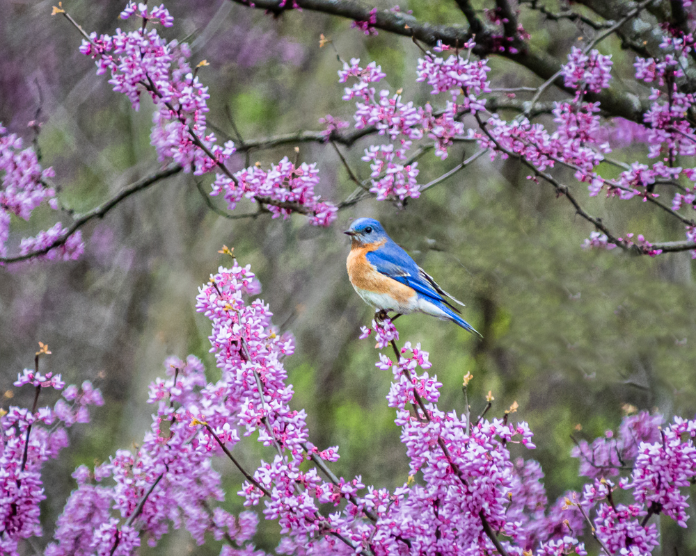
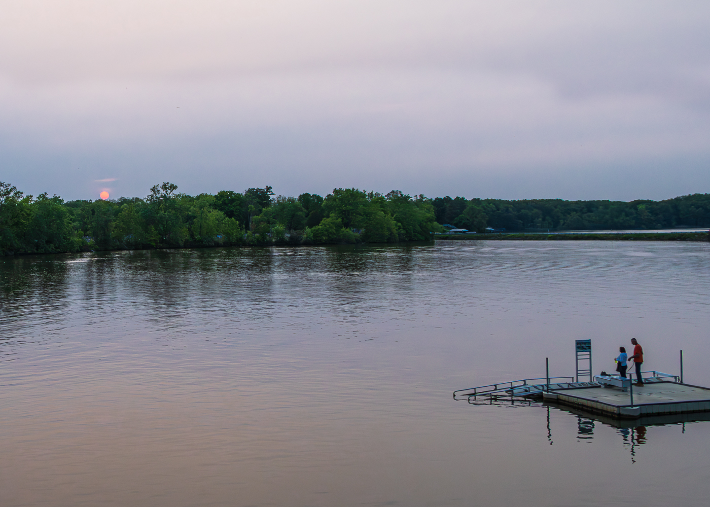
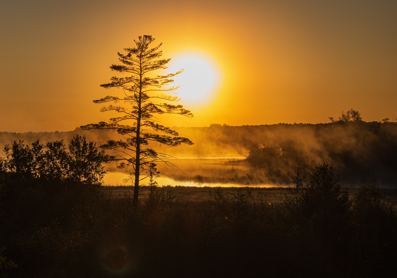
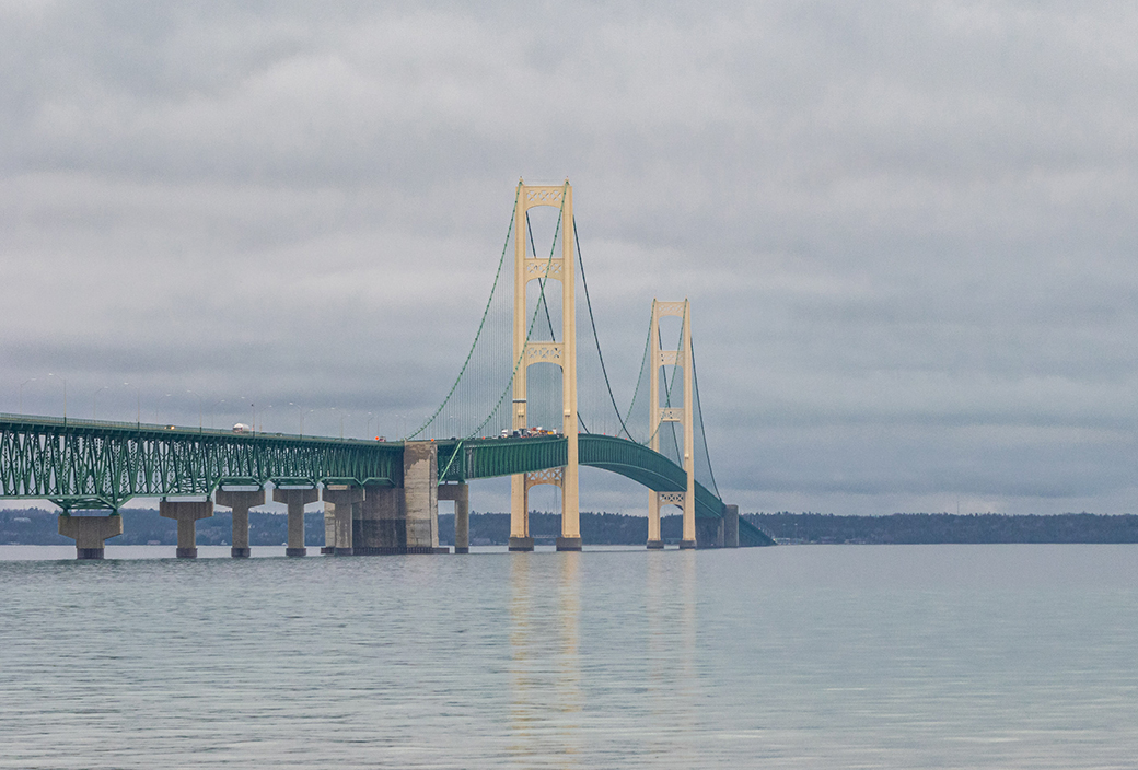
Thanks Steven! I shot this photo using a Canon SL1 camera with a Tamron 18-200, f/3.5-6.3 lens. |
Oct 19th |
| 87 |
Oct 20 |
Comment |
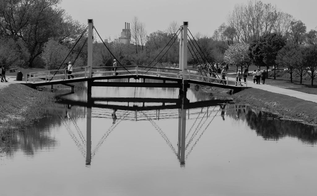
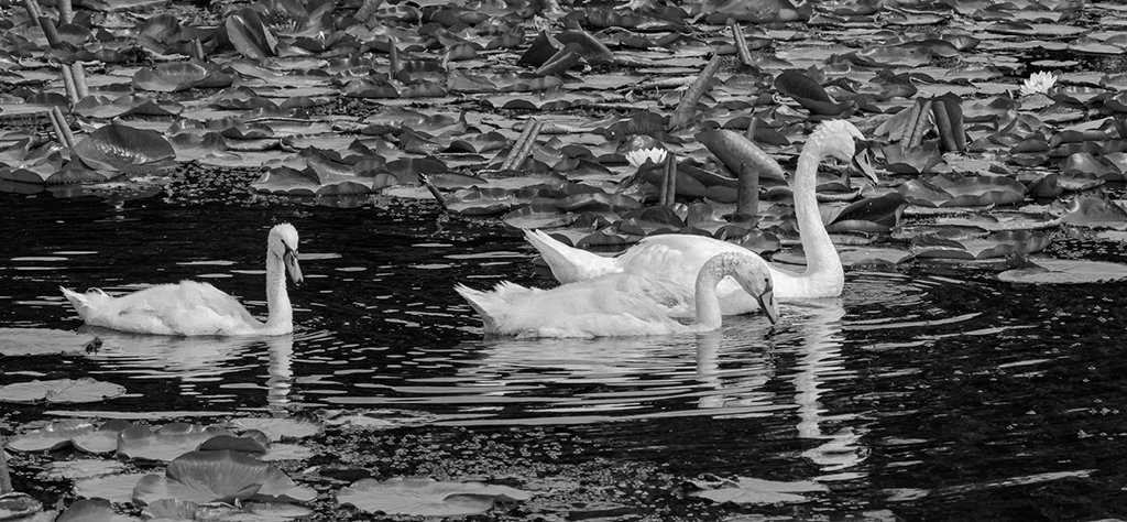
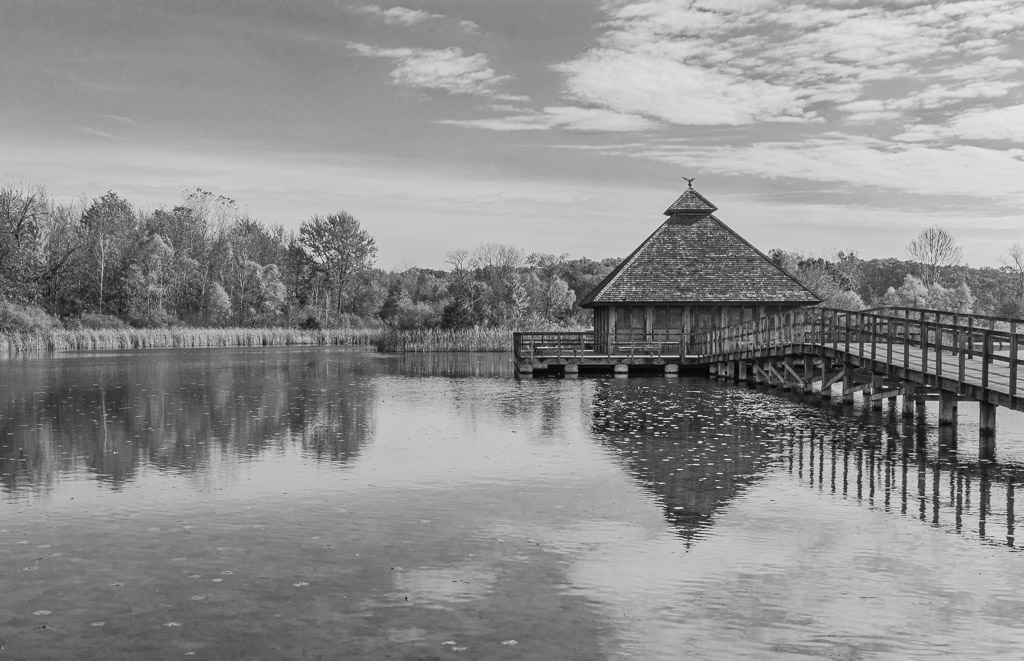
Excellent photo! Good composition with the horizontal lines as well as the bird itself. The reflection adds to the quality and the black & white conversion accomplishes your goals of emphasizing the tones and serenity of the image. Nice work! |
Oct 19th |
| 87 |
Oct 20 |
Comment |
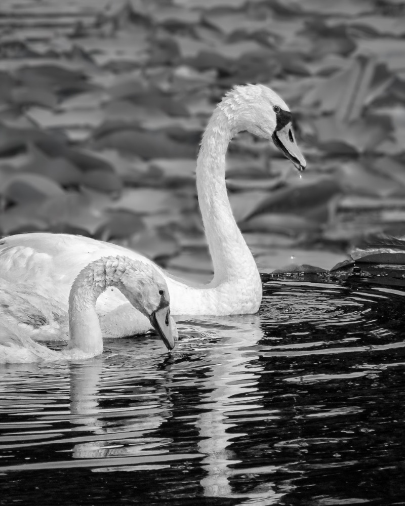
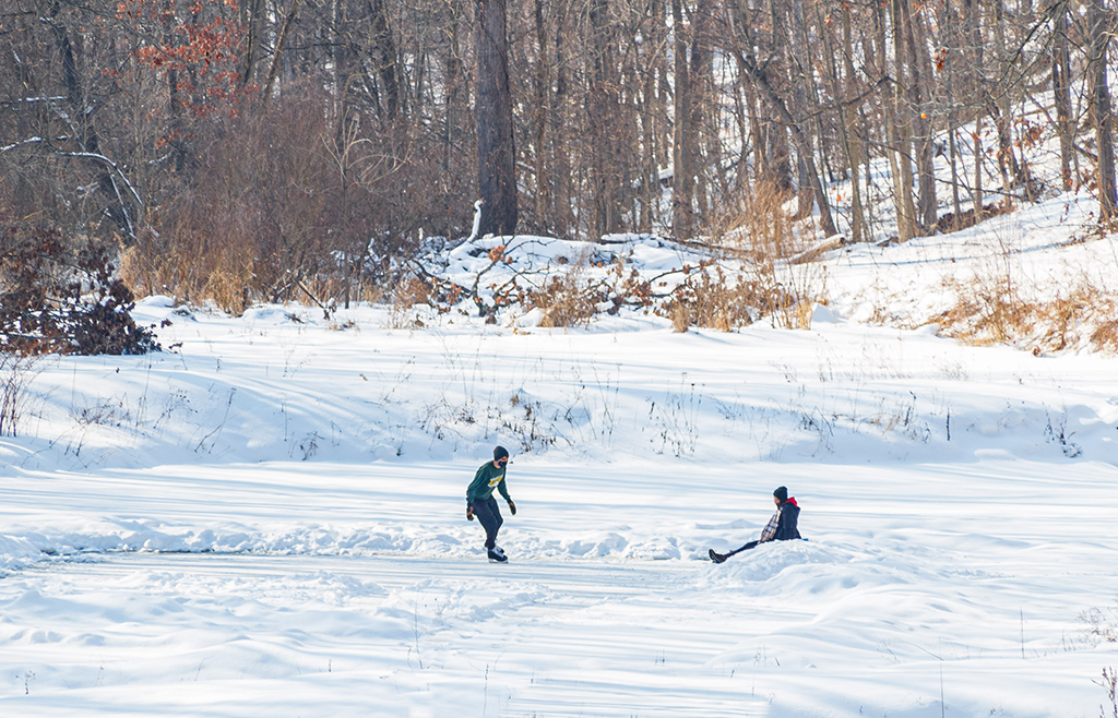
Nice shot! I like the black & white conversion with this image. I also like the detail throughout the photo which allows my eyes to move to various parts of the image (multiple points of interest). However, I do agree with Chan that the main point of interest is the person in the foreground and as such, I wouldn't change a thing. Just some thoughts...nice work! |
Oct 19th |
| 87 |
Oct 20 |
Comment |
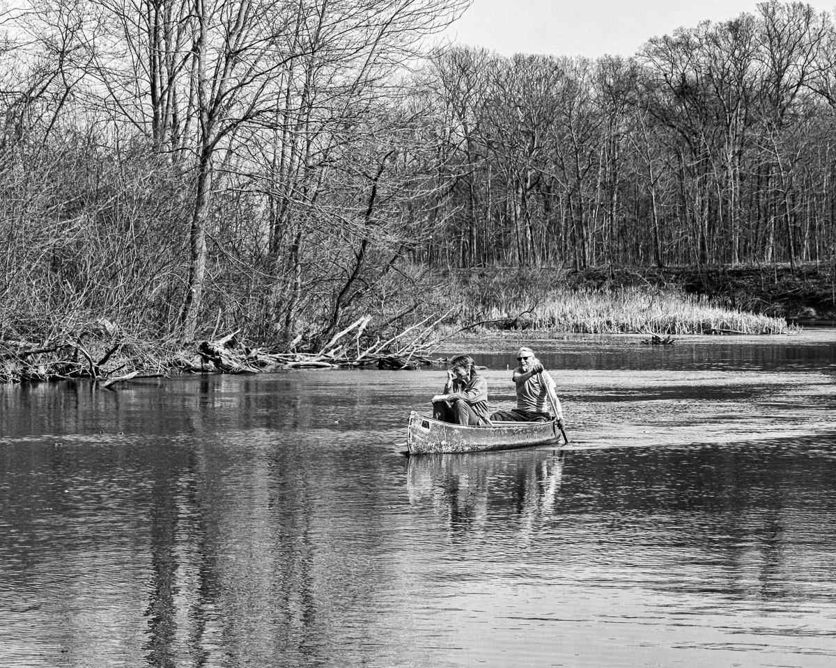
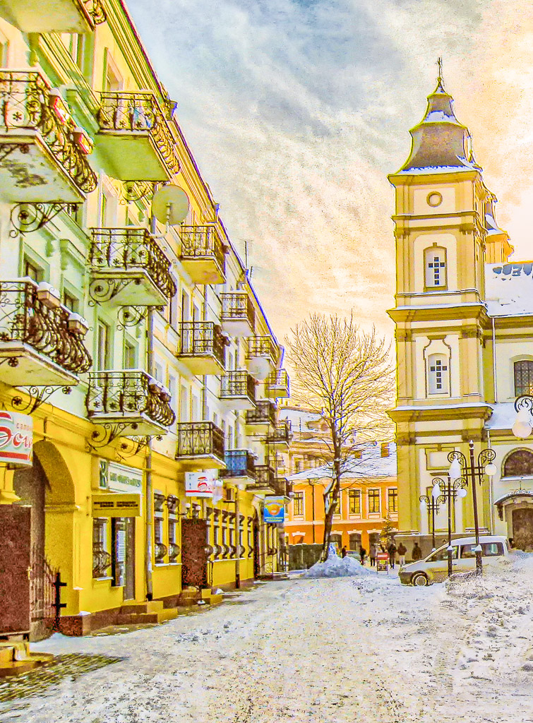
Very nice image! I like the black & white conversion for this photo. The composition is excellent with the buildings framed by the trees. Also, very sharp and detailed throughout. As far as the crop, in my opinion I would leave the crop as you have it. I generally like cloud structure in an image, however I feel that the inclusion of more clouds at the top is more distracting. Nice work! |
Oct 19th |
| 87 |
Oct 20 |
Comment |
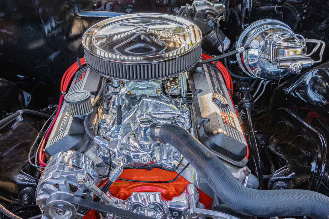
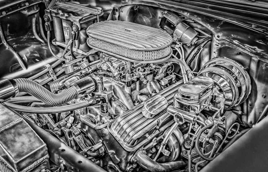
Great image! I like the detail and the natural pose of the mechanic doing something. You can tell that he is concentrating on his work, which adds to the interest. The black & white conversion is perfect for this photo. As far as the crop, in my opinion you could either crop the photo at the elbow line, then try to reduce the remaining glare as best possible, or widen the crop to include more details around the mechanic, similar to Lance's suggestion. Nice work! |
Oct 19th |
| 87 |
Oct 20 |
Comment |
Great image! Excellent clarity and sharpness throughout. The conversion to black & white plus the blue tone adds to the quality of this photo. The reflection is excellent and as such, in my opinion, I would leave the crop as you have it. I agree with Steven...you are influencing for the better! |
Oct 19th |
5 comments - 4 replies for Group 87
|
| 96 |
Oct 20 |
Comment |
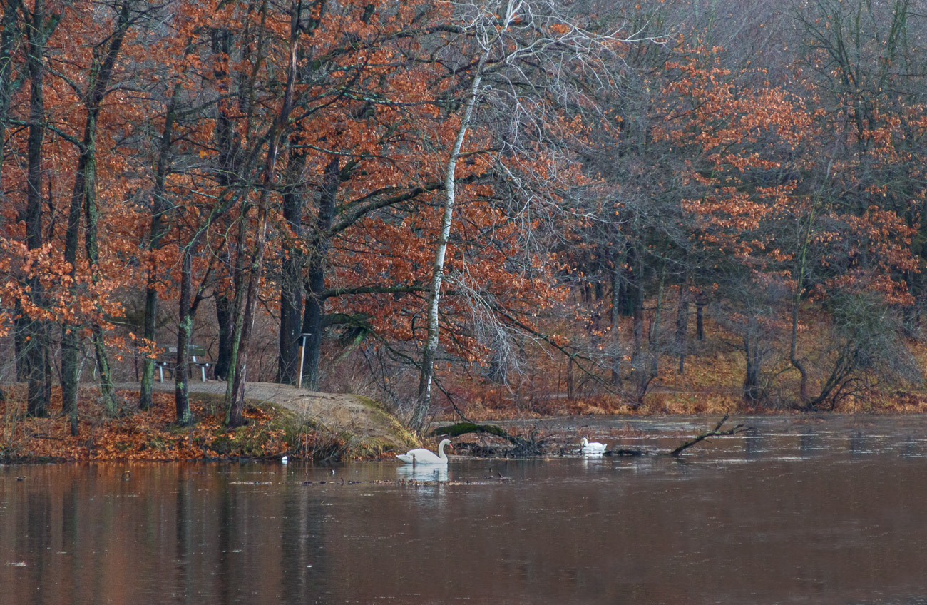
Excellent image! It seems like fog is a common theme this month! I believe that your handling of the fog is excellent and provides a nice background to the cattle. The foreground elements of the tree limbs and the fence provide good, solid depth. The fence line to the right guides my eyes through the image. I also agree with the conversion to black and white for this photo. My only critique is that I agree with the others in modifying the crop a little. Nice work! |
Oct 19th |
| 96 |
Oct 20 |
Comment |
This is a great image! Well composed, "stitched" together very well, and excellent use of HDR. The fog is well handled and adds to the mystery of the photo. As far as the foreground elements, I agree with cropping out the tree limbs on the left side. However I would leave the remainder of the foreground elements as they are. In my opinion, having the foreground elements provides depth and dimension to an image, which is evident in your photo. Very nice work! |
Oct 19th |
| 96 |
Oct 20 |
Comment |
Excellent image Dan! Very well composed and the fog is well handled and provides a mystery to the photo! The trees in the background, behind the fog, also adds to the quality of this image. I am also impressed at the sharpness of the image, with no diffraction in using an f/22 aperture. I agree with everyone else, I wouldn't change a thing. This image should be framed and hanging on a wall! |
Oct 19th |
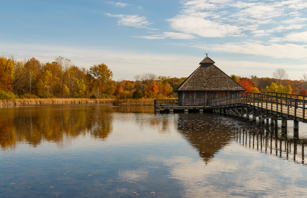
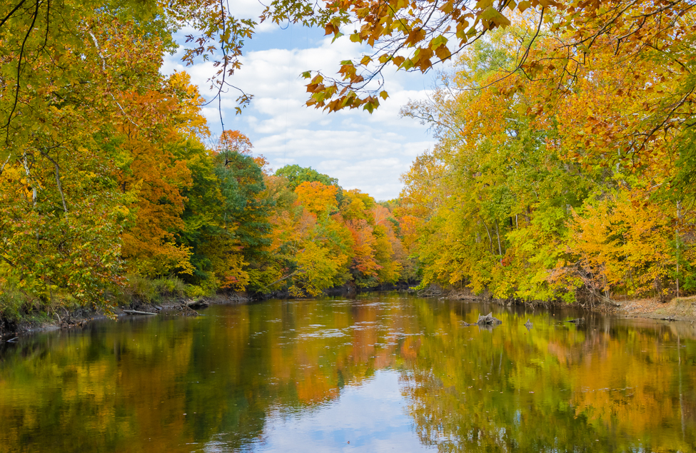
| 96 |
Oct 20 |
Comment |
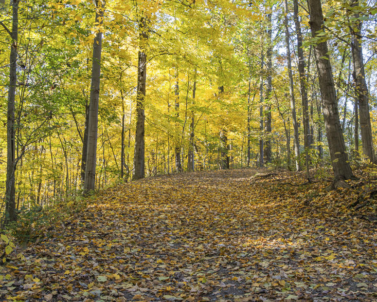
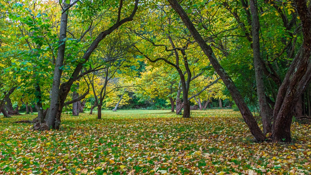
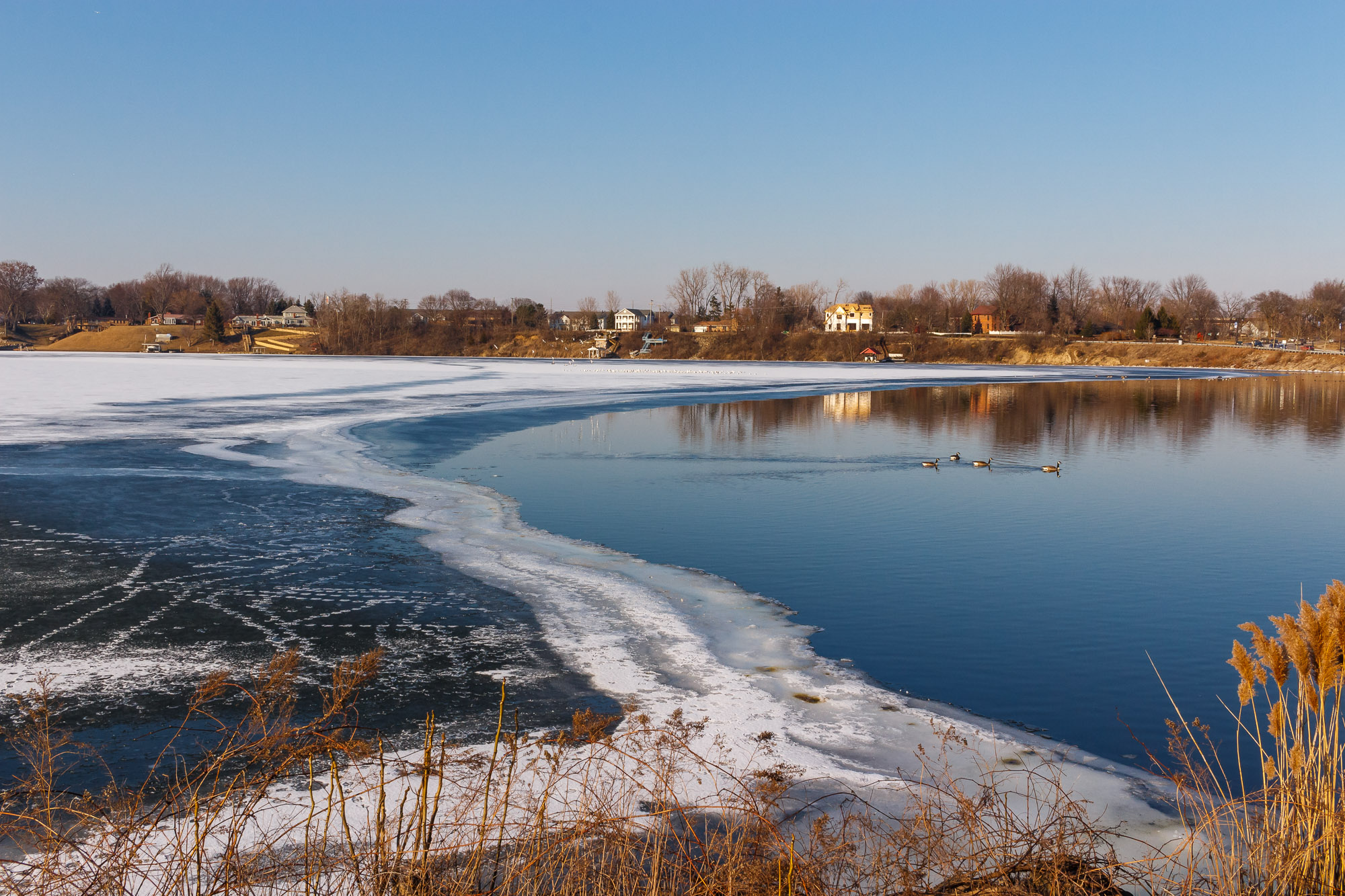
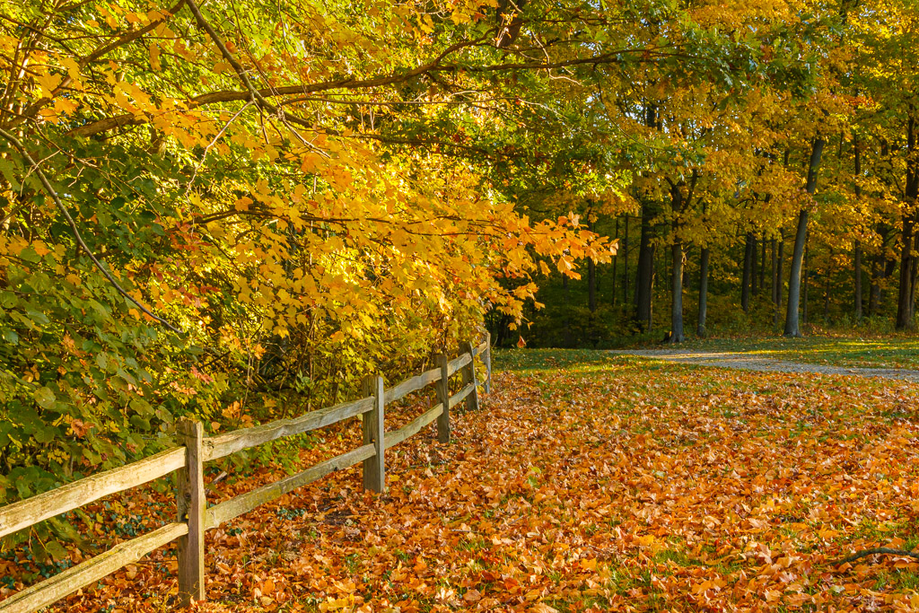
Excellent Autumn image! The color management is great, especially the blue tone in the image. I also like the reflection in the water, which adds to the quality of the photo! The image overall is sharp with excellent contrast. My only critique is that I agree with the others that, if possible, a little more visible image above the trees should be considered. Nice work!! |
Oct 19th |
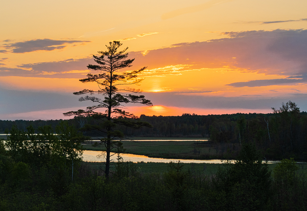
| 96 |
Oct 20 |
Comment |
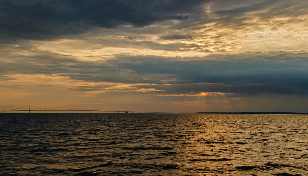
Excellent photo! In my opinion the composition is good. I like the silhouetted land formation to the left. The cloud structure is excellent. I especially like the red hue in the background. I also like the landscape crop better and agree with Cheryl that the light area between clouds can be reduced somewhat in post processing. However, keep in mind that the line of light reflection on the water, just right of center, is due to the light area between the clouds. If this light between the clouds is reduced too much, it could render the reflection on the water out of place. Just some thoughts...nice work! |
Oct 19th |
| 96 |
Oct 20 |
Reply |
Thanks Dan! I agree that some of the leaves are definitely blown out and I should have used a polarizing filter. Regarding the matter of the point of interest, that is usually the big debate in photography. In a couple of the photography classes I have taken it was stated there can be a primary and many secondary interest areas. In addition one of the classes also stated that occasionally there can be no specific center of interest at all, when the entire scene collectively serves as the center of interest. I generally agree with this, but usually try to have at least one area of interest. I believe that on the occasions of not having a defined area of interest in the photo, the viewer has more freedom in their interpretation, as in the case here where both you and Robert noted "something around the corner". Just my thoughts on this...thanks for your input and comments! |
Oct 15th |
| 96 |
Oct 20 |
Reply |
Thanks Robert! I agree that some of the leaves are blown out and I should have used a polarizing filter. I usually do, but for some reason did not for this photo. Thanks for your insights! |
Oct 15th |
5 comments - 2 replies for Group 96
|
10 comments - 6 replies Total
|