|
| Group |
Round |
C/R |
Comment |
Date |
Image |
| 87 |
Sep 20 |
Comment |
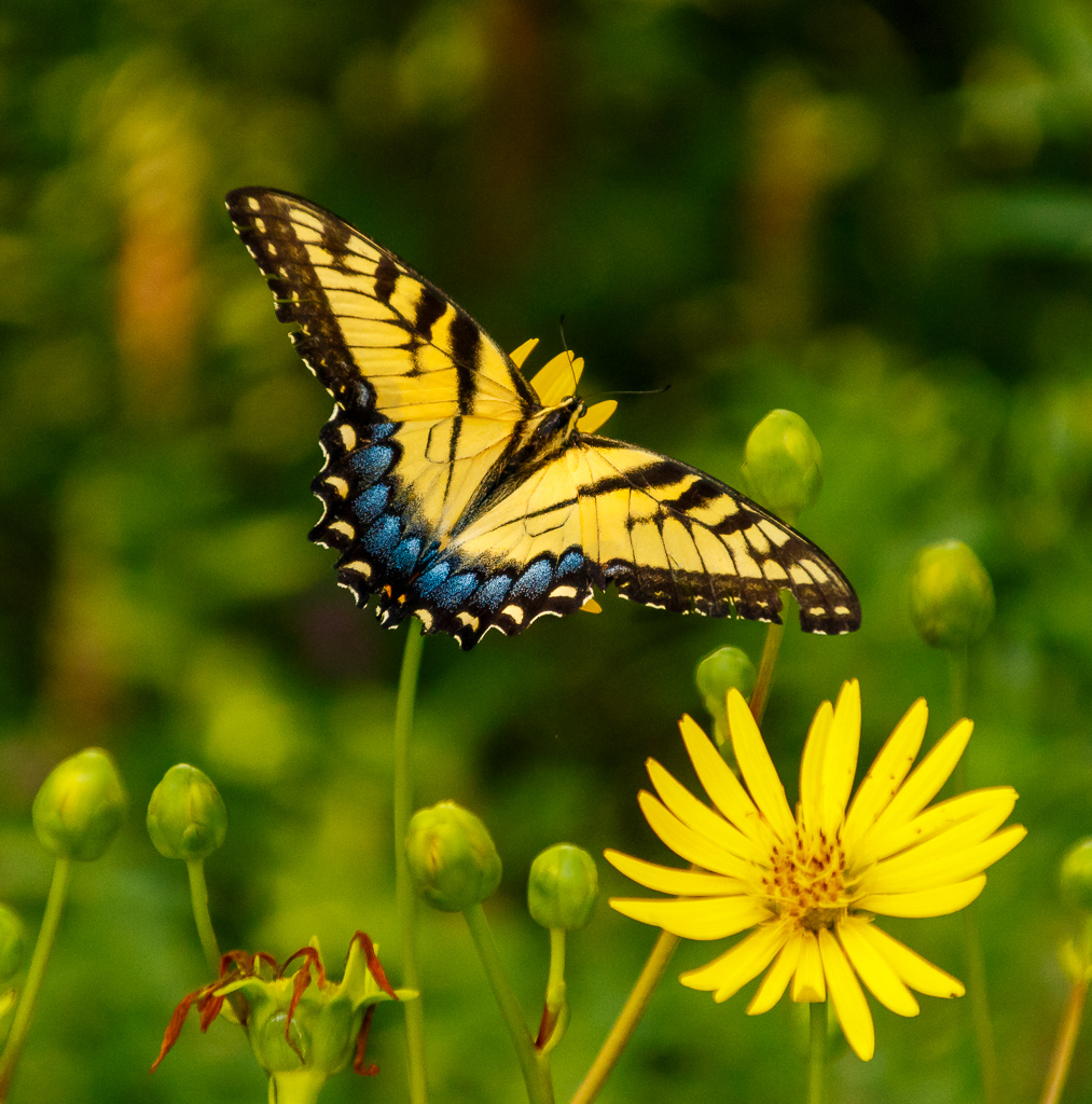
Hi Jennifer - My apologies for the late reply...my photography classwork was very heavy this month, leaving little time for other things. This is an excellent photo! I like the theme, to me representing a change of seasons. The sunflower is sharp with very good details. Good color management as well. Also, nice connection to your art history class and the Mannerism style. Excellent work! |
Sep 22nd |
| 87 |
Sep 20 |
Comment |
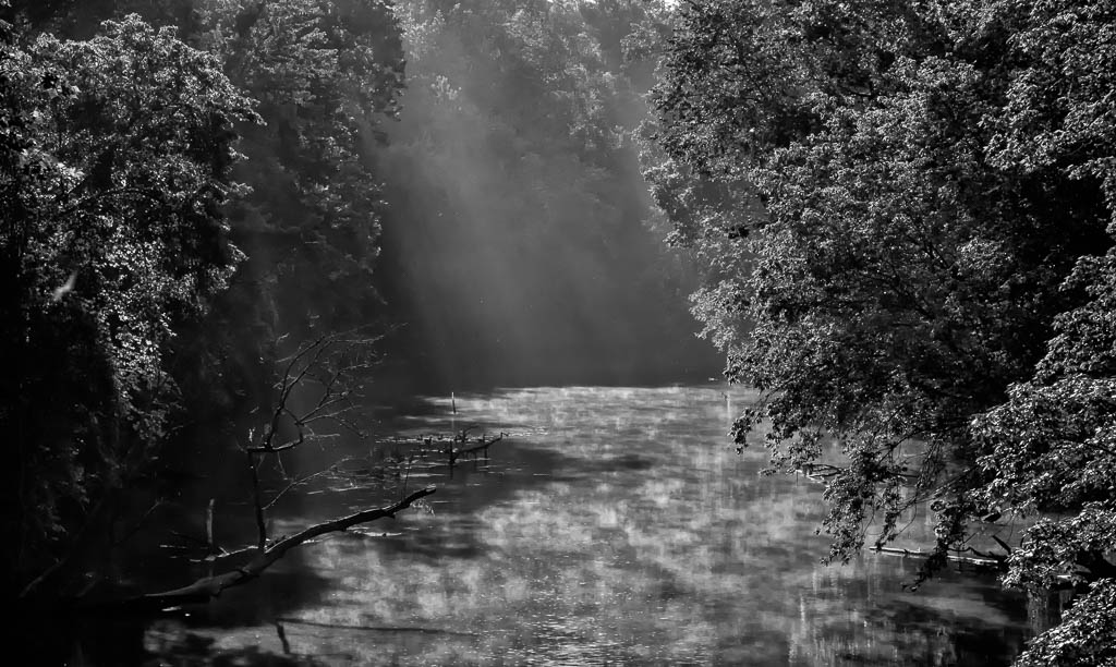
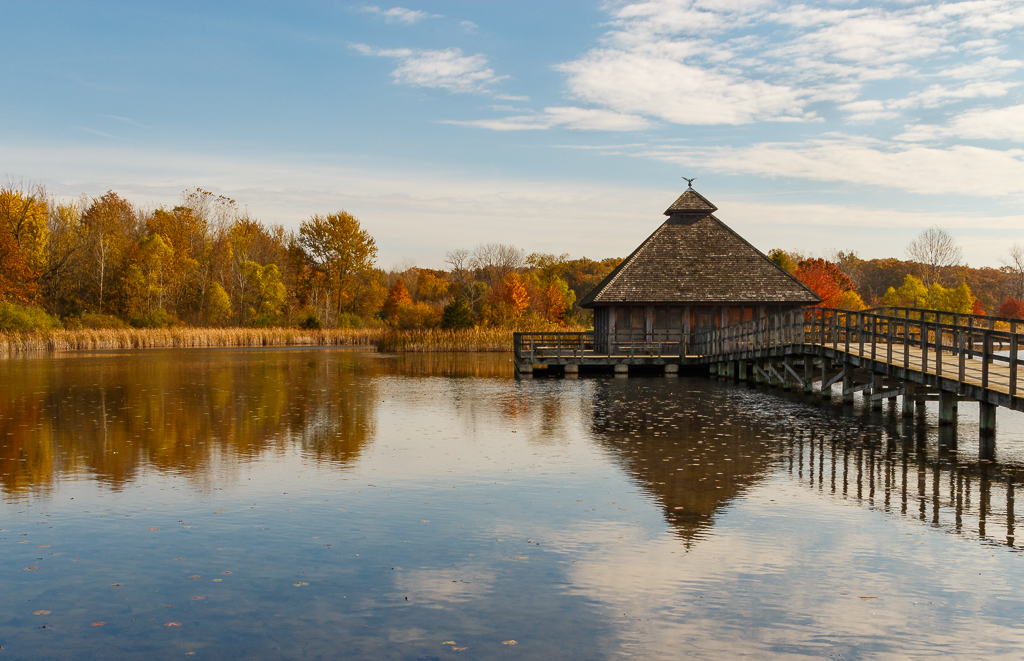
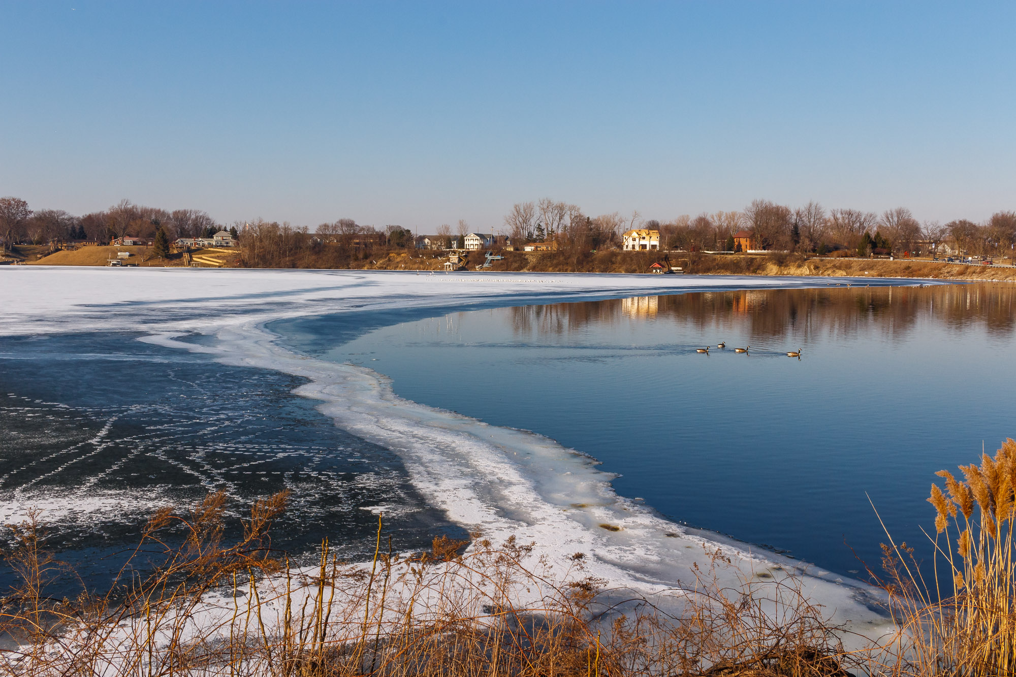
Hi Graham - My apologies for the late reply...my photography classwork was heavy this month. This is a nice tranquil photo! Good balance and composition. The reflection of the tree on the water adds to the interest factor in this photo. Excellent photo, nice work! |
Sep 22nd |
| 87 |
Sep 20 |
Comment |
Hi Steven - My apologies for the late reply...my photography classwork was heavy this month. This is an excellent photo! I like the creativity and the composition. Color management is also excellent. Of the two images you submitted I like this one the best, however the staggered composition is a very close second! Excellent work, thanks for the inspiration! |
Sep 22nd |
| 87 |
Sep 20 |
Comment |
My apologies for the late reply...photography classwork was heavy this month. This is a very interesting and creative photo! The overall sharpness is excellent and the reverse vignetting is an excellent choice. I agree that the black and white version is very compelling! Nice work...love the creativity! |
Sep 22nd |
| 87 |
Sep 20 |
Comment |
My apologies for the late reply...photography classwork heavy this month. This is an excellent image, great DOF. The photo is very interesting and I agree that this may be well presented in color. |
Sep 22nd |
| 87 |
Sep 20 |
Reply |
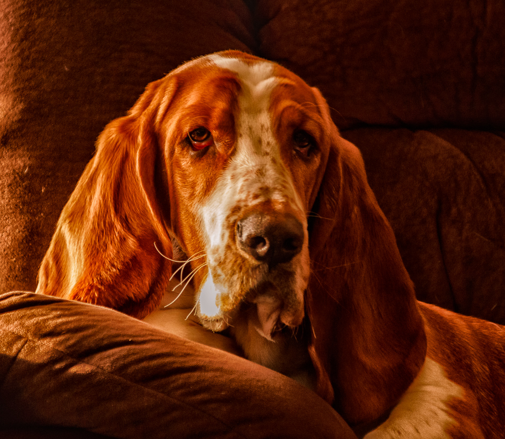
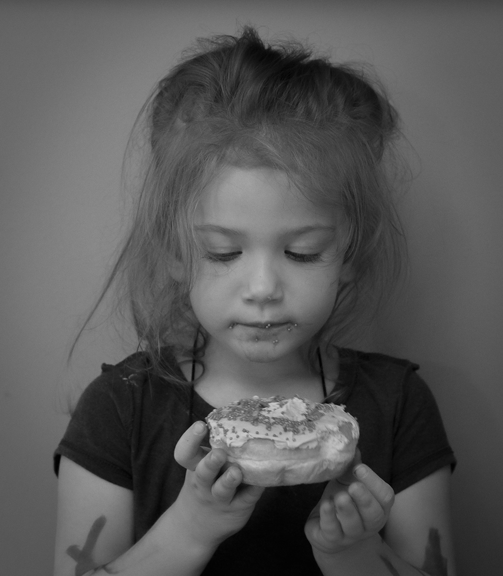
Thanks Steven! I took your suggestion to increase the exposure and contrast (see revised photo in Lance's comments)and really like how the image turns out. I agree regarding the crop...I usually would include the elbows. However in the original image I focused more on the head shot and did not include the elbows (perhaps next time I will be more conscience to include the elbows in this post, which will give more flexibility. Thanks again! |
Sep 3rd |
| 87 |
Sep 20 |
Reply |
Thanks Lance! I really like your suggestion! My goal was good, soft tonal contrast, especially in her face. I took your suggestion in the attached photo...slightly increased exposure and contrast and slightly lowered both highlights and shadows. I believe the tonal contrasts in this is more pronounced. Thanks! |
Sep 3rd |
 |
| 87 |
Sep 20 |
Reply |
Thanks Jenifer! The lighting was an overhead light at the kitchen table where she was eating and natural light from sliding glass doors to the left of the photo. Fortunately the wall behind her was gray. |
Sep 3rd |
5 comments - 3 replies for Group 87
|
| 96 |
Sep 20 |
Reply |
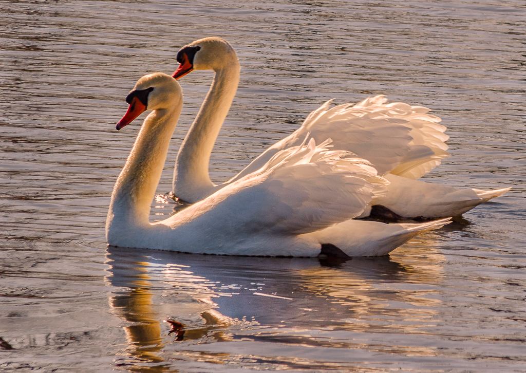
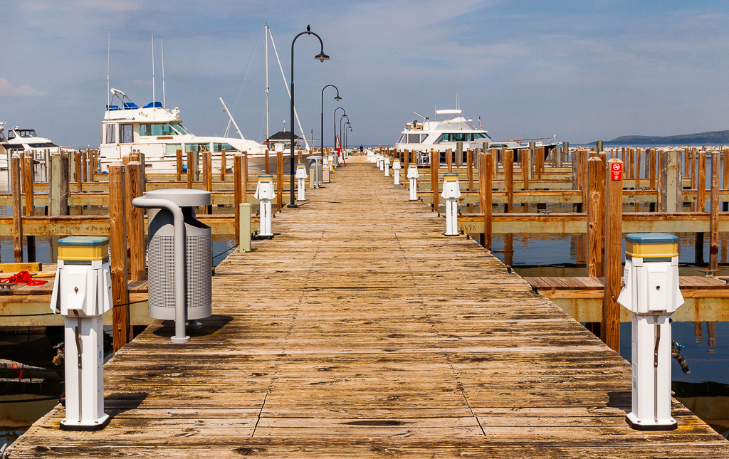
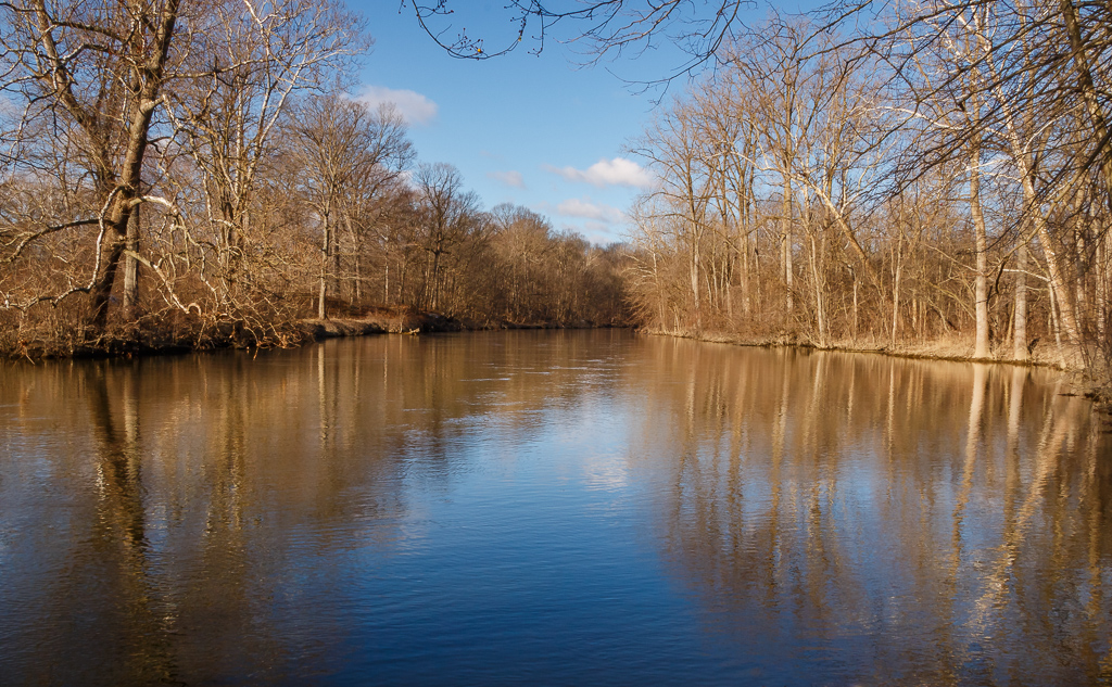
This is excellent! I like this version. The blues are right and the color balance of the pier is very good. Nice work! |
Sep 21st |
| 96 |
Sep 20 |
Reply |
I like this...the blues are in my opinion more pleasing. You can work in the individual red & orange color channel in LR to bring out the pier if desired. |
Sep 21st |
| 96 |
Sep 20 |
Comment |
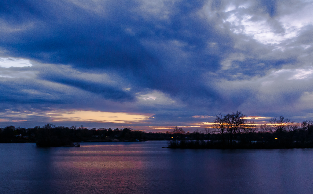
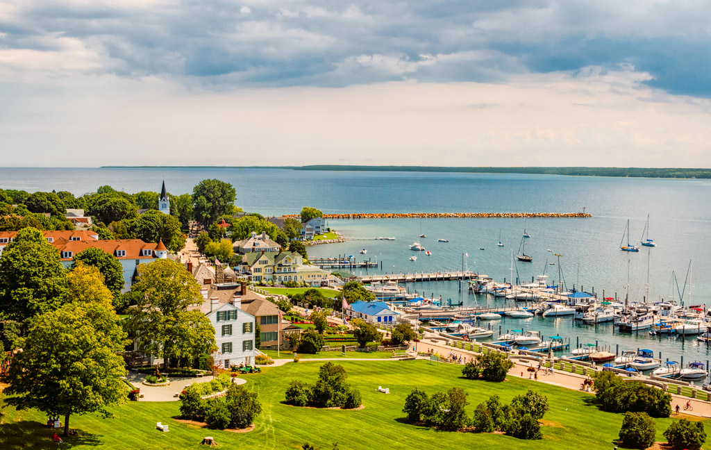
Hi Gerard...you bring up an excellent question to consider. In my opinion, much in photography reviews today appear to focus on one single point of interest or fixation point. I agree with this to a point. However, I also believe there can be a primary point of interest and many secondary points of interest as well. I also feel that at times the entire image, especially a landscape image, can collectively serve as the center of interest. The beauty of photography is that the photographer presents his or her vision of the subject at hand. As far as your image, I like the overall sharpness and detail throughout. The sky also has a layering effect in the clouds that compliments the land itself. The only suggestion that I would offer is to look at re-cropping the image to show more of the sky, perhaps the horizon at the top 1/3 line. Well done, and good question for discussion. Topics like this are also good for discussion in the Group 96 bulletin board. |
Sep 21st |
| 96 |
Sep 20 |
Comment |
Excellent landscape image! Good balance between the foreground and the sky. Nice use of color balance as well. Also, compared to the original, you brought out the colors very well. I like the cloud structure in the sky and feel this brings out the quality of the image. There is a portion of the sky that in my opinion may be a little over saturated. Very well done! |
Sep 21st |
| 96 |
Sep 20 |
Comment |
Hi Cheryl...excellent photo. Great composition with the church and the sky. In my opinion, the sky looks great. The stars seem to "pop", the comet is nicely captured, and the clouds provide a good contrast. I agree with Dan on perhaps look at brightening the church just a little and also agree that the PS Clone Stamp tool is best in these situations with the lights. I notice your edited version in your 9/16 reply to Zolt and I think this version is perfect, I wouldn't change a thing! |
Sep 21st |
| 96 |
Sep 20 |
Comment |
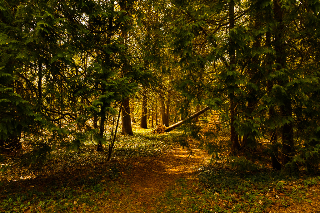
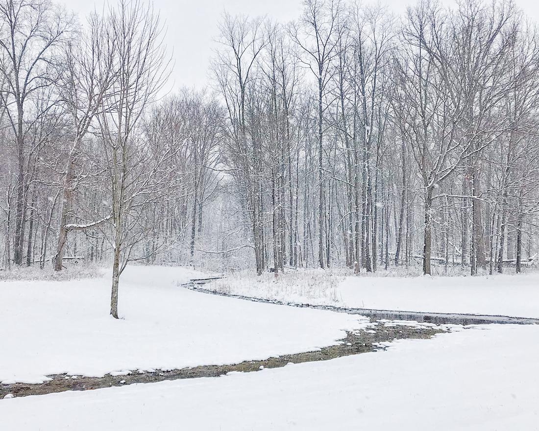
Hi Dan, welcome to the group! This is an excellent black and white photo! I love the simplicity and the overall composition is excellent...leading lines from the stream to the rocks and the rocks to the horizon at the right. In black and white images I look for both tonal contrast and texture. This image has both displayed very well! In my opinion, other than the crop suggestion by Robert, I would not change a thing. Very well done! |
Sep 21st |
| 96 |
Sep 20 |
Comment |
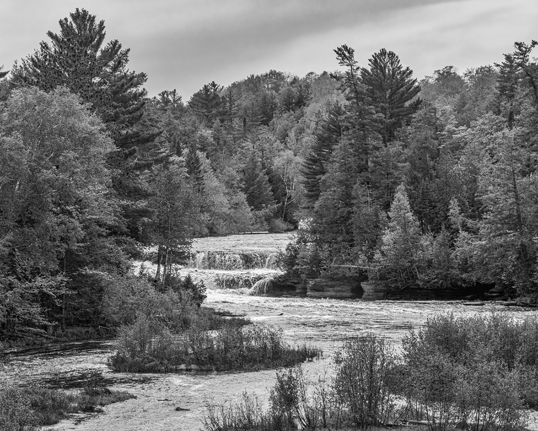
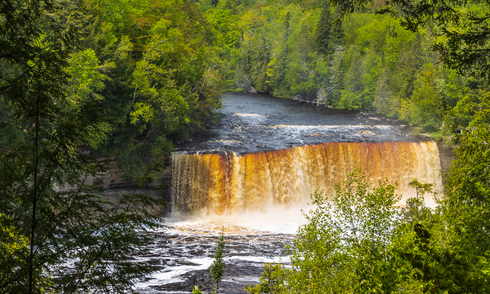
Excellent photo! The overall composition is very good with the focus on the waterfall and the trees in the foreground. Good details in both the rocks and the mist. I tend to like darker images and as such, in my opinion you may want to consider adding a little more contrast between the rocks and the sky, with the darker rocks also offsetting the mist. Very well done, excellent image! I also like the original image as it a very good landscape of the overall area. In my opinion, you may want to consider this photo as well, perhaps adding some saturation to the yellow trees in the foreground. |
Sep 21st |
| 96 |
Sep 20 |
Comment |
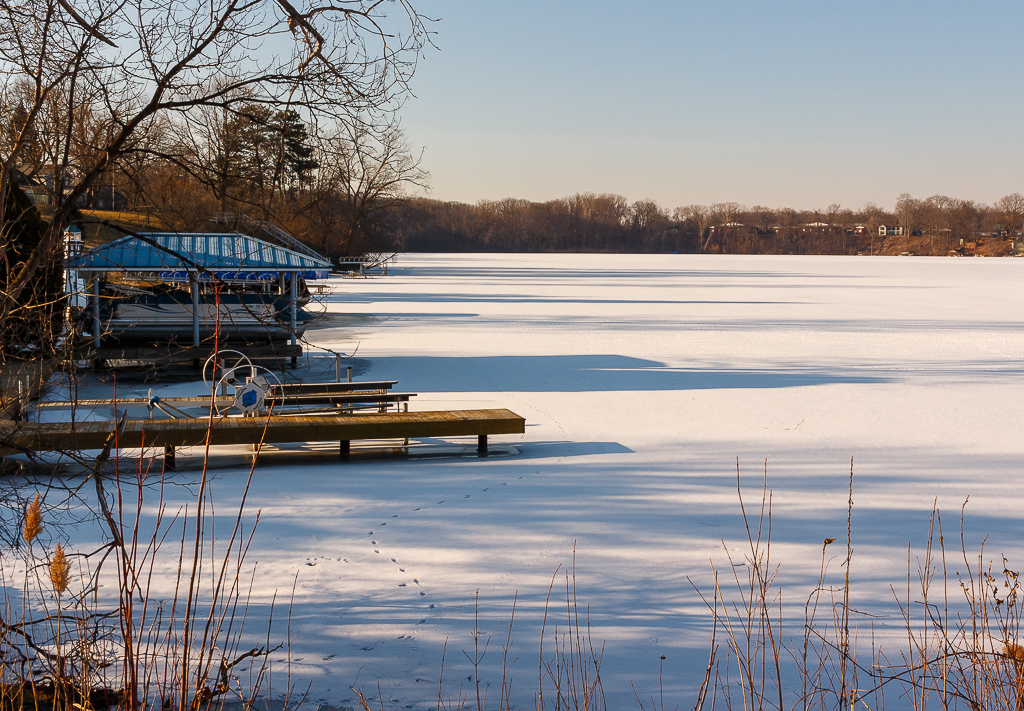
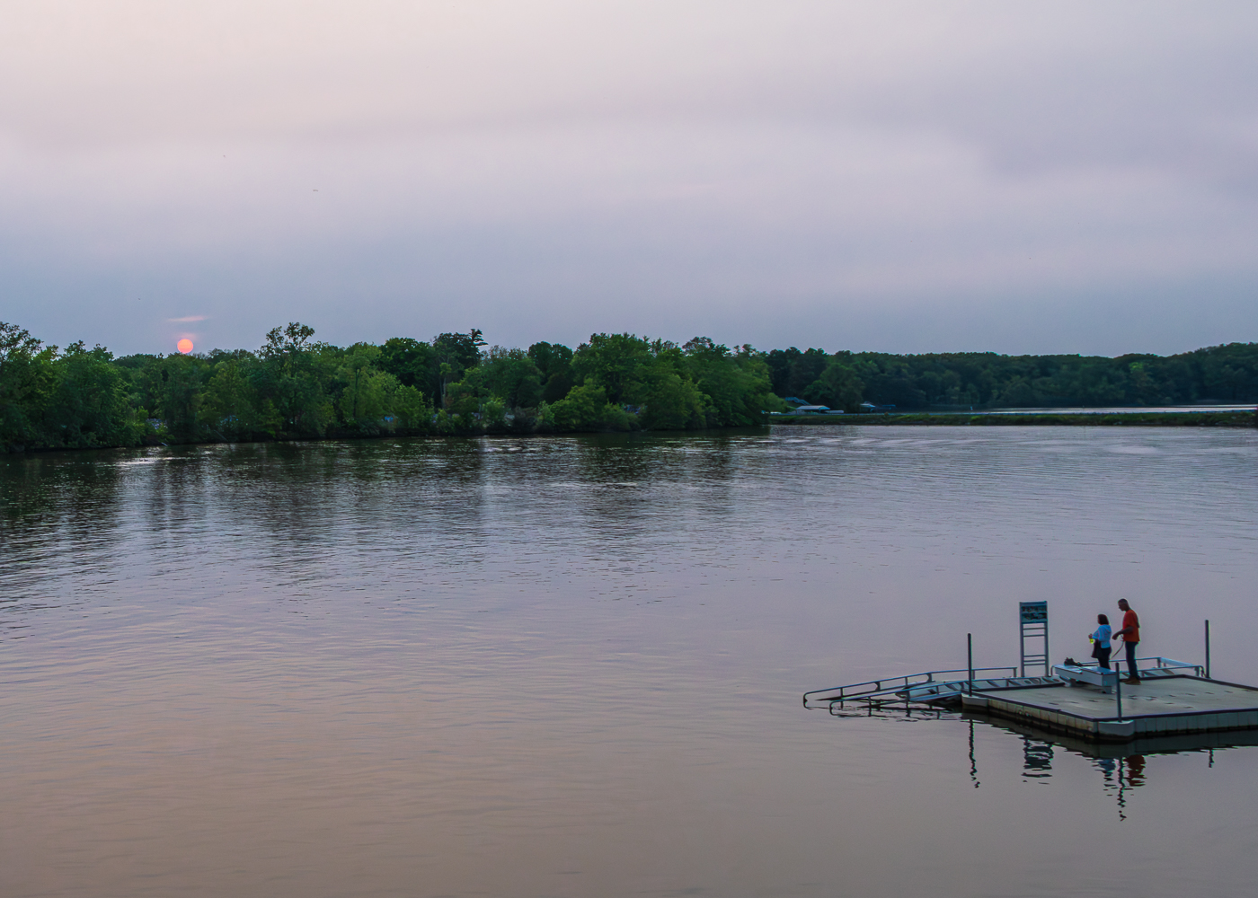
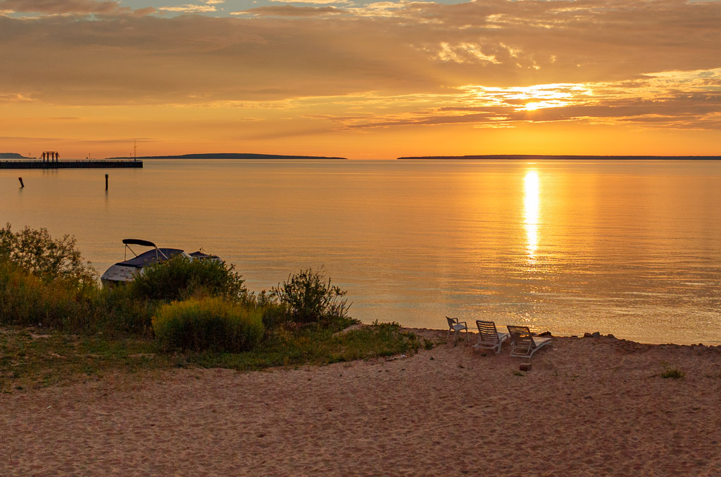
Hi Emily - very nice capture of the lake and pier. Excellent overall composition. I like the sky as well with the good cloud structure. Also, nice use of foreground, having something to balance the photo! Like the other comments, I also like the 16:9 crop the best. The only things I mention to consider is the blue sky and water appear a little over saturated to me. Perhaps explore drawing the saturation of the blues back a little in LR. Also, while in LR, possibly lower the brightness of the foreground grass a little as well, especially the bright spots. Well done, very nice image! |
Sep 21st |
6 comments - 2 replies for Group 96
|
11 comments - 5 replies Total
|