|
| Group |
Round |
C/R |
Comment |
Date |
Image |
| 87 |
Aug 20 |
Comment |
Excellent photo! Excellent sharpness in the eye with a well defined catch light. The texture and detail of the skin adds to the quality of this image. The shallow DOF draws my attention to lizard's head and eye. Nice work! |
Aug 19th |
| 87 |
Aug 20 |
Comment |
Nice black and white photo! This image does have that old time, nostalgic feel to it. Good composition with excellent sharpness throughout. I agree with the other comments that the right side appears to be a little too bright, perhaps blown out. However I feel that this area should be kept as opposed to being cropped out as it gives the viewer the complete picture of what you are capturing. Perhaps some dodge and burn to reduce the glare somewhat. Nice work! |
Aug 19th |
| 87 |
Aug 20 |
Reply |
Thanks Jennifer! |
Aug 19th |
| 87 |
Aug 20 |
Reply |
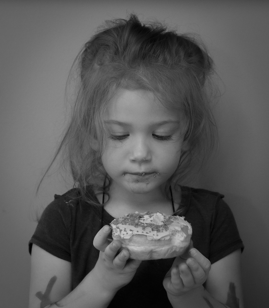
I agree, the impact is very evident in this image! I have a similar image of my granddaughter that I will be submitting to my instructor...black and white with her (3 years old) looking down at a doughnut she is eating |
Aug 5th |
| 87 |
Aug 20 |
Comment |
Excellent image! Nice detail and sharpness throughout. Also excellent lighting! This is a photo that will work well in both color and black and white! I am starting to understand how remarkable your portrait images are...I am taking a photography class where the current section involves photographing people, including portraits. This is not my strong point, but I am learning. Well done! |
Aug 5th |
| 87 |
Aug 20 |
Comment |
Very creative images! This is an example of what I like about the art of photography (as an ex-engineer I like the technical side as well)...allowing the photographer to express what he or she sees and interprets. We as viewers also have the ability to interpret the image as well, sometimes seeing what the photographer sees, sometimes having our own interpretation. This image makes me take time to view it and to think and determine what I see. Thank you for this! |
Aug 5th |
| 87 |
Aug 20 |
Comment |
Excellent B&W image! I like the choice of B&W over the color version, and the crop is excellent! This image has excellent detail and a "pop" to it. Well done!! |
Aug 5th |
| 87 |
Aug 20 |
Comment |
Chan - excellent photo! Great composition and perfect detail throughout. I also like the colors brought out in the photo which adds to its beauty. As mentioned by Steven, the vignette is perfect. I agree with your comments...this photo makes me think...what was the boy reading on his phone? What is at the top of the stairs? Well done! |
Aug 5th |
| 87 |
Aug 20 |
Reply |
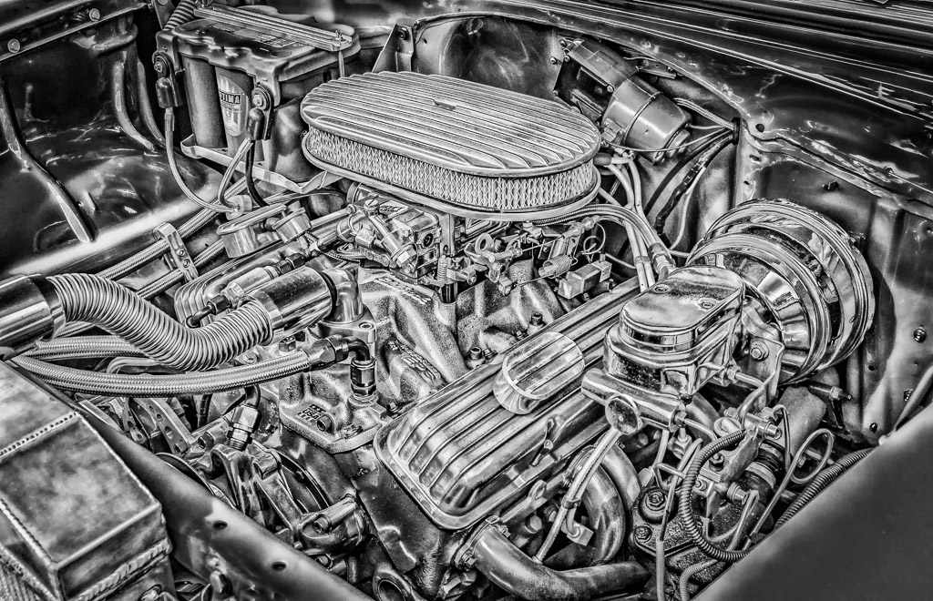
Thanks Lance! Please note my response to Chan on the lighting. I have experimented with the Nik Detail Extractor (within Color Efex option) in the past with mixed results...for cars and other equipment it seems to work well. For other subjects (landscapes, etc) it doesn't seem to work as well in my opinion. Thanks again! |
Aug 5th |
| 87 |
Aug 20 |
Reply |
Thanks Chan! As far as the lighting, this photo was taken in the evening under cloudy skies. The hood of the car was attached and raised up, however there was not any felt cover on the inside of the hood, leaving the steel exposed. This acted as a reflector (sort of) of the ambient light. In addition, the filter I used, Nik Detail Extractor, tends to lighten any shadows as more details are brought out. Thanks again! |
Aug 5th |
| 87 |
Aug 20 |
Reply |
Steven - thank you! |
Aug 5th |
6 comments - 5 replies for Group 87
|
| 96 |
Aug 20 |
Comment |
Thanks everyone for the comments and suggestions! After reviewing everyone's comments and looking at the image again, I agree that my original is a little too flat in regards to tonality. I like the increased contrast in the examples provided! I also like the various suggestions regarding the crop of the image. All very well on point, which gives me something to think about. Thanks again! |
Aug 19th |
| 96 |
Aug 20 |
Comment |
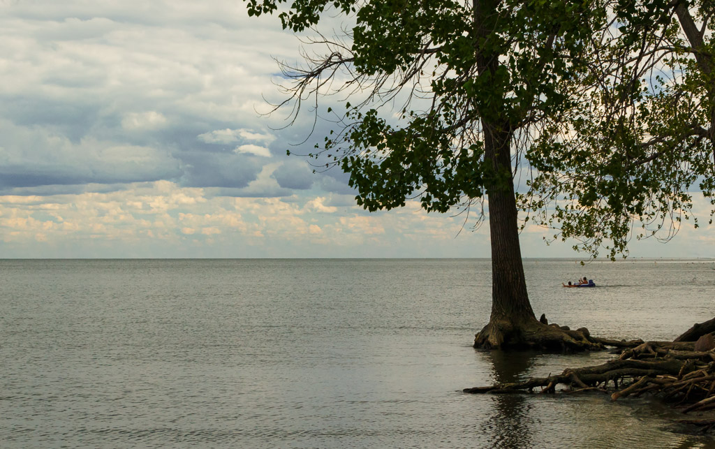
Nice image! Nice conversion to black and white. Good composition and excellent overall sharpness. I like the sky and its' detail as this adds to the interest in the image. I also like the variation of leading lines with the foreground rocks and the pier. A couple of details to consider...the foreground to me appears a little bright, perhaps a slight decrease in the highlights. Also, if possible adjust the crop to add a little more to the left side of the image. The pier as a leading line guides my eyes in the image and if possible a little more of the photo would help with this. Nice work! |
Aug 19th |
| 96 |
Aug 20 |
Comment |
Nice image! Good conversion to black and white with good contrast throughout. Also good overall sharpness throughout which is generally hard to do with a well defined foreground element. I like the layered effect of the background which provides depth and dimension throughout the photo. I agree with the comments on cropping a little to get the foreground off center. Nice work! |
Aug 19th |
| 96 |
Aug 20 |
Comment |
Excellent photo! Nice use of HDR (a good tool that you utilized well!). Excellent composition and good low angle shot which included the sky. The color in the clouds and the overall tone are good. I agree with Gerard in lightening the church a little adds to the image. Nice work! |
Aug 19th |
| 96 |
Aug 20 |
Comment |
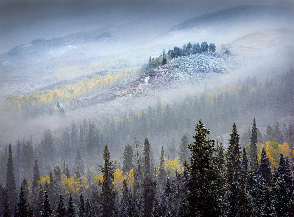
Excellent image! I agree this image portrays a sense of mystery and the unknown. I like the composition on this, especially the diagonal of the mountainside. I also like the layering effect which provides depth and dimension to this photo. To me, the image overall appears a little too bright. I hope that you don't mind, but I took the liberty of a quick edit in Lightroom. I lowered the overall exposure, increased contrast a little, lowered the highlights, and slightly increased the yellow color band. |
Aug 19th |
 |
| 96 |
Aug 20 |
Comment |
Nice image! This is a good shot of a busy night scene, which is hard to do. I like the composition, especially the nice diagonal of the bridge. The city lights appear solid without being blown out. A few things to consider...the image overall appears a little blurry. You mentioned in response to Cheryl's comment that you are looking at getting a remote shutter release. This is always the best way when using a tripod. One other way is to use your camera's timer, set at 5 or 10 seconds. This way your scene is set and hands are away from the camera when the shutter releases. You may also want to experiment with Zolt's comment on cropping out the dark pier on the left. To me this is not a big distraction, however you may get a different look with this removed. Nice work on this image! |
Aug 19th |
6 comments - 0 replies for Group 96
|
12 comments - 5 replies Total
|