|
| Group |
Round |
C/R |
Comment |
Date |
Image |
| 87 |
May 20 |
Reply |
Thanks Jennifer! |
May 7th |
| 87 |
May 20 |
Reply |
Thanks Chan! |
May 7th |
| 87 |
May 20 |
Comment |
Hi Jennifer - Nice image! The composition of this image is excellent and to me the contrast is spot on. In addition the texture of the lion adds to the quality of the image! The only suggestion I would make is to look into darkening some of the white streaks in the background which may be somewhat distracting. |
May 7th |
| 87 |
May 20 |
Comment |
Excellent photo! Nice overall image sharpness and vibrant colors add to the quality of this image. This is especially true in the reflection (love reflections!). Also good explanation of the leveling of the image, which is difficult along shore lines. I agree with you and the others in the cropping that Lance provided. |
May 7th |
| 87 |
May 20 |
Comment |
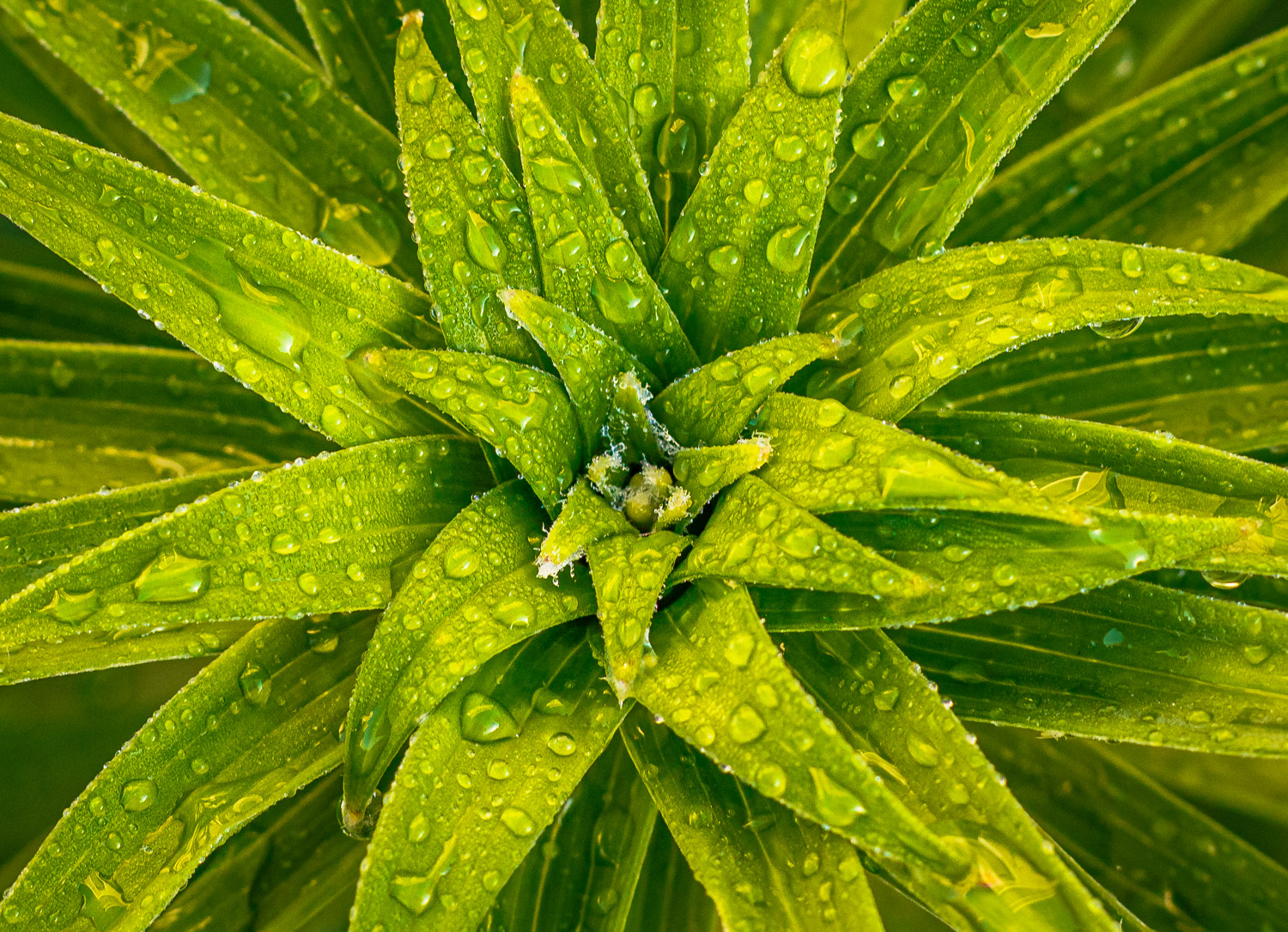
Good morning Lance - very interesting idea on posting the 2 photos.
As far as the main flower image, I like the creativity in including the rain. The color and texture are spot on and I also like the diagonal composition of the flower. Your explanation on how the flower is being sprayed with a sprinkler is a great compositional tool as my first thought was that this was taken in the rain or through a window.
Regarding the tulip, this is an excellent black & white photo! Converting flowers to black and white is very difficult and this image is spot on. I like the texture and the contrast along with the 2 tone background. In seeing your color version, which is also good, I prefer the black and white. |
May 4th |
| 87 |
May 20 |
Comment |
Hi Steven - I really like this close up image. The selective focus allows me to concentrate on the "fallen" king and the white squares leads me view to this main component of the image. I agree with the above comments of long lead of the white squares to the king (not cropping any off) and the darkening of the foreground to remove any distractions. Very nice! |
May 4th |
| 87 |
May 20 |
Comment |
Good morning Lance - thanks for your comments. I also agree that the individual components of the scene should remain as much as possible. I generally do not add components to a photograph during post processing. However, I am not opposed to removing certain components of a scene in post processing when these elements could be distracting. I try to avoid these distracting elements while taking the photo, but if I can't or notice them during post processing, I generally remove them if possible.
With this photo I unfortunately do not have any alternate shots. I generally take the initial shot of the scene, then take several other shots from varying angles, points of view, and locations. I don't know why I did not get any for this image, perhaps I was more interested in the wildlife and just took a single shot. Thanks again for the comments, they make me think and learn, which is appreciated. |
May 4th |
| 87 |
May 20 |
Reply |
Steven - thanks for the comments. I noticed the different appearance of the flowers too. I believe it is due to the lighting. I agree that the flowers in the upper left can be distracting to the main flowers and probably should be cloned out. Thanks again! |
May 4th |
5 comments - 3 replies for Group 87
|
| 96 |
May 20 |
Reply |
Perfect! Excellent photo! |
May 18th |
| 96 |
May 20 |
Comment |
Great image! I like the symmetrical composition and the details of the night sky! I agree with the crop at the bottom in removing the star reflections and with the enhancement to the milky way. I personally like the light on the horizon as I feel that an image can have more than one area of interest. |
May 17th |
| 96 |
May 20 |
Comment |
I love this image! The color original is good as well, but to me the black and white, with the border, provides an excellent mood to the image. I agree with the comments above in cropping out the light pole and the added contrast. The reflections on the water is excellent, especially the storm clouds. The only suggestion I have is to possible look into lightening (slightly) the reflection of the building. This appears to me to be a little dark as compared to the lighter building itself. This is minor as this is an excellent image! |
May 17th |
| 96 |
May 20 |
Comment |
I really like this image (I also like the original as well)! I love the mood that this image provides. I agree with the other comments that the sky in the original can be distracting. I like Cheryl's crop on the image which shows more of the 3rd tree. I agree with the increased saturation and vibrancy. I am a firm believer in trying to get the best image we can from the camera but also using the tools available to us to present the image we have in mind. |
May 17th |
| 96 |
May 20 |
Reply |
Thanks Zolt! Appreciate your comments! Please note my response to Cheryl on the matters noted. |
May 17th |
| 96 |
May 20 |
Reply |
Thanks Robert! I truly appreciate your comments! |
May 17th |
| 96 |
May 20 |
Reply |
Thanks Cheryl! Your comments and insights are truly appreciated and thought provoking. I completely agree with the cropping both the top and bottom of the image and also agree with smoothing out the texture in the water. Unfortunately I did not have a tripod available to have the longer exposure. I also agree that the white balance is off and needs adjustment as the image is overly yellow.
Also thanks for your comments about the possible distractions. Interestingly, in the PSA Image Analysis class there is discussion on distractions, split interest areas, and the center of interest. While an image may have multiple areas of interest, there is a fine line between this and distractions. Your comments on the possible distractions are good and thought provoking and forces me to take note of this more in future images. Thanks again!
|
May 17th |
| 96 |
May 20 |
Reply |
Larry - thanks for the suggestions. I agree with your proposed changes. I didn't notice the patch of blue at the top and agree it should be cropped out. As far as the sand, I was not sure what to do with this area and cropping some off should be a good solution. Thanks! |
May 4th |
3 comments - 5 replies for Group 96
|
8 comments - 8 replies Total
|