|
| Group |
Round |
C/R |
Comment |
Date |
Image |
| 63 |
Apr 26 |
Reply |
In this case I respectively disagree. This specific image does not really need a stroke line to separate the majority of the image from the background. Adding the stroke line does add a bit more of a 'contrived' feel to the image and diminishes some of the spontaneity of the presentation. |
Apr 14th |
| 63 |
Apr 26 |
Reply |
My rule of thumb is to stack when the subject is the approximately the size of camera sensor, or smaller, and/or is there is a lot of interesting detail that I want to ensure is cleanly caught. In these cases, the impact of aperture may be significantly lessened, so I may need to stack to get the desired depth-of-field. In this case the subject was a bit larger than the sensor, and I really thought that the bends and interactions of the bands might be interesting, so I stacked (and was glad I did). |
Apr 14th |
| 63 |
Apr 26 |
Reply |
I think that this image is great the way it is. It's just not a close-up image. I do not suggest trying to make it so just for our group. I am sure that you have may others that would fit the bill. |
Apr 11th |
| 63 |
Apr 26 |
Comment |
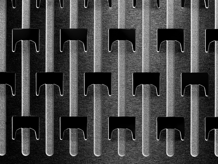
This image really exemplifies the essence of close-up / macro photography. Presenting the normal mundane world in such a way that we re-see reality in a manner we have not before. The fact that you, as the maker, were surprised at the native texture within, is a testament as to the impact of these types of images. I am glad you took our challenge to heart.
In this image we see several compositional elements in play. There are a lot of repetitive and parallel elements, wonderful tonal contrasts and an interesting variety of texture within. If one wanted to build upon these qualities further, one might consider darkening with each grater 'gaps' to make them more consistent across the presentation. I might also consider darkening the tips of the structures at the top to add consistency across the image.
As presented, this is not a monochrome image (since there are yellows and browns present is additional to gray scale) although it need not be to be effective.
By the way, I like the "Original Image" image of the grater as well.
I have included a monochrome version of the image in which these suggestions were applied, to illustrate my thoughts here.
|
Apr 10th |
 |
| 63 |
Apr 26 |
Comment |
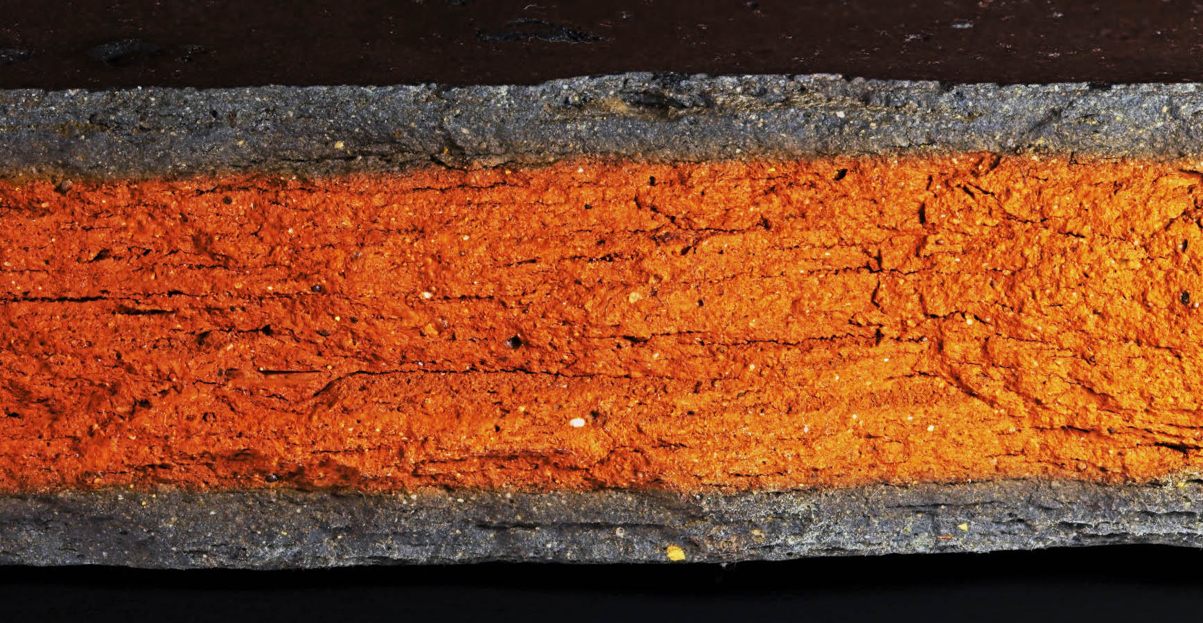
What a fun magnification shot. Kudos for seeing this as a photographic opportunity. Also, I like that you provided us with a glimpse of the set-up employed to capture the image.
Regarding the image itself, it does appear to be a bit washed out (perhaps due to the direct lighting), with some of the detail and color in the piece being lost. Here I might suggest adding contrast and darkening the piece a bit using a curves layer to rectify this. Boosting the colors a bit might also be beneficial. I also might consider darkening the uppermost layer to match that of the lower dark layer to add a bit of balance to the presentation. I have included a version of the image in which these suggestions were applied, to illustrate my thoughts here.
The Canon MP-E 65mm (1X to 5X) macro lens is a manual focus macro lens that is quite effective in generating large magnifications. It is difficult to use since one needs to work at finding the appropriate focus place. Due to the high magnification this lens can achieve, the apparent depth-of-field is also very small. But if one can work past these issues, it's a very effective macro lens.
|
Apr 10th |
 |
| 63 |
Apr 26 |
Comment |
Quite a stunning image here with a wonderful contrast in color, texture and form. It's as sharp as it needs to be allowing an effective presentation of the native texture within. I feel that the dark black background also adds to the effectiveness of the presentation.
All-in-all, and great photographic image. I am left to wonder though, if this subject is a bit large for this study group's focus. I do admit that there is some close-up quality to the image, as we are asked to explore the interaction between the hub and red leaves. I believe though, that the objectives of this group is to explore the challenges of shooting small subjects and less so in reveling in small sub-areas that might have some close-up qualities.
Again though, this is a wonderful photographic image |
Apr 10th |
| 63 |
Apr 26 |
Comment |
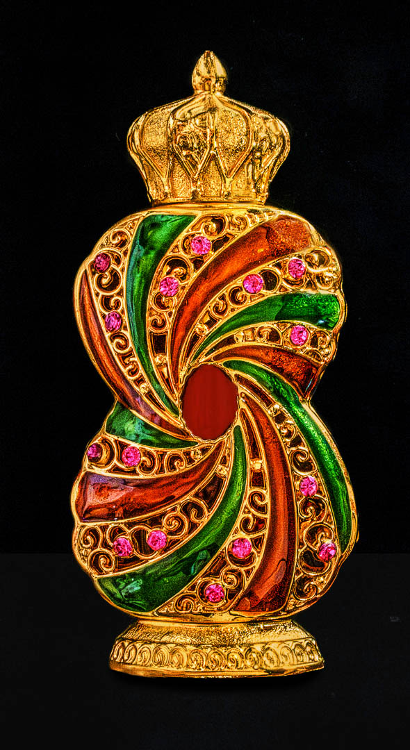
Great presentation of the piece of Jewelry. Nice and clear with a clean background. The whole image does appear to be a bit washed out, with some of the detail in the piece being lost. Also, the depth of the color within is also diminished; especially with the rose/pink gems. Here I might suggest adding contrast and darkening the piece a bit using a curves layer to rectify this. Also, you might consider selectively adjusting the different colors as well. Finally, the background is featureless, giving the feeling that the idem is floating in space. Adding a very subtle difference between the base and background could address this point. I have included a version of the image in which these suggestions were applied, to illustrate my thoughts here. |
Apr 10th |
 |
| 63 |
Apr 26 |
Comment |
Great use of common place items in this challenge, and a creative rendition here. I like the composition and the lighting effect that you employed here. I do find that some of the effectiveness of the presentation is lost where the forks intertwine. This interaction is an important part of the image though. Perhaps if one moved the forks apart a bit this might allow more black empty space between the fork tines. Or perhaps using a large vs smaller fork set in an alternating pattern. This is a minor point related to the set-up rather than to the quality of the image though. Nice Job ! |
Apr 10th |
5 comments - 3 replies for Group 63
|
5 comments - 3 replies Total
|


