|
| Group |
Round |
C/R |
Comment |
Date |
Image |
| 63 |
Feb 26 |
Reply |
Interesting take on this image, and I appreciate your thoughts. Here, I specifically added a gradient of light to the background, moving away from a completely back background. I also intentionally left the space around the subjects as well. I thought that a tighter crop resulted in an overly constrained feel to the presentation. There was sufficient detail and character associated with the subjects and reflections that I did not need to constrain the image or to add a pure black background to further emphasize the subjects. |
Feb 21st |
| 63 |
Feb 26 |
Reply |
This might be done by taking the image such that the entire background was sharp, selecting the background on it's own layer, blurring the background layer and then adding a gradient as a mask to allow more of the blurred background at the top, and less-to-none of the blurred background at the bottom. The depth (rate of transition) of the gradient mask will determine how sharp or soft the background will be. |
Feb 18th |
| 63 |
Feb 26 |
Reply |
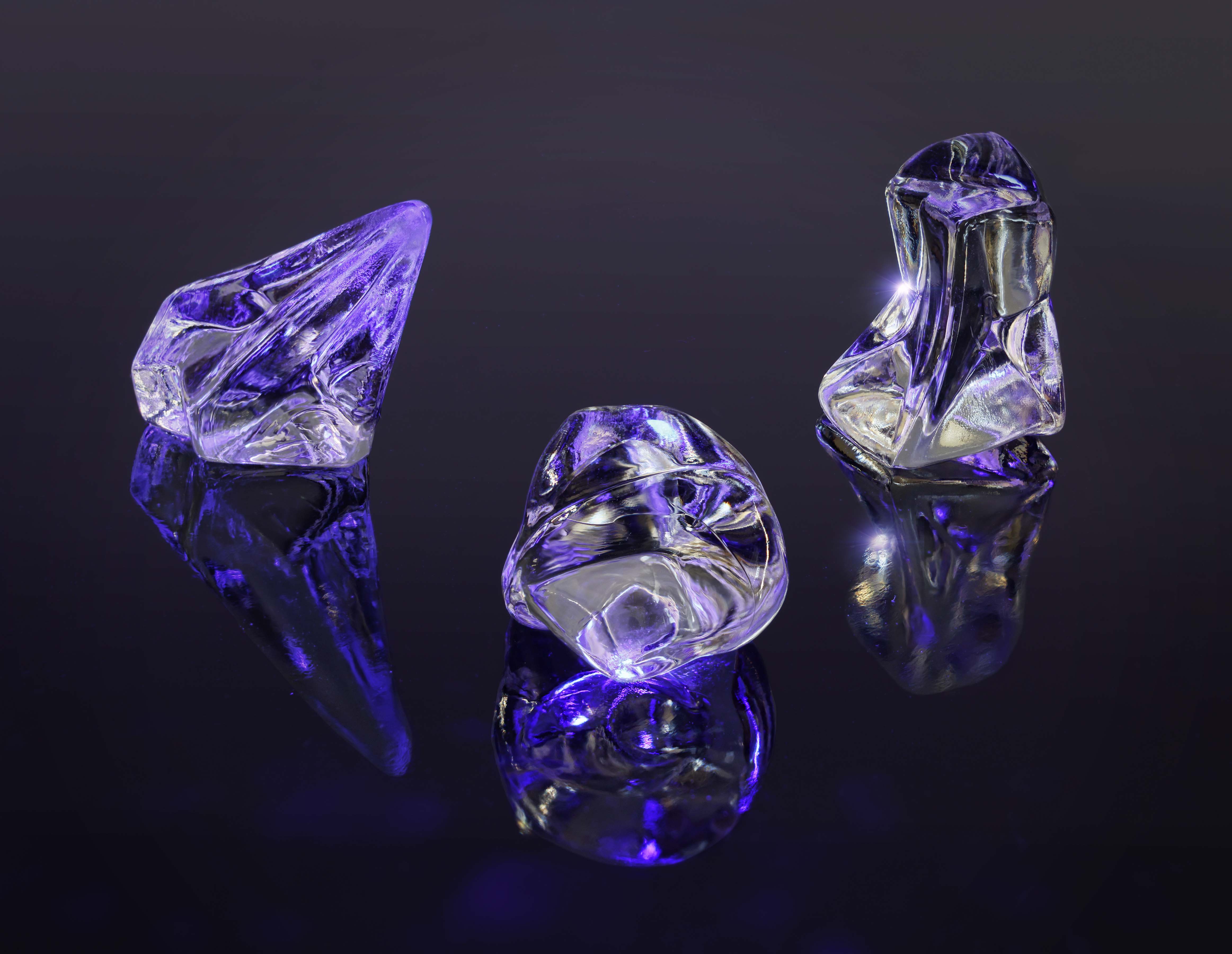
I was not able to obtain any colored pieces. Using different colored lights I was able to inject some color (red, blue, green) into the scene though ... |
Feb 11th |
 |
| 63 |
Feb 26 |
Comment |
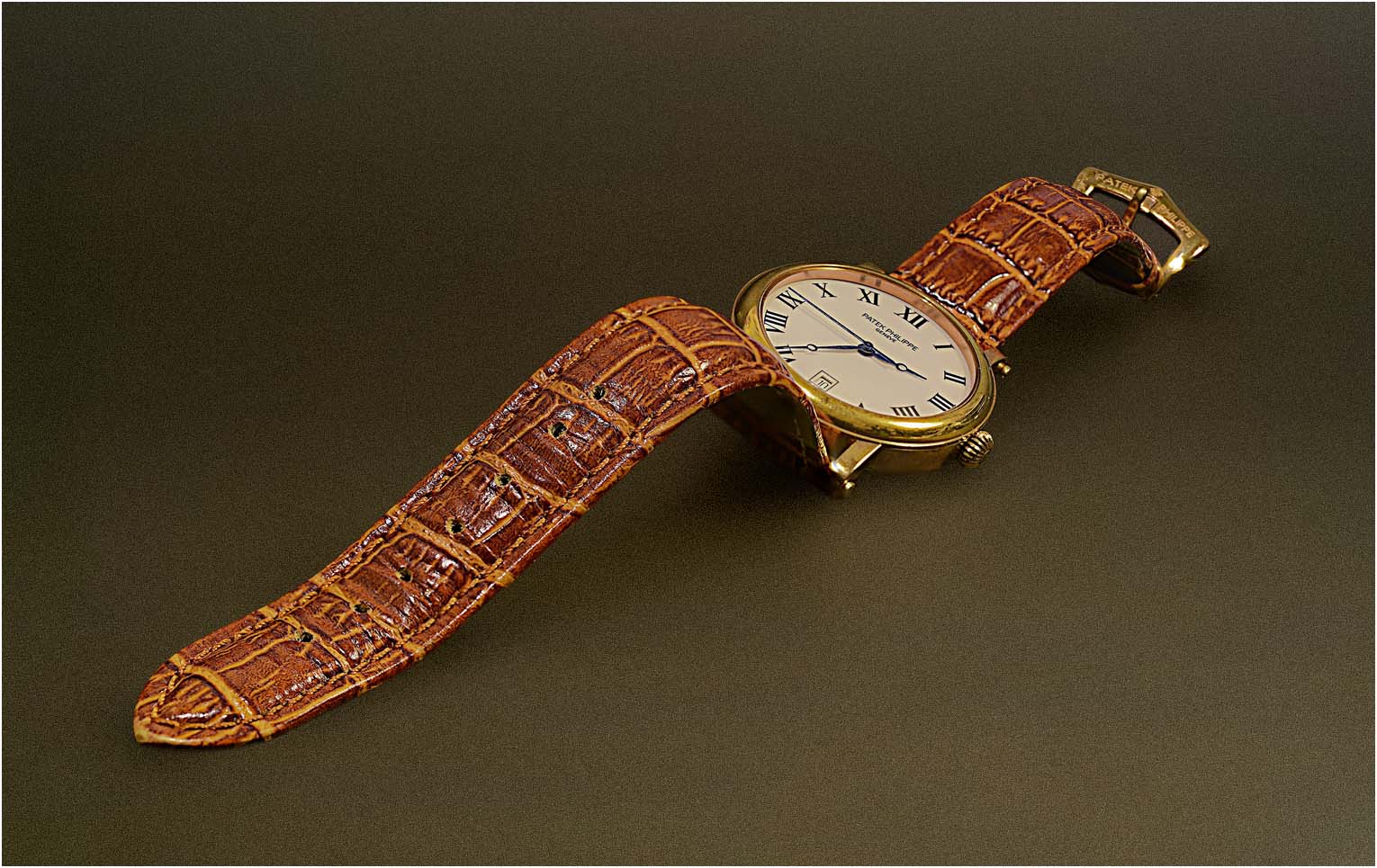
Interesting yet simply clean shot of this watch. The composition was effective and the flat light gave nice subtle shadowing. The DOF was fine in that the entire watch was as sharp as it needed to be.
I am not sure that I am a fan of the fall-off in the surface texture though. I might suggest getting rid of the texture entirely (blurring the background) adding back uniform texture/grain through-out the background and then adding a slight dark to light gradient to the background to impart a sense of depth. I also felt that the subject was a bit constrained and that more space around the subject would make for a bit more effective presentation.
I have included a version of this image where I have tried to do this to illustrate my thoughts. |
Feb 8th |
 |
| 63 |
Feb 26 |
Comment |
Here we are given a simple yet effective presentation of this butterfly. The critter is cleanly presented against a background which gives us a sense of the natural environment it is found in. The exposure and colors are nicely handled as well. The image is rather static, so there is not a lot of energy within the image. As a documentary image though, it is quite effective. |
Feb 7th |
| 63 |
Feb 26 |
Comment |
In this image it's less about the actual capture, and more about the post processing to convert the image into a more artistic, water color-ish presentation. In this case that subject makes for a good scene to do this and the conversion is effective.
My personal preference might be to make the colors a bit more-bold and to increase the contrast some, but that is not a statement upon the quality of the image, just my slant as to where I might be tempted to pull the image. Clearly you chose a different path, and I am assuming that this was a conscious choice and that you did not just settle for what the program gave you. A nice, interesting image.
|
Feb 7th |
| 63 |
Feb 26 |
Comment |
Collecting interesting images of textured glass (slag glass is often a textured, pressed glass) can be a challenge, and I think that here you were up to the challenge. The color and placement of the lights behind the glass yielded many fascinating colors and shapes that you were able to capture here. The shapes and colors within this presentation make for a interesting image. This is purely an artistic construct so comments on the technical presentation are not as appropriate in this case. Nice job though at creating this artistic and colorful image. |
Feb 7th |
| 63 |
Feb 26 |
Comment |
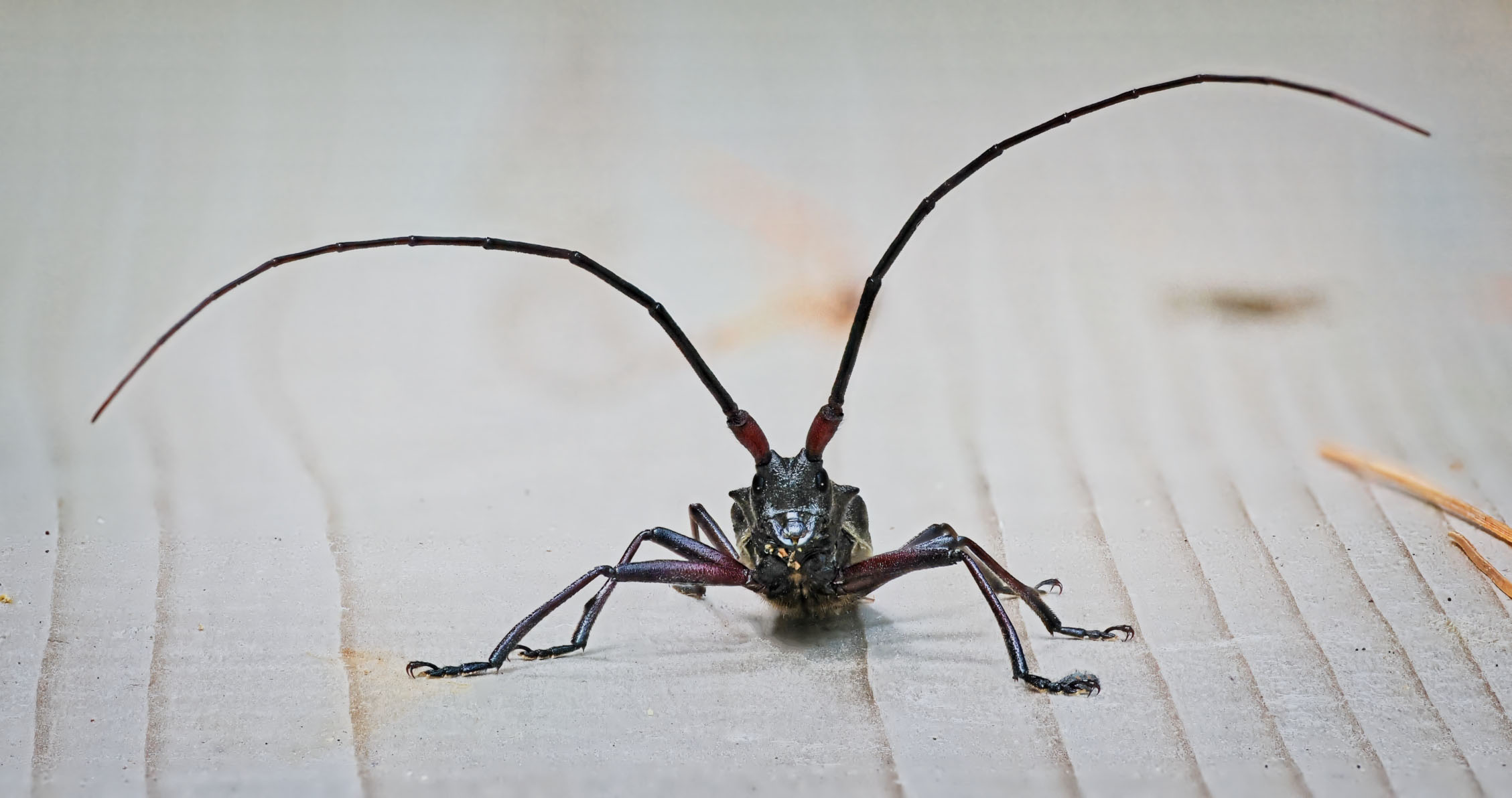
What an interesting image of this critter. Great focus and composition. I also am enjoying the drop-off in sharpness within the image which to my eye aids in giving us a sense of depth in this image. Focus stacking can result in somewhat flat images, so adding this depth back is often critical.
Your title implies that the face of this critter is important, yet I am having a more difficult time is making this out. There is a lot of specular highlights on the body/face and the facial features are difficult to make out. As such I feel a bit cheated.
Here I might remove much of the special highlights of the face and body and darken the eye some. I might even add back a slight catch-light to the darken eyes. Such edits might clean up the image a bit and make the face much more identifiable and relatable. Of course, this all assumes that you wish to and are allowed to do such edits (in many documentary and/or nature images, such edits may not be allowed). I have included a version of this image where I have tried to do this to illustrate my thoughts.
|
Feb 7th |
 |
| 63 |
Feb 26 |
Comment |
Ruth:
Welcome to Group 63.
What an interesting subject and capture. Kudos for seeing this scene. The main subject is nicely displayed against a soft background with great subtle color. In this image the depth of field was challenging with elements both close and further away being rather soft. In my opinion his mix of soft and sharp is rather distracting to me, and pulls me away for enjoying this entire image. I realize that you did not have the right equipment to generate a focus stack, but to my eye this would have been preferable.
Finally, I am not sure if the off-centered presentation is appropriate here. Yes we try to apply the "rule of thirds" in many of our shots, but here I don't believe that its needed. A more centered presentation of the subject would work fine here and even emphasize the subject a bit more.
Thanks for sharing your effort here.
|
Feb 7th |
6 comments - 3 replies for Group 63
|
6 comments - 3 replies Total
|


