|
| Group |
Round |
C/R |
Comment |
Date |
Image |
| 63 |
Jan 26 |
Reply |
Another way to add color is to do this in a clear bowel, and to place a colored placemat under the bowl. This can give a wide variety of color as well. |
Jan 29th |
| 63 |
Jan 26 |
Reply |
What do you both think about the alternate images (image 2 and image 3)? I am "on the fence" in regard to these presentations. |
Jan 12th |
| 63 |
Jan 26 |
Comment |
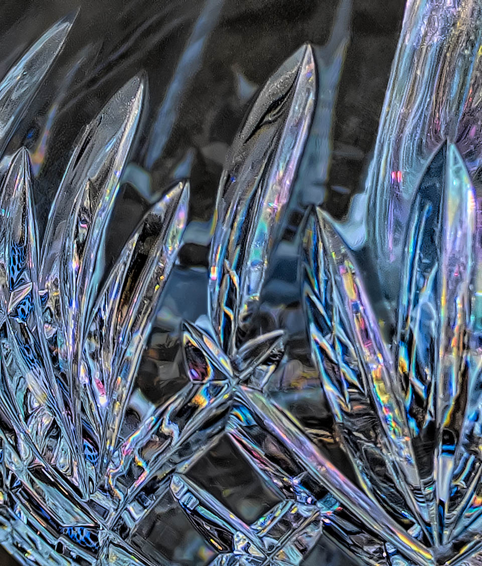
Making good shot of crystal is always a challenge, and I applaud your effort here. The are so many interesting lines, reflection/refraction patterns and color within this image.
Now, as the maker, having spent time with this subject you know which parts are the most interesting to you and your eye focuses upon those parts. However, in this image the viewer needs more help in identifying those critical areas. The viewer needs to struggle to see which parts of the image are background and which parts represent your intended subject. Here you could help the viewer out by selectively darkening some the areas that you wish to deemphasize. Also with glass images, wear marks, smudges and spectral highlights tend to be more predominate and distracting. Here I would suggest darkening those areas that you wish to deemphasize, and removing the wear marks, smudges and spectral highlights. The remove tool is great for doing this last step although it does take some time.
I have included a version of this image where I have done these things to illustrate my thoughts. See what you think. |
Jan 7th |
 |
| 63 |
Jan 26 |
Comment |
I have taken several images similar to this so I appreciate the effort going into collecting such an image. The shape of the drop rebound column (often called a 'Worthington Jet') is interesting as are the ripples and reflections. I also appreciate color that was captured as well. How was this color introduced into the image. I was somewhat surprised that a flash was not used. Often the speed of the flash (in the range of 1/25,000 sec) is the element that freezes the subject rather than a fast shutter speed. |
Jan 7th |
| 63 |
Jan 26 |
Comment |
This is quite the artistic presentation. It does have an interesting affect within the image. The paint overly is nearly dominating the whole presentation, so seeing beyond this is challenging. It's difficult to see what efforts were made before the overlay of old paint was added, so making comments is also challenging. I am left to wonder if this interesting image fits into the close-up / macro focus of this group though. |
Jan 7th |
| 63 |
Jan 26 |
Comment |
Here we have a very clean presentation of these critters. The ducks themselves are nicely rendered being as clear, sharp and vibrant as they are in nature. The background is also soft with no distractions, giving us a feeling of depth in the images and the feel for the natural environment. I do find that the foreground wooden stump is overbright and is a bit distracting. Selecting the bright areas of this stump and darkening it a bit (perhaps with a curves layer) such that the ducks are the brightest part of the image could address this point. The bright areas also seem and bit over sharpened and/or "crispy" as well although I doubt that these were sharpened in post processing. The suggested earlier edit should address this point as well. |
Jan 7th |
| 63 |
Jan 26 |
Comment |
A very effective image of this bloom. The petals are a nicely displayed being as bring and as sharp as they need be, and the background is soft enough to highlight the main subject. This is often more difficult to accomplish in flower images. They seem simple but often require a lot of effort to come out well. The only suggestion is that I would have liked to see the stem a bit sharper, to sperate this element away from the background a bit more. In this case sharpening in post processing might do the trick. Aside from that point an interesting presentation. |
Jan 7th |
5 comments - 2 replies for Group 63
|
5 comments - 2 replies Total
|


