|
| Group |
Round |
C/R |
Comment |
Date |
Image |
| 63 |
May 25 |
Comment |
This image was conceived as an exploration of light to present a common place item is an unusual way. So, the subtility of the light and the partial exploration of the detail were all part of the concept here. Not the typical image we often see submitted. The effort at subtility here has lessened what some may have described as "impact" here, but perhaps that was by design. Why does it appear so? Is an image with less obvious impact good or bad or just different?
Let's hear your thoughts below ... |
May 28th |
| 63 |
May 25 |
Reply |
How would you change it to improve the "impact" ? |
May 28th |
| 63 |
May 25 |
Reply |
Yes, but that does not mean that in your image you need to keep it that way. You might add a subtle background and perhaps a different but subtle base for the hat to sit on. The fact that several members noted that the subject appears a bit disconnected from the outside, indicate that this may be how others are perceiving the presentation. Perhaps there are things that one can do to make the hat presentation more effective. We don't always have to live with what the camera gives us in our images. Food for thought |
May 28th |
| 63 |
May 25 |
Reply |
Please expand on the comment "image is lacking". What is lacking and how would you improve it? |
May 28th |
| 63 |
May 25 |
Comment |
Here you give us another example of your selected focus style and for the most part this is a successful presentation. The colors and relative sharpness is quite effective here. I do find that the bee is getting a bit lost in the background though. May I suggest that you don't just live with what the camera gives you and use your post processing skills to further create your image. The fall off in focus in this shot is good, but in this case there is a sharpness to the edges of the background blooms which is a bit distracting. I would independently blur the background some to push the softness of the background even more. I might also consider darkening the background a tad to allow your subjects to come forward a bit more. Here I also added a bit of contrast and darkening to the bee to achieve better separation of the bee from the bloom. Selective focus is one way to adjust the viewer's eye as we may wish, but in-camera selective focus is often not sufficient to really complete the story. I have included a example where I have tried to to illustrate my thoughts. See what you think. |
May 27th |
 |
| 63 |
May 25 |
Comment |
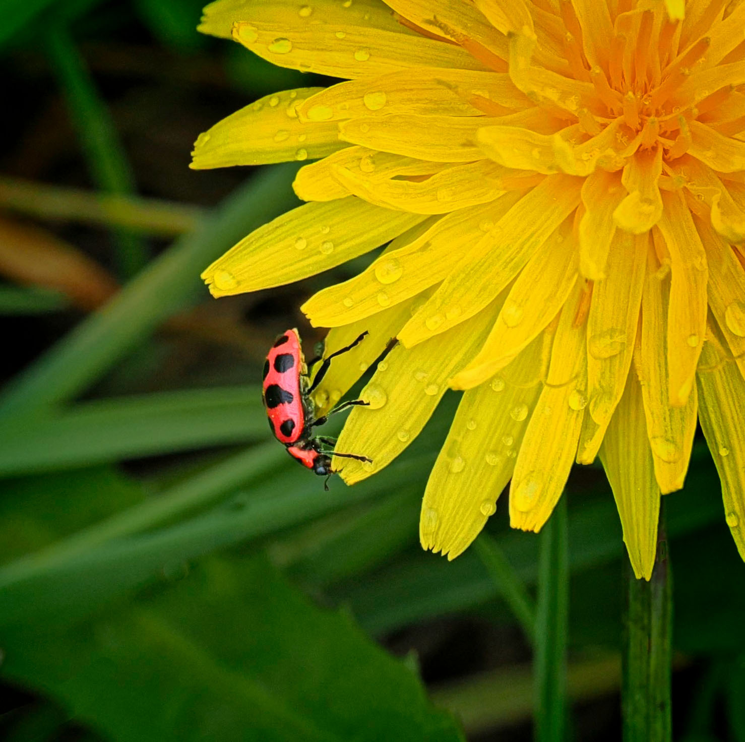
Great capture here. I am especially enjoying the composition choices here, with the placement of the ladybug on the flower and the relative size of the critter and the bloom. Very effective and pleasing to the eye. The background is a bit distracting, always a difficult choice as to the most effective balance. Here I might suggest darkening the background to de-emphasize its contribution slightly. Also, more of the bloom's native detail may be shown by adding a bit of micro-contrast to the yellow bloom. You worked so hard to capture this detail, so why not show it? I have included an edit file to illustrate my thoughts. See what you think. |
May 27th |
 |
| 63 |
May 25 |
Comment |
Great portrait of Woodpecker with a nicely subdued background. Great pose which shows off the relevant parts of this bird. It was nice of him to pose just for you. The image is as sharp as it needs to be. I might consider darkening the tree a bit, since it is as bright or brighter than the main subject. Not too much though as it is a critical to the presentation. Nice shot! |
May 27th |
| 63 |
May 25 |
Comment |
I concur with the earlier comments regarding the clarity and colors captured here. They truly capture the essence of this hat. I also agree with Murphy's statement as to how the subject appears to be floating in space. Adding a faint horizon line and perhaps a base which differs from the background in color and/or texture may alleviate this issue. I have started to do this in many of my macro shots to deal with the same effect of subjects not being connected to their environment. |
May 27th |
| 63 |
May 25 |
Comment |
What an interesting capture. I love the detail of the Mantis and the unusual orientation selected here. To me this all works well. The softening of the flowers at the top does not bother me overly much here, although I would have darkened the flowers at the top that are farthest away to build in a bit more separation and depth to the image. I do agree that the bee is so dark that we lose much of its detail, almost to the point that it loses much of its impact. I am unsure how much of this detail might be restored in post processing though. |
May 27th |
| 63 |
May 25 |
Comment |
This is a fun shot and you have clearly presented the subject amongst the interesting surrounds. I do agree with the earlier comments regarding the crop and noise. Difficult to strike that right balance between detail and distraction. I always find that I am challenged to find an effective balance. |
May 27th |
7 comments - 3 replies for Group 63
|
7 comments - 3 replies Total
|


