|
| Group |
Round |
C/R |
Comment |
Date |
Image |
| 63 |
Mar 25 |
Reply |
It is so easy to get overly-focused on one part of our images, that we look past other elements. I suspect that this is what happened to you here. Don't you just hate when that happens? Luckily, one can deal with these oversights in post processing. See my recent comments I made to Xio regarding the significance of post-processing in our craft. |
Mar 27th |
| 63 |
Mar 25 |
Reply |
I was out yesterday, shooting some interesting flowers at the UC Santa Cruz Arboretum & Botanic Garden. As I was shooting, I was continually shifting between smaller apertures (f/18 or or) to gain increased depth-of-field, and larger apertures (f/8 or or) to reduce the detail in the background. In the end, I always seemed to like more, the smaller apertures, since I knew that I could deal with the more detailed backgrounds in post processing, (selecting blurring and darkening the background to deemphasis this part of the presentation). See my recent comment to Xio in regard to using post-processing to deal with some of our shooting dilemmas.
The point here is that for the first time, I also tried using the automatic features to collect and stack images while I was in the field. I was really surprised how easy it was to do this, and how much better and sharper my images were. I was shooting right after a period of light rain, so capturing the sparkle of rain drops on the flower petals was a big part of my objectives, and here the stacked images were by far the best. Again, I will need to deal with the backgrounds, but I think that this trade-off will be my most effective path. This was the first time I tried using the auto-stacking feature while in the field, and I must say that I was impressed. |
Mar 27th |
| 63 |
Mar 25 |
Reply |
You raise an interesting point. Sometimes in order to get some parts of our image to come out as we want, we are forced to move away from the optimum in another. In this example it is suggested that you use a higher ISO to allow a smaller aperture (to gain an improved depth-of-field), but as you point out, the cost of this is a brighter image (which is not the direction you wish to go in). This is not an atypical trade off that we often need to deal with.
My suggestion here is to prioritize what are the most importance issues to deal with and use other methods to resolve the other. To my mind, the most important issue is the depth-of-field, so do what is required to optimize this. If the result is a too bright image, darken it in post processing.
Too many photographers fail to look to post processing as a tool to help resolve issues and these types of dilemmas, yet in today's world not doing so is like tying one hand behind your back. As much as many photographers dislike it, post processing is now as important as choosing the right lens or camera settings in creating compelling images. |
Mar 27th |
| 63 |
Mar 25 |
Reply |
The subjects were on a piece of black glass, which had a reflective surface. In my experience, shooting on glass mirror often does not work out as well. Often in a glass mirror, the mirror coating is on the back side of the glass. Subjects shot on this mirror glass show a space between the bottom of the subject and the reflection, the space being the thickness of the actual glass. So, the subjects often look as though they are floating in space. One does not get this effect if one uses a metal mirror though. The things one learns through trial and error (lots of error). |
Mar 26th |
| 63 |
Mar 25 |
Reply |
With the current denoise applications, it's now more effective than ever to remove noise. So, accepting more noise in order to gain greater depth of field and/or sharpness may be the compromise in today's world, as long as you are willing to do a bit of post processing. The resharpen applications are nowhere as effective in bring back sharpness (regardless of the examples software vendors tend to show), so do what is needed to ensure sharpness, and deal with the other effects as they arise. |
Mar 17th |
| 63 |
Mar 25 |
Reply |
Good Point. I neglected to even think about adding a pinstripe border, but I agree that it might have a place here. Especially since the image is being presented against a dark background. Here is one approach regarding this border that one might take ... |
Mar 7th |
 |
| 63 |
Mar 25 |
Comment |
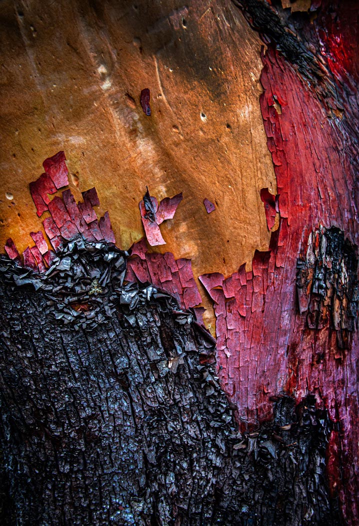
What an interesting a colorful image. Kudos for both seeing this and with your capture. Lots of interesting texture to complement the color palette. Might I suggest that you remove some of the bright white spots in the darker bark, as to my eye these are a bit of a distraction. Also, I might tone down and deepen the red color in the washed-out areas in the red peeling bark. In do these things the resulting image has a richer feel while still being true to your vision as captured. I have included a version here which illustrates my thoughts. I will note though, that these suggestions may border on side of "personal preference" as opposed to 'improvements' so you might consider giving them a try and see how you feel about the results. Nice Job! |
Mar 6th |
 |
| 63 |
Mar 25 |
Comment |
This is a great capture with the simple dragonfly effectively captured on a single interesting bloom against a colorful but clean background. The colors are captivating and your composition with the brighter areas behind the dragonfly adds to the presentation. You made a lot of good choices here. Now, let's get a bit more into the detail here (since this is a detail-oriented study group). To my eye the body of the dragonfly is a bit hot (bright) and could be toned a bit. Also, the wings are a bit soft as well, perhaps due to the aperture you used (f/6). A larger depth of field with a smaller aperture (f/16 or so) would increase the area of sharpness in this example. This might require that you chose a much higher ISO setting (800-2,000), but with today's cameras and sensors this is an acceptable trade-off (the days of "low as you can go" ISO, are past). Luckily, one can sharpen the wings a tad using applications like Topaz Sharpen AI. One can also clone away some of the wing blur present as well to make it appear a bit sharper. Finally, I don't think that you need as much space at the top and cropping down from the top might help to emphasize the subject a bit more. I have included a version here which illustrates my thoughts. I will say that these suggestions are minor and should only be taken as more advanced and finishing touches. The image as collected was quite impressive and you should be proud of your effort. |
Mar 6th |
 |
| 63 |
Mar 25 |
Comment |
What an interesting and fun capture. I love the simplicity of this presentation with the single stem and flower augmenting the view of the critter. The butterfly is nicely shown and is enhanced by the clean background. To my eye the background does appear a bit bright and makes it a bit difficult to focus upon the main subject. This is a subtle effect but it struck me when I first opened the image. Here I might suggest darkening the background and stem slightly. The butterfly is slightly soft as well, perhaps due to the wide-open aperture (f/4.5) employed in this shot. Luckly this can be remedied using one of the current sharpening applications (I used Topas Sharpen AI), and it appeared to work well. Note though, when I did this, I needed to sharpen different areas of the butterfly independently to balance out the sharpening effect.). I have included a version here which illustrates my thoughts. |
Mar 6th |
 |
| 63 |
Mar 25 |
Comment |
This is a beautiful shot, being both simple and complex. The colors are wonderfully muted, and the subject is clean presented. The reflections in the water are a plus, and the darker background frames and sets apart the main subject nicely. The editing choices were well considered, but I think you stopped too soon. The actual bloom is a bit overexposed and especially in the center. As such you are losing much of the native detail and subtle shadowing within the actual bloom. As shown, the detail that we see in the reflection is not visible in the bloom. Here I suggest adding more micro contrast using the texture and clarity sliders in the Lightroom develop mode (or in Adobe Camera Raw) to the bloom, and perhaps a bit more independently to the central section (perhaps with a curves layer).I have included a version here which illustrates my thoughts. See what you think … |
Mar 6th |
 |
| 63 |
Mar 25 |
Comment |
I agree with you that this monochrome presentation is quite effective in showing off the texture and shadow detail of the leaves. I do like how you darkened the bottom leaves. In doing so, the bottom leaf seems to come forward and is much more predominant. Now I think that something similar could be done on the small triangular patch of leaf in the upper right (right above the central point to the plant). In doing so even more depth could be added to the image. Nice capture with a lot of interest though. |
Mar 6th |
5 comments - 6 replies for Group 63
|
5 comments - 6 replies Total
|


