|
| Group |
Round |
C/R |
Comment |
Date |
Image |
| 63 |
Feb 25 |
Reply |
How would you suggest correcting this? Whether in the collection of the shot or in post-processing, or both? |
Feb 15th |
| 63 |
Feb 25 |
Reply |
My goal was to produce an image which reflected the concept of minimalism. Toward that end, I felt that giving more open space and making the subject smaller relative to the entire image, did just this. That was the intent of the processing. Note also that the Before image was not edited so it is not surprising that there may be things there that would not make it into a final version. It was included to demonstrate how editing can be used to reenforce a desired concept (in this case minimalism). |
Feb 11th |
| 63 |
Feb 25 |
Reply |
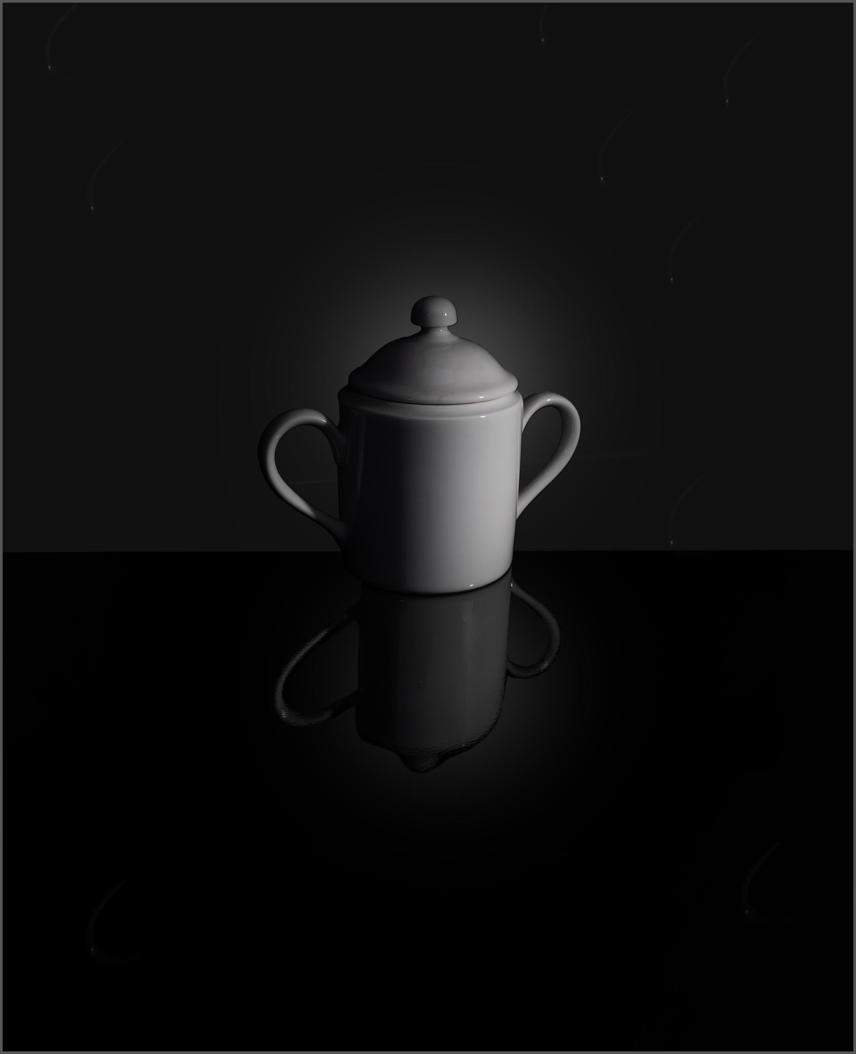
Glad you liked the presentation.
This image was captured indoors, with a single rather dim flashlight sitting on the base to the right of the bowl, as the sole light source. Since I did not have a lot of light, I employed a bit longer exposure (1/3 sec) to get the dramatic fall-off of light across the face of the bowl. Or at least, such was my plan.
The "glow" (brighter area behind the sugar bowl) was purposefully added in post processing, Note, also that the glow is also seen in the reflection as well, but to a lesser extent as we would expect in a reflection. I find that adding this subtle glow in the background goes a long way in the presentation, and it's not difficult to do in Photoshop. |
Feb 10th |
| 63 |
Feb 25 |
Comment |
What a fun image. The clarity and starkness of this image really gives an interesting feel to the presentation. It almost looks as though it was a graphic art type of image rather than a photograph. Still, I like it. Your choice of what elements to include and your composition goes a long way within this effective image. I also like the selected light and shadows as well. To me this does feel a bit on the flat side, meaning that there does not appear to show a lot of depth within your presentation. I might suggest darkening the elements that are further away to add back some depth. I know that you hear this a lot from me, but I still think this is appropriate to comment upon here again. I might also remove or de-emphasize (darken and desaturate) the greenish background elements at the lower left-hand side. This is the only place where this type of background appears, and it just looks out-of-place and odd here. Finally, the small pinkish gear face in the lower left quadrant bothered me some and I found that I kept trying to darken this to get it to blend in a bit. In this case adding more contract and a deeper red color added contrast, but made it blend better into the image as a whole. I know that this sounds weird but see if you do or do not agree. I have included a version of this image with these suggestions to illustrate my thoughts. See what you think. |
Feb 10th |
 |
| 63 |
Feb 25 |
Comment |
Great capture of this bug on the yellow bloom. I think that your selected focus works quite well with this image. The bug is nicely shown, as is the most interesting parts of the bloom. One thing that happens in these types of images is that we get overly fixated upon some parts of the image, look past other bit more problematic sections. Perhaps that is occurring here. In the image, the yellow bloom looks a bit overexposed such that we are losing a lot of the native detail here that you worked so hard to capture. I do find that the blurry bloom peeking out from behind the lower right quadrant of the main bloom is a bit distracting and is not needed to further your story here. Finally, there are a lot specular highlights on the bug that detracts from the look. Assuming that this image is not being submitted into a competition division that excludes pixel deletion or movement, we can easily address each of these points. The bloom yellow exposure can be reduced and micro contrast (using the texture and clarity slider some in ACR) can be adjusted to bring out much of the native detail and structure. The blurry background bloom can be cloned out and the specular highlights within the bug can be lessened or removed (the Photoshop "remove" tool worked well here). These edits serve to remove some of the distractions within the image and yields a cleaner, and to my eye, more effective presentation. I have included a version of this image with these suggestions to illustrate my thoughts. See what you think. |
Feb 10th |
 |
| 63 |
Feb 25 |
Comment |
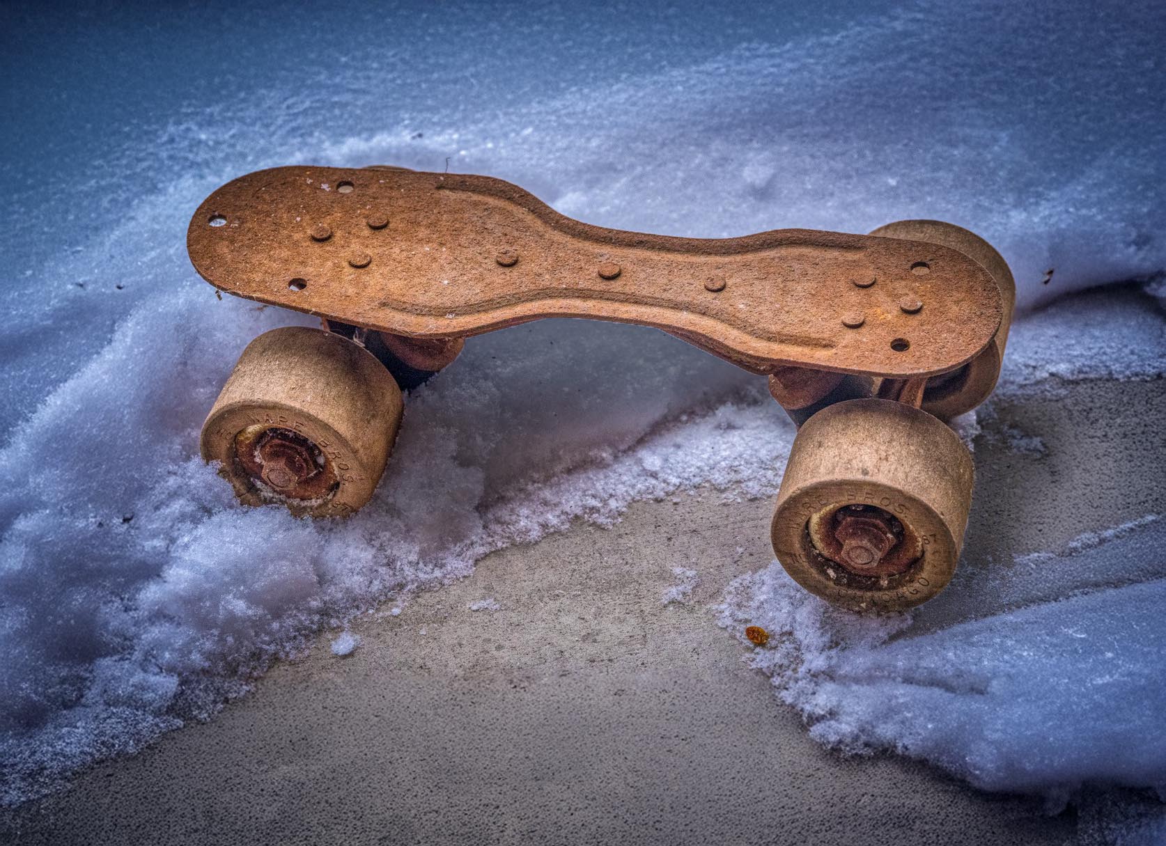
What a fun shot. This too brings back memories of my skating adventures in my youth. That it does so could be considered one measure of the success of this presentation. That being said, to me it feels a bit too constrained giving a bit of a "in-your-face" aspect to the image. May I suggest that when you shoot these types of images, that you give more space around the main subjects (you can always crop in if desired later). Since you may not be able to re-crop this image you might try using the Photoshop "generative expand" capability to expand your canvas. I also feel that the flat lighting contributes a bit to the bland "here-I-am" feel within this presentation. If one were to add a bit of shadowing with some dodging and burning (lightening the areas closer to the viewer while slightly darkening areas further away), this might add a bit more depth to the image. I have included a version of this image with these suggestions to illustrate my thoughts. See what you think. |
Feb 10th |
 |
| 63 |
Feb 25 |
Comment |
This is a wonderful image, one of the best I have seen you submit to date. The subjects are cleanly and sharply presented against an interesting but non-competing backdrop. I am really enjoying the detail and presentation of the butterfly / thistle. Nicely done. There does appear to be a gradient of light that extends from the brighter area at the lower left to the darker areas at the upper right (the later having been mentioned previously), and to my eye this detracts from the main subjects some. May I suggest evening out this by lightening the upper right corner a bit and adding a darker vignette on the lower left quadrant some. Doing so would emphasize the subject more and deemphasize the background light gradient some. I have included a version with these changes to illustrate my thoughts. See what you think. |
Feb 10th |
 |
| 63 |
Feb 25 |
Reply |
I had not considered a border, but I think that it might have a place here (see image). The background was purposefully moved away from a solid black point, so it is distinguishable from the black of the presentation media (the background the file presentation software provides). This is not the case with the lower part (base) of this image. Here I think that the key is making the border relatively unintrusive, being very thin and not too bright. If done right, I don't think that it would detract from the minimalist feel that I was striving for. As an aside, I think it's interesting how here, we are taking the opposite stances on a boarder, then we typically do. Thanks for your comments. |
Feb 10th |
 |
4 comments - 4 replies for Group 63
|
4 comments - 4 replies Total
|


