|
| Group |
Round |
C/R |
Comment |
Date |
Image |
| 63 |
Nov 24 |
Comment |
Nice capture of both the spider and its interesting surroundings. Lots of detail within. I do find that despite the details, there is not a lot of clarity regarding the spider. I am not sure it it's the image resolution, or that the detail of the body masks the clarity of the overall image. After all is said and done though, I am having some difficulty in seeing the detail within the spider, which is this case is a significant port of this image. |
Nov 25th |
| 63 |
Nov 24 |
Comment |
An pleasing presentation. I don't need to echo what was said previously. One outcome of the stacking process is that image can begin to look a bit flat and lack some dimension. In my images, I address this in post processing after the stacking. Here I might suggest darkening slightly, the outermost petals surrounding the central core. This might aid in the separation of the core of the bloom from the rest of the bloom and add back a bit of depth to the image. I have included an example of this to illustrate my thoughts. Nice Job! |
Nov 25th |
 |
| 63 |
Nov 24 |
Reply |
To add upon Pierre's thought, the in-camera stacking is fairly new and is just starting to show up in a lot of Camera models. As Pierre stated, many cameras collect the focus slices in an automated fashion. It often referred to in communications as "focus stacking" but that is incorrect. It's a more recent and less common function to actually stack the focus slices within the camera.
I have the Canon R5 Mark II, and it just introduced the ability to stack images. I have created several image stacks and compared the "in-camera stacked" images with the same slices that I stacked using HF or ZS software. I have been very impressed with the in-camera stacked results. The last couple of stacked image submissions were from the in-camera stacked results. |
Nov 15th |
| 63 |
Nov 24 |
Reply |
One might try adding some directional light (lighting more from one side than the other). That way one might get fall-off of light across the subject. When that type of light is present, subjects look as though they are more three dimensional, and not as light. One might try doing this in post processing as well. Things to consider. |
Nov 15th |
| 63 |
Nov 24 |
Comment |
Nice presentation of this design. Since it is identifiable as to what it is it may be less of an 'abstract' design, but this does not diminish the image in any way. Great composition, color and clarity. I like the color treatment here. Did you add color, or did you enhance existing color with your efforts? In this case I don't feel that the pinstripe boarder adds anything to the image, but that is a maker's choice |
Nov 1st |
| 63 |
Nov 24 |
Comment |
Nice portrait shot of this critter. The top-down view shows off its body nicely capturing some of its detail effectively, however the carapace (top, large oblong structure) is just a bit soft. It might have been a bit more interesting to get a front or side view, but perhaps that was not possible here |
Nov 1st |
| 63 |
Nov 24 |
Comment |
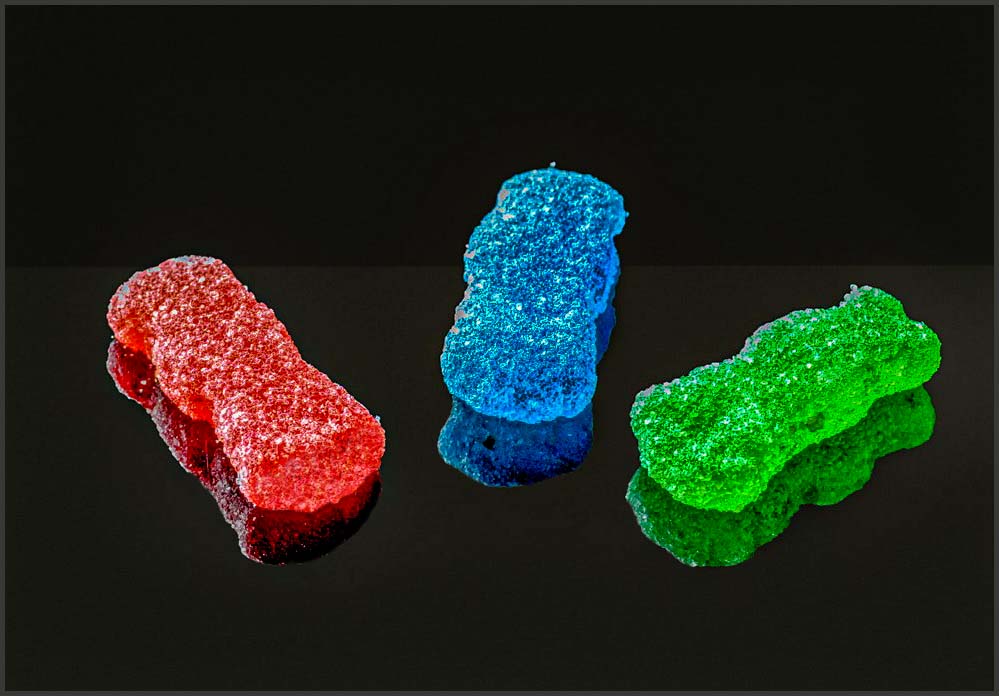
Great job in responding to my challenge. This is a simple yet impactful presentation. The subjects and reflections stand out nicely in terms of composition, color and clarity.
Now some work remains in terms of the post processing to enhance the image some.
• Here I feel that the candies and reflections are overexposed. Reducing the exposure and highlights in post-processing will help
• I like to make my reflections darker than the objects being reflected. This is naturally the case as light energy is lost in the reflection process making reflection naturally darker
• Removing the light halos around the reflections via cloning will allow the reflections to blend in more effectively
• Images on a black background tend to look as though they are floating in space. I often add a subtle horizon line to my images to give a sense of a surface that the subjects are on.
• The detail at the end of the red "sour" candy is lost. One might clone back this detail on int's own layer and adding some of this back with a partial layer opacity (50-60 %)
• Finally, I don't believe that you need as much empty space in this image. Might I suggest cropping in a bit, especially from the top.
I have included an image where I made these edits to illustrate my thoughts.
In my experience almost all stacked macro images need some sort of post processing to really maximize the image's potential. These suggestions are based upon many images' worth of trial and error. It is fine though, if you don't agree with me here. Nice Job!
|
Nov 1st |
 |
5 comments - 2 replies for Group 63
|
5 comments - 2 replies Total
|