|
| Group |
Round |
C/R |
Comment |
Date |
Image |
| 63 |
Sep 24 |
Reply |
Good images just don't happen. They are created first in the maker's mind, then as they are shot and finally in post processing. Rarely are these three elements not involved. It's not solely about the capture. But then again, to me, that IS the art of Photography. |
Sep 16th |
| 63 |
Sep 24 |
Comment |
Great effort. In terms of a composite image, it is very realistic and believable. The relative size and hues of the added elements are spot on. I don't think that the border adds to the presentation. After spending so much effort making it look real the border move this image toward the surrealistic realm. As added the border does look a bit tight to me as well, and giving the bird a bit more space to 'breathe' might be helpful. |
Sep 16th |
| 63 |
Sep 24 |
Reply |
Nice catch regarding the color on the body. I missed that. I suspect that this is a reflection from something red nearby. It's amazing how much color comes from these types of reflections. |
Sep 11th |
| 63 |
Sep 24 |
Reply |
In this case the elements that you noted were all added in post processing. I feel that these elements add quite a lot to the image and "ground" the bears (as opposed to having them 'float' in the image). I could have added these elements as I was setting up the shot (placing a background in the shot and shooting on a table with texture), but it's difficult to collect and set-up all of these things and adding them in post processing allows so much more flexibility. You see similar things being done in still life images as well (see the Still life courses offered by Joel Grimes). All part of the "art" of macro photography. |
Sep 10th |
| 63 |
Sep 24 |
Comment |
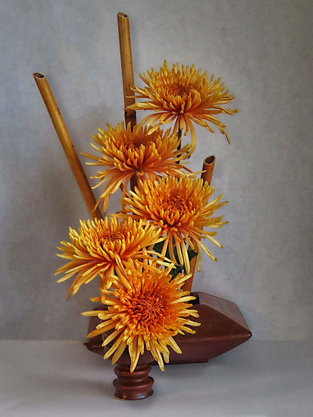
What a fun still life image. As noted in earlier sessions, these images are far more challenging than one might expect. Here you have done a wonderful job in highlighting the blooms with soft front lighting. Only a hint of back shadows are present. At times using a bit stronger side lighting adds more depth to the image, but that need not always be the case. Here I might suggest darkening the background slightly to bring out the blooms a bit more and correcting the horizon line between the table surface and backdrop some. As shown here, it's a bit ragged. Also, the color cast on the table surface is a bit odd and might be addressed. Finally, you might consider sharpening the blooms some. I have included a version where I have done these things to illustrate my thoughts. Overall, though quite a pleasing image. |
Sep 8th |
 |
| 63 |
Sep 24 |
Reply |
I like how you removed the dirt to create your image. Similar to what Murphy submitted this month. Had this been my image I might have been tempted to clone some of the stem from the middle of the plant to the base, keep a bit more of the base in the crop (per my earlier suggestion) and continued along the path of removing the background. This is a bit more work but it might be worth the effort. Thanks for sharing the starting image. |
Sep 8th |
| 63 |
Sep 24 |
Reply |
I was Lucky to find gummy bears with this interesting color pattern. It does make the image more compelling though. |
Sep 7th |
| 63 |
Sep 24 |
Comment |
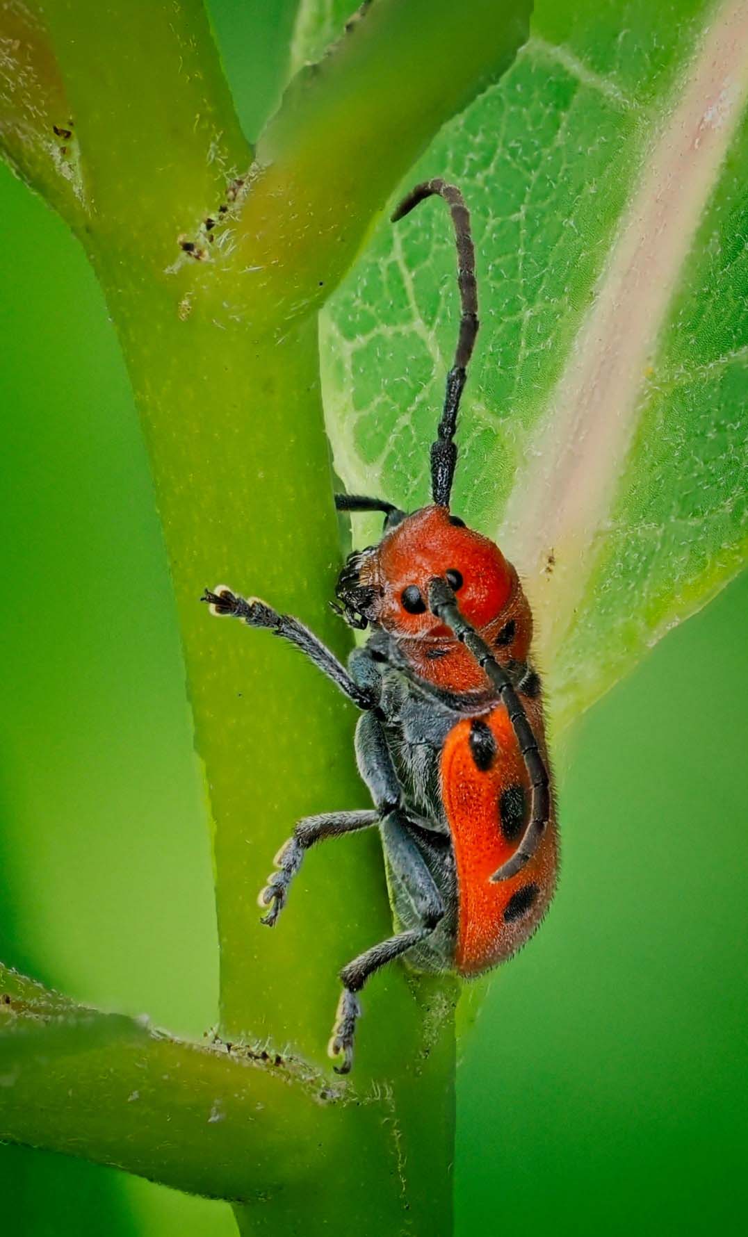
What a fun image. Great detail and composition. The color pallet of red/brown bug against a green background is very effective. I do find that the stem of the plant is blending into the background, giving a sense that the bug is floating some in the image. May I suggest selectively darkening the stem the beetle is sitting on to separate it from the surrounding greens. In doing so, the subject may now appear a bit more anchored to the scene. I have included a version of this image in which I did this, to illustrate my thoughts.
The in-camera stacking appears to be effective working for you. I have recently obtained a Canon R5 MII that has this ability as well, and I have been pleasantly surprised how well it works.
|
Sep 7th |
 |
| 63 |
Sep 24 |
Comment |
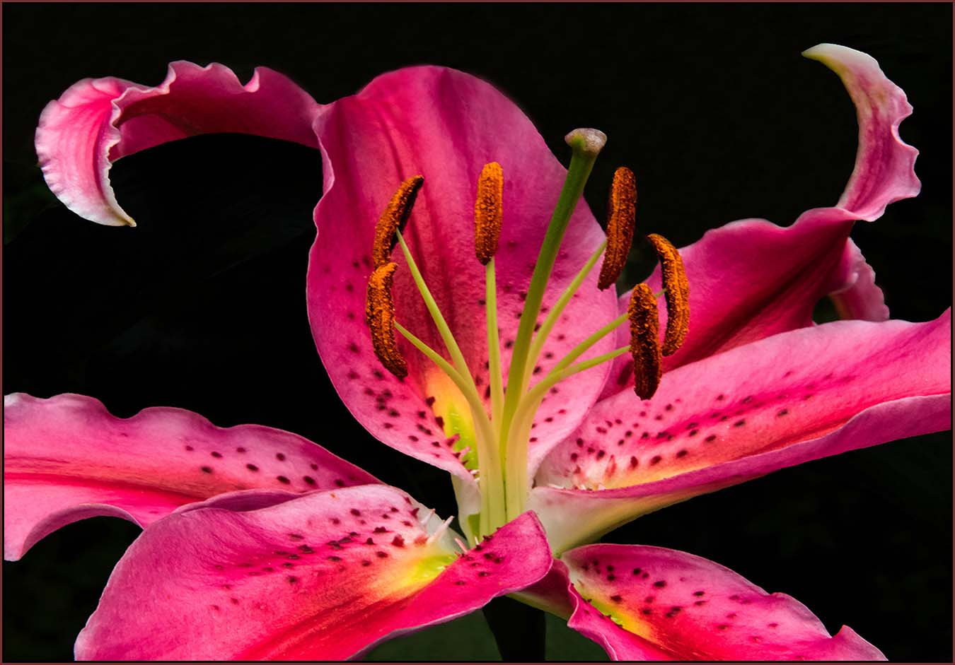
Quite a striking image. I like what you did to replace the distracting background with a clean dark pallet. This really places the emphasis upon the bloom and allows the native colors to shine. The image is nicely composed within the frame and the bloom is as sharp as it needs to be. I realize the utility of adding the pinstripe border here, but to my eye the bright red color is now competing with the bloom and is becoming a bit of a distraction. It is true that it is effective to choose a border color from the colors within the image, but such that it dose't become too noticeable. I had included a version here which modifies the intensity of the border color. I suspect that in this example the separation value of the pinstripe border remains while not being too prevalent. See what you think �� |
Sep 7th |
 |
| 63 |
Sep 24 |
Comment |
Interesting image of this feline critter. Great composition, color and clarity, and the eyes are especially compelling. You don't need much more than what you have provided here to tell this story. |
Sep 7th |
| 63 |
Sep 24 |
Comment |
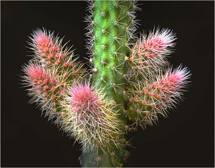
Interesting image and a wonderful subject. Lots of interesting detail and shapes. As noted earlier here you captured a nice pallet of colors and shapes within this image. Given the shape of your subject (as you noted in your response to Muphy) composition was a challenge, and I appreciate the direction your decided to take. Here the crop looks a bit aggressive at the bottom, and you might consider allowing a bit more of the stem to show below the branchpoint. Also employing a vignette at the top and bottom may help to focus the viewer's eyes to the more interesting parts of the catus. These two suggestions are ment to aid in focusing the viewers eyes away for the forced crop that was required here. Finally, may I suggest adding a bit of contrast to the image, bring out some of the native colors that attracted you to this subject.
I have included a version of this image to illustrate my thoughts. In this version I used the Photoshop "Generative Expand" capability to add parts of the subject at the bottom. This is artificial and I am not suggesting that this is what should be done here. I did this solely to demonstrate the visual impact of including a bit more of the subject below the branch point. |
Sep 7th |
 |
| 63 |
Sep 24 |
Reply |
The surface in this image is gray. The fact that the glass was black doesn't mean that we need to settle for this state, and here I altered the color to suit my mood. The role of the glass was more to generate the reflections in this case. |
Sep 5th |
6 comments - 6 replies for Group 63
|
6 comments - 6 replies Total
|


