|
| Group |
Round |
C/R |
Comment |
Date |
Image |
| 63 |
Jun 24 |
Reply |
Generally, I try to take macro images from the side, or with a sideward angle. These images tend to be more compelling and command more interest. Shooting images from the top looking directly down are easier to get (due to a reduced depth-of-field) but tend to have less character. That is why I chose the composition and angle in this shot. |
Jun 10th |
| 63 |
Jun 24 |
Comment |
Interesting image of the seed pod on a rocky patch of ground. Colors and clarity of fine, as is your depth of field (albeit a bit narrow which is fine here in this example). The composition is a bit static with the subject front and centered. For a documentary image this is fine, but there is not much 'energy' here. This at times, can be challenging. Your comment suggests that the inside of the pod is a unique feature of this shot, yet we don't get to see much of this interesting aspect of the image. Finally, we generally include a bit more technical detail her (camera, lens, and settings) to aid in our evaluation of the image as you collected the image. |
Jun 9th |
| 63 |
Jun 24 |
Comment |
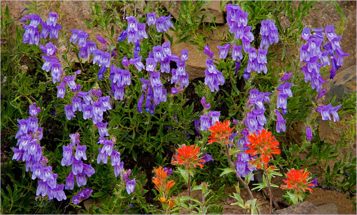
I like where you are going with this image and I feel that you were quite successful in capturing the complimentary shapes and colors within this scene. The blooms are nicely dispersed throughout the image and the balance of the colors is quite effective. Here though, I feel that the presence of blooms at the edge or moving out of the image adds a cluttered aspect to this image. Here I would remove any bloom touching the edge or add back a bit of background to eliminate partial blooms on the edge. In this case I might also expand the canvas slightly (using generative expand) to move the blooms further any from the edge. These changes may seem trivial, but to my eye the resulting image look less clutter and more intentional, less like a spur-of-the-moment snapshot. I have included a version of this image in which I illustrate this thought. I would be interested in hearing what you all think �� |
Jun 8th |
 |
| 63 |
Jun 24 |
Comment |
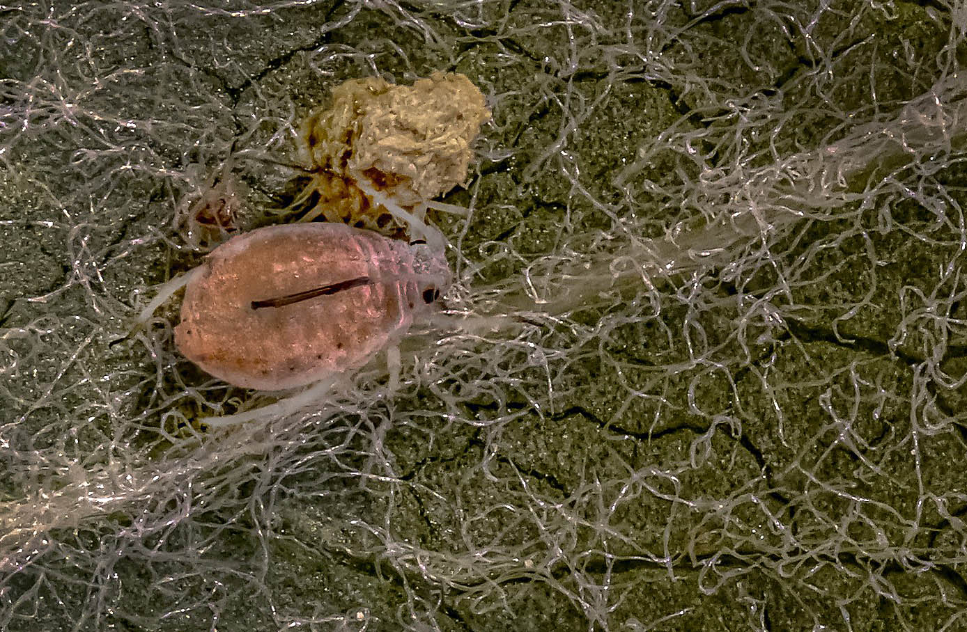
This image is less about the mite itself, and more about the mite and the environment that it lives in. as such, the relative proportions of mite to background are appropriate. We don't see a lot of the mite detail, but that's not really essential here. I might suggest that you don't need quite as much of the surrounding background to tell this story though, and cropping in so from the bottom and right might be helpful. This retains the story and emphasizes the mite a "mite more" (if you pardon the pun). I also suggest that if you clone away a bit (some but not all) of the thread that is falling across the mite's eye, this might increase our interest in the bug. I have included a version of this image in which I illustrate these thoughts |
Jun 8th |
 |
| 63 |
Jun 24 |
Comment |
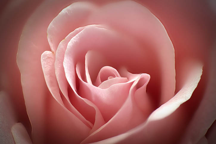
What a classic and beautiful image of this rose. I know that his shot has been taken many times, but this does not stop me from trying to capture this classic shot, and I am glad it did not stop you as well. There is a wonderful combination of softness and detail within this image, and the bloom appears nearly flawless. The only suggestion I may make here is to "blend in" the outside square corners of this image to more closely align with the shape of your bloom. Here I might suggest using a vignette to do this. I have included a version of this image in which I illustrate this thought. This is a minor point though, and this is truly an image you should be proud of. Nice Job! |
Jun 8th |
 |
| 63 |
Jun 24 |
Comment |
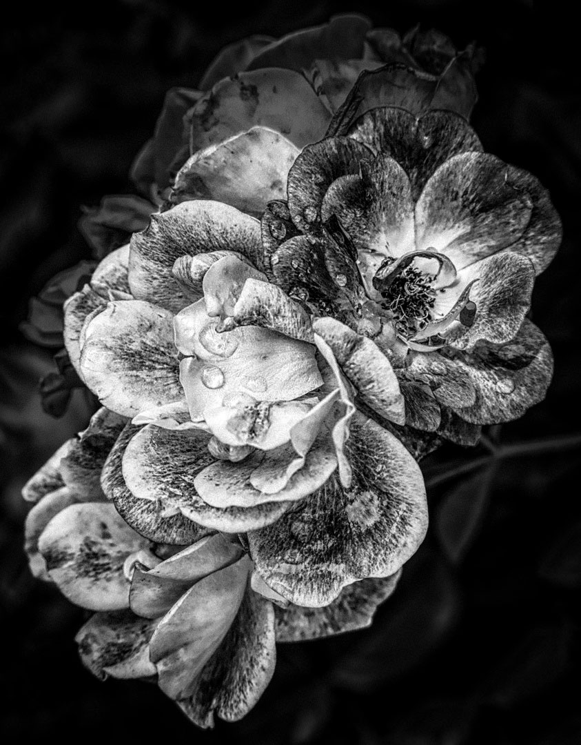
I am enjoying the texture and detail associated with this image. The drops on the petals also adds a lot of interest. The composition is quite effective, but I do feel that the primary bloom is merged with a bloom behind it, and as such in losing some of its impact. Here I would selectively dark the background more, and slightly darken the secondary background bloom to attain more separation of your main subject. The whole image does appear a bit overly-soft as well, so I would sharpen the image a bit to correct this as well. I have included a version of this image in which I illustrate these thoughts. |
Jun 8th |
 |
5 comments - 1 reply for Group 63
|
5 comments - 1 reply Total
|


