|
| Group |
Round |
C/R |
Comment |
Date |
Image |
| 63 |
Dec 23 |
Reply |
OK - Now I get it ! |
Dec 15th |
| 63 |
Dec 23 |
Reply |
To my mind the objective of cropping in from the left is not to center the image, but to improve the "overall balance and weight" of the image. To my mind cropping in a bit from the left is designed to do this, not to create more symmetry. The natural asymmetry would still be retained within the presentation.
In the case of close-up and macro photography, often the goal is to highlight a principle subject(s) in great detail, so "breaking" the "do not center" composition rule often has a place and can be effective. The question here is not whether we should break the rule, but "is the image more effective" in doing so. |
Dec 14th |
| 63 |
Dec 23 |
Reply |
I appreciate your thoughts. In this case I have already darkened the background significantly (see the original vs final image). Here my thoughts are that while darkening the background would bring the rose out a bit more (which is not really required beyond what I have already done), at a cost of removing the context of the bloom. If this context is diminished further, the bloom will look as though it is not connected to the outside world and might take on a more surreal look (something I did not like).
In Close-up and Macro photography we often need to make these types of decisions, more so than in most other types of photography. It's so easy to end up with images in which the subject is clear and sharp, but lacking context or is not identifiable. Yet another point to consider in our Macro photography.
|
Dec 14th |
| 63 |
Dec 23 |
Reply |
One of the challenges in these types of images is to decide how clean do you want to make the subject (a rose in this case). If all of the imperfections are removed, the image takes on a surreal aspect, while keeping too many may give a cluttered look. What to keep and what to remove is a constant battle in each and every image.
BTW, the raindrops were part of the actual scene and were not added to the scene or in post processing. |
Dec 14th |
| 63 |
Dec 23 |
Reply |
Several of you have noted the contribution of the branch coming in from the left. midway up the image, being a distraction. I don't disagree, but I don't see that there is a relatively easy way to correct this in post processing. I don't really understand Barabra's suggestion above (I may be missing something). I think that the solution resides in how the subjects were originally laid out. One of the objectives in this study group is to begin to see these types of things before we capture the image, easier said than done. |
Dec 14th |
| 63 |
Dec 23 |
Reply |
Thank you ... |
Dec 10th |
| 63 |
Dec 23 |
Comment |
This is an excellent image of this grouping of mushrooms. I love the composition and how the grouping tapers off in size and height as the grouping spills to the left. There is almost a sense of flow to this composition that you took well advantage of. I also love how this group is nestled into the surrounding foliage. A very effective image. Now, lets bring this to the next level. Here I might add a bit more micro-contest (Clarity and/or Texture) to the mushrooms themselves to bring out a bit more of the wonderful detail that you captured, and I might suggest darkening the foreground slightly to pull our eyes into the image and to the subject a bit more. Finally, you might consider cropping in from the left a bit. I understand that in leaving more space to the left, you allow space for the flow I noted early to move into, but I don't believe that it is needed here. I have included a version which demonstrates my thoughts. These are minor points though. Great Job! |
Dec 6th |
 |
| 63 |
Dec 23 |
Comment |
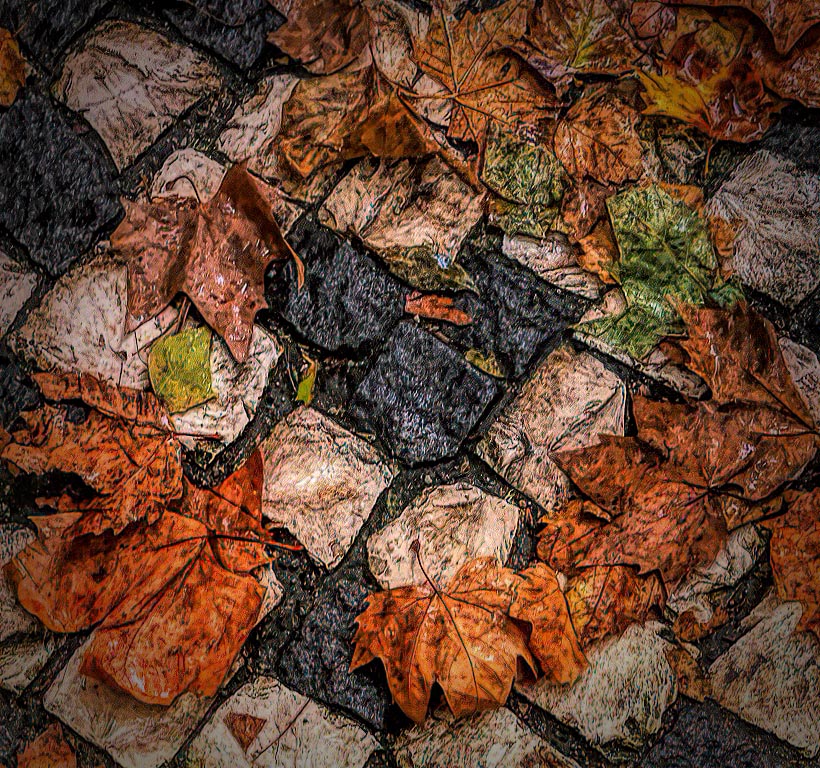
What an interesting image. Kudos for first seeing this as a potential image, and in your capture. The composition and positioning of the different elements (leaves and stones) was well thought-out. I love the central dark stones, the ring of gold and brown leaves and the hint of some green elements. This makes it an easy image to view and to explore. Unfortunately, this image is way too soft which detracts from the presentation considerably. I tried to apply several different techniques to see if I might be able to improve this aspect. I tried using Topaz Sharpen AI, High pass filers and added micro contrast (Texture and Clarity) in differing amounts to sharpen the image. I was successful to some extent although my version still looks a bit crunchy (see attached image). Perhaps you have alternate version that is bit sharper. |
Dec 6th |
 |
| 63 |
Dec 23 |
Comment |
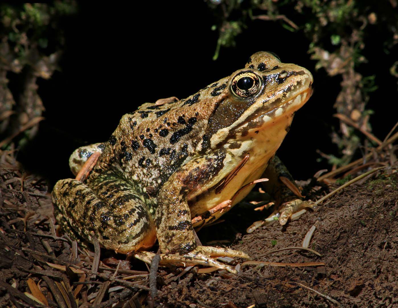
The am enjoying the presentation of this critter in its native environment. The subject is nicely presented and is as sharp as it needs to be. Kudos for ensuring that the background elements are not interfering or distracting from the critter. I might suggest that you could darken the foreground to gain better separation of the toad from the foreground dirt and clutter. You also might consider removing some of the lighter detritus in the foreground as well, to lessen these distractions. I have included a version which demonstrates my thoughts �� |
Dec 6th |
 |
| 63 |
Dec 23 |
Comment |
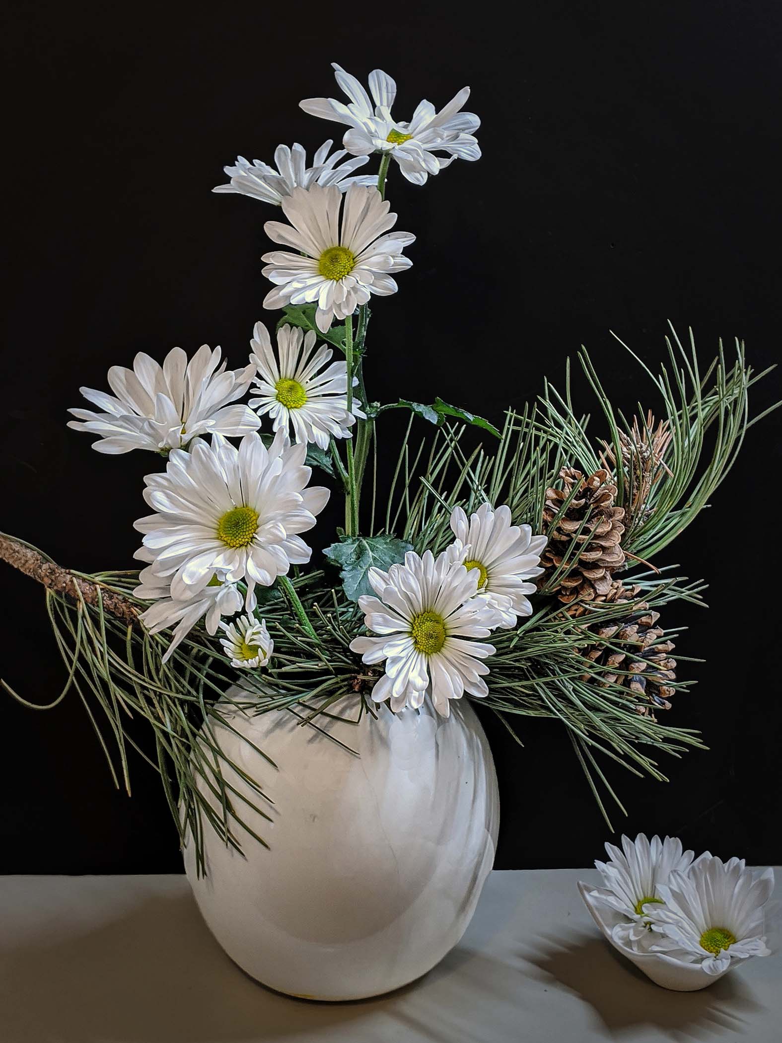
This is an effective still life of these flowers and vase. The bloom and greenery arrangement and composition is nicely done and shows off the blooms effectively. There is a simplicity to the presentation that is aided by the clean background. Now we need to bring it to the next level, by reducing the odd discontinuities and muted feel within the background. Here I might suggest darkening the background considerably and to darkening the base a bit. This would allow the subject to standout even more that it does currently. I have included a version which demonstrates my thoughts �� |
Dec 6th |
 |
| 63 |
Dec 23 |
Comment |
This is a wonderful image showing off the brilliant colors of this bird. The crop and resulting composition are very effective and the image is as sharp as it needs to be. I might suggest adding a bit more micro-contrast (texture and/or clarity) to the lower part of the bird's body to bring out the detail of the feathers that you so effectively captured. Nice Job! |
Dec 6th |
5 comments - 6 replies for Group 63
|
5 comments - 6 replies Total
|


