|
| Group |
Round |
C/R |
Comment |
Date |
Image |
| 63 |
Nov 23 |
Reply |
In this case I chose not to add a stroke border. Adding one changed the dynamic and reduced the effect of this image emerging from the darkness, something I wanted within this image. |
Nov 17th |
| 63 |
Nov 23 |
Comment |
Let me echo the comments made earlier. A very attractive and effective image. I do like the choices you made in regard to the background. As I look at the image though, I get a sense of a softness or of a slight blur and/or halo around the entire plant. In looking closely, I see that surrounding the entire plant stems and blooms there are a lot of pixels the bleed over into the background. I think that these pixels are contributing to the effect I see. I am wondering if when you selected the background in your processing, these are left over from that effort. When these pixels are removed, the image this effect disappears, and the image appears much cleaner. I might also suggest sharpening the image slightly and perhaps adding a sling vignette to pull our viewing eyes into the center of this great image. I have attached a version which illustrates my thoughts. Can you tell that a vignette has been added? It is very subtle here, but if I were to turn it off and on, you would notice the effect it has. |
Nov 16th |
 |
| 63 |
Nov 23 |
Comment |
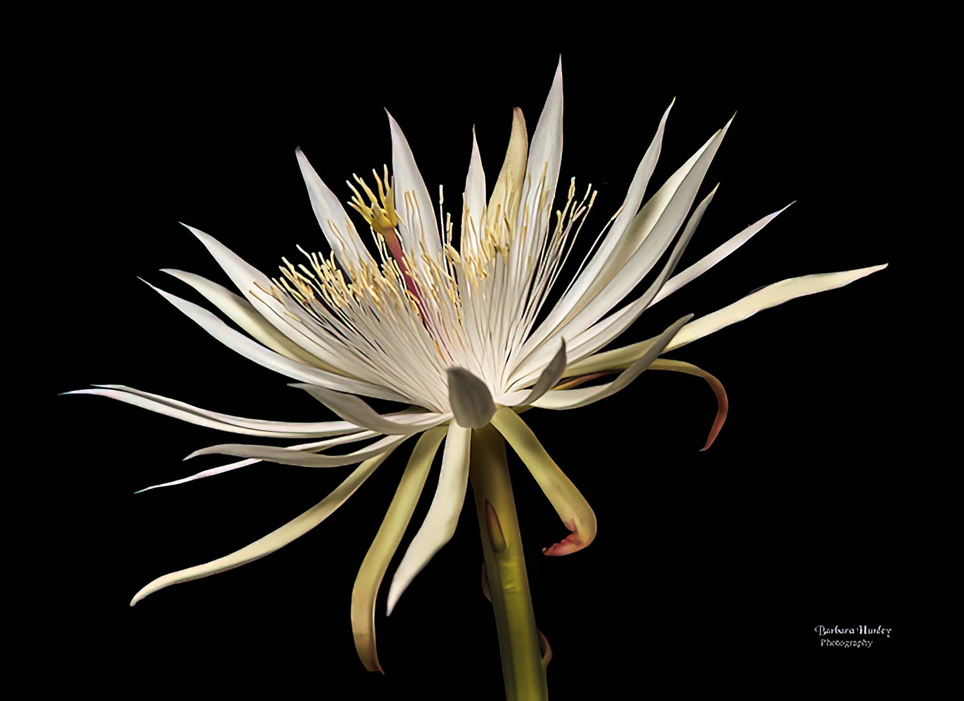
What an interesting story behind this capture. Both the bloom and the maker have their parts in this "mini-saga". In regard to the image itself, it's a classic presentation of this bloom, and I mean this in the positive sense. Your composition against the dark background highlights the bloom effectively. There is a clean and uncluttered feel to this image which I appreciate. To my eye it is a bit over exposed, and reducing the exposure slightly and adding a bit of contrast will bring out a bit more of the native detail and beauty that you have successfully captured. It also appears that the bright stem is beginning to compete with the bloom's petals so here I might suggest darkening the stem some as well. I have attached a version which illustrates my thoughts. This is a wonderful capture and rendition of this bloom, and with just a few minor post processing tweaks even more of the captured radiance of this bloom might emerge. |
Nov 16th |
 |
| 63 |
Nov 23 |
Comment |
Kudos for "braving the cold" to collect this image. You did a wonderful job with this capture. The composition and exposure were both very effective. Exposure is definitely a challenge with snow and ice, and you mastered it well, here. Since contrast is such a critical element in this presentation, I might suggest increasing the contrast some to darken the blacks between and within the ice patterns. Here you also might consider sharpening the image a bit as this would emphasize the rice crystals as well. In regard to the blue stroke element, I know that you like using adding these elements, but to my eye I don't see how it adds to this presentation. One note - darkening the entire layer some using a curves or levels adjustment layer and then applying a gradient in the mask of the layer might be an effective way of balancing the light as noted earlier. I have attached a version which illustrates my thoughts. |
Nov 16th |
 |
| 63 |
Nov 23 |
Comment |
I really am enjoying this close-up of this bloom with the interesting detail and color. Nice job in both seeing the image and in the capture. This image says a lot about the detail of the veins and structure of this plant, and I think that we can pull even more interest from this capture. As shown, it has a slight 'washed out' feel to the presentation. Adding a bit more contrast might bring a bit more depth to the image. I also note that the image is a bit soft. Normally this might not be too much or an issue, but here, since the whole presentation is about close-up detail, the softness has far more impact. I don't mind the dark edge at the bottom since with its inclusion you are implying that the whole petal is of importance. If you do include it though I might suggest cleaning up the edge some, getting rid of the bright spots and "smultch" that is present, and perhaps darkening the area. I have attached a version which illustrates my thoughts. BTW, I tried several methods to sharpen the image, but none were effective. |
Nov 16th |
 |
4 comments - 1 reply for Group 63
|
4 comments - 1 reply Total
|


