|
| Group |
Round |
C/R |
Comment |
Date |
Image |
| 63 |
Oct 23 |
Comment |
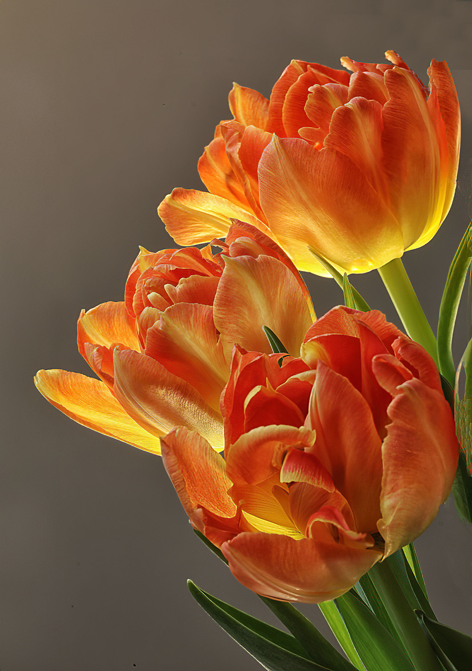
A notable submission here. Wonderful colors throughout. Don't disagree with the earlier comments regarding compositions. I think that you are in that gray zone where cropping in or out a bit more might relieve the tension the current image has. I wonder if that was your intent. Here I was a bit disappointed that more of the blooms were not in focus. Clearly here your plane of fucus was on the middle bloom as it and its leaves are sharp while nothing else is. It's true that in our images not everything needs to be tack sharp, but here a majority of the image is not sharp, yet I find myself wishing that this were not the case.
In the attached file I expanded the canvas some and sharpened the blooms some to illustrate my thoughts ... |
Oct 23rd |
 |
| 63 |
Oct 23 |
Comment |
Aside from showing us some interesting aspects of this tree and it bark; this image has a pleasing abstract feel to it. As noted by Alane and Steve, without your explanations, we might be left wondering what the heck this was. By providing an explanation we no longer go down that path, and are left to enjoy the image all the more. Your compositions and colors are nicely thought out here, and the variety tones within in the image are all quite effective. Ther is a nice simplicity to this presentation. Nicely seen and captured. |
Oct 23rd |
| 63 |
Oct 23 |
Comment |
Here is a lot of interesting drama in this image and I think the positioning of the bee as it is just topping the rise of the bloom is quite effective. The black background is also a plus here although I do agree with Murphy in regard to adding a pinstripe border. Unfortunately, the bee is the only element here that is in focus, and to my eye that is insufficient to carry the day here. If the bloom were also in focus that might do it, but this is not the case here nor was I able to sharpen it using the editing tools as my disposable. I am also not a fan of the treatment executed upon the greenery, as there is somewhat of an artificial feel to this are of the image. I will admit though that this might be more of a personal viewpoint rather than a quality statement. |
Oct 23rd |
| 63 |
Oct 23 |
Comment |
What a fun image. The clarity of the bee and surrounding bloom is effective in showing the main subject. The composition and color are well thought out as well. I do find that the image is a bit busy as a whole. There is so much going on with the blooms in focus, the softer blooms and the Bee such that the Bee gets lost a bit. You might consider darkening areas of the plant that are below the plain of focus, and perhaps blurring these areas a bit. This will make it look as though those areas are further away and add a greater sense of depth to the image. I might also add a bit more contrast to the Bee as this element does appear to be a bit washed out. I have included a version of this image in which I have done these things to illustrate my suggestions. |
Oct 23rd |
 |
| 63 |
Oct 23 |
Comment |
What a fun and clear image. The bird is wonderfully sharp and the presentation is very clean. In this case I respectively disagree with the other comments in regard to the background bokeh. In this image the background spots do provide a sense of realism and of depth in this image. I don't find that they are overly distracting. I might deemphasize the lighter space in the mid right background as this does unbalance the image slightly, but generally I find that here the Bokeh is rather pleasing.
Well, there you go. Ask three photographers a question and you get five different opinions.
|
Oct 23rd |
| 63 |
Oct 23 |
Reply |
I have gone back and forth regarding the green peppers. I appreciate your thoughts here though. Perhaps I got overly fixated upon the red / yellow / orange color scheme. Thanks ! |
Oct 12th |
| 63 |
Oct 23 |
Reply |
I had not thought about doing as you suggested, and it does have a marked effect. Great idea! |
Oct 12th |
5 comments - 2 replies for Group 63
|
5 comments - 2 replies Total
|


