|
| Group |
Round |
C/R |
Comment |
Date |
Image |
| 63 |
Jun 23 |
Reply |
When we collect our focus slices there is a tendency to "stop down" the lens (selecting the largest aperture or smallest lens opening with the highest f -value), thinking that this will maximize of depth-of-field. In fact, the final depth-of-field in the images is obtained by the number, placement and focus area of our slices as we stack, and not by the aperture. In fact, if you "stop down" the lens too much, making the opening too small, we can get softer images. This phenomenon is called lens diffraction and is a property of the lens itself. In some lens this occurs at larger f-values than others. Generally speaking, though most lens do well between f/7 and f/16 or so. This is something you need to test with your own equipment. This is why I generally suggest f/8 - f/10 while collecting focus slices. |
Jun 12th |
| 63 |
Jun 23 |
Reply |
In regard to "high" ISO, I agree. With the newer mirrorless models (specifically my Camon R5 and R6) I routinely shoot wildlife at ISO 4,000, to support faster shutter speeds (around 1/1,000 sec). I typically deal with any noise using Topaz Denoise AI, although I have not tried the newer noise removal techniques in Lightroom / Photoshop. |
Jun 9th |
| 63 |
Jun 23 |
Comment |
Nice clear and simple image of this bloom. The sharpness of the blooms really pulls my eye in to the subject, and the fall-off of your depth-of-field in the blooms behand the main subject and in the leaves and stem provide some depth to the image. I am a fan of the black background, so I like it's use in this image. May I suggest that in the future you make your images larger. This image is only 1.4 x 1.3 inches (a total file size of 172 Kb), so the image is a bit grainy once it is rendered in the Study Section application. The max file size is 1 MB so you have a lot of space to make the image larger allow a better presentation. |
Jun 8th |
| 63 |
Jun 23 |
Comment |
Nicely detailed image of this fly. Lots of great detail, especially in the wings. Showing this critter on the leaf gives us great context of where we might find this fly. I do wonder if you need as much of the leaf as you have provided. Cropping from the left and bottom a bit might still retain the desired context, yet allow the fly to be more prominent in the image. Nice job though! |
Jun 8th |
| 63 |
Jun 23 |
Reply |
Close-up and Macro photography are often defined as a specific sub-set of photography involved in capturing images of small subjects. Each type of photography has its own unique challenges, issues and techniques, and Close-up / Macro photography is no different. Earlier I attempted to provide a simple definition for this type of photography. It is my understanding that this Study Section was developed to explore and to practice this type of photography. Now there are many other types of photography that may include a close-up of a wider scene, and yes, they are "close-up" images of that specific scene. However, that is not the definition that we choose to apply in this study section. Each Study Section is refined to explore a different type of photography, to understand its challenges, limitations and uniqueness and to provide the members with experience in generating those specific types of images. This section was designed to allow its members to explore the photography of smaller subjects and the challenges in doing so. I hope this helps. If not, feel free to contact me at cginsburgh@gmail.com. |
Jun 8th |
| 63 |
Jun 23 |
Reply |
Great point regarding the texture of the flower petals. I had not considered this ... |
Jun 6th |
| 63 |
Jun 23 |
Reply |
I too have been tempted to do the same thing from time to time. Our focus in this Study Goup is artificially constrained, but a good image is a good image. |
Jun 6th |
| 63 |
Jun 23 |
Reply |
Generally speaking, a macro short is one where the SUBJECT is roughly the size of a postage stamp, and a Close-up shot is where the SUBJECT roughly the size of a loaf of bread (no larger). Here I am referring to the actual size of the subject in real life, and not as it appears in the image.
As a note, the distinction between the Macro and Close-up is made since with Close-up images, one can increase the depth-of-field using the aperture, whereas in Macro images (with its greater magnification) aperture is less or not effective in increasing the depth-of-field. Thus, the rise of techniques such as focus Stacking. |
Jun 6th |
| 63 |
Jun 23 |
Comment |
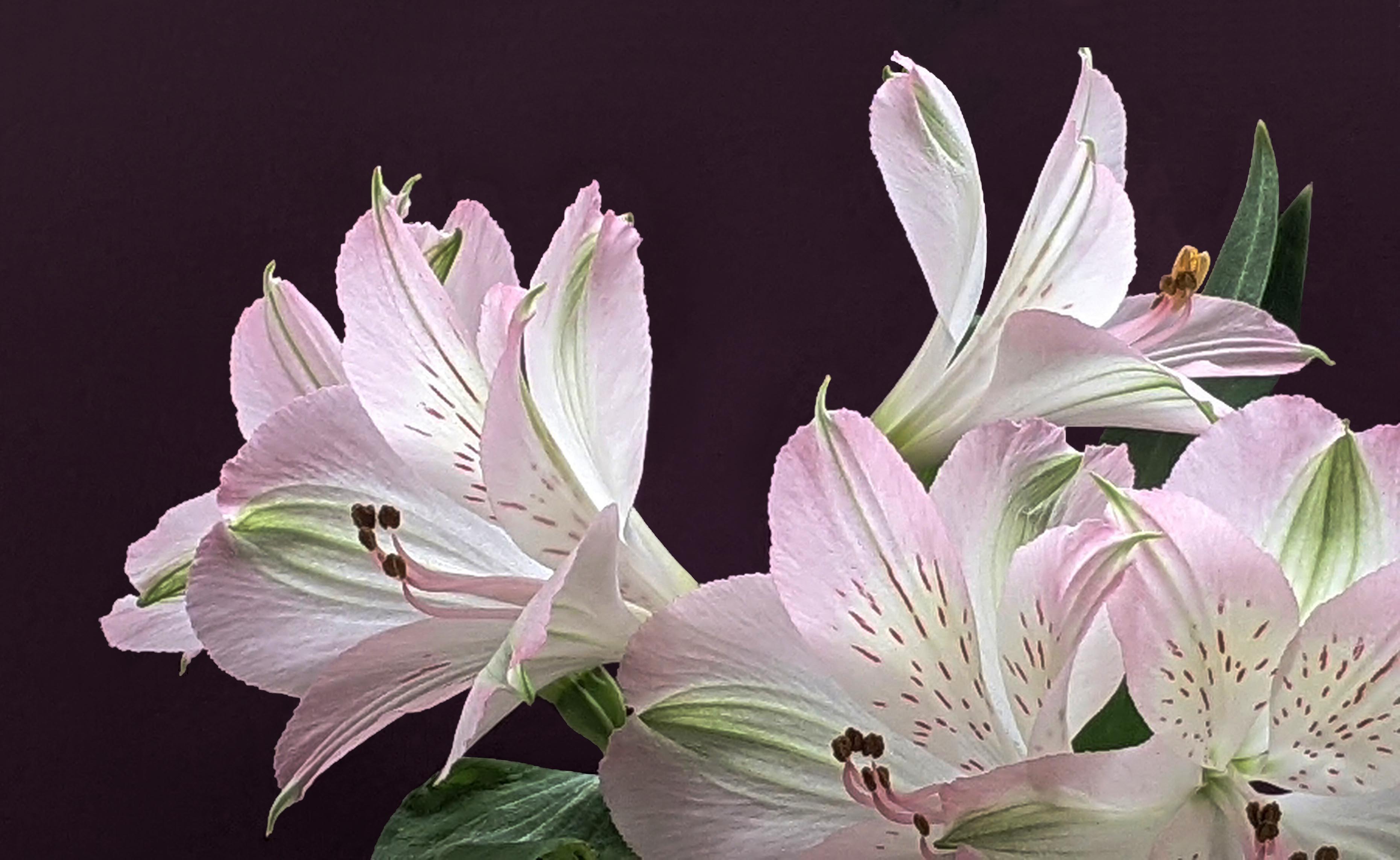
What an artful presentation of this collection of Alstromeria blooms. The composition is quite effective and your background really enhances the scene. The blooms do look a bit washed out, which diminishes some of the interesting detail that you worked so hard to capture. Here I suggest increasing the contrast a bit (perhaps with a curves adjustment layer) to enhance some the native color and detail. There is also a line in the background (between the petals of the upper right-hand bloom) which distracts our eye a bit which could be easily removed. Also, I noted that throughout the image at the border between the blooms / leaves and your background there is some "crud" or "schmaltz" (perhaps due to the smaller sensor size in the cell phone or due to editing artifact), which when removed provides a cleaner presentation of the plant. Finally, I would suggest that you expand the canvas (or redo the crop) to allow a bit more space between the top bloom and the edge. I have included a version of this image to illustrate my point here. See what you think regarding these ideas �� |
Jun 5th |
 |
| 63 |
Jun 23 |
Comment |
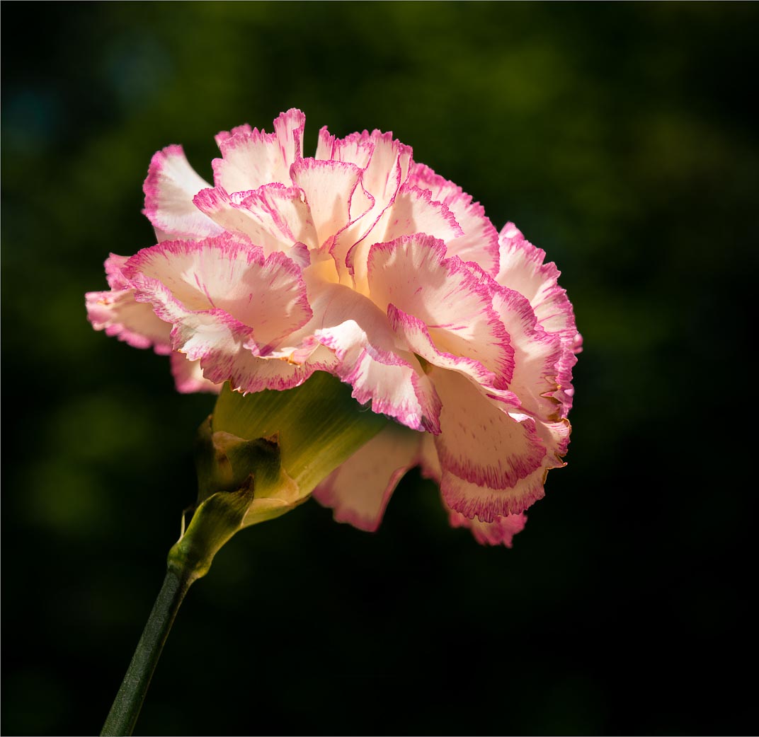
I am enjoying the simplicity and clarity of this presentation. Getting down low to make this image was a good choice, and the background is quite effective. Here the exposure was a challenge, with parts in the stem and area below the bloom being a bit dark while exhibiting blown-out areas in some of the petals. There are not a lot of adjustments one can do in Photoshop to eliminate the blown-out areas. However, I might suggest a bit of Photoshop magic, in cloning in areas from other petals to replace the blown-out areas. I might also lighten some of the stem to even out the harsh shadows seen here. I might also remove the lighter background element just below the bloom, as to my eye it presents an unneeded distraction. I have included a version of this image to illustrate my point here. See what you think regarding these ideas �� |
Jun 5th |
 |
| 63 |
Jun 23 |
Comment |
This is a quite an artful image seen with imagination and captured with considerable skill. That being said, I am not sure that this image is appropriate for our Close-up / Macro study group. Yes is sort of a close-up image, but here it's a "not so small close-up" of a much larger scene. Generally speaking, a macro short is one where the subject is roughly the size of a postage stamp, and a Close-up shot is roughly the size of a loaf of bread (no larger). Your subject in obviously larger than the later definition. This is a great shot, but perhaps not for this specific study group. |
Jun 5th |
| 63 |
Jun 23 |
Comment |
Great image and I can see why it has done well in past competitions. The detail in the main subject and in the hand is quite good, and I am enjoying the shallow depth-of-field seen in the back parts of the hand. I do see a bit of a light halo around the string as is passes by the hand and the critters back leg, and where the legs and hand meet above the main body. This looks out-of-place, and suggests issues with some of the editing. Whether this is the case or not, it looks as though there might have been some issues here. I would suggest darkening these areas to remove the halo glow that is seen here. |
Jun 5th |
6 comments - 6 replies for Group 63
|
| 75 |
Jun 23 |
Reply |
Here I don't think the question should be "is it as sharp as the others" but rather "is it sharp enough to effectively carry its role as the main subject". When commenting upon images I often note that "it's as sharp as it needs to be". This suggests that the attribute of sharpness, is a relative one, and the role and amount differs with each image. |
Jun 28th |
| 75 |
Jun 23 |
Reply |
I think that you are limiting yourself in regard to restricting your aperture to f/11 or larger (smaller f values). Generally speaking, diffraction does not normally show up until f/18 or smaller. If that is not the case with your specific lens, it might be time for a better-quality lens. |
Jun 12th |
| 75 |
Jun 23 |
Reply |
Another benefit of using a tripod is that it slows one down. I tend to rush my shots, so when I am forced to slow down, I get more "immersed" in my shot, and they do come out better. Less frames, but better results. |
Jun 9th |
| 75 |
Jun 23 |
Comment |
I can see where you are going with this image. However, the subjects are not real clear which makes it more difficult to appreciate the image. Perhaps its due to the actual size of the image. Increasing the resolution of the image to 300 ppi did appear to help some. With the subject not being clearly presented here, it's harder to pick out he subject from the surrounds, which may account for some of the earlier comments about the busy background. I am not so sure that the background is too busy here, but with the main players not being clearly defined, the background has a larger role. |
Jun 8th |
| 75 |
Jun 23 |
Comment |
I appreciate the direction that you took in regard to this shot. Shooting at 1/200 to 1/250 sec with a flash can illuminate the subject while allowing the background to dissolve to back (invers-square rule for light intensity). I often use this technique with the subject is against a cluttered background that I cannot impact (pre or post capture). I do find that I am wishing to see just a bit more of the bloom at the base of the bloom. Lightening (bring up detail in the darker area) the lower portion of the bloom provides a bit more balance to the image. I find that even seeing a vague presentation of the stem at the bottom goes a long way, and grounds bloom in the image a bit more. This can easily be done without impacting the dark background since the lightening effect can be masked out. |
Jun 8th |
| 75 |
Jun 23 |
Reply |
I also changed the hue of the green pinstripe. To my eye the original pin stripe had too much yellow in it which made it stand out as a distraction (at least to my eye) rather than the supporting element I believe it was intended to be. A minor point, but your images are getting so advanced and accomplished that these minor points are critical. |
Jun 6th |
| 75 |
Jun 23 |
Reply |
These comments were made relative to the original image which was mistakenly displayed as the submitted image. In your B&W version, much more of your vision of shape, texture and from does come though. In your version, being somewhat darker, this show through even better than my earlier, and lighter version. Interesting presentation. |
Jun 6th |
| 75 |
Jun 23 |
Comment |
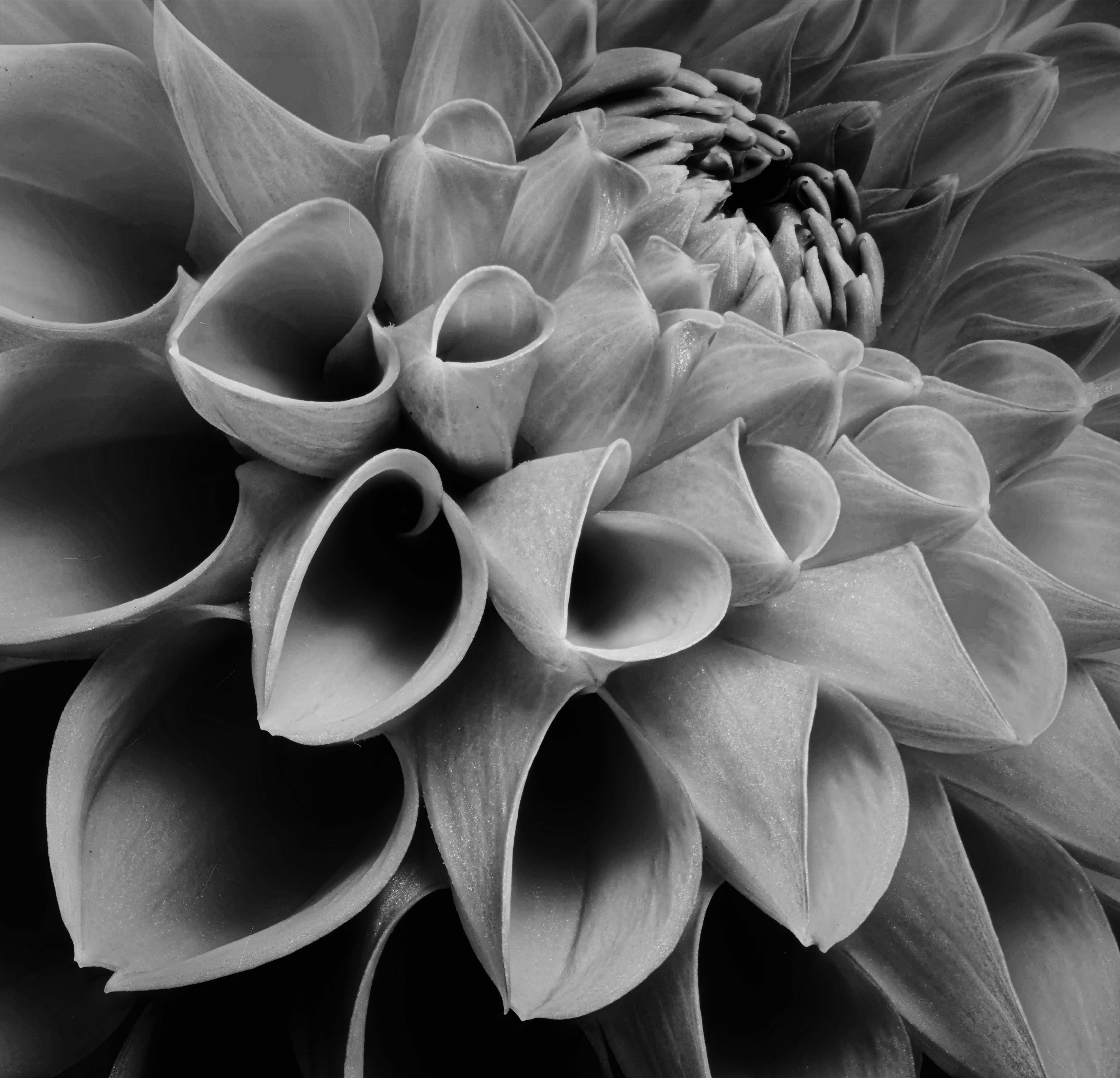
Here you are trying to take us into the interesting realm of tone and shape (in this example as it's all about structure rather than color), however, with this submission, I don't think you were as successful as intended. The presented image is dark and muddled, and while you were not as concerned with using color to present your vision, this version detracts from our appreciation of the critical elements of structure and tone. If one were to brighten the image these elements would become far more apparent, and your vison of these elements as captured here would be more effectively portrayed. Yes, the color would be enhanced as well, but that is not the main objective here. If one were to eliminate the color and present this as a monochrome image, this also might be a more effective way to tell your story. |
Jun 5th |
 |
| 75 |
Jun 23 |
Comment |
Here I agree with Murphy in his summation. The flowers and scene are nicely presented. I do find that the fact that the top fence in soft and blurry while the lower is sharp, represents a distraction. Here I might suggest a bit of Photoshop magic in duplicating the bottom rail, flipping it 180 degrees, and placing it on the top (blending it as appropriate) to address this discontinuity. I may also suggest that one perhaps darkening the fence elements a bit to reduce their impact some. |
Jun 5th |
| 75 |
Jun 23 |
Comment |
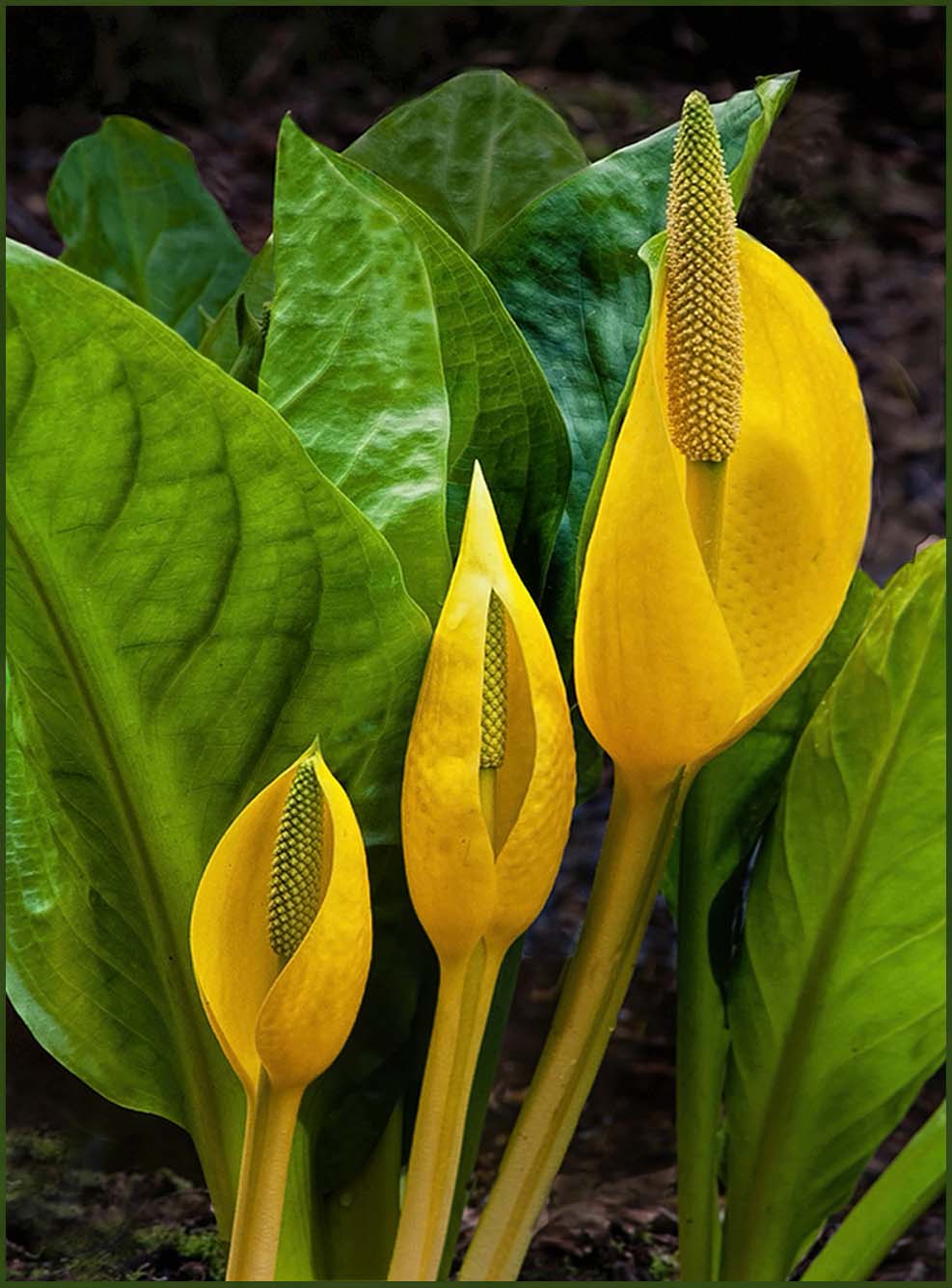
Here we have yet another example of your keen and detailed photographic eye. There is a simplicity to this image, and your main subjects, with their dramatic color and ascending size carry your story effectively. The green leaves in the background creates a natural setting for these yellow blooms. I might suggest though, that the two back most upper green leaves might be darkened some to provide a bit greater sense of depth. I also find that the color of the pinstriping is a bit discordant relative to the rest of the image, and as such is distracting. I might suggest darkening this color some and blending it in to the other greens within the image. In doing so the stripe now take more of a supporting role in this image. I have included a version of this image to illustrate my point here. See what you think regarding these ideas �� |
Jun 5th |
 |
| 75 |
Jun 23 |
Comment |
I appreciate your intent here, in trying to give us a more unique view of these blooms. You have nicely captured the blooms and your square crop and darkening of the background helps to isolates the booms somewhat. However, to my eye the background is so busy in detail and light tones, that it challenges my eye to fully see and appreciate the main subject. To my eye, the subjects get lost in the clutter. Here I fear that the only solution is to change the angle of the shot, or to put an artificial barrier or backdrop between the blooms and the surrounding area (a somewhat radical approach). Even though our eye / brain can easily distinguish between the background and the main subject, our camera has a much harder time doing so. Getting this type of shot to match what our eyes see can be a real challenge. |
Jun 5th |
6 comments - 5 replies for Group 75
|
12 comments - 11 replies Total
|


