|
| Group |
Round |
C/R |
Comment |
Date |
Image |
| 63 |
Mar 23 |
Reply |
One of the issues with some macro images is the loss of context. In this image it might be easy to forget the context of the image, that being those very small poppy seeds that are so hard to see. Who knew that they had so much interesting detail? It might be difficult to find sea shells small enough to be useful. |
Mar 28th |
| 63 |
Mar 23 |
Reply |
Let me follow-up up with the following thoughts. In our shots and especially in nature, we work so hard to "get the shot", and it's hard to set it aside, especially when it just falls short of the mark. I find that this is often the case in nature shots, where, like this submission it is almost there, but just falls short. Getting all of the critical elements right in a nature shot is far more difficult that it may seem and causes us to appreciate it when it does happen. All we can do is to keep on with our efforts and enjoy the fruits of our labors when things do work out. |
Mar 10th |
| 63 |
Mar 23 |
Comment |
Great headshot of this gull. Lots of detail and your exposure was spot-on. I don't disagree with Murphy's comments regarding the sharpness of the image, especially in regard to the beak. In shots such as this where the majority of the image is the bird head, having the entire head in focus is so important. If not, why bother ? |
Mar 9th |
| 63 |
Mar 23 |
Comment |
Let me agree and mirror Murphy's comments, especially in regard to a pinstripe border. I appreciate how you left the reflection as being a bit darker here. This is naturally what happens as reflections are naturally a bit darker than the elements being reflected. Nicely seen and captured. |
Mar 8th |
| 63 |
Mar 23 |
Comment |
An interesting view of this bloom. There is a clarity and simplicity in your presentation. The bloom is nicely shown and the background is soft yet not without it's content. I do find that the bloom is a bit centered. Here I would crop in from the left, top and bottom to move the bloom to a more effective third. This would also allow the stem (which is less than distinct) to act as more as a leading line and a bit less as a primary element. |
Mar 8th |
| 63 |
Mar 23 |
Comment |
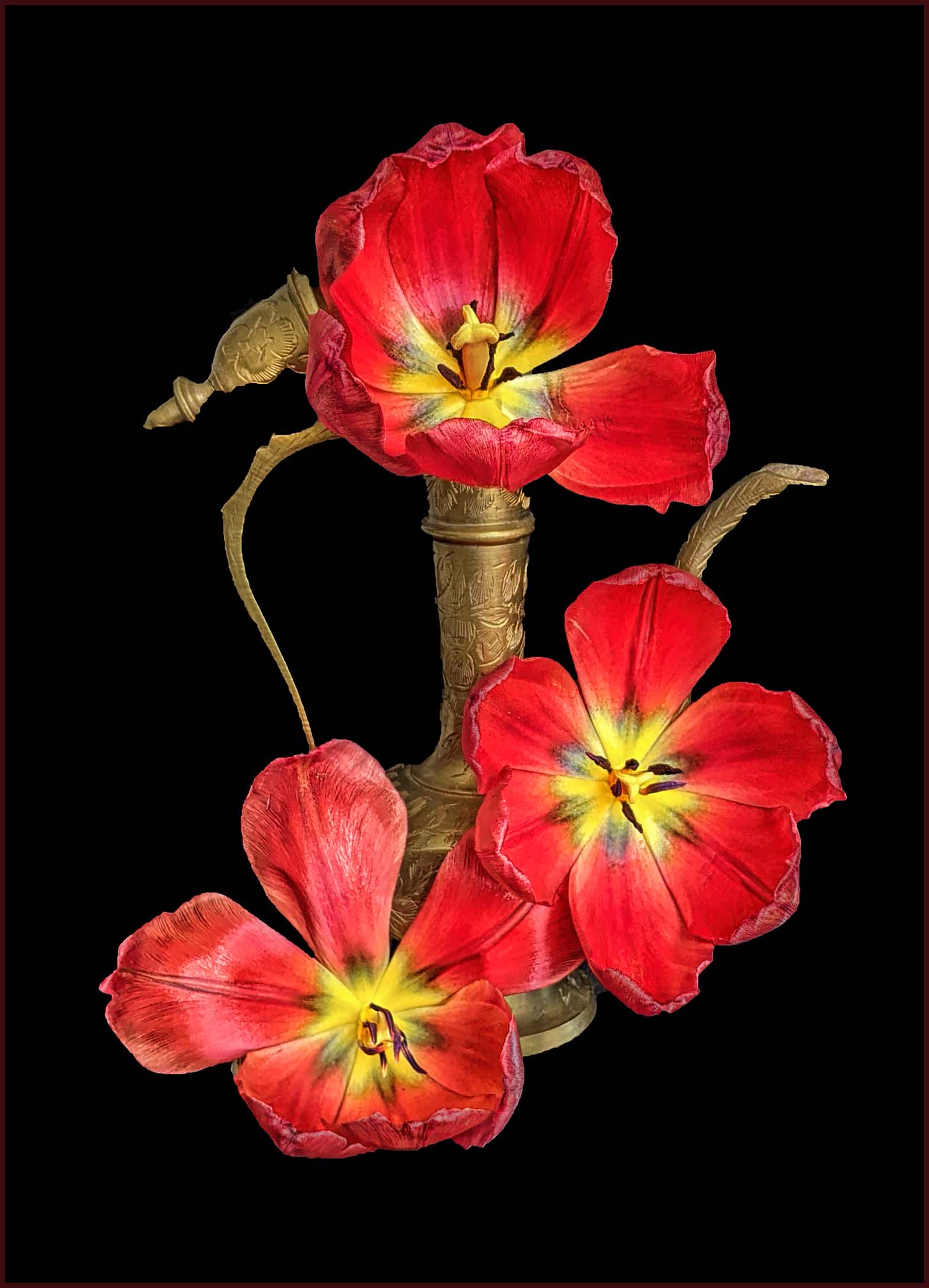
This is a wonderfully clean image, highlighted nicely from the background. The clarity, colors and composition are all nicely done. The image is lit from the front, and as such is a bit flat. Adding a bit of directional light (lighting the brass from the side and perhaps darkening the edges of the blooms where they bend over at the tips) might help a bit here. The image is a bit unbalanced due to the crop (although in this presentation it might be a bit more difficult to see) and I would add a bit more canvas to the left of the image (and perhaps a subtle pinstripe border to separate the image from the presentation background). Finally, I might be tempted to select and darken the pistil/anther flower elements in the center of each bloom to bring them out a bit more. Here I show these edits to illustrate my thoughts. |
Mar 8th |
 |
| 63 |
Mar 23 |
Comment |
Great use of color, form, and empty space. I especially like the cropping in which you chose not to include all of the 'slinky" at the top of the image. As such the viewer is brought into the image to explore the loops, lines and colors. Well seen ! Nice Job. |
Mar 8th |
| 63 |
Mar 23 |
Comment |
What a fun image. I did get the humor right away, but perhaps that is because you mentioned the addition of the "golf eyes" in your description. Titles are so important in directing the viewer to see the image as we wish. If one were not so directed, there is a lot of wonderful detail here and the "eyes" might be missed at first glance. If one were to miss the "eyes", how then might the image be viewed. I am wondering if this might of occurred at your club ? |
Mar 8th |
6 comments - 2 replies for Group 63
|
| 75 |
Mar 23 |
Comment |
Here the challenge is to see the image as others see it. It was so easy to focus upon the red and blue blooms, and how well they stand out, while overlooking what is going on with the leaves in the lower half. It is so easy to overlook these things with our own shots. Seeing our images as others do is an advanced Photography skill and emerges with experience. |
Mar 14th |
| 75 |
Mar 23 |
Reply |
I was not as concerned with making the lower left corner sharp. In this case being just slightly soft and dark helped to frame the subject. I did go back and forth regarding a pinstripe border. I decided that in this case the backlit halo of light fibers surrounding the leaf was a critical element, and that adding the border might compete with this essential design element. |
Mar 13th |
| 75 |
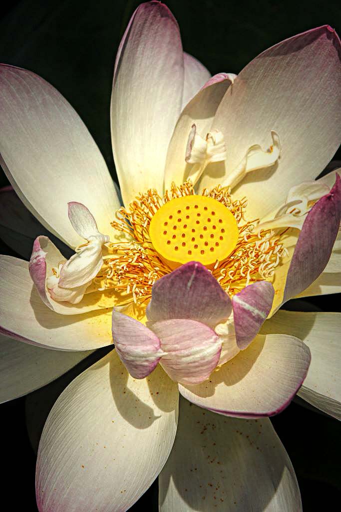
Mar 23 |
Comment |
Interesting discussion thus far. I am enjoying the composition, crop and sense of depth you have captured in this image. I feel that the image is a bit washed out though, perhaps being a bit over exposed and losing much of the native detail in the petals. Thant and heightening the detail in the center may help some (as noted earlier). I have included a version of this image which illustrates my thoughts. |
Mar 13th |
 |
| 75 |
Mar 23 |
Comment |
I was rather disappointed with this submission, While the actual blooms are clear with a lot of interesting detail, the whole image has a "contrived" look to it. I suspect that this is due to the poor execution in cutting the image out (overly sharp edges, halos, the original background showing through the edges and lots of bits of background 'stuff'). Also, the blooms do not appear to be connected to the real world ('floating' in space). There is also a "flatness" to the image with little separation between some of the overlapping petals. Finally, I am not a fan of the background color selected, as it lends a jarring aspect to the entire presentation. Not one of your better efforts, but then again, we all can't always be on "top of our game". Looking forward to seeing your next submission. |
Mar 13th |
| 75 |
Mar 23 |
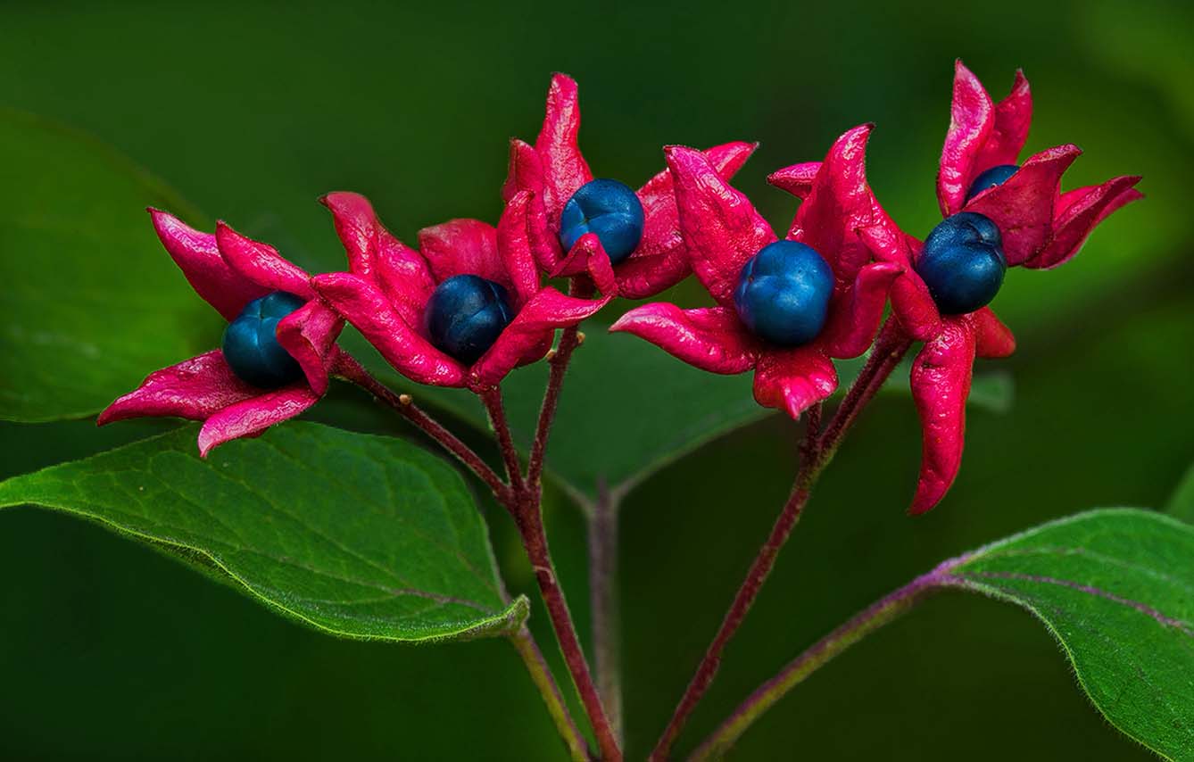
Comment |
This is a wonderful image, with a clean presentation, a simple yet effective composition, and a nice array of color. I am beginning to see your personal style emerging in your submissions. For the most part the main subject sands out nicely, with the exception that the green leaves on the main branch are blending into the background and some of the background elements are beginning to compete with the main subject. These issues can be effectively delt with by selective darkening of the background while partially lighting the subject's stems. Many of your images have clean simple presentations of the subjects yet tend to be a bit flat in conveying a sense of depth. This can be addressed with more use of selective lights to highlight your subjects a bit more effectively. I have included a version of this image which illustrates my thoughts. If you would like to review how this was done, let me know and perhaps we can set up a quick Zoom session. |
Mar 13th |
 |
| 75 |
Mar 23 |
Comment |
I applaud your eye in seeing this image. As shown, it has an unstated simplicity that works here. I do find that it's not as sharp as it might be (as noted earlier) and that a challenge of getting the settings right. I find that people tend to be more afraid of a too high ISO, rather than opting for faster shutter speeds (and more stomped down apertures). With today's cameras, this is far less an issue as it used to be. Additionally, you can correct for the noise that high ISO might introduce, but you can't correct for "lack of sharpness" nearly as effectively. In this image I note a dark halo (or smug) surrounding the actual grass stems that I suspect was introduced in processing, but I am not sure what to do to correct that. |
Mar 13th |
5 comments - 1 reply for Group 75
|
11 comments - 3 replies Total
|


