|
| Group |
Round |
C/R |
Comment |
Date |
Image |
| 63 |
Feb 23 |
Reply |
In my experience though, the stroke command can be problematic, especially if the stroke is added to a layer with a mask. I generally find it is more trouble than it is worth, but my images often become more complex (I enjoy processing and I tend to do more "stuff" with my processing). so that may not be your experience. Since I often have issues with the stroke, I came up with a more manual method described above. Lots of ways to do this. |
Feb 9th |
| 63 |
Feb 23 |
Reply |
I don't disagree. It was intended to be a bit more on the abstract side, which at times can be a bit more difficult to get "into". |
Feb 8th |
| 63 |
Feb 23 |
Reply |
I noted that you felt that you were being restricted by the software as to how you could add your border.
Here I describe a method which allows you to control the size, color and density of the border that you add in a "non-destructive" manner. In this I mean that the border is added as its own layer, rather than placing the border directly on the image pixels.
This method works in both Elements and in Photoshop CC. If you are using Elements, its best to work on your image using the "Expert" mode.
Note - That if this all seems a bit too much to digest, I understand. I already had these instructions so I thought I would offer them.
1. Add a solid color adjustment layer at the top of your layer stack (don't worry about the color as you can change this at any time).
2. Now select the entire image (CTL-A on PC CMD-A on Mac). You should see "marching ants" around the image.
3. Now modify this selection by going to the "Select" Dropdown menu at the top of the page and selecting the Modify => Border option (Select => Modify => Border).
4. Type in the size of the border. The relative width of the border will depend upon the size of your image, then click "OK". Larger images may require larger borders to give the desired effect.
5. Now with the modified mask active (i.e., you still see the marching ants) add the selection as a mask to the solid color adjustment layer (one method to do this is in the Layer Dropdown menu at the top of the page select, Layer => Layer Mask => Reveal Selection). This will place a mask on the solid color layer which only allows a border, the size you determined earlier, to show through).
6. If you now double click on the solid color layer, a dialog box should open which allows to you modify the color of the solid color adjustment layer, and therefore the border you see around your image.
7. If you change the opacity of the solid color adjustment layer, you can also change the density of the border color.
8. If you wish to change the size of the border, you need to delete the mask that is on the solid color adjustment layer, repeat these steps starting at step 2, and type in a different size in step 4.
9. You can also turn this border "on" or "off", by making the solid color adjustment layer visible or not.
|
Feb 8th |
| 63 |
Feb 23 |
Comment |
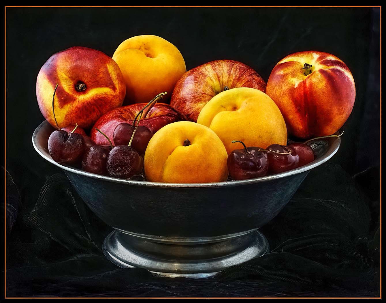
I was impressed with your effort here. Even though they look relatively simple, still life images are some of the hardest to do well and require an expereinced eye to gage and capture the light in the most advantageous manner. In fact, the gentle fall-off of light across the scene is one of the hallmarks of an effective still life image, and seeing and creating this is an advanced Photography skill. In your image your have captured a wonderful scene with a lot of interest. The composition and colors are all effective. The lighting though is a bit harsh, with hot spots on the fruit, some washed out loss of detail in the fruit and almost no detail in the bowl and background. It appears here as though the fruit are floating on top of a bowl of blackness. These are some of the things that one needs to look for as they collect these images. It takes far less light that we might expect. Here I would bring out the detail within the bowl, background shadows, and in the cherries. I would also clone out many of the hot spots that we see in the cherries and in the fruit. I would also work to reduce the brightness we see in the base of the bowl. Finally, as you bring out the shadowed detail in the bowl and background, you will also need to remove a fair amount of color noise and many additional specular highlights that might now emerge. I have included an example of these types of edits to illustrate my thoughts. |
Feb 5th |
 |
| 63 |
Feb 23 |
Comment |
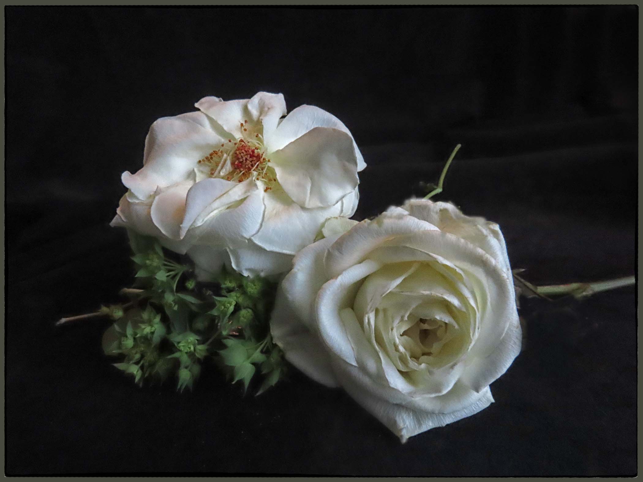
Here you give us yet another artfully constructed still life. The composition is effective, and here two blooms work (and "rules" be damned). Your lighting really enhances the scene allowing a gentle softness throughout. I am especially am enjoying the subtle depth-of-field employed as there is sufficient detail within the roses, while the bit of softness in the stem and greenery. All, in all, a great effort. That being said, I feel that your choice with the stark white border unfortunately disrupts the overall feel of the image. It adds a starkness to the image which directly counteracts much of the effect you were going for. Adding the border is not the issue, but the bright starkness chosen here. I would have employed a softer gray or khaki color here, perhaps pulled from the color of the stem in the background. This would allow the border to blend in more into the presentation without dominating the presentation. I have included an example of these types of edits to illustrate my thoughts. Aside from this though, and wonderful image. |
Feb 3rd |
 |
| 63 |
Feb 23 |
Comment |
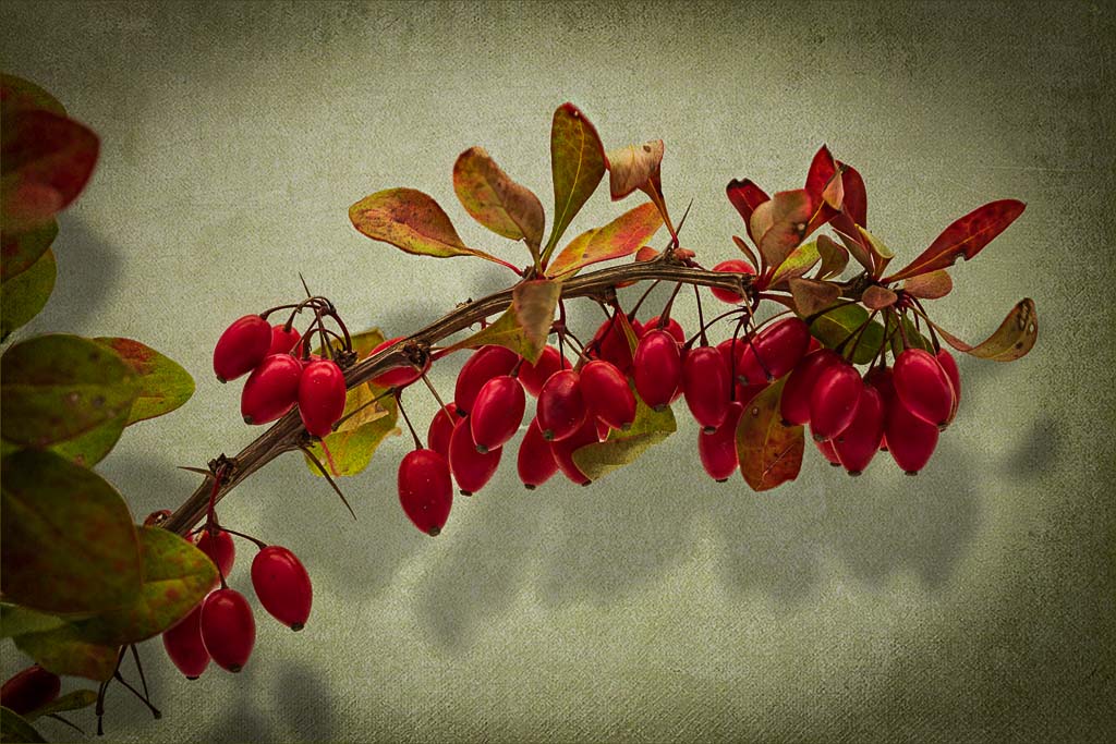
Barbara - Your images keep on improving and this is no exception. Creating effective still life images is an advanced skill, and one that you seem to be recently embracing. One of the keys of effective still life images is to capture a fall-off of light across the subject, and you have successfully done so here. I especially am enjoying the shadows cast by your subjects. I think that your composition and use of a framing elements were well thought-out and your choice of texture and background effective. The vignette also enhances this image. I do feel though, that this image is a bit dark, in that we are losing some of the detail and impact of the berries. Here I might be tempted to lighten the entire image a tad (another one of those technical terms), and perhaps bring out the shadowed detail in the berries (not the shadows cast by the berries). In doing so I think that the subjects are brought to life a bit more, and we can more fully appreciate both the subjects and your vision. I have included an example of these types of edits to illustrate my thoughts. Nice Job! |
Feb 3rd |
 |
| 63 |
Feb 23 |
Comment |
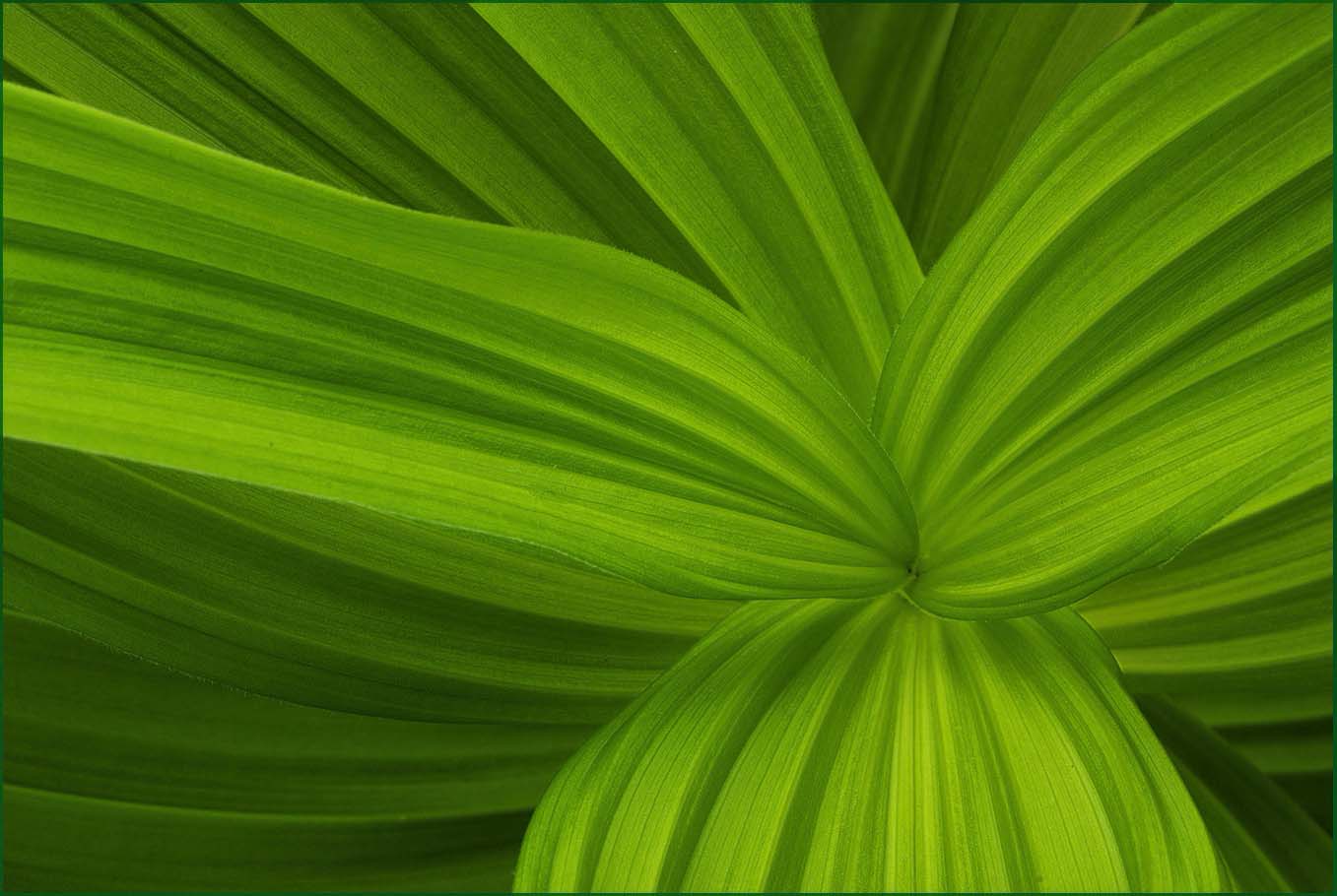
All I can say is WOW. This is an impressive image. Simple in it's presentation, you effectively capture a wonderful sense of flow throughout the image. It is both a presentation of this plant, and in another sense an abstract that captures our imagination. Kudos for first seeing this, and second for your impressive capture. I do note that there is a sameness or flatness to this image as the tonal qualities remains the same across the entire image. Here I would be tempted to slightly darken areas that I think are behind the main leaves, allowing some of the leave to predominate slightly. Not much, and not enough to disrupt the flow inherent in the image, but some to add a greater sense of depth. I have included an example of these types of edits to illustrate my thoughts. Never-the-less, a truly magnificent image. |
Feb 3rd |
 |
| 63 |
Feb 23 |
Comment |
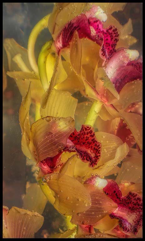
You have given us quite a novel image here. I am enjoying the undulations of the submerged blooms within the liquid and the interesting distribution of the red flower parts (getting real technical here) throughout. The entire image has a muted and somewhat soft feel, and that is not surprising since the blooms are submerged. But let me ask, do you need to retain that feel with this image? If this were my image, I would be tempted to darken the background and to add a bit of micro-contract to the actual blooms to enhance the shapes and color, thereby sharpening the presentation some. I have included an example of these types of edits to illustrate my thoughts. Also, I will ask does the black border add to this image? As this image is presented, it is already on the black background, so adding the black border only serves to reduce the effective image size. |
Feb 3rd |
 |
5 comments - 3 replies for Group 63
|
| 75 |
Feb 23 |
Reply |
I could have, but honestly, it did not occur to me that I could (or should). No other reason ... |
Feb 16th |
| 75 |
Feb 23 |
Reply |
Sorry for the delayed response ...
My E-mail address is cginsburgh@gmail.com. Send me a note, and perhaps we can discuss this further. |
Feb 13th |
| 75 |
Feb 23 |
Comment |
Murphy makes a really good point. My most successful images are those where I slow down and take my time (I always seem to be in too much of a rush). Using the tripod does slow me down which is why many don't like to use them, but for me my results seem to be the better for it. |
Feb 4th |
| 75 |
Feb 23 |
Reply |
Focus stacking is just another tool to be used as appropriate. In case you want to know a bit more about this technique, I have a feature article entitled "Focus Stacking and its Application in Macro Photography" that was published on the PhotoPXL Photographic site on March 12, 2020 on the Photo PXL (https://photopxl.com/focus-stacking-and-its-application-within-macro-photography/). If you have questions let me know and we can discuss it a bit more. |
Feb 4th |
| 75 |
Feb 23 |
Reply |
Alas, I too have encountered too many judges who spend more time spouting 'rules' and less time considering if the edit works for that image and vision. Here you have a central subject that you have chosen to make the 'star of the show', so it deserves to be front and centered. That is your vision with this subject and in this image the centered placement works. |
Feb 4th |
| 75 |
Feb 23 |
Reply |
The critical point here with the vignette is to make it subtle, often such that if you did not know it was added, you might not notice it. Vignettes need not always me black or dark. Here I added a vignette of color to your image with a black background. Given you goal of creating images for cards these alterations might go a long way. If you want to see how I added these, let me know and I will set-up up a quick Zoom session. |
Feb 4th |
 |
| 75 |
Feb 23 |
Reply |
I am coming to realize that it's less about the phone, and more about the finger pressing the shutter button. Also, processing has a lot to do with this. If you saw the original image, you most likely would not be as impressed (I was not), but with some thought and effort we can "bring good things to life".
|
Feb 4th |
| 75 |
Feb 23 |
Comment |
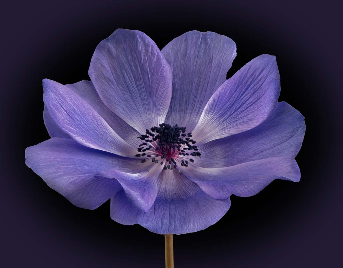
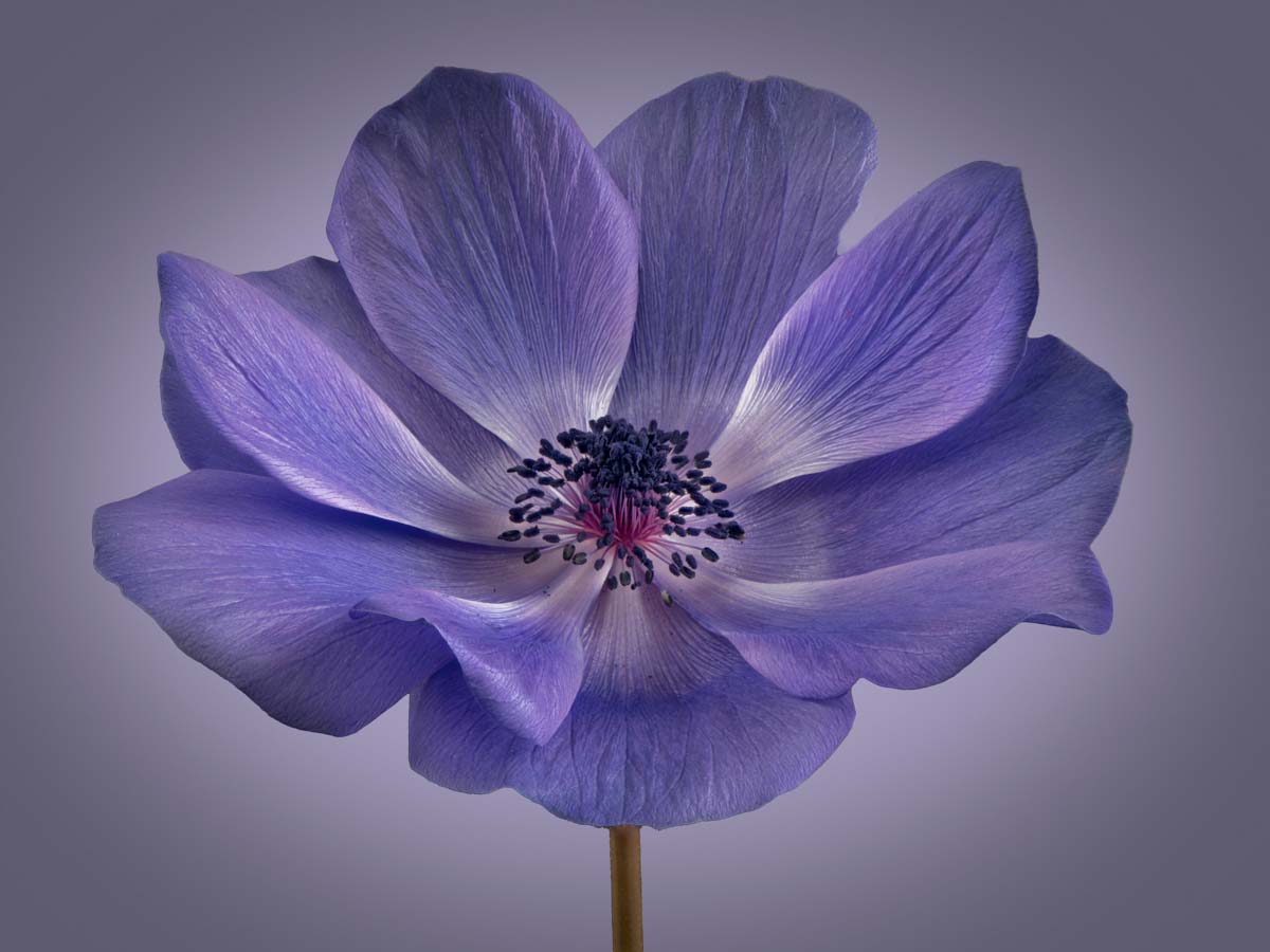
Wow, quite an impressive image here. The stacking was well done, as you really have captured the beauty of the detail inherent in the bloom. The light captured in this image is exquisite and I am enjoying the subtle shading seen within the bloom. Here I would be tempted to increase the detail within the darker anthers (the dark structures on the end of the central filaments). Moving the Shadows slider to the right in Adobe Camera Raw (or the Lightroom Develop module) masking out everything else but the anthers would work. Finally, might I suggest adding a subtle and gentle dark vignette. This might add a bit more complexity to the background (as opposed to a uniform color). I have included an example of these types of edits to illustrate my thoughts. Nice Job though. |
Feb 3rd |
 |
| 75 |
Feb 23 |
Comment |
Very interesting and minimalistic image. The simplicity of the image really focus our attention on the main subject. To further the simplicity I might remove some of the highlighted spots and web elements here, as to my eye they are distracting from the whole image. I realize that that is what was there, but that does not mean that you need to retain it in your image. I also feel that there is too much space around the fruit. I would crop down the image to make the fruit a larger part of the whole scene. I have included an example of these types of edits to illustrate my thoughts. Note that I also added a dark red pinstripe border to finish off the presentation. See what you think �� |
Feb 3rd |
 |
| 75 |
Feb 23 |
Comment |
I really like this image. You did a great job at applying a composition with really brings of the flow of the stem without losing the quality of the blooms. The background is quite effective, and the pinstripe boarder enhances the image. Perhaps you might consider removing the structure n the upper left, that one bloom structure attached to the stem of the upper left. I have tried this, and it simplifies the image some, but I am uncertain if it makes it better. Something to consider. |
Feb 3rd |
| 75 |
Feb 23 |
Comment |
I like where you are going with your edits. As compared with your original image, you have brought out more detail and structure in the bloom. I think that you could have gone even further with these edits though, since there is so much interesting structure that you have captured. We just need to see it more. The image is a bit soft along the left edges with some blurring of the petals along the lower left edge, perhaps due to the shallow depth-of-field of f/5.6. That is not always a bad thing, but since this is not seen elsewhere in the image, this does stand out as being different. Getting everything in focus is one of the challenges of flower photography. Perhaps try this with a f/11 to f/16 might help, potentiality with the risk of losing a bit of the background softness, but we can re-introduce this, by editing the background independently from the main bloom. Focus stacking is another option to consider as well. |
Feb 3rd |
5 comments - 6 replies for Group 75
|
10 comments - 9 replies Total
|


