|
| Group |
Round |
C/R |
Comment |
Date |
Image |
| 63 |
Jan 23 |
Comment |
What a great artful image of this half bloom. The composition, color and clarity of this image is wonderful. There is a simplicity demonstrated here that does not compete with the texture and detail within the blooms. That being said, I am not a fan of the subtilty colored background. To my eye the washed-out color clashes somewhat with the petals in this instance. I understand that if you used a darker, more pure black background, the edges of the image might blend into the presentation background. While a 1 pt pinstripe boarder in the bloom's predominate color might help, it also might distract the viewer a bit from the actual bloom (I tried this myself and I am undecided it adding a pinstripe helps or not). Perhaps changing the background color to a more reddish-brown (mirroring the browns in the anters) might be more effective. See what you think �� |
Jan 7th |
| 63 |
Jan 23 |
Comment |
I am enjoying both the subject material and your antique treatment yield this wonderfully artful image. It's a challenge to make something new from existing images, and you have succeeded admirably here. The only suggestion I have might be to adjust your cropping here. The existing image has a bit of an "unbalance tension" here which to me is a bit distracting. This image would work well as a centered image, so I would decrease the right-hand side and increase the space on the left-hand side (expanding the canvas in there is no more image). Give this a try and see what you think �� |
Jan 7th |
| 63 |
Jan 23 |
Comment |
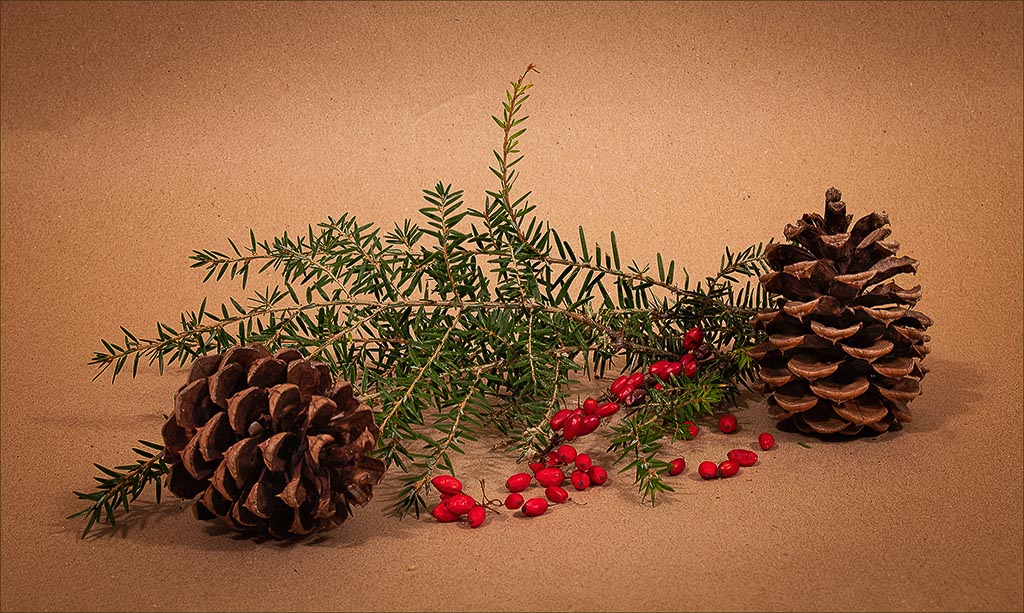
I am enjoying the simplicity of this arrangement. I also feel the choice of color inclusion was especially effective. The lighting is simple yet effective as well. The only think I might of done is to bring out a bit more of the detail in the shadows of the pinecone structures. The attached image demonstrates my thoughts �� |
Jan 7th |
 |
| 63 |
Jan 23 |
Comment |
Art can be found everywhere, and you definitely have it here. I am impressed. Kudos for transforming one image (gray scale and natural) into something else. That takes real imagination and skill to pull it off. I especially like the augmentation of the texture. |
Jan 7th |
| 63 |
Jan 23 |
Comment |
Great image. Congratulations on your award. The only thing that I might suggest here is to add a bit more space around the sides and top. I wonder if not cropping quite as tightly, might change how we view this subject. Just a thought �� |
Jan 7th |
| 63 |
Jan 23 |
Comment |
Great insect image. This was a challenge in trying to get the entire insect in focus. Even at f/22, there was just not sufficient depth-of-field to achieve this. If the bug is moving (as they tend to do), it may be difficult to attempt a stack here. Possible, but difficult as you need to be quick in your set-up and execution. I don't disagree with the earlier comments. I love the sharp detail on the bug and right-hand branch, but this tends to emphasize the less-than-sharp structure on the left that you purposefully left in. Looking forward to your next image. |
Jan 7th |
| 63 |
Jan 23 |
Reply |
The setting was quite dark so in my attempt to replicate the "feel" of what it was like here, I left the image a bit on the darker side. Not every image needs to be bright, especially when the subject being capture is a bit dark and gloomy |
Jan 7th |
6 comments - 1 reply for Group 63
|
| 75 |
Jan 23 |
Comment |
I can't disagree with most of the earlier comments. As presented the subject appears to be floating in a sea of black, and it's difficult to see where the image starts and ends. Murphy's suggested pinstripe border might address this, especially if the color of the border is muted and understated (such as the green color found in the leaf on the left). |
Jan 22nd |
| 75 |
Jan 23 |
Comment |
This is a real artistic rendering of this scene, and for the most part is very effective. The overall softness of this image lends itself to an ethereal feel to this presentation. This image does appear to be a bit tight and cramped, and if this were mine, I might have given more space around the blooms. Also, the angler nature of the background appears to clash a bit with the subjects. Finally (and this might be a personal bias) there appears to be a light soft halo surrounding the bloom, more pronounced in some areas than others. This may be due to the modeled nature of the background, but to me is a bit distracting and might be addressed in post processing. |
Jan 22nd |
| 75 |
Jan 23 |
Comment |
Often when we attempt to capture expansive scenes, the resulting image doesn't fully capture or experience. I think though, that here you have succeeded. Great job in capturing the foreground, midground and background in representing this scene. Combined these elements lend a sense of depth to the image. Your composition and use of the existing colors also is very effective here. There are many ways to crop this image, but I like the choices made here. Nice Job. |
Jan 22nd |
| 75 |
Jan 23 |
Comment |
Interesting view of some of the stages in the life cycle of this plant. The varying planes of focus in this image adds a sense of depth to the image. It is a bit spread out: as noted earlier, which makes it a bit more difficult for the eye to rest on the image as a whole. I don't disagree with the "crop for the left" comments made earlier. One might also consider removing the upper left white bloom entirely to aid in the composition. |
Jan 22nd |
| 75 |
Jan 23 |
Comment |
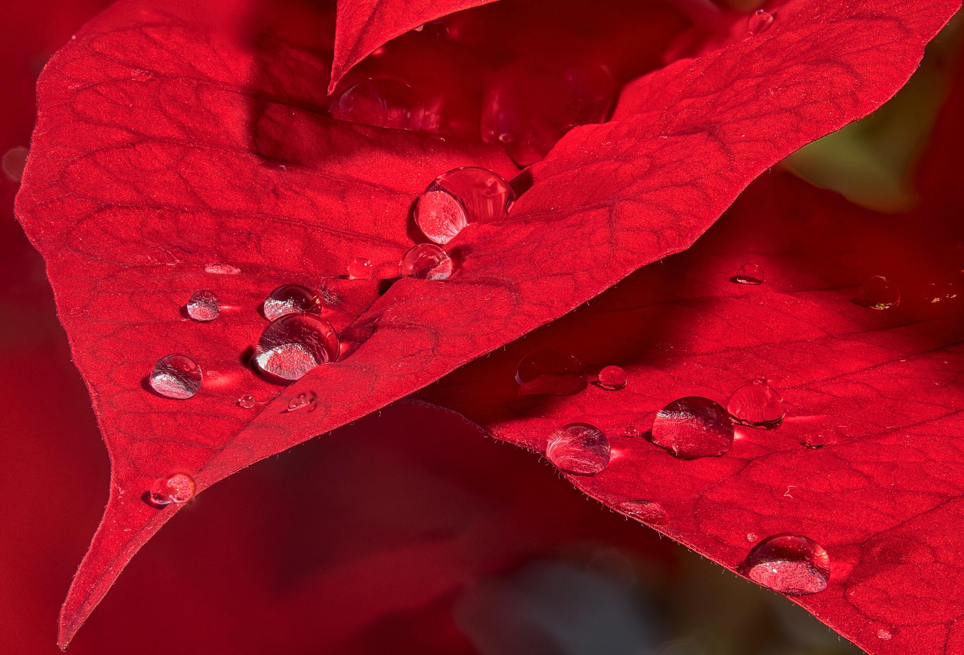
I am enjoying this shot immensely and appreciate your eye in seeing this composition. Not only did you see this, but you went through the effort of collecting the detail with your focus stack, and the results were well worth the effort. However, since you went through so much effort to collect the image why not take more advantage of the detail you strove to collect. As presented, this image appears a bit washed out, and flat. The wonderful detail of the petal veins and the water drop has been lost in this presentation. Also, to my eye, there is not a lot of separation between the petals and the background resulting in a rather flat affect. If this were my image, I would have darkened the background allowing more separation of the petals from the surrounding area and increasing the "depth" of the image. I also would have increased the contrast and clarity (perhaps with a curves adjustment layer) on the actual petals to bring out the detail within the petal veins and the water drops. I have included a version of this image in which I have done this, to illustrate my thoughts. Focus stacking is a wonderful way to capture more detail in an image, but often it requires a bit more processing to add back some of the image depth, that this technique tends to lose.
See what you think.
PS - If you would like to see how I did my edits, let me know and perhaps we can set up a quick Zoom session
|
Jan 3rd |
 |
5 comments - 0 replies for Group 75
|
11 comments - 1 reply Total
|


