|
| Group |
Round |
C/R |
Comment |
Date |
Image |
| 63 |
Dec 22 |
Reply |
How would modify the image if you wish to limit the "garish" perception? |
Dec 22nd |
| 63 |
Dec 22 |
Reply |
I appreciate your comments. It's always a balance as to how dark to allow reflections. Reflections are normally darker than the subject being reflected (something many makers fail to appreciate), so to look more natural the reflections need to be darkened a bit. The challenge is by how much ... |
Dec 22nd |
| 63 |
Dec 22 |
Reply |
Often I shoot my subjects on a sheet of Black "Art Glass"
The glass you want is called Black Solid Opalescent "Art" Glass by Spectrum. This is glass produced for stained glass work and you may be able to order from Spectrum or through another Stained glass supplier. One 12 x 12-inch square should be sufficient for most uses. The spectrum product number is 1009S. This is the standard glass.
This glass is a solid color and you can't see through it. It has a shiny smooth finish so you should your subject's reflections but not a lot of distracting artifacts some glass finishes can yield.
Note: You do not need the Fusible "System 96" glass (1009SF) which is a glass designed to melt at a lower temperature for specialty "fusion" work and is generally more expensive.
|
Dec 18th |
| 63 |
Dec 22 |
Reply |
Ohh - THE PUNNNNISHMENT that you are all dishing out ... |
Dec 15th |
| 63 |
Dec 22 |
Reply |
You don't see the image posted that is just below my comments? This image may look the same but the edges have been expanded and the bottom lowered, also extending the stem. |
Dec 14th |
| 63 |
Dec 22 |
Comment |
This image has a real "postcard" feel to it, perhaps due to the border applied. The actual Pack looks as though it was "pasted in" rather than being a part of the image as a whole. Perhaps if there was some shading on the pack and a shadow cast by the pack, the effect might be more realistic. Good composites are a lot more challenging than one might think and require a practiced eye to see and add the subtle effect that make them work. |
Dec 13th |
| 63 |
Dec 22 |
Comment |
The inclusion of the eye does shift this image into the "creepy" realm a bit, but perhaps that's your intent. As a composite image I feel that the lighting is a bit off. The blocks demonstrates full frontal lighting while the hand does not. I am also not sure if the eye lighting is consistent with the hand as well. These are subtle things but contributes significantly to the feel that this image was "pieced together" rather than being a complete whole. Composite images are a lot tougher to pull off than one might expect. |
Dec 13th |
| 63 |
Dec 22 |
Comment |
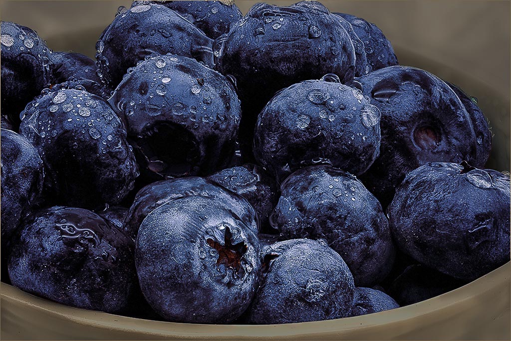
Technically you have a wonderful image here, giving us an "up close and personal" view of these berries, and you should be proud of that effort. I do agree with your thought that this image could be a bit more, as to my eye it appears a bit pedestrian. This type of image is often referred to as a "still life", and one of the hallmarks of still life images is the gentle and subtle falloff of light across the subject. This looks simple and easy, but requires a practiced eye and is much harder to achieve than one might think.
In this image I think that the composition is fine, but that the lighting is on the harsh side, with bright and shadowed areas competing with one another. There is also a bright halo on the top side of the blueberries at the top of this image. Here I might try to minimize these effects by dampening down the highlights and bringing out a bit more detail in the shadows. I would also remove the halo noted above, and decrease the brightness of the bowl to give the berries a bit more prominence. I have included a version here, where I have done just this to illustrate my thoughts. I think these edits improve the image some, but the fundamental issue of the light still is present and can only be addressed at the time of capture.
|
Dec 8th |
 |
| 63 |
Dec 22 |
Comment |
This image certainly presents a wonderful 'riot of color' here and belays the amount of time and effort expended to get this shot. Kudos for your imagination, vision and technical expertise in pulling off such an image. That being said, to my eye it's a bit much, and I am having some difficulty is getting into this image as presented. I suspect that this is due to the background elements being as bright and colorful as the foreground elements, and that these two elements compete with one another. If this were my image. I would be tempted to deemphasize the background some to allow the foreground elements to separate and shine a bit more. I would select the background, place it on its own layer and blur and darken in a bit to achieve this separation. I have included a version here, where I have done just this to illustrate my thoughts. When we spend as much time and effort in creating these types of shots, it's difficult to see these types of details and effects. See what you think �� |
Dec 8th |
 |
| 63 |
Dec 22 |
Comment |
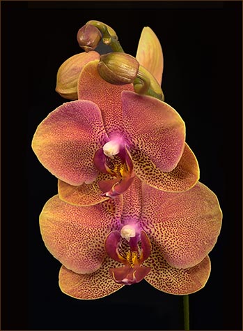
This image is an excellent example of much impact a simple close-up image can have. The clarity of the blooms and the colors captured are wonderful. I also like how your choice of a black background really serves to enhance the orchard bloom. That being said, I feel as though the subject is a bit overly constrained in this version. If this were my image, I would expand the canvas, clone in the black background to give the bloom a bit more area to "breathe" and add a slight pinstripe border to separate the image from the presentation background. I would also extend the stem at the bottom to straighten the connection of the subject to the outside environs. I have included a version here, where I have done just this to illustrate my thoughts. This are subtle changes which make, to my eye, the image so much easier to enjoy.
See what you think ��
|
Dec 8th |
 |
| 63 |
Dec 22 |
Comment |
Rather than commenting on this image let be address your interesting question regarding processing. When is enough, enough?
First, I believe that our goal as photographers is to capture in our images, the vision that we had when we collected the image (the reason you pressed that shutter button). As humans though, we are imperfect observers, and have evolved to only see things in our environment that may be of interest or might be threatening. It's difficult to train ourselves to see more (although it can be done). So when we see a scene that we wish to capture, what we see may not be what the camera actually captures (been there, done that, have the tee shirt). So, to me the role of our editing is to bridge that gap between what is in our image and what was our vision. How much and what you do with your edits depends upon what you captured and what you wish to relate in the image. Most really accomplished photographers leverage this concept extensively, and you are correct that Ansel Adams spent months editing his prints to achieve his vision.
But realize the photography is an art, so there is no right or wrong relative to what is an acceptable vision. Use whatever tools you need to get to where you need to go, and don't feel as though you need to apologize for how you got there. It's your art ...
Other thoughts or comments?
|
Dec 7th |
6 comments - 5 replies for Group 63
|
| 75 |
Dec 22 |
Reply |
I also have had the same experience as Murphy. I tend to focus upon what looks good to me keeping an open mind that there are always alternative settings and compositions to try. In this case I would be less concerned with the number of blooms and more regarding the number of bloom collections. Here there are two groups (again that 'evil' even number), but they differ so much (long and short, parallel in alignment) and the larger generates a bit of flow, so to my eye the number has far less sway here. |
Dec 22nd |
| 75 |
Dec 22 |
Comment |
The stem was rather long, so including the entire stem would yield an image with a smaller bloom. It's all a matter of balance. I could have cut down the stem, but I was also trying for shots similar to the vase images (smaller submission), so I needed the long stem for those shots. I could have ended the stem in post processing (delating the end and adding background), so that might have been an option, although I sort-of liked the stem leading off the page. So many options to choose from �� |
Dec 22nd |
| 75 |
Dec 22 |
Comment |
You have done a wonderful job in showing us this bloom in all of its complexity and the dull muted color pallet is great and gives us the feel that this is a night bloom. Kudos for choosing this as part of your expression. I would have liked to see this as a sharper rendition though. I suppose that the soft presentation may also contribute to the feeling of this being a night bloom, but to my eye it detracts more than it adds in this case. Finally, you think the crop is too tight at the bottom and would like to see the entire bloom here. |
Dec 13th |
| 75 |
Dec 22 |
Comment |
This is a wonderfully soft and emotive image. A real artistic expression captured in 2 d. I cannot disagree with the comments made earlier. There does appear to be some sort of haloing around the petals (perhaps due to processing), so I would try to remove that in Photoshop. Nice job! |
Dec 13th |
| 75 |
Dec 22 |
Comment |
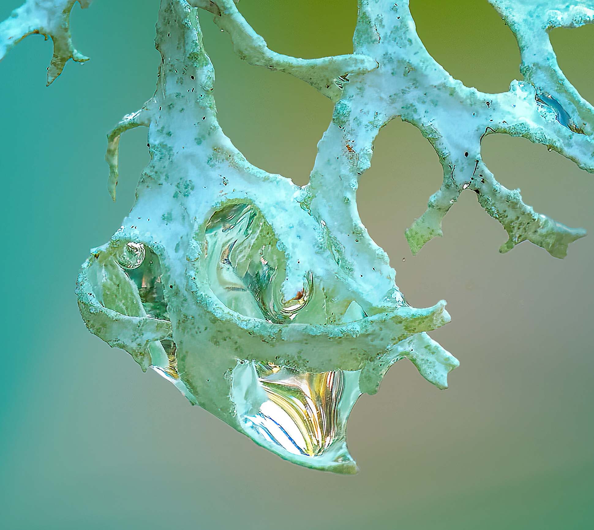
This is a wonderful image. The clarity and color of the subject is outstanding and you have presented us with a fascinating image that almost borders on the abstract. Kudo for seeing and capturing this image. That being said, to my eye it appears a bit flat. I feel that the main subject might be presented in a slightly more dominate light. If this were my image I might darken the background a bit, increase the micro-contrast of the actual subject to enhance a bit it's native texture and perhaps crop a bit off of the bottom. The goal of these edits would be to enhance the main subject some and to achieve a better separation of the subject from it's surrounds. I have attached an example image where I have done these thigs to illustrate my thoughts further. Let me know what think �� |
Dec 12th |
 |
| 75 |
Dec 22 |
Comment |
This is one of the best images I have seen from you, and that is saying a lot given the consistent quality of your shots. The colors and composition is great, and the clarity is outstanding. I especially like how one can almost "feel" the textures within the blooms. Lots of very subtle texture and lighting within the petals. You use of the gold reflectors was a wise choice here, and the gold color is evident within the image. I am also enjoying the subtle detail in the background. The only suggestion I have is that might have used a darker, more subtle color in the pinstripe border. I appreciate that you are trying to pull in some of the main image into this border, but to my eye it's a bit overwhelming and distracts more than it adds. Try a darker, less intense color and see if what you feel about that balance. |
Dec 12th |
| 75 |
Dec 22 |
Comment |
This image forced me to re-acquaint myself as to the nature of this group (under "About Group 75"), and in doing so I realize that the mandate of the group is a bit broader than I had originally thought. This is a good thing. This image has many of the classic compositional elements that is often seen in these types of images, and here they all work well. The tree is nicely haloed by the blue sky and the trunk forms a wonderful leading line. I agree with Murphy's comments as well regarding the sharpness of the tree leaves. I have seen past commentary where it is recommended not to have leading lines extending from the very corner. I don't know if this is appropriate here, but it might be interesting to look at similar images (or crops) where this comment is applied, to see what you think. |
Dec 12th |
| 75 |
Dec 22 |
Reply |
No shame here. Just an opportunity to gain experience. With the newer generation of mirrorless cameras one can go as high as ISO 4,000 with little noise. That is my experience with the Canon R5. It's really changed how I approach the 'exposure triangle' when I am shooting. It's a brave new world out there. |
Dec 12th |
6 comments - 2 replies for Group 75
|
12 comments - 7 replies Total
|


