|
| Group |
Round |
C/R |
Comment |
Date |
Image |
| 63 |
Oct 22 |
Comment |
Here you have provided and wonderful presentation of these blooms. The subtitle lighting used here is quite effective revealing the texture and color of these elements. The simple composition is also effective, and I especially like the emergence of the green bud on the mid right side. The capture does have a bit of a "floating in space" feel to the presentation as there is little to anchor the blooms to the surrounds, but perhaps that was intentional, and the application of the black background re-enforces this concept. I do like the white border, although to my eye it is overly thick, and perhaps intrudes too much into the image. If this were my image, I might have applied a much thinner, pinstripe border here. |
Oct 11th |
| 63 |
Oct 22 |
Comment |
This is a great submission. There is a lot of technical excellence that went into this capture and presentation. As you have invited such comments, I must say that I like the color rendition better. This is not because I tend to like color images better, but in this case, this is because the B&W version tends to emphasize the smooth blurred out areas of the nearer petals. There is some wonderful sharpness and detail in parts of the bloom, but this crispness in not carried out throughout the entire bloom, and fact that is emphasized more in the B&W version. Here I suspect that the f/6.3 aperture was insufficient to the task of fully capturing the entire bloom. |
Oct 11th |
| 63 |
Oct 22 |
Comment |
I think that the comments of "crisp and inviting" sums up this image completely. In this image your composition really sets up the image wonderfully, and the clarity and light capture really aids in this crisp presentation. The spacing between the blooms is very effective and I am enjoying the leaf detail we see is the areas between the blooms. Also, your inclusion of the lone pink bloom is a nice addition. Finally, your treatment of the light with the edge vignetting effectively pulls us into the scene. A simple yet effective image that you should be proud of. |
Oct 11th |
| 63 |
Oct 22 |
Comment |
I do agree with the comments made thus far regarding the actual image. Lots of fun detail and color. Even though you tired to de-emphasize the colorful background elements, I still find that they are distracting and compete with the subject. If this were my image, I would be tempted to clone out the colorful background element entirely. In this case blurring and darkening these elements may not be sufficient. I might also remove the small pink elements on the left side that are intruding into your image as well. |
Oct 11th |
| 63 |
Oct 22 |
Comment |
I really am enjoying this interesting image. The detail and colors are superb, and the texture of the scene really adds a lot to the image. The composition here is quite effective, and although the main body of the scorpion is centered that long body moves the appearance of the subject a bit off center. The folds of the background leaves are also effectively positioned. I am impressed that the critter stayed still enough to create a focus stack. That is rarely the case with live critters. One small quibble is that the shoulders (if that is what one calls them) of the scorpion tends to blend into the background, and we lose the separation of subject from its surrounds. Perhaps if one darkens the shadows in this are thins might help some. Nice Job! |
Oct 11th |
5 comments - 0 replies for Group 63
|
| 75 |
Oct 22 |
Comment |
Kudos for seeing this image and I applaud your efforts in trying to capture your vision here. The composition here is every effective and I am enjoying the color pallet employed. I do agree though that the softness of the entire image, works against you here. In this case an aperture of f/22 is not quite sufficient to cleanly capture your vision, and that you might not be able to push your equipment further, so the use of focus stacking is the next best effective tool. Getting it right in the camera does not preclude the use of techniques that allow one to do more than what the camera / lenses are capable of doing in a single shot. Getting familiar with this technique (especially with flower and nature photography) may open up many new opportunities that a single native shot may not permit. |
Oct 11th |
| 75 |
Oct 22 |
Comment |
I love this "up front and personal" presentation of this bloom. I feel that the composition is effective, (especially in the second crop that add a bit more space to the top) and the blurry smooth background really sets your subject apart nicely. The muted colors and the clarity of the bloom is attractive, although I would have liked to see the forward (area of the bloom closest to the viewer) elements as sharp as the remaining bloom. I don't mind that the far edges of the bloom are less sharp, but the soft forward parts of the bloom leaves me feeling as though I am missing something. This subject would be a great opportunity to apply some focus stacking to get the entire bloom sharply defined. |
Oct 11th |
| 75 |
Oct 22 |
Comment |
I appreciate the efforts required to capture such an image. As noted earlier, wind and subject movement are factors that make this type of capture challenging for small subjects. Here I think you found an acceptable solution bring the bloom indoors, although some might disagree arguing that you have "destroyed" the bloom in moving it. That aside, your new set-up allows you the opportunity of "doing it right". I am enjoying the detail associated with the red petals and the top of the bloom between these elements but am disappointed that the entire bloom is not sharply presented. By collecting the appropriate number of focus slices you should have been able to capture the entire bloom in crisp detail. Now it is true that the entire bloom need not always be sharply presented, but in this case, I feel that in not doing so, the story is incomplete. |
Oct 11th |
| 75 |
Oct 22 |
Comment |
I love the colors and composition of this image and your composition effectively presents these subjects to the viewer. I do find that these blooms are too soft, to really present these subjects. You have gone to great efforts in applying the appropriate light and composition to highlight these blooms only to fail to deliver sufficient detail to appreciate the actual blooms. The depth-of field is good here, but the focus appears a bit off. |
Oct 11th |
| 75 |
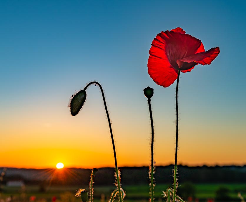
Oct 22 |
Comment |
I applaud your eye is seeing these poppies in different stages of life. The presentation is effective, although I too agree with Murphy in that there is more sky and empty space present than required. Copping is both the easiest (it's simple to execute) and most difficult thing to do. It's hard to discard the pixels that we worked so hard to collect. More times than not, in photography, "less is more". Here I present a suggested crop that may still retain your essential points while addressing many of the points already expressed. Just my thoughts �� |
Oct 11th |
 |
| 75 |
Oct 22 |
Reply |
I intentionally left the interior darker to aid in the presentation of depth within the bloom. I could of added just a bit more light to the interior without disrupting the effect I was seeking. |
Oct 11th |
5 comments - 1 reply for Group 75
|
10 comments - 1 reply Total
|


