|
| Group |
Round |
C/R |
Comment |
Date |
Image |
| 63 |
Jul 22 |
Reply |
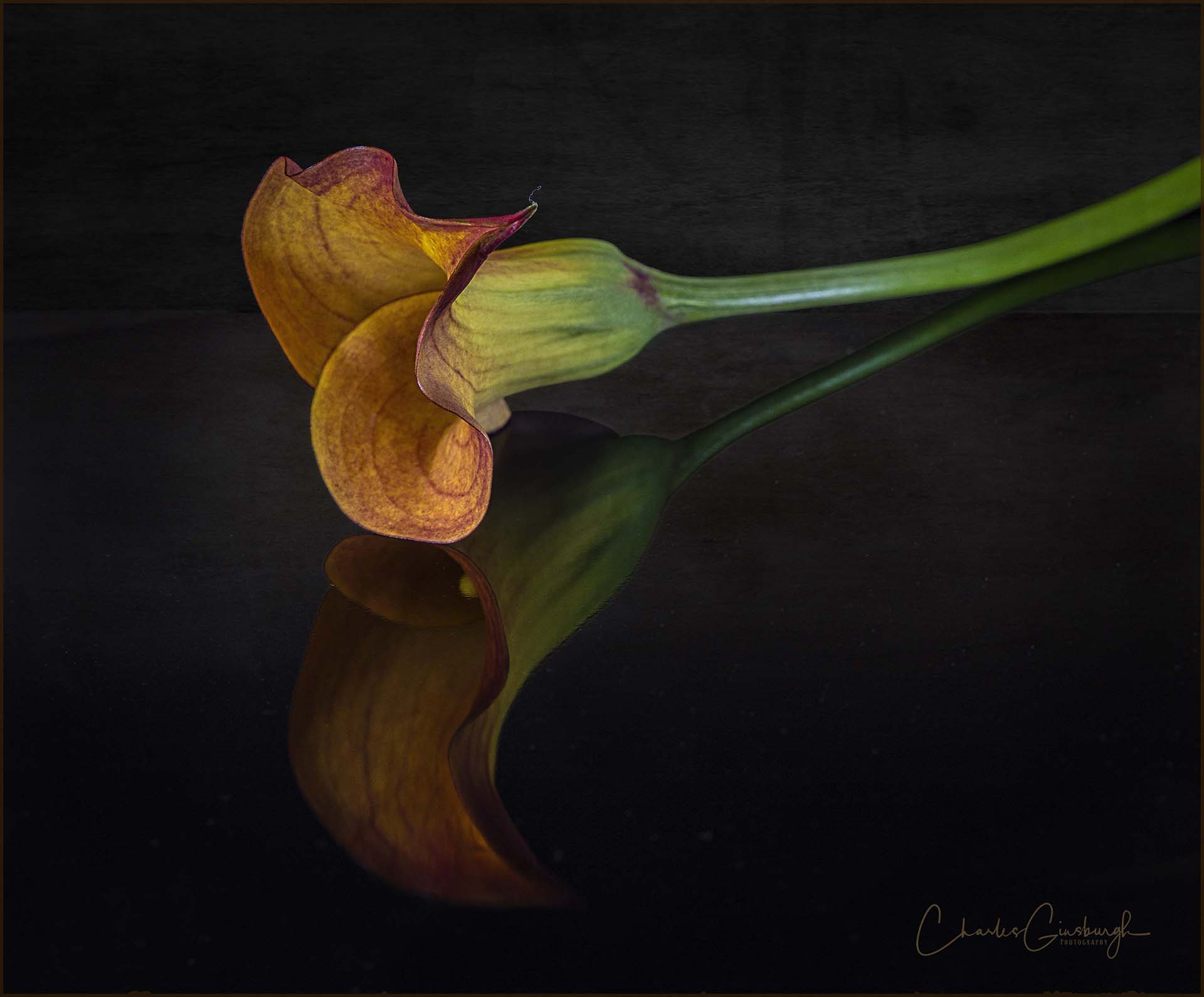
The subject was on a sheet of Black Glass, so you see the reflection of the subject as well. |
Jul 20th |
| 63 |
Jul 22 |
Reply |
A third less obvious example |
Jul 20th |
 |
| 63 |
Jul 22 |
Reply |
Another example |
Jul 20th |
 |
| 63 |
Jul 22 |
Reply |
here is one example of adding a texture as a background |
Jul 20th |
 |
| 63 |
Jul 22 |
Comment |
Great image. Here you have effectively conveyed your vision of this bloom while retain a sense of vibrancy to the presentation. The image is quite sharp, and the colors are radiant. The rather harsh light employed here aids in this presentation, both in revealing the bright whites in the bloom, the details inherent in the petals and in the shadows present. I think that your crop is quite effective here, and highlights the essence of the bloom, that being the petals and inner structure. Nice job. |
Jul 20th |
| 63 |
Jul 22 |
Comment |
I really love this image. It is so vibrant and sharp, and each aspect lend s a different quality to the image. I actually like the composition. As presented, there is a flow of the subject, from the upper left diagonally down to the lower right, a flow present in the bloom and leaf, and mirrored in the stem. I find that that is a strength in this image. The black background is a great addition, and effectively highlights your subjects. You might try reducing the intensity of the light here. The light is rather bright and harsh, but it does aid in revealing the detail here. It may not be possible to do this in post processing but try this out next time you collect your image. One thing I have started to do is to fill in some of my dark and featureless backgrounds with a slight texture. Nothing to distract from the subject, but just enough to fill the space with a touch of detail and form. I find that this adds to the presentation of the subject. Of course, the background cannot be pure black, but here there as several color options that may further enhance the presentation and allow slight textures to emerge. If you would like to see some examples let me know and I will post a few. |
Jul 20th |
| 63 |
Jul 22 |
Comment |
What a wonderful collection and jumble of color and form you have given us. Although one type of pansy is represented multiple times this image still retains as sense of balance, and with a clear focal point. I am enjoying how you have chosen to used the different levels of the flowers (some taller than others) and size to reinforce your focal point. The colors and image clarity are magnificent. There does appear to be some type of compression in this image though. It appears as though when you cropped and /or resized the image you abandoned the original aspect ratio, allowing more movement in from the sides as opposed to the top/bottom. I get a sense of the image being a bit squished (if you can pardon the less than technical term). It's hard to point out why this is so evident, but to my mind it is overwhelming the image and makes it hard to appreciate it fully. |
Jul 20th |
| 63 |
Jul 22 |
Comment |
I am really enjoying this image, and agree with all of the comment suggested thus far. In terms of the background, I don't find it overly distracting, but "ask three photographers for an opinion, and you often get six". I do like the suggestion of darkening the backdrop slightly to bring your subject to the forefront a bit more though. I do find that the subject appears a bit constricted, and if this were my image, I would be tempted to expand the canvas and cropping less tightly around the main flower. I think that giving a bit more space around the subject will enhance its presentation. If in doing so you start to introduce additional distracting elements, I might accept that and try to find other ways of dealing with the new distractions. All in all though, a great image. |
Jul 20th |
| 63 |
Jul 22 |
Comment |
This image is a great example of one class of macro images, in which the detail and complexity of an insect's body is cleanly highlighted. Your image invokes a bit of primal fear in me, and perhaps that's a measure of success. You have really brought this subject "up-close and personal". Lot a magnificent detail in the eye and head, but I find that some detail is lost beyond the eyes, especially in the lower right quadrant of the image and back in the head. Perhaps you need to collect more slices to ensure that more of the critter is represented sharply. Unfortunately, this is one of the downfalls of doing such a good job at revealing detail. The viewer tends to want more, and the less than detailed areas tend to stand out. All in all, this is a great effort and really generates an instinctive response in my gut. Great Job. |
Jul 20th |
| 63 |
Jul 22 |
Comment |
What a clean and clear image. Your subject is clearly shown in great detail, without a lot of distraction. Kudos (congratulations) for your efforts here ! I would be interested in knowing a bit more about what it was that I was seeing here. Are those the wasp's eggs or is she (or he) feasting on them as a meal ? I agree with the comments regard the composition that were offered by Murphy. The stem creates a great leading line in this image, but there is a lot of empty space that does not add a lot to the image. If I were to re-crop the image I would eliminate a lot of the empty space, while trying to avoid the subject being completely centered. Give this a try and see what you think. |
Jul 20th |
6 comments - 4 replies for Group 63
|
6 comments - 4 replies Total
|