|
| Group |
Round |
C/R |
Comment |
Date |
Image |
| 65 |
May 21 |
Reply |
Generally, the difference between what I get with a single shot at f/20 and a stacked image varies with the size of the subject. The more the magnification, the less the impact the smaller apertures in impacting the depth of field. So when I shoot smaller subjects (roughly the size of a postage stamp), I find that stopping down (using smaller apertures) is less effective. This image, shot with my 100 mm macro lens, is on the border. In similar shots, I shot both a stack and tried to captured the subject in a single image. Both gave OK images, but there were a few places that the single shot exhibited some slightly soft areas, which the stacked version did not. In my vision of this image, the difference was significant. With larger subjects, the difference is less pronounced. With the f/22 images I often need to spend more time adjusting the background to be less distracting as well.
As an aside, I really feel that the Canon R5 / R6 mirrorless cameras represent a quantum leap forward in quality and features. Shooting with the R6 has changed my "behind the view finder" calculations as to the appropriate exposure triangle settings I need. I can shoot more handheld shots at much higher ISO settings and higher shutter speeds with little detriment to the image quality. I love this camera. |
May 21st |
| 65 |
May 21 |
Reply |
I understand, and often experience the same doubt. One of our editing challenges is to strike the right balance. |
May 13th |
| 65 |
May 21 |
Comment |
There are many great things about but this image. The simple composition, color and clarity of the subjects many this a compelling shot. However it still leaves me a bit flat, and I feel that it can be so much more. You have captured the dichotomy between the soft fuzzy buds and the detail within, but there is so much more interesting detail to reveal here. There is texture and dimension in the buds, and interesting detail in the stem, that this presentation only hints at.
If this were my image I would selectively boost the contrast, clarity and sharpness to deliver more of the inherent detail within. I have included a version of this image with these modifications to illustrate my thoughts better. See what you think.
|
May 10th |
 |
| 65 |
May 21 |
Comment |
I am impressed how your editing has converted this image to one with a significant "graphic arts" feel to it. Perhaps in doing so, you have imparted a more simplistic feel to the image. I don't see the significance of the title. The image may have had a translucency to it originally, but this appears to have been lost with your edits. There appears to be a visual halo here especially at the top of the bloom where the texture of the background fails to go around the entire subject |
May 10th |
| 65 |
May 21 |
Comment |
I really like this image. You have captured this face with quite a bit of personality. To my mind though its time to ramp this up a bit to the next level. Here I would work to bring out more of the fir texture, and to bring out more of the shape of the face. As presented it's a bit plain (not soft but plain), and since the furry faces is the main player I would strive to add a bit more physical character to the face.
I have included a version of this image with these modifications to illustrate my thoughts better. See what you think.
Taking images of our pets is difficult. We see the image through the eyes of the owner and housemate, and generally read more into the image that what visually it imparts. perhaps that occurred here, but not feel alone. We all suffer from that.
|
May 10th |
 |
| 65 |
May 21 |
Comment |
What a fun image of these interesting blooms. I love the contrast of the blooms with the dark background. I am also enjoying the composition. No, you do not have two complete blooms, but you do have a good representation of the interesting fringe from both booms and to my mind, this works. I am a bit disappointed at the graininess of the image, especially in the centers and in the green stem. I do not know if this is due your using a smartphone to take this image, or to some other factor. |
May 10th |
| 65 |
May 21 |
Comment |
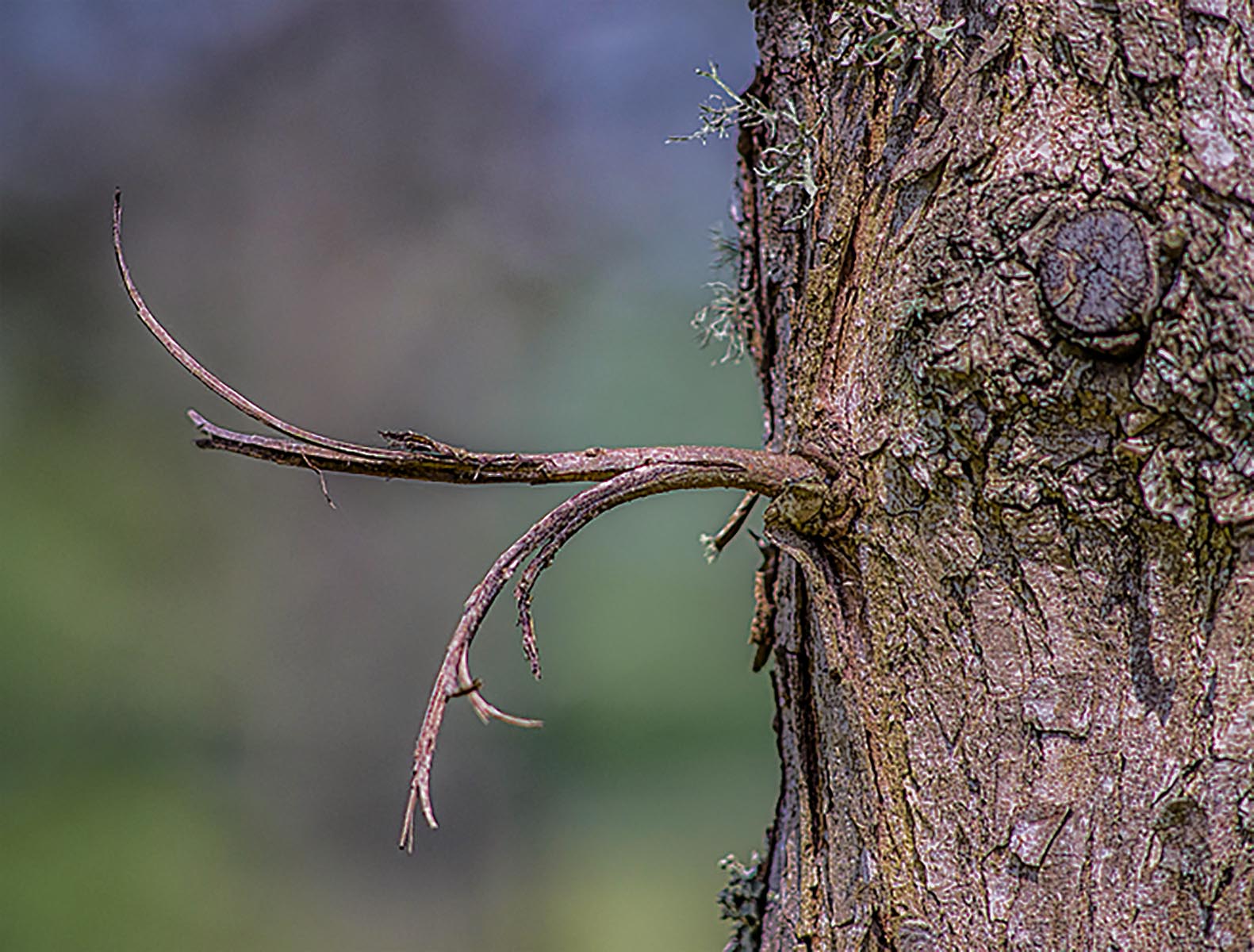
Here, you have provided us with a simple yet effective shot of this slice of nature, and I am impressed with your eye in seeing this. I like your composition in choosing a shooting angle such that the trig is essentially isolated from the background, as this really highlights the twig as the main subject.
That being said, I wonder if you need as much of the tree trunk in this presentation. While there are some interesting features to the tree truck I don't see anything that is exceptional which might compete with the twig as the star of the show. If this were my image I would be tempted to crop in significantly to highlight the twig more, while still retain a few of the more interesting trunk features (such as the knot). Also the image looks a bit washed out so I might reduce some of the whites and highlights and increasing the depth of color by adding a bit of Microcontrast and Vibrance. Finally, I find that the tree trunk is a bit soft. Some may argue that not all of an image needs to be tack sharp and I don't disagree, but to my mind the highlighted subject should be, and since this image contains so much of the tree trunk it becomes a costar and needs to be sharper to carry it's role in the shot. In this case, cropping in does not help a lot.
I have included a version of this image with these modifications to illustrate my thoughts better.
|
May 10th |
 |
5 comments - 2 replies for Group 65
|
5 comments - 2 replies Total
|


