|
| Group |
Round |
C/R |
Comment |
Date |
Image |
| 65 |
Apr 21 |
Reply |
Yes, he did mention that. It might be somewhat of a challenge, but still doable for a few slices (with some luck). |
Apr 28th |
| 65 |
Apr 21 |
Comment |
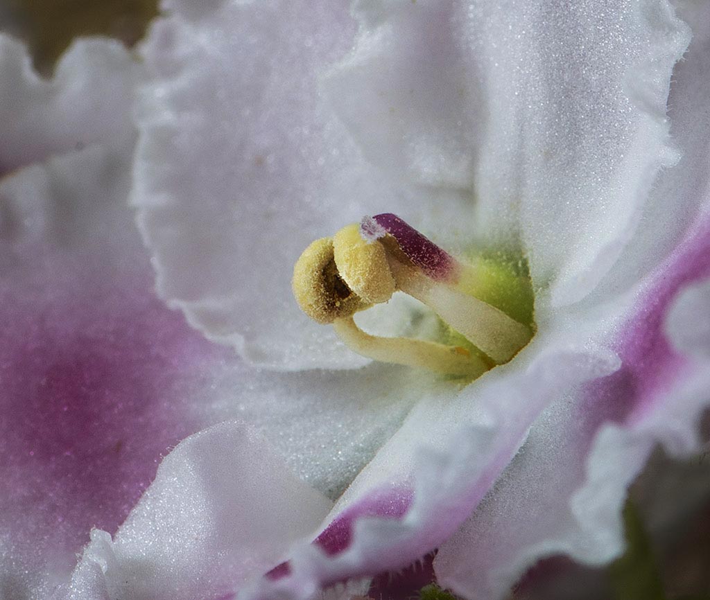
What a fun image. The blooms have such interesting centers, and here you have provided us with a wonderful view into it's detail. The differential focus between the center structure and the surrounding areas is effective, and really highlights the center. That being said I would go a bit further. To my eye the entire image is a bit washed out, and I would enhance the shadows some and to add a bit of micro-contrast to make the central structure stand out a bit more. Your composition does this to some extent, but why not push it a bit more. I have presented a version below to demonstrate my thoughts more. See what you think ... |
Apr 25th |
 |
| 65 |
Apr 21 |
Comment |
I am enjoying the different and a bit more artistic rendition of this flower. As presented we are forced to appreciate the bloom in a slightly different manner. Since the stamens are so front and center I would have liked to see them in greater focus. Your composition has placed them in the spotlight, so I expect them to be clean and sharp, and I am a bit disappointed in this regard. |
Apr 25th |
| 65 |
Apr 21 |
Comment |
I really am enjoying the subject, and the angle you have provided. The detail is sufficient to really peak my interest, especially in the milkweed fibers. I do not disagree with any of the pervious comments or thoughts. I wonder if the image would look better if all of the pod were in focus. Different yes, but better, I wonder. I would have liked to see more detail in the stems leading to the main pod, or in at last one of them. When I shoot my macro images I can care to ensure that I have a few frames where the stems are in focus. I may or may not use them, but it's nice to have the option. |
Apr 25th |
| 65 |
Apr 21 |
Comment |
Lots of fun stuff to enjoy in this image. Although it is an abstract there are still some definite places for your eye to latch onto, and a sense of flow to appreciate as well. Nice range of tones for this monochrome image as well. I believe that all of these points are critical to a good abstract. |
Apr 25th |
| 65 |
Apr 21 |
Reply |
The lights I used are from Adaptalux (https://adaptalux.com). Each colored light wand was purchased separately. It was a bit expensive, but I really like the flexibility and options these lights offer me. |
Apr 7th |
4 comments - 2 replies for Group 65
|
4 comments - 2 replies Total
|