|
| Group |
Round |
C/R |
Comment |
Date |
Image |
| 65 |
Jan 21 |
Comment |
This is another bold image of this flower and its wonderful detail. And again, represents a great example of what Macro photography can present to the viewer. The composition is very effective and the relative drop-off in clarity is effective in directing the viewers' attention to the foremost flower structures. I do think that the depth of field here is a bit too small. Here I would not expect the filament and anther (light green and brown) parts of the stamen to be sharp, but that the stigma part to the central pistil was not (I have to look up what these parts were called at parts-of-a-flower.png; k8schoollessons.com). This is a discontinuity that bothers me, and as such is distracting. In additional I find that the anther and the stigma parts have a halo, bright rim or some overly sharp edge to them. This imparts an artificial feel to the image which really distracts and bothers me. If this were my image I would try to clone out (if allowed) these artificial looking edges to make the image look more natural. |
Jan 21st |
| 65 |
Jan 21 |
Comment |
What a fun image of this rose and the water drops, which decorate the bloom. I love your composition and the clarity of the bloom, your rendition of the colors is great. I don't disagree with the comments that the background bloom is distracting, and I like your solution (to darken and blur it some) rather than the previous suggestion to remove it entirely. The bottom line though is what do you, as the maker, like and wish to present to your viewers.
One comment about the commentary your receive. Seeing the things that we comment upon is often very difficult when it comes to our images. We encounter a scene, develop a vision that we wish to capture, capture the image, edit it and either print it and/or post it. We live with the image from "cradle to grave", and we become invested in what we want the image to show, and often lose sight as to what the image actually shows. This is normal as humans. It's so easy to look past elements that are right in front of our eyes. This is one of the advantages of receiving the comments that we do. Getting past this is a very advanced photographic skill, and takes a lot of work, experience and practice. So, hang in there. Don't feel bad, as you are only being human, and you are doing the right things to get past this normal tendency.
|
Jan 21st |
| 65 |
Jan 21 |
Comment |
What a wonderfully artistic presentation this subject. I am enjoying the novel colors you pulled out of your IP capture. I am also appreciating the variable focus throughout the image. Personally, I fell that the clarity of the background is spot-on. It is soft enough that it does not distract us from the main subject, but clear enough to allow us to know resides there, an element that adds context to the main bloom. I might of made the entire (or at least the central part) of the main bloom a bit sharper (but that is a personal preference), and perhaps the slight softness to the bloom is a purposeful part of your intent. I do feel that the bloom is a bit too close to the top, and this adds a bit of tension to the image that betrays the more peaceful aspect of the image. I have attached a edited version here where I tried to address these last few point. Again, I present this for illustrative purposes, to demonstrate my thoughts. See what you think. |
Jan 21st |
 |
| 65 |
Jan 21 |
Comment |
I really appreciate your ability to see this image ahead of time and applaud the attempt at capturing your vision. You choice to present this as a monochrome images and your use of the reflection are effective in the final presentation. To my eye though, the final image falls a bit short. The soft presentation of the pepper is distracting and I find myself battling to separate the soft and less-soft areas of the pepper. In addition, I find that parts of the reflection are shaper than the actual pepper, and this plays with my head a bit as well. Perhaps you sought to use this variable clarity in an artistic sense, but I do not get that impression here, or it just fails to resonate with me. After attempting to find some order in the clarity of the presentation, I find that I tend to abandon the effort entirely and discount the image. Not something that we wish our viewers to do with our images. My challenge to you here is to drive this image (or a similar version as you may have already eaten this pepper) a bit more. If your intent was to introduce an artistic quality to the image, drive this forward some. If your intent was to highlight the interesting contours of the pepper, do so with more clarity. "Good Luck Mr. Phelps" (for those 'Mission Impossible' fans). |
Jan 21st |
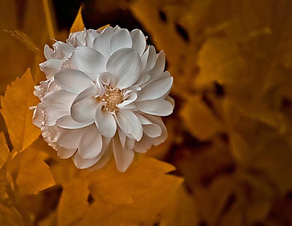
| 65 |
Jan 21 |
Comment |
What a bold image of this flower and its wonderful detail. A great example of what Macro photography can present to the viewer. A question of intent springs to my mind as I view this image. The size and composition of the bloom suggests that you wish to present the interesting detail within the bloom. If this was your intent, I fear it falls a bit short of this goal. The petals and their tips have wonderful detail, but the central regions of the bloom is rather soft, and somewhat disappointing. I have no issues with the very lowest petals be a bit soft, as this offers a type of framing element, but the interesting center elements are overly soft and lack contrast. I wonder if you had a certain intent in mind, and then settled for what you got rather than what you wished to get. I know that you can do better as you yourself have demonstrated this to the group. This happens to us all, and I battle against this demon in many of my shots. As I become more experienced and accomplished, my standards rise, and I need to restrain from presenting anything but my most successful rendition of my vision. |
Jan 21st |
| 65 |
Jan 21 |
Comment |
What an interesting shot you have presented to us. Lots of vibrant colors and shapes with several clearly identifiable subjects. My eye has no problem going directly to the sharply presented orange bloom. I do feel a bit of tension in the composition as the orange bloom is on the upper quadrant and is radiating upward and quickly off the image. Perhaps that was intentional. I do get the sense that the image is a bit busy. First you have two distinct and separate points of focus, being the orange bloom and then the leaf in the lower right quadrant with its bright and sharp edges. I tend to bounce between these two elements which is a bit detracting. Add to this the bright light horizontal lines, and the bright spots in the background and the busyness abounds. In the attached image, I addressed many of these concerns. While I am only so-so with this result, it does serve to illustrate some of the points in my comments. I do appreciate though, that these edits may have taken the image away from your original vision, so I only offer this for illustrative purposes, and not to suggest that it is "better". |
Jan 21st |
 |
6 comments - 0 replies for Group 65
|
6 comments - 0 replies Total
|


