|
| Group |
Round |
C/R |
Comment |
Date |
Image |
| 65 |
Nov 20 |
Reply |
The glass I use is called Black Solid Opalescent "Art" Glass by Spectrum. This is glass produced for stained glass work and you may be able to order from Spectrum or through another Stained glass supplier. One 12 x 12-inch square should be sufficient for most uses. The spectrum product number is 1009S. This is the standard glass.
Note: You do not need the Fusible "System 96" glass (1009SF) which is a glass designed to melt at a lower temperature for specialty "fusion" work and is generally more expensive.
This glass is a solid color and you can't see through it. It has a shinny smooth finish so you should your subject's reflections but not a lot of distracting artifacts some glass finishes can yield.
I will send out a E-mail to you all regarding this.
|
Nov 19th |
| 65 |
Nov 20 |
Comment |
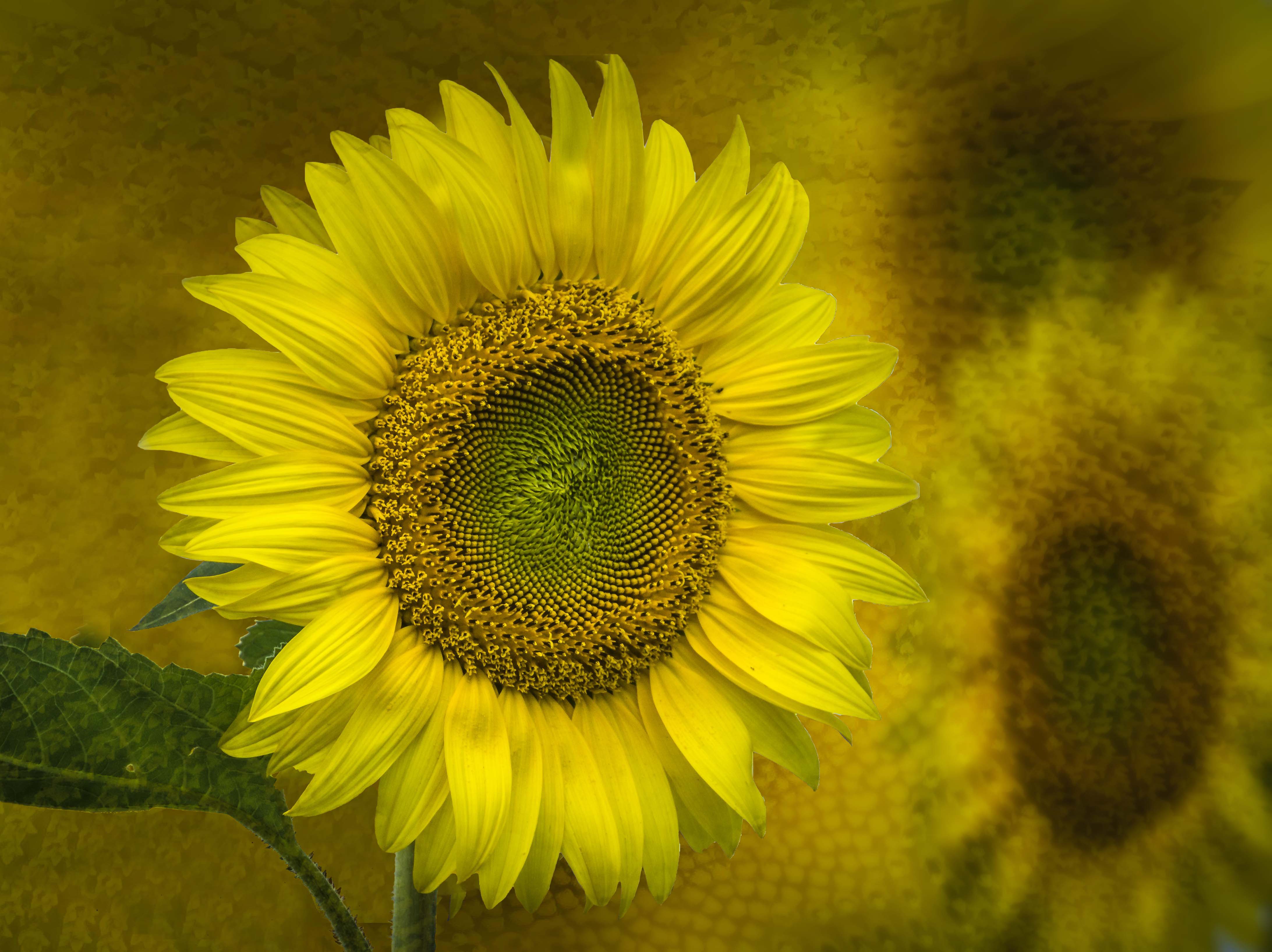
I really like what you have provided us here in this composite. Composite images are anything but simple and you have done a wonderful job in this image. I really like how you have incorporated the flower structure as a texture while giving us a hit of alternate flowers in the background.
In this presentation, I do find though that the background flower elements are a bit distracting and my eyes are continually bouncing from the foreground sharp flower to the background elements at the right, and back again. Here I would be tempted to decrease the distance between the main flower and the background flowers, and to subtly deemphasize the clarity and tone of the background blooms. To accomplish this I would move the foreground bloom over to the right, crop of from the left edge and perhaps blur and darken the background some. To my mind, this would emphasize the main flower just a bit more, without detracting from the background story you have incorporated into this image.
I have tried this and present a version a the image to further illustrate my thoughts. See what you think. Regardless of these points though, this is truly an image you should be proud of.
|
Nov 12th |
 |
| 65 |
Nov 20 |
Comment |
What a wonderful image. I think that you very successful in giving us this stylized vision. I like the mix of sharp and textured feel within the stylized image. You choice of crop is also very effective in emphasizing the "in your face" feel to the image. Since you are highlighting the tonal and texture contest in this image, I wonder why you felt the need to blur the stem. In the same vein, I am wondering why you wish to add a "softer flow to the edges". You have accomplished such a wonder presentation of contrast and texture, why do things to diminish it? I am just interested in your thoughts, and do not mean to offer these thoughts as criticism. |
Nov 12th |
| 65 |
Nov 20 |
Comment |
I really am enjoying this image. I think that the composition and exposure work and have no issues which what you have presented. I like the sharpness of the main subject and appreciate the falloff in sharpness toward the back of the subject. To my mind, this aids in adding a sense of depth to the image. The image as a whole has a sort of technological appeal, and I love the style of the presentation (similar to many of my images so it must be great, RIGHT? :) ).
I think that this image does highlight on of the unique aspects of macro-photography, that being to show us everyday items in a new and perhaps unseen manner. Nice Job
|
Nov 12th |
| 65 |
Nov 20 |
Comment |
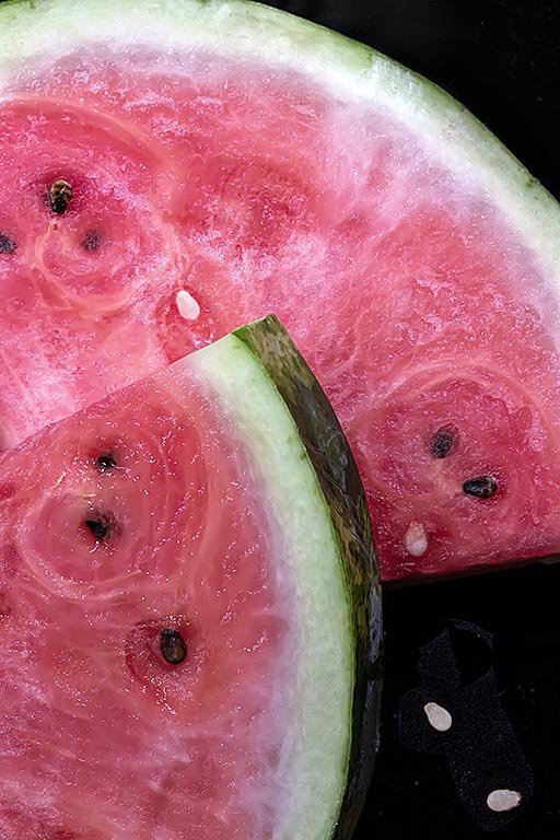
This image certainly captures the luscious nature of these subjects. I love the simplicity of the setting and colors that are contained within. The seeds do definitely adds to the story and to the image as a whole, so ensuring their presence was a good choice.
I do find though the foremost subject does tend to blend into the subject behind it. I am not sure how to address it since there is a defined edge between the tow. Perhaps if one darkens slightly the foremost subject just a bit more and/or lighten the background might aid in the separation of these elements. I also am enjoying the lighter seeds on the tabletop, but they do appear to be somewhat blown-out, so their impact is lessened some. Perhaps adding a bit of texture back (by cloning over these with some of the dark seeds and reducing the opacity of the cloned layer) might help. I tried this in my version of the image (provided solely to illustrate my ideas) but only with marginal success.
My personal bent with these types of shots is to add a bit more micro-contrast to the entire image to bring out more so the watermelon texture contained within the slices. I would also darken and/or add some contract to the white areas of the rind to emphasize the color transitions between the pink, white and green hues. Food or thought (if you pardon the pun). I have included an example of this image where I made some of these changes to illustrate my thoughts more fully.
See what you think...
|
Nov 12th |
 |
4 comments - 1 reply for Group 65
|
4 comments - 1 reply Total
|