|
| Group |
Round |
C/R |
Comment |
Date |
Image |
| 65 |
Jul 20 |
Reply |
I did not use the color replacement tool. Rather I added a color layer and adjusted the opacity and blend mode to get this effect |
Jul 17th |
| 65 |
Jul 20 |
Reply |
I like some of the effect you have achieved, but don't care for the increase in the speckled appearance of the rock. To my eye this adds a sense of clutter to the subject that I don't want. |
Jul 16th |
| 65 |
Jul 20 |
Reply |
It is a continuing challenge to see the same things in our shots that others see. It is really hard with our own images since we live with them all throughout the creation process from vision through execution to the final result. We know what we saw, and what we intended to show, but at times its difficult to acknowledge what we actually present in the image. It just takes experience and practice, and is part of the normal photography learning curve, so don't feel bad.
Go back to your original edited image and practice expanding your canvas some. It's worth taking the time to practice this now rather than waiting until the next new opportunity presents itself. Once you do this a few times, it will become easier to remember it in the future, and there will be less of a hurdle to giving it a try. "Been there, done that, have the tee shirt".
|
Jul 16th |
| 65 |
Jul 20 |
Reply |
I don't think I did anything to sharpen the image. What I did do was to replace the blown out hot areas with a color replacement and made bit of a curves adjustment. I did not try here to "tone down" the hot spots. This is often not very effective with hot spots as these regions are often 'blown-out' and there is no pixel differential information for Photoshop to work on. |
Jul 16th |
| 65 |
Jul 20 |
Comment |
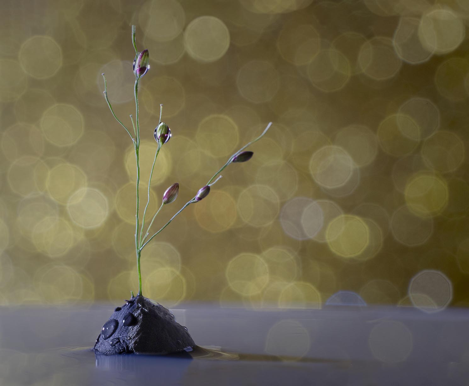
I can see that you put in a lot of effort in constructing this shot and your efforts have paid off handsomely. I love the composition (except for a point I will note below), the colors, and the specular highlights in the background.
I do find that the crop of the image appears overly constrained to my eye. I would have liked to see a bit more at the bottom, and especially more at the top such that the upper stem does not go out of the frame. You spent so much time successfully pulling all of the elements together, just to have that last point present an unneeded distraction.
This is a great shot to practice expanding your canvas within Photoshop. Here you could expand the canvas of your image a bit at the top and bottom either allowing Photoshop to fill in the expanded regions with "Content Aware Fill" or by manually cloning in the relevant background and foreground elements. Note though that the Content Aware Fill is not perfect and minor cloning corrections and edits are needed to fine tune the process. This is a great technique to master and I have used in quite a lot to fine tune those shots where I was just a bit too tight. It has "saved my bacon" more than a few times.
My final suggestion is to allow just a bit more detail to show in the shadows of the clay base. To my eye it's a bit too shadowed, and if I could see just a bit more detail here, the entire image might feel a bit more balanced. One last point to consider is are the specular highlights needed in the grey foreground?
I have tried my hand at editing your shot to incorporate some of these suggestions to illustrate my points. See if you like these ideas (or not).
Regardless of these minor points, it's a great shot and your submission are dramatically improving.
|
Jul 9th |
 |
| 65 |
Jul 20 |
Comment |
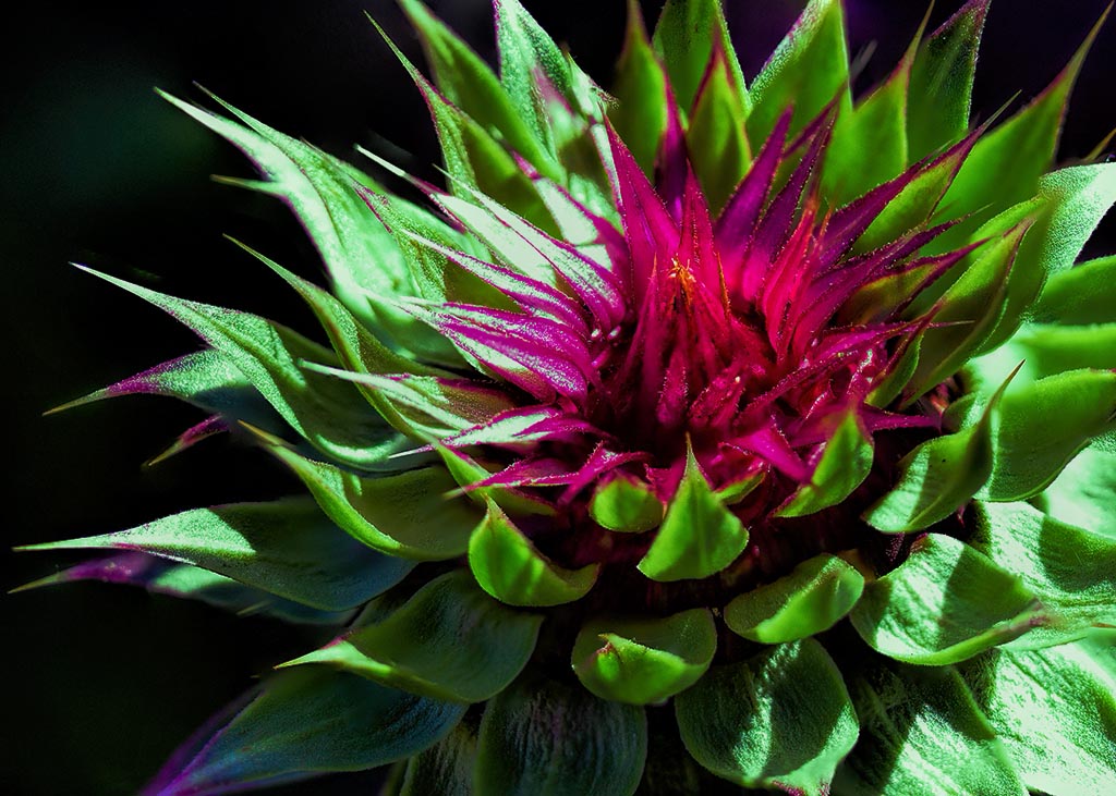
These plants make such wonderful subjects with the color, texture and dimension. In this shot you have successfully given us an up-close and personal look at this subject. I love the color and detail throughout, and especially in the center.
To my eye the exposure here is a bit hot, with many hot spots which distract my eye from the center of the bloom and from the bloom as a whole. These plants often have a slightly waxy finish to the leaves, and tend to reflect light a bit more harshly that what we might expect. Use of a diffuser or shooting at a different time might help here. I did try to address the exposure some in post processing, where I used a series of luminosity masks to target the brighter areas, and added a bit of green color to the areas since there was little information in these regions to enhance or to work with (see attached). Perhaps this just made the shot different rather than better. See what you think.
Finally, the entire image is not entirely sharp or in focus where elements closer and further away are soft. Perhaps this is due to the few focus slices you collected, the aperture employed (f/2.8 has little depth of field) and/or perhaps to a too large a focus distance between each focus slice.
I am impressed that you attempted collecting focus slices while hand holding the camera. This is a very difficult process to master and often takes many more slices to ensure that the entire subject is sharply represented in the focus slice collection. I do know that Don Komarechka (an impressive macro photographer @ www.donkom.ca) uses this techniques to capture his snowflake images, but as he admits there is a bit of "spray and pray" in executing this technique as well as years of trial and error to perfect. In doing so he often shoots 100s of image to get his final stacked image.
If I were using my 100 mm macro lens I would be tempted to shoot at least 20-30 slices with the camera mounted on a tripod, to make this shot (but that's just me).
|
Jul 8th |
 |
| 65 |
Jul 20 |
Comment |
What a fun shot. You have successfully captured some of the 'character' of this little critter by giving us such a clear view of it's face and eyes. They really are compelling here, so kudos for your efforts. In this case the limited depth of field, only allows for some of the body to be in focus, but here that may not be detrimental. In redgard to what you have given us, this is sufficient. We do see a slight amount of the environment (i.e. clear parts of the flower) that the critter is sitting in, but not as much as I would have liked to have seen. Showing more of the flower that he (or she) is sitting one would make the subject a bit less solitary and provide a bit more context to where he is and what he is doing. In this presentation, a majority of the image is of the blurred and indistinct flower and adds little value expect for showing his little body in the midst of a larger flower bloom. Had more of the flower be clearly presented this latter effect might have been far more effectively leveraged.
In this case you could have captured the spider first while he was sitting still, and then without moving your camera (hopefully while on a tripod) reshot the entire field as a stack to insure that more of the flower was in focus. This is more work, but good macro photography takes this kind of effort. The non-macro photographers in the world often don't realize the amount of effort it really takes to get those spectacular shots. Rarely is it a one-shot effort.
Often when we are shooting, and see a great opportunity for a shot we get so excited that we forget in that moment, all of the lessons we have learned, and only after the fact do we recall that we "should' have done. Actually, this is quite normal. In the Photography "learning curve", the next stage after learning techniques, is forgetting them in the moment as we shoot ("been there, done that, often still do, have the tee shirt"). The solution is experience and practice. The more experienced you get, the earlier in the shooting process you recall and begin to apply the techniques and lessons you have learned. There is no way around this and we all go through this stage. Now you see where you might of applied a techniques when another points it out after the fact. Next you may begin to see these instances yourself on the computer. With more experience you might begin to see the on the back of your camera (hopefully before you leave the site), and finally you will recall and apply the lessons as you are shooting. This propagation of events comes with experience, so keep on shooting and you will advance.
|
Jul 8th |
| 65 |
Jul 20 |
Comment |
Technically this is a magnificent shot. I love the sharpness and color and I personally really like the back background you have employed here.
However, I don't disagree with your comment that "something is missing or is odd here".
Here I believe that it is the composition and relative placement of the three shells. We don't have sufficient separation between the left and middle shells, and they apper to meld together both in texture and in tone. There is almost an "M.C. Escher like effect " with these two shells.
Try this image again but rearrange the shells with an eye of more separation between the subjects. They don't need to be completely distinct from one another, but they do need to be uniquely identifiable. One could also make one of the shells slightly lighter or darker than the others to aid in this separation, but in this specific case, I don't think that would be sufficient.
Its hard to make a great shot from a poor composition, and at times its really hard to access the quality of the composition while we are shooting. That takes experience and practice, and is part of that "photography learning curve" thing I mentioned in my comments of Vinod's image this month.
This does have the making of a wonder image though. Keep hitting that shutter button.
|
Jul 8th |
| 65 |
Jul 20 |
Comment |
Another impressive addition to your collection of water drop collisions. In the past I have consistently noted that to my eye, your images appeared a bit too constrictive, and that by backing off a bit, the over-all effect and beauty might be more effectively portrayed. In this case though I don't feel that way. Aside from the beauty of capturing in detail an event that normally happens but is rarely seen, here the focus is upon the separation for the secondary collision structure (which I call the 'collision table') from the Worthington jet. Capturing this within a water drop collision event always impresses me and fills me with awe and wonder.
I have a few images that capture this type of separation (mostly by luck), but have yet to discover the conditions that make this more reproducible in my images. You inspire me to try yet again.
In this specific image I love the color and translucency of the subject, and am especially enjoying the symmetry and shape of the Worthington jet. I do find that the edges of the splash at the very top is a bit soft and wonder if sharpening in post processing might help a bit here.
Nice Job.
|
Jul 8th |
5 comments - 4 replies for Group 65
|
5 comments - 4 replies Total
|


