|
| Group |
Round |
C/R |
Comment |
Date |
Image |
| 65 |
Jun 20 |
Comment |
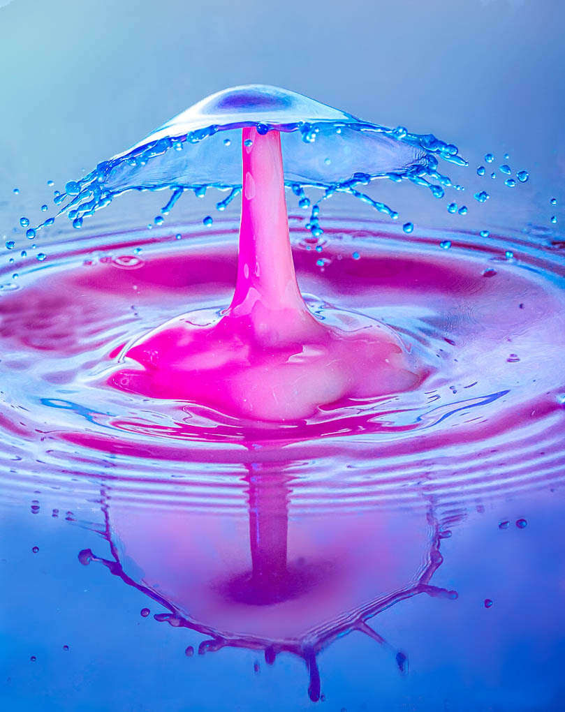
Here you have given us is another magnificent drop collision event presented here in a wonderful wash of color. I appreciate the timing that was required to capture this precise moment and an enjoying the color that the different parts have and the reflections you have given us. I find through that the image is too cramped and that the energy imparted by the spreading drops is truncated by your crop choice. To my eye it also feels as though that the image is a bit overexposed and that some of the detail associated with the jet and base is lost some and that there is a "flatness" associated with the images. Finally There is some mottled texture in the background just behind the cap that is a bit bothersome and distracting. It this were my image I would remove that to retain the clear smooth background, and add a bit more contrast. I have tried my hand at some edits to illustrate some of these points. Here I removed the distractions from behind the cap, added a bit of micro contrast to the image, slightly darkened the background and sharpened the collision even a tad. See what you think. You may or my not like the modifications. |
Jun 15th |
 |
| 65 |
Jun 20 |
Comment |
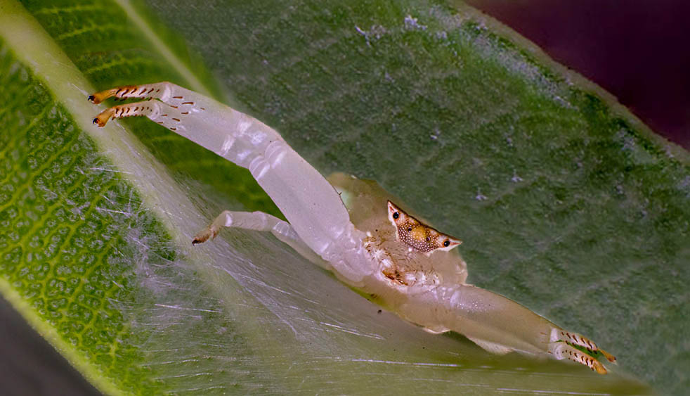
It seems that this was a difficult shot given the space and the environment. Such conditions can make collecting focus slices challenging. Kudos for the effort. It was nice though that the subject chose to remain still as you collected your images. I am enjoying the clarity of the subject and of the surrounding area. The composition is especially effective with the parallel lines between the subject and leaves supporting one another. I do note that there are bands of sharp regions and of soft areas in this image and these areas of differential focus are somewhat distracting. Here I referring to the areas of the leaf in the background and foreground where parts are sharp and other parts are soft. There was a lot of distance to travel to capture all of the leaf sharp with our focus slices, so I understand the challenge., but never the less the distraction takes me away for the main subject. Here I have provided a edited image I have applied some rather aggressive cloning to remove the soft areas and to add back a bit of the spider's right claw (copied from the left) to illustrate how the image might appear if the banded areas of focus were not present. I am not suggesting that this is a better images, but only to demonstrate the points made here. |
Jun 15th |
 |
| 65 |
Jun 20 |
Comment |
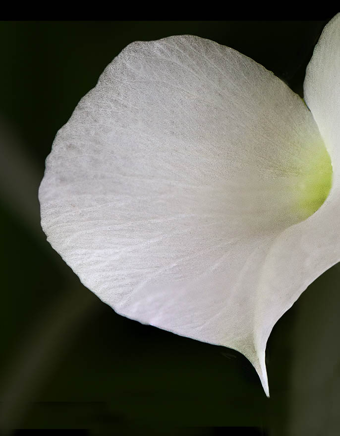
I love the simplicity of this image, and the starkness between the subject and it background. One of the attributes that this image exhibits is the detail within the bloom, and the subtle blend of colors as the petal transitions into it's throat of the flower. Since this detail is presented as being important I would be tempted to bring it out a bit more in post processing. I am also lees of a fan in regard to the blurred tendril in front. Finally I feel that the flower is just a bit cramped and leaving a bit more space at the top and bottom would allow me to relax into the image a bit more (don't you love the technical terms I use here ?). Luckily all of these points are both minor and easily addressed. I have included my attempt to do just this to illustrate my thoughts.
See what you think. |
Jun 15th |
 |
| 65 |
Jun 20 |
Comment |
There are times when we get the urge to really "create an image", and it sounds as though this was the case with you. The result is a really interesting piece of art. Presenting this image as a piece of art means that we have a bit of latitude in presenting the image as realistic rendition, and this is not a bad thing. I am enjoying the colors and textures you have worked so hard to bring forth, both in the flower and in the background. Personally I like the original background, but what you have given us is also quite noteworthy. If this were mine I would be tempted to darken (or perhaps lighten) the stem thereby allowing it to stand out a bit more from the background. Since it currently blends in so well with the background, the flower appears to be floating in the midst of nothing, and it lacks some grounding to it's environment. While that is not a requirement in one's artistic rendition, I do feel a bit of tension here in that the bloom in not connected to it's surrounding. I am not sure you intended this tension. Other than those minor points, nice image. |
Jun 15th |
4 comments - 0 replies for Group 65
|
4 comments - 0 replies Total
|


