|
| Group |
Round |
C/R |
Comment |
Date |
Image |
| 65 |
Sep 19 |
Reply |
In terms of a variable intensity LED light, I have used the...
Neewer Super Slim Bi-Color Dimmable LED Video Light with LCD Display, 2600mAh Li-ion Battery and Charger - Ultra High Power LED Panel, 3200K-5600K for Camera Photo Studio Portrait Video Photography
which runs around $ 50 on Amazon. It runs off of a rechargeable battery or on household power. You do need a stand (mini-tripod) for it but perhaps you already have one. |
Sep 24th |
| 65 |
Sep 19 |
Comment |
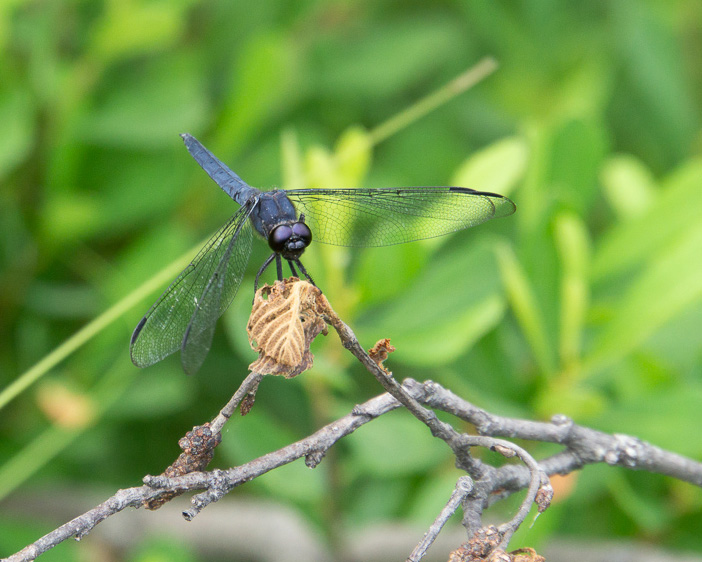
What a clean and effective image. I love how you have really "nailed" the depth of field to effectively give a clear dragon fly in the midst of a complex and wonderfully blurred environment. So why not take advantage of the beautifully captured subject. In this case I think the concept of "less is more" applies. I would the tempted to crop in significantly to show off the subject (the dragonfly), and to minimize most of the background. As it stands now, the dragonfly is a relatively small part of the image even though it is clearly the main subject, and as such it getting a bit lost in the presentation. I have attached a cropped version of this image. See if you feel if is or is not more effective in presenting the dragonfly (presumably your main subject and "the story" here) in a more compelling fashion. |
Sep 18th |
 |
| 65 |
Sep 19 |
Comment |
I love this image. Its simplicity in form allows for the effective presentation of the critical elements. Technically the exposure and focus is very effective so I have no issues there. I do seem to get a bit lost in appreciating what the true subject is here. Is it the writing, or the pen that presumably creates the writing? You have positioned the pen in such a way that this point (to my eye) is a bit unclear. The amount of writing included in the image further serves to confuse the point some. Clearly the pen and the writing it creates, is the story, but who is the main player and who is the supporting cast. Here I see equal weight assigned to both, so I find myself jumping back and forth from the pen to the writing and back again without the satisfaction of "settling in" to the image as a whole.
Do the others get the same feeling or am I just being overly critical? I am open to any additional comments and thoughts here. |
Sep 18th |
| 65 |
Sep 19 |
Comment |
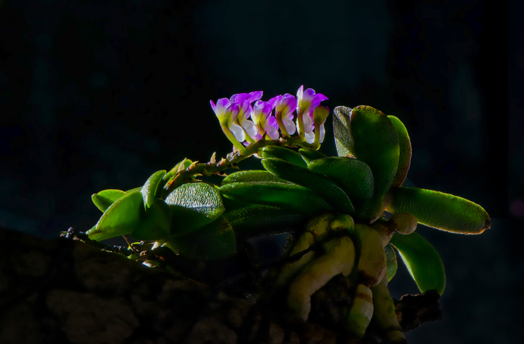
What an interesting image. It has this Dark and Moody feel with the low key presentation and the rim lighting. That being said, I find myself wishing that I could see more the central subject, and that the rim lighting associated with the blooms not be as harsh as it appears in this presentation. If this were my images, I would be tempted to increase the detail in the shadows just a bit so that the central area of the main subject contained a bit more detail, and I would reduce the intensity of the bright highlights such that the wonderful detail in the blooms were more evident. Finally to my eye the image looks a bit unbalance. I do appreciate that the main subject is on a power third, and that you have left room for the stem (?) to move outward from the bloom to the left. However, since the stem is so dark and there is so little detail visible in this element, to my eye it fails to carry its weight in filling the space you have provided, and the result is a lot of empty space with little detain to anchor it.
I have edited this image with these thoughts in mind and had attached it here to illustrate my thoughts. See what you think. |
Sep 18th |
 |
3 comments - 1 reply for Group 65
|
3 comments - 1 reply Total
|