|
| Group |
Round |
C/R |
Comment |
Date |
Image |
| 65 |
May 19 |
Comment |
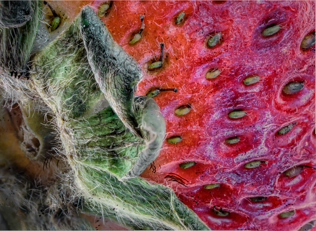
You have successfully captured a considerable amount of detail here with your application of focus stacking. However, the image appears to me to lack a sense of depth here. This is common in focus stacking, and often needs to be addressed in post processing. I also see a large amount of blue specular highlights in the strawberry with just don't seem to belong. Fortunately, these issues can be addressed in post processing. I would be tempted to select and darken the background portion of the image on the left, that being the part of the image that is behind the prickly leaf. This will allow the leaf to stand out some giving some dimension to the image. Also I would try to select and remove the blue specular highlights within the body of the strawberry (a luminosity mask would be helpful here). Finally I would enhance and darken slightly the color of the strawberry to allow it to recede slightly from the prickly leaf which appears to be extending out toward the viewer. I have applied some of these things to your image to illustrate my thoughts. See what you think!
Focus Stacking can bring out the detail in our macro shots, but there is a price to be paid here. Often we lose a sense of depth in stacked shots, and we need to restore this in post processing (selected darkening, and/or blurring background elements may help). Stacking also often brings of a lot of specks, dust and specular highlights which we also need to address. I guess there is no free lunch.
|
May 11th |
 |
| 65 |
May 19 |
Comment |
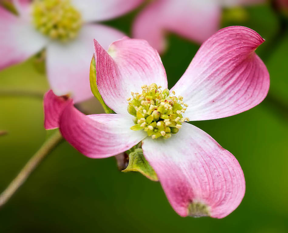
Great flower image. Lots of interesting shapes, flow and colors associated with this shot. I do find though that the other flowers in the background tend to compete with your main subject adding a bit of a cluttered feel to the image. Also, I was disappointed that the star of the show, your main bloom was not more in focus. If a specific bloom is to be showcased, I believe that it ought to be (at least in part) in focus. I think though that you could address some of these points in processing. Cropping out some of the image on the left may remove some of the background clutter without lessening the impact of you shot. Also, I would be tempted to blur the background a bit more than it already is and to darken it a bit to allow the central bloom to stand out a bit more. Finally I would attempt to sharpen the central bloom some. I tried applying the "shake reduction" filter in Photoshop to the main image (found under the Filter => Sharpen => Shake Reduction Photoshop menu). This filter can often work wonders in a photo if the blur is due to camera shake. If the subject is moving, then this filter is less effective. I have applied some of these things to your shot to illustrate my thoughts some. See what you think! |
May 11th |
 |
| 65 |
May 19 |
Comment |
Now you are cooking!!! This is a classic macro example - Bug Critters "up close and personal". Personally I don't tend to take these subjects, but that does not diminish your choice of subject and the interesting profile of this critter that you have given us. Well done! Great clarity and composition, and I appreciate the effect that the surface substrate gives us. All well thought out and executed. I might be tempted to lighten considerably the reflection of the bug on the upper left quadrant, as this dark element tends to over-balance the image some. The head-on, center weighted positioning of the subject imparts a basic symmetry to the shot, and this reflection competes with this symmetry. Aside from that, wonderful shot! |
May 11th |
| 65 |
May 19 |
Comment |
Great story. Starting out in one direction and moving in another as the shot dictates. Boy if that isn't the story of our lives ��
I agree that the flower center holds a lot of interesting elements, and 'focusing' in on that story yields an interesting shot. Now we just need to bring these elements out a bit more. I would be tempted to darken the petal on the upper left to contrast with and separate from the towering flower elements in front of this petal. I would also be tempted to add some micro-contrast to the white elements at the bottom of the image. I love how you captured all of these elements with the selected crop, but now I feel that we need to make them stand out a bit more. You got the cool stuff, now you need to flaunt it !
|
May 11th |
| 65 |
May 19 |
Comment |
Sounds like you did all of the right things here, including your thoughts and efforts regarding the set-up, collecting the image(s) and follow-up processing. I find that there is always quite a bit of processing needed after I obtain the stacked image. As to your final image I love it. The subject, background, reflection and composition all work wonderfully together to give us a piece of art. The only thing that bothers me somewhat is the fact that some of the pearl button (upper left elements) looks a bit overexposed and we lose some of the detail. I suspect that there is still some detail here and that further processing using micro-contrast (clarity), dehaze and levels might recover some of this. All in all though a great shot and one of your better entries. Well Done !!! |
May 11th |
5 comments - 0 replies for Group 65
|
5 comments - 0 replies Total
|