|
| Group |
Round |
C/R |
Comment |
Date |
Image |
| 65 |
Apr 19 |
Comment |
I love what you have given us in this image. You really nailed the concept here, giving us a new and in-depth detailed view of the everyday. The colors and composition here presents us with a pleasing tableau from the everyday, something not often provided. Kudos.
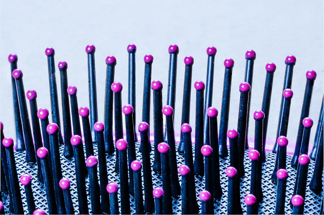
Here you have begun to master the Focus Stacking technique, with wonderful detail.The good news is that Focus Stacking brings out lots and lots of detail, while the bad news is that Focus Stacking brings out lots and lots of detail and specular highlights. In fact Focus Stacking often brings out too much detail, some of which we failed to see when we the generated the scene and other artificially generated or emphasized (like many specular highlights).
I think that this may be the case here as well. Do you really need all of the small specks that you see on all of the brush bristles ? I find that with I focus stacking, there is often (very often) a lot of "clean-up" that is required with the final stacked image. Here I would be tempted to remove over 80 % of the small specks and specular highlights. Using the cloning tool in Photoshop, I did this to demonstrate my point, and it took me about 20 min to do so. However the resulting image is much cleaner and more pleasing (to my eye) to view and enjoy. In this case I also replaced the white stark background with a slight light blue backgound, to lessen the harsh contrast between the bristles and background.
This type of clean-up is very common when Focus Stacking is employed, and is just the cost of doing business. I have yet to find a global tool that effectively does this (such as "speck or dust removal" which does a rather poor job), so often the clean-up needs to happen "one speck at a time". The good news is that you quickly get very practiced and accomplished at these small edits. See what you think about my edits, and see if this cleaner image is more appealing. This is one of the secrets that few outside of the macro photography environment know about.
|
Apr 12th |
 |
| 65 |
Apr 19 |
Comment |
I love your minimalist approach to this image. You have given us a detailed yet unfamiliar view of an otherwise common (to many) event. Wonderful.
I would not change anything in the main subject. I do find that the wisps of 'whatever' you have given us outside of the actual cork to be distracting. To my eye they add a sense of messiness to an otherwise simple and powerfully minimal presentation. I find that I am continually trying to clean my computer screen to remove this 'dust' or whatever.
|
Apr 12th |
| 65 |
Apr 19 |
Comment |
I appreciate how you were trying to add an additional level of depth and richness to what might be a somewhat plain image. Giving additional texture to your image is a way of accomplishing this.
In this case though, I think that you went way overboard with your application of a texture. To my eye this image screams TEXTURE with a hint of subject. The texture competes with and obscures your subject, and so the impact is lost (or is refocused to texture rather than subject).
Here I would dial back the magnitude (opacity) of the texture you added, and even differentially add less texture to the subject than what is added to the background. Here less may be more.
|
Apr 12th |
| 65 |
Apr 19 |
Comment |
I really am enjoying this image. The subjects are complex in their content, but the setting is simple and minimalistic, which serves to emphasize the detail of the buttons even more. However, the side lighting and the selective shadows really make this image sing.
Taking more 'focus slices' can aid in giving a more uniformly sharp image, so I tend to error on the side of taking more than less. Perhaps this is why we loose a bit of clarity on the far surface of the top button. Also I don't know how many times I wished I would have backed off a bit and included more of the area around a subject in my slices, so the issues you note here are not unfamiliar to even the most experienced macro-photographer.
In this image I find that the brightness of the light facing elements to be a bit distracting, especially on the right edge of the lower button. If these areas could be toned down some in either the light setup (hard to do after the fact) or perhaps in the post processing, a bit more balance might be achieved without sacrificing the directional quality of the light and shadows you captured here.
I really appreciate how you challenged yourself in setting up the lighting here. Isn't amazing how difficult and challenging it can be to see these aspects of light, when we are taking the actual images. It's something I try to work on, and I am glad to see that you are too.
|
Apr 12th |
| 65 |
Apr 19 |
Comment |
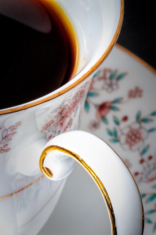
Wonderful subject. I especially like how you are pushing yourself to find a more subtle level of expression in your macro photography, That's where the craft becomes both more challenging and rewarding, and something worthy of working on in our study section.
Here you state that for concept was to 'focus' our attention to the cup handle, the rim, and the edge of the coffee. One of the ways you have successfully chosen to do this is to ensure that these are the most clear areas of the images. However, in this case this may not be enough. Don't forget to apply other means of emphasis (or de- emphasis) as well, such as selective tonal alterations. If one were to subtly darken the background saucer (relative to the cup sides and handle), this might improve the separation between the foreground subject and a background element and add a bit more dimension and depth to the image. Sharpening a bit more, the cup side and handle some might also aid in this separation, and subsequently in the 'story' you are striving to tell.
As an aside, I also find that the reflection of the handle on the side of the cup, at its point of connection adds a bit of distraction, but I am at a loss as to how to minimize that element in this image. Perhaps with a different angle this might be addressed some, but not in the image as it currently is framed.
I have tried to add these edits to the image using selections, masks and adjustment layers to illustrate my point. These edits are not large, but effective edits rarely are. Here we are trying to 'nudge' the viewer into seeing things from our desired perspective. See what you think ?
|
Apr 12th |
 |
5 comments - 0 replies for Group 65
|
5 comments - 0 replies Total
|


