|
| Group |
Round |
C/R |
Comment |
Date |
Image |
| 65 |
Dec 18 |
Reply |
Interesting take upon my image. In this shot I really wanted to bring out the subtle shading and falloff of light, and I feel that this B&W version loses a lot of that subtle quality. Also I find that since the color interplay between the yellows within the flower head and the greens of the stem is lost in the B&W version, so is some of the consecutiveness between these elements is weakened. So, in this case I don't feel that the conversion adds to the image, so I am not a fan of this version. |
Dec 26th |
| 65 |
Dec 18 |
Comment |
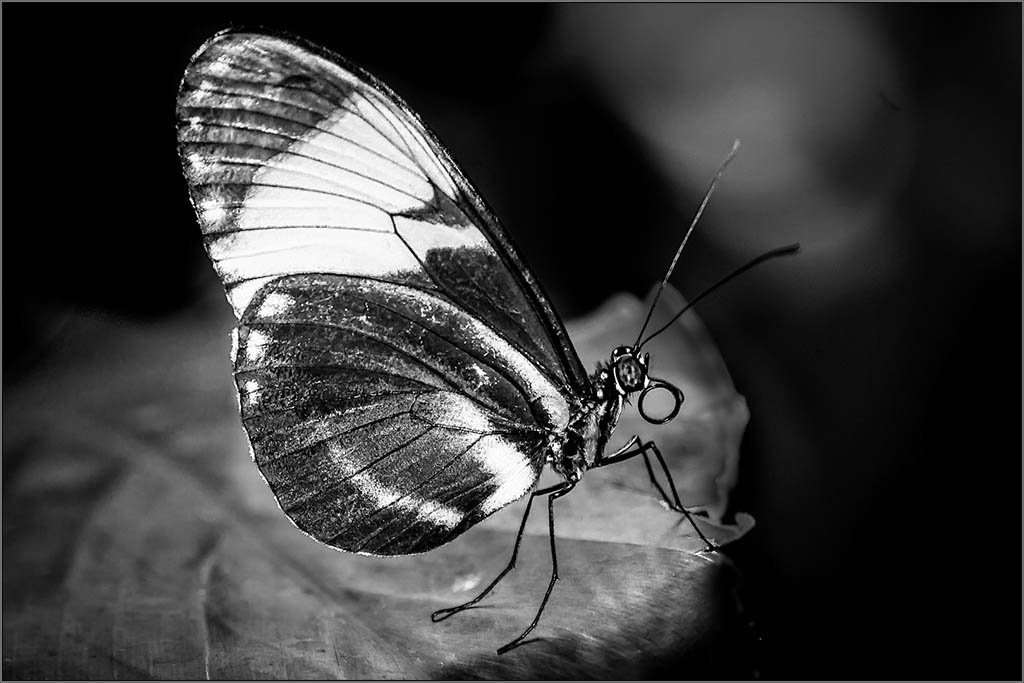
This is a great monochrome view of this butterfly. There is a good tonal range is this image, and the clarity of the butterfly is wonderful. The composition of the image is lost a bit since the dark right hand area of the image merges into the dark background of the presentation application, making it appear as though the butterfly is centered. In this case I would be tempted to crop of a bit of the left hand images (putting the wing on a third), and adding a thin white or light gray pinstripe border around the image. (I tried this below, but the border is not shown effectively when the image is mounted on the gray background. It would been when placed on a dark background). In doing so you take control of the composition. |
Dec 24th |
 |
| 65 |
Dec 18 |
Comment |
Welcome to our little group, George. You image has given us a different view of these flowers playing upon a strong foreground, and an interesting background. The colors and clarity of the image are spot on. Since you have chosen to make the large foreground flowers the main subject, I think that you could afford to loose a lot of the sky. As it is now it feels a bit unbalanced since the flowers are so predominant, yet you give equal weighting to the empty sky (as shown by the large percentage of the image the sky represents). I suggest cropping out a lot of the sky and bringing back (if at all possible) the tip of the foreground flow that you cropped off. |
Dec 24th |
| 65 |
Dec 18 |
Comment |
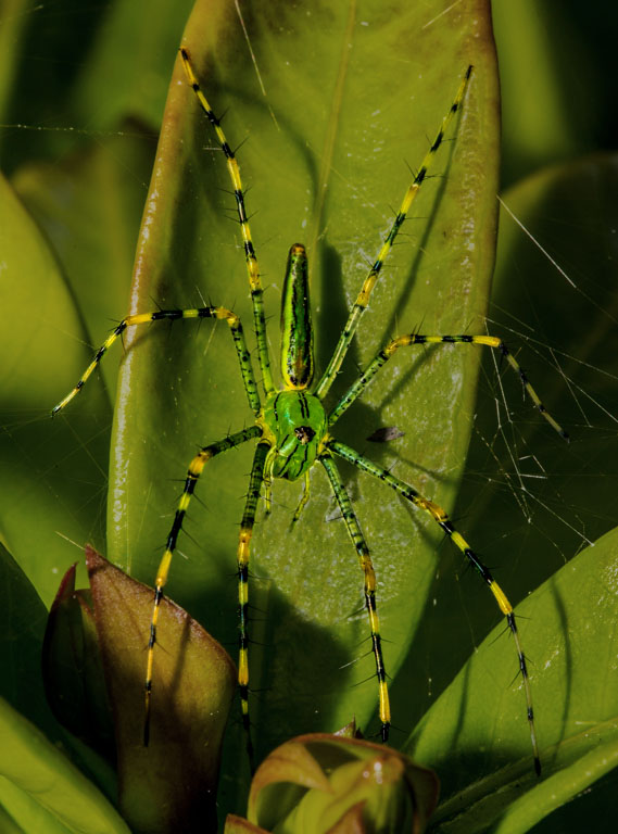
Nice capture of a 'wee bit of nature'. Well seen and well captured. That being said, I think that the shiny reflection in the leaf is very distracting taking our eye away from the main subject. I would have removed this distraction by cloning over the shiny areas of the leaf. In the attached example tried this to gage the effect. I also darkened and desaturated the leaf behind the spider to bring of the subject a bit. See what you think �� |
Dec 24th |
 |
| 65 |
Dec 18 |
Comment |
What a great idea in only showing us a portion of the original image (and thank you for showing us where your image came from). I am enjoying the colors, content and composition of the final shot, although I would have not cut off the bit of wing at the top. The final image looks a bit over-processes (slightly posturized) perhaps due to the magnification from the tight crop. I suspect that you were running out of information (pixel depth) in this image since so little of the original image found it's way to the final presentation. I agree with Angela that the white spots is a bit distracting, and should be toned down or removed. I think you could do this and still have a nice text backdrop. |
Dec 24th |
4 comments - 1 reply for Group 65
|
4 comments - 1 reply Total
|