|
| Group |
Round |
C/R |
Comment |
Date |
Image |
| 65 |
Mar 18 |
Reply |
You noted that you "processed 11 shots with Lightroom Classic CC" (not Photoshop CC) . I assumed that you were indicating the processing performed was a focus stacking process. Perhaps I was wrong. However I have seen this miss-conception regarding the "Stacking" functionality in Lightroom before, so let me address this miss-conception
When you have a lot of similar images from a shoot, you can organize them using the Lightroom Stacks feature. This allows you to stack images together so that only one image representing the stack appears in the Grid, Filmstrip and Loupe. This can clean up the screen reducing the number of images you see.
This is an organizational tool, and has nothing to due with processing multiple files. This is not a focus stacking tool. Lightroom cannot (at this time) perform focus stacking since Lightroom does not use layers, and most applications use layers in their workflow.
In regard to "cutting off" part of the flower generally you either leave the entire area (center of the flower) or you demonstratively crop (crop a lot). You don't normally "barely" crop of the edges of the main subject. This is what I noted in your images. I suspect that this is also the case in portrait photography. You can crop off a person's head in a portrait, but you do it in a meaningful and demonstrative crop, and not is such a way as to loose just a small bit of the subject.
In the attached image I performed a demonstrative crop, although I would normally not cut off the small petals in the upper right, but since your submitted image had then petal cut off, and I could not recover them.
|
Mar 14th |
 |
| 65 |
Mar 18 |
Comment |
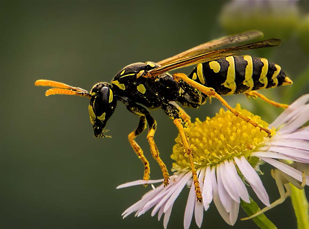
Aren't bugs fun! And it looks as though, for the most part the bugs looks as though he (or she) was willing to cooperate with you some. Here you give us is a lot of wonderful detail and color, and the clarity. It does not bother me that the tip of the wing is a bit soft. This provides us with just hit of the sensation of movement, something that makes sense in this image.
One thing inherent in these types of images is often they can benefit for additional processing. For example, the upper part of the thorax, and some of the tail end of the body looks a little washed out, and could use a bit of levels adjustment to deepen the blacks without loosing the native detail. Also, I find that the background is not blurred enough. We see some sharp edges in the background flowers, and this suggested that there was movement there. But in this case this distracts from the image. I would isolate the background from the foreground (via selections and masks) and blur the background a bit more. I would also darken the background a bit. BTW - When I wish to make my subject really stand out from the background I isolate the subject from the background, and do three things: 1); Blur the bkg. 2) Darken the bkg, and 3) Desaturate some the bkg. Doing these things tends to separate the subject from the background and adds a sense of dimension and depth to an image.
I also feel as though there is a bit too much space in from of the bug (on the left). It's good to leave some space in this direction for the bug to move into, but there seems to be a bit too much space (to my eye) here. Try cropping in the left edge to bring the bug's eye right to the third line.
I have tried to do these things with the image to demonstrate my thoughts further. See what you think about the impact of these ideas.
I am looking forward to your next submission.
|
Mar 8th |
 |
| 65 |
Mar 18 |
Comment |
Such a unique piece of jewelry, and a worthy subject for a macro shot. The pendant shape, texture, bronze color and contours all bring us an interesting subject. These elements accent nicely the Koi figure which is clearly your centerpiece. I also am enjoying the cloth the pendant is on. Both the color and texture provide and pleasant contrast to the actual pendant.
That being said, the reflections in the pendant of the lights are a bit distracting. These blown-out areas lack detail, and contrast with the native color and texture of the pendant.
This image also feels a bit cramped. I appreciate how , in your cropping to moved the main subject to a (thirds) power point, but the fact that some of the pendant strap was cut off in the upper left, and that there was so much empty space along the right edge conspire to give the image a somewhat unbalanced and cramped feel (to me) .
|
Mar 8th |
| 65 |
Mar 18 |
Comment |
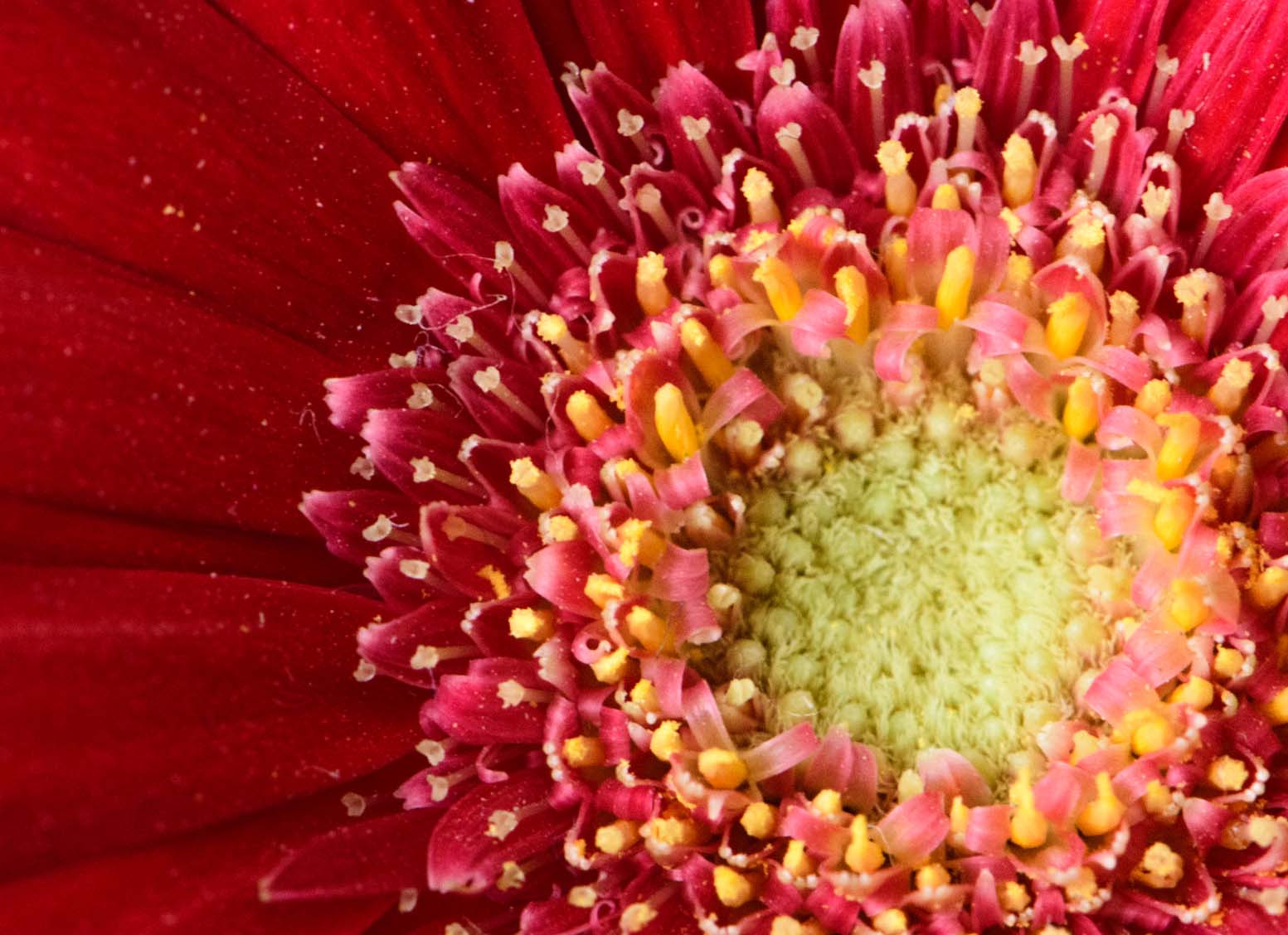
This is a great subject, and your portrayal of it is well seen and conveyed. I like how the petals stream from the center highlighting the center as the 'main' subject. The colors also serve to reinforce this concept.
That being said, the overall softness of this image detracts from the overall feel of this image. The detail in the flower center is just not sharp enough to support the central role you have given it. We miss the detail in the very center, and the little flower-like structures that top the tips of the pistils and the small petals lack definition and clarity.
I am a little confused as to how you processed 11 images (in what I assume is a "stacking process") in Lightroom. I was unaware that Lightroom could perform a stacking process since this is usually done using layers, and unlike Photoshop (or Elements) Lightroom doesn't use layers in its processing. The image does not look as though it was the results of a 'focus stacking' effort.
Finally, I feel as though some of the flower center was cutoff in this shot. The tips of the center bloom are lost in at both the top and bottom edges. Generally one tried to either leave the entire center structure present or crop in a visually intentional manner to signal your intent. In this case neither was done and it leaves a somewhat incomplete feel to the shot.
I hope that you don't let these comments dissuade you from future efforts. In this study group we all 'crash and burn' from time to time, and that's fine since we are all pushing ourselves in unfamiluar ways within this Study Group.
I am looking forward to seeing your next efforts.
|
Mar 8th |
| 65 |
Mar 18 |
Comment |
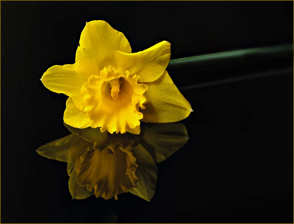
I love your image. Not only does it have great story, composition, subject and color, but with the reflection and dark background it conveys a sense of emotion as well. Well thought-out and executed. The border was also a good inclusion since now you define the border rather than letting chance provide a suitable background to bound your image.
To my eye it looks a bit cramped within the defined border. Perhaps without the border it may look less so, but with the border to me it's a bit confined. I would suggest adding a bit of space around the image (before applying the pinstripe border). Since the background is so uniformly dark and simple, this is very easy to do in Photoshop (expand the crop areas beyond the images edges with 'content aware' box checked in Photoshop). I would also burn in (darken) the far edge of the stem to help with it's containment. As it is now the constant green straight stem pulls or eye away from the subject and right off the page (don't you just hate those pesky compositional things?).
Finally I would alter the color of the pinstripe border to reflect colors in the image. It may be a monitor to monitor thing, but to my eye the orange color is a bit discordant with the rest of the image. I have tried these suggestions to demonstrate my thoughts. These are all relatively minor issues, but see if the image is improved when applied. Nice Job !!!! |
Mar 8th |
 |
| 65 |
Mar 18 |
Comment |
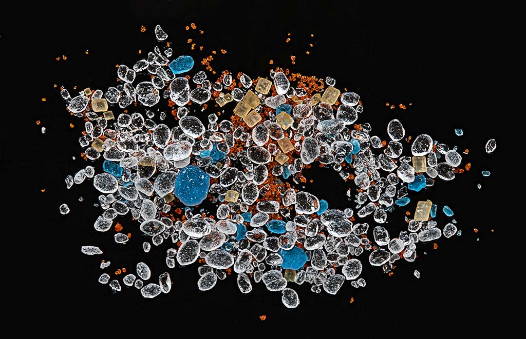
I love it when a plan comes together, and your plan surely did in this image. What a wonderful mass of color, shapes and texture. I love how you thought this out, found the materials and then proceeded to give us something special.
You are correct in observing that when we generate the 'focus slices' the camera and lens moves slightly. In fact as we change the focus (moving in or out) the size of the image changes a bit. The good news is that this does not matter. During the alignment process the stacking software (or the stacking process in Photoshop) scales each image slightly to account for this, and these adjustment processes are rather robust. I don't think that the long exposure time is the issue. I have successfully stacked tens of slices (30-40) where the exposure was two or more seconds per focus slice. Of course this assumes that we have dampened out other sources of movement (calm air, camera on a tripod, locking the cats up in a nearby room).
I said earlier that this was a wonderful mass of color, shapes and texture, and it is but that can also work against you. It is easy to forget our lessons in composition that still apply. You need to have a centralized subject to catch our eye and in this image you do with the larger blue crystals, but there is also a lot of subject around the edges that pull our eyes from the main story. There is also a lot of dust or very fine particles that clutter-up the scene (to my eye). One of the things that few discussions on focus stacking discusses is the need to do a fair amount of editing on the final stacked image. The stacking process really brings out dust, hairs, very fine particles and optical artifacts, and one needs to remove these to generate a clean presentation. It is not uncommon for me to spend an hour or so just cleaning up a stacked image.
Here I have taken the time to "clean up" this image by removing the dust, hairs, and fine particles to demonstrate this point. This only took me around 10 min or so (but then again I have practiced this a lot). I also removed some of the particles away from the edge, and added a bit more of the background around the image to give it a bit more space to breathe in. To my eye this is a much cleaner presentation but it still has the main points that I think you were trying to make. What do you think ?
|
Mar 7th |
 |
5 comments - 1 reply for Group 65
|
5 comments - 1 reply Total
|


