|
| Group |
Round |
C/R |
Comment |
Date |
Image |
| 65 |
Feb 18 |
Reply |
When I give Macro Presentations, I do stress that 'patience' is a critical factor in generating these images. If I am rushed, impatient or just "not in the zone" when I shoot, rarely do my images come out. "Been there, done that, have thee shirt". In those cases I tend to take the first set-up or approach I come-up with, and/or take too few focus slices. I don't stretch myself to 'see' alternate views or possibilities, and ultimately pay the price with a less-than-stellar result. The more practice one has though, the easier it becomes to catch that one is feeling that way, and to do something about it.
Keep on hitting that shutter button !!! |
Feb 9th |
| 65 |
Feb 18 |
Comment |
I applaud you for trying to challenge yourself some. This image has a lot of pleasing attributes. The concept and composition of the image are great. I do find that the image is a bit soft though. If one includes details as a major element, then show the detail.
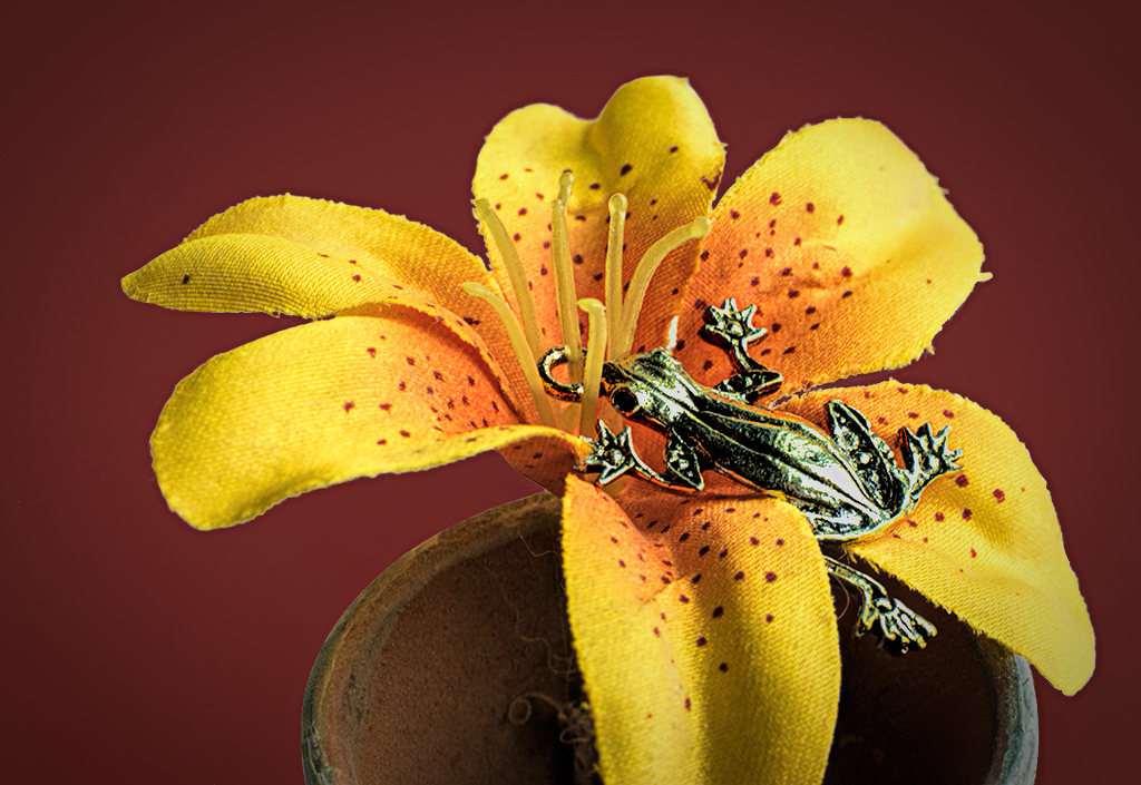
I agree that adding a darker background might enhance the flower some, but here I have opted for a background color which emphasis some of the spots and details on the flower (rather than being a complementary color on the color wheel). I also darkened the pistils of the flower to make them stand out a bit, toned down the overly bright areas in the frog and sharpened the image some to enhance the details (especially in the flower spots).
These edits might be more of a "makers choice", but see if you don't feel as though they make the entire flower 'pop' a bit more.
|
Feb 9th |
 |
| 65 |
Feb 18 |
Comment |
This is an interesting "feather still life". I applaud you for trying new and different things. The colors are great really making the feather stand out from the background. The image as a whole though, doesn't seem to hold my interest. I find that my eyes continue to go to the lower left quadrant, where the tips of the feathers contrast with the background and the complexity of the feather detail is best demonstrated. The rest of the feather, with it's bend upward and down again to the right is less interesting. Perhaps that is due to the shadow on the left which partially blocks the leading line of the central stem, or the fact that the red-on-red feather throughout the bend hides detail that I expect throughout the image. The soft (non-sharp) tips of the feather at the end of the arch to the right also disappoints. The arch provides such a wonderful leading line for the eye to follow, but it leads to a soft spot which fails to match the wonderful detail in other parts of the image. In macro, detail is king (to my sensibilities at least) and in this image the detail is spotty.
I too have tried to take macro images of feathers, and too often my images also suffer from these same issues. I wonder if the nature of this subject makes our shots more susceptible to those points. Again though, I applaud you for trying new and different things. Not everything works the first try when we do, but boy do we learn fast. I am looking forward to your next image.
|
Feb 9th |
| 65 |
Feb 18 |
Comment |
This is what I would consider this image a "close-up" image (since the subject size is larger than the sensor but smaller than a loaf of bread). The reason I note this is since with most the close-up images, adjusting the aperture will impact the depth-of-field, as opposed to most macro shots (where the subject is equal to or smaller than the sensor) where the aperture has little-to-no impact on the depth-of-field (thus the potential need for focus stacking). As was noted earlier, for our study group, we accept both types of images.
So with your cork shot, choosing an appropriate aperture will impact the depth-of-field, and I do like how you chose not to make the entire shot tack-sharp with your aperture choice. I also am enjoying the arrangement of the corks and the composition. The only thing I would comment upon is about the wine bottle neck. Something about its placement continues to bother me. I am uncertain if there is too much of it or not enough. Perhaps including just a bit more to include all of the bottle threads. My eyes keep going to the bottle neck when the left edge of the neck (as you look at it) intersects the edge, with a bit of consternation (in my gut). This is a good example of listening to your own feelings, but I am not quite sure what mine are saying.
That aside, nice job !
|
Feb 9th |
3 comments - 1 reply for Group 65
|
3 comments - 1 reply Total
|


