|
| Group |
Round |
C/R |
Comment |
Date |
Image |
| 65 |
Mar 17 |
Comment |
You are correct in that many photographers chose to use a softer finish in their artistic photography, and it can be a pleasing presentation style. However one should not easily dismiss the reactions of the study group members here as well. The fact that so many of the members commented upon the softness of the image should serve as an indication that something in the image was striking the membership as being uncomfortable and/or worthy of comment. I have found that our study group members try hard to be constructive in their personal evaluations, and tend not to just “jump on to the band wagon” with their critique. So if there was such a collective critique, one might ask oneself what might cause such a response.
To my eye the fact that the entire image is uniformly soft and somewhat high-key obscures the central subject and leaves me wishing that I could see the central subject more clearly. If that were the case if one were able to differentiate the subject more from the background using color or tonal qualities (rather than sharpness) or with sharpness as well, perhaps that might help. I tried this in the attached file. I don’t know how successful I was, but if this was even a bit better to one’s eye perhaps I am on the right track.
Photography is an emotional art style, and being so is difficult to critique. One of the skills we are striving to develop in this study group is to be able to listen to our emotional response as we view an image and to subsequently put into words what our emotions are telling us. We are still learning, and even though we might miss in identifying what is cause of an emotional response, we should not ignore that fact that such a response exists.
Hang in there, and keep on pressing that shutter button.
|
Mar 22nd |
 |
| 65 |
Mar 17 |
Comment |
Excellent Macro Image !!! You really nailed this image in composition, sharpness and color. The only things I might offer, is to darken your background a bit more and adding a bit more sharpening to really make the yellow eye penetrate the viewer. I tried this and hope that the attached image demonstrates what I am trying to convey. Great Image though. A real winner ! |
Mar 19th |
 |
| 65 |
Mar 17 |
Comment |
Well seen ! I love the composition and how your vision of the image is captured within the image. The processing you did seems appropriate. In this case, less is more. I am not too concerned with the lower right corner being dark. The darker bands frame the light band which runs from lower left to upper right, giving a sense of flow across your image, which works nicely here. I also like how the sunburst in the reflection is the brightest part of the image drawing our eye to the middle where you want it. Nice job ! |
Mar 19th |
| 65 |
Mar 17 |
Comment |
With your images, imagination abounds, as we once again see with this image of your art. I agree with the earlier comments regarding that as an image, the portrayal is a bit busy, but if the object you are taking an image of is busy in-of-itself, what’s a person to do ? The comments regarding the lighting of the art resulting in a somewhat high key image with hot spots also seem appropriate. I have tried to address some of these issues in Photoshop using micro-contrast and a “levels” adjustments to tone down the high key nature of the image, and using “color selection” with a Hue / Sat layer to target and tone down the hot spots. See what you think …. |
Mar 19th |
 |
| 65 |
Mar 17 |
Comment |
I love your selection of subject, and the simplicity in form each bloom has. Well seen !!!
I cannot disagree with the earlier comments though regarding the sharpness of the image. One thing I might add is that the main subject (in this case the bundle of five blossoms) merges into the background, especially on the lower right, and upper left. It becomes lost as a center of focus. One might try to darken the edges using an vignette to try to emphasize the pear blossoms more.
|
Mar 19th |
| 65 |
Mar 17 |
Comment |
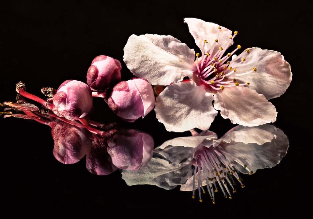
Nice well thought-out effort. It great to see that you are willing to try out new things. What confuses me with this image is the double / triple / quadruple images seen in the reflections. Is this due to the mirror itself. Would this occur if a piece of glass were used rather than a mirror to obtain the reflection ? I tried to edit out some of the double (and triple) reflections to see how this might look, but I was not overly pleased with the result. The reflections of the petals still are too busy. To my eye, simplicity in the reflections (so that only one version of each reflected element were present) would make this a more restful image.
Don’t you hate it when the adoption of one new technique leads to issues that we had never seen before ? Kudos for trying this out though. Keep up the efforts. Your images are getting better each month.
|
Mar 19th |
 |
6 comments - 0 replies for Group 65
|
6 comments - 0 replies Total
|


