|
| Group |
Round |
C/R |
Comment |
Date |
Image |
| 65 |
Feb 17 |
Comment |
Do be too hard on yourself regarding the composistion. Once we focus upon a new technique, we tend to over focus, or at least I do, and the other aspects fall off the radar screen. With practice, the stacking will become more confortable, and it will be easier to remember and incorporate the other elements such as point-of-view and composistion. I had one mentor who would first concentrate on the artistic parts of the shot (light composistion ...), and then say to himself "numbers" as a reminder to review the more technical aspects. Just to say that you are not alone in your struggle to keep track on all of the photographic elements. |
Feb 18th |
| 65 |
Feb 17 |
Comment |
Generally the “Macro” setting on a camera closes down the aperture as much as possible to increase the depth of field. Of course this reduces the amount of light coming in, so the camera also increases the shutter speed to compensate. I find that at times the camera just doesn’t get it all right, resulting in a somewhat over exposed image. The “Marco” setting is for individuals who don’t know what settings are required to get a good macro shot, and you are well beyond that. What were the settings that you employed or were the settings that the camera settled on ? Regardless of the settings though, digital images rarely are their best right out of the camera and often need some additional processing. |
Feb 18th |
| 65 |
Feb 17 |
Comment |
Interesting idea, and a worthy subject. Generally, you get the starlight (or starburst) effect at very small apertures. In this case you shot using f/2.8. How about trying f/18 to f/22. The down side is that the selective focus ( a strength in this shot) may need some additional effort if you do. If the background becomes too sharp, you may need to isolate the background in Photoshop, and apply a slight blur to the background. Alas, nothing ever comes without a cost. |
Feb 17th |
| 65 |
Feb 17 |
Comment |
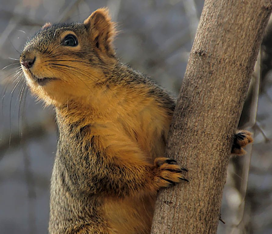
Nice composition. You managed to capture some of the personality of this critter. The image is overblown some though, and washed out. Some post processing can correct much of this (see attached). |
Feb 17th |
 |
| 65 |
Feb 17 |
Comment |
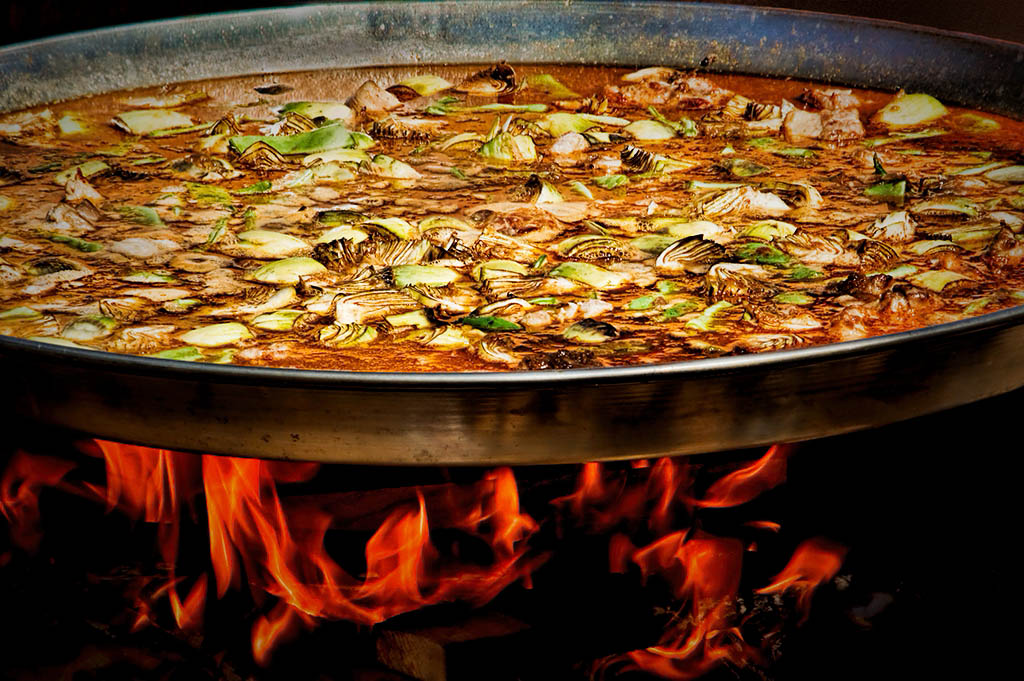
Great shot. Once again, you excel at seeing.
However, I don’t think that you are giving your wonderful shots justice, with the minimal Post Processing you employ. This is a great image, with a wonderful range of colors, good composition and the flames just make the shot. It even tells a story (aside from making me more and more hungry as I examine the image) !
But I believe that it could be so much more. There are some blown out parts of the pan and with a bit of the Paella. Also the Paella is so bright that it competes with the flames for the eye and the viewers interest. I would suggest that you eliminate the blown out parts by cloning out these areas. Other methods (such as burning) will be less effective since there is no information in the image to work on in these blown out areas. Next I would add darken slightly and add a bit of contrast to the Paella. The goal here is to balance the tonal qualities of the image so that the Paella and the flames are more balanced. I personally would sharpen the flames and Paella slightly, and finish with a vignette to bring the viewer to the middle of the image.
I quickly applied these suggestions to the image. See what you think !
|
Feb 17th |
 |
| 65 |
Feb 17 |
Comment |
Nice image and good job see this . Orchids make the most interesting subjects. I like the fact that there is selective focus employed here with only the one bloom and the leaves (or buds) on the right being the principle element in focus. The black background is a wonderful choice as well. Normally one gets this type of background using a flash (where the flash is the only light source) and a very fast shutter speed (eliminating the impact of ambient light). The black backgrounds shows up here but I see that you used a long exposure here (1.6 seconds with a stopped down aperture). How did you get the dark background?
One suggestion I might offer is to lighten up the leaves (or buds) on the right, to make the light to dark transition less harsh or abrupt. One might also darken (burn and / or reduce) the hot spots in this area a bit as well. I find that bright light in this area pulls my eye away for the main subject and is distracting. You did such a good job with the main bloom, so make that the main subject with no distractions.
|
Feb 17th |
| 65 |
Feb 17 |
Comment |
I love making the common, uncommon. And this is what you did here.
Nice use of stacking. It’s real easy to get stacks greater than 15 focus slicers, isn’t it ? In looking closely at the image I see uniform sharpness throughout the entire image. I one has too few slices; you can get non-uniform sharpness, with waves of sharp and not so sharp image throughout the image. Not so here.
Nice thought regarding the foreground (white plate)and background (back backdrop) as well. Often we get so focused (pardon the pun) of the mechanics of the image that we forget to consider the composition as well.
The only thing I might ask you to consider is the cropping, where we have lost both sides of the plate of marshmallows. I am not sure that the inclusion of the entire plate of treats would have helped though. Marker’s choice. I do like the comments by Anu regarding looking at an angle other than straight on. Food for thought (OK, so I slipped in another pun).
|
Feb 17th |
7 comments - 0 replies for Group 65
|
7 comments - 0 replies Total
|


