|
| Group |
Round |
C/R |
Comment |
Date |
Image |
| 7 |
Jul 22 |
Comment |
You found an interesting log to capture Paul. I do not feel the main portion of the log is separated from the balance of your image, and thus does not draw one's eye. I think Tony has done an excellent edit to crop in, simplify what is in your image and lighten the subject for a dramatic presentation. |
Jul 19th |
| 7 |
Jul 22 |
Comment |
Gaetan, I favor your cropping in and I like your trying to do something different with the sephia, however the darkness makes it hard to fully appreciate your image. I also agree ideally you would have separated the tree in the background. |
Jul 19th |
| 7 |
Jul 22 |
Comment |
Hoshedar what catches my eye are the dominant beams in the foreground, then the like fine art appearance given by the structure in the background. The designer gave every third beam a light color, which really comes to play in the background I like the half sphere opening on either side, however I agree with others about the buildings being a distraction. Beautiful blue sky. I would be interested in seeing what you did in processing. |
Jul 19th |
| 7 |
Jul 22 |
Comment |
Spectacular sunset Tony, thanks for sharing. I agree with everyone in regard to over sharpening and the aspects Tom corrected. Otherwise a great image. |
Jul 17th |
| 7 |
Jul 22 |
Comment |
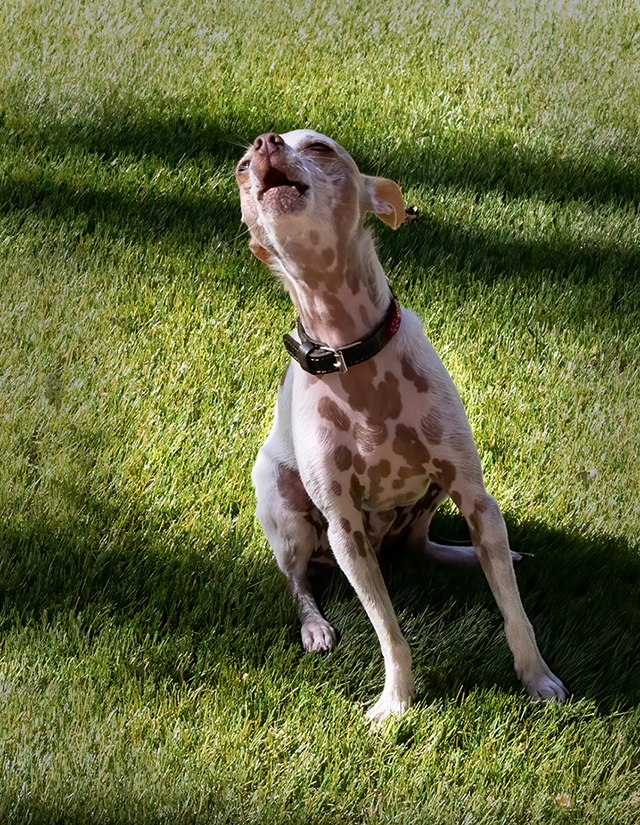
Nice capture Barbara. I favor your first image as the dog appears to really be into the music and is somewhat at a diagonal angle. I selectively lowered the brightness. |
Jul 17th |
 |
| 7 |
Jul 22 |
Reply |
Thanks for your efforts Tony. On my monitor, which has not been calibrated in awhile, the left sleeve is ever so slightly more magenta. The scoreboard is much cleaner than reality in your image. |
Jul 17th |
| 7 |
Jul 22 |
Comment |
Tom your imgage is nicely composed, sharp, in focus throughout and well exposed. Your image pops due to the sharpness of the sunflower along with the different angle of lighting. |
Jul 17th |
| 7 |
Jul 22 |
Reply |
Thanks Gaetan. What I value most about participating with critiquing images, there usually are several opinions. Myself I wanted the ball and bat to blur somewhat to show motion. But I understand why some would not. Thanks |
Jul 10th |
| 7 |
Jul 22 |
Reply |
We are on the same page Barbara. I have moderatley increased brightness on the striker, bat and ball. On everything else I darkened. I will go back and increase those values, and likely will find agreement. |
Jul 10th |
| 7 |
Jul 22 |
Reply |
Good advice Tom. Thanks. About the blur on the ball and bat I also like it for the very reason you stated. |
Jul 10th |
6 comments - 4 replies for Group 7
|
6 comments - 4 replies Total
|