|
| Group |
Round |
C/R |
Comment |
Date |
Image |
| 41 |
Nov 21 |
Comment |
Lisa,
I really love this and it's right in my ally!
You did a super job compositing the elements and creating a whole new environment!
What are you going to do with this one? Is is part of a series? |
Nov 19th |
| 41 |
Nov 21 |
Comment |
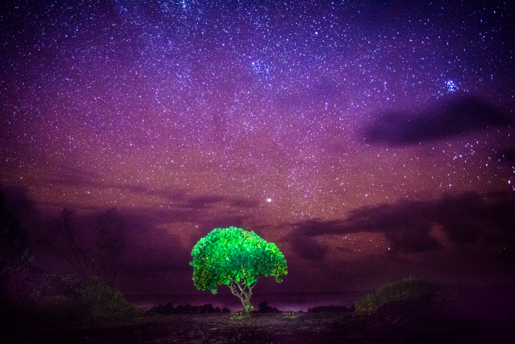
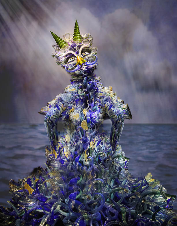
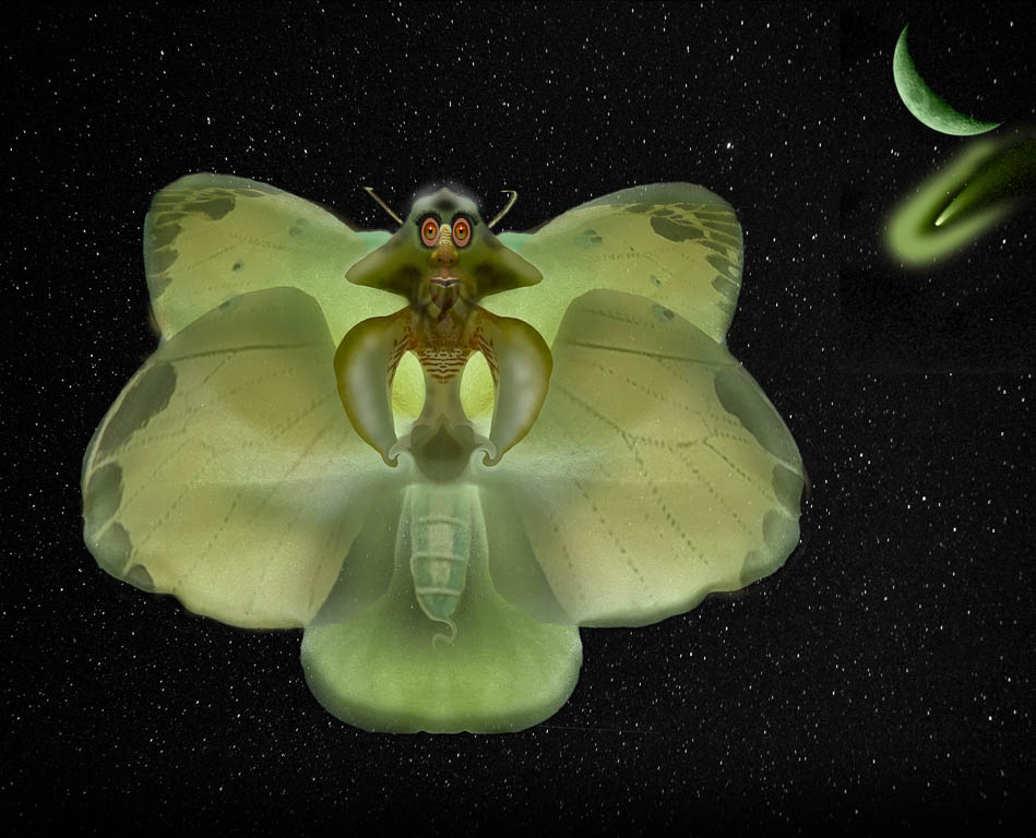
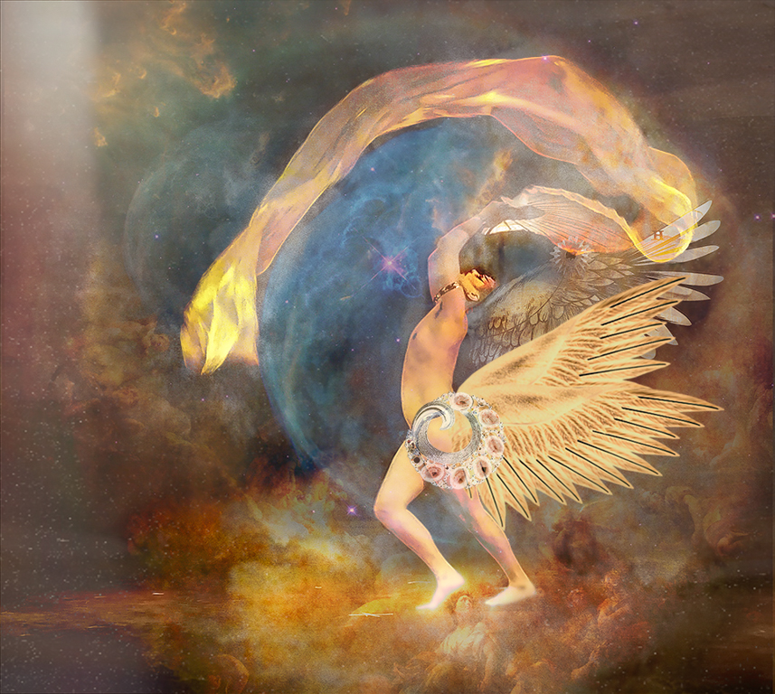
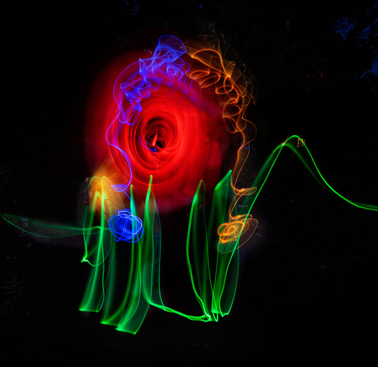
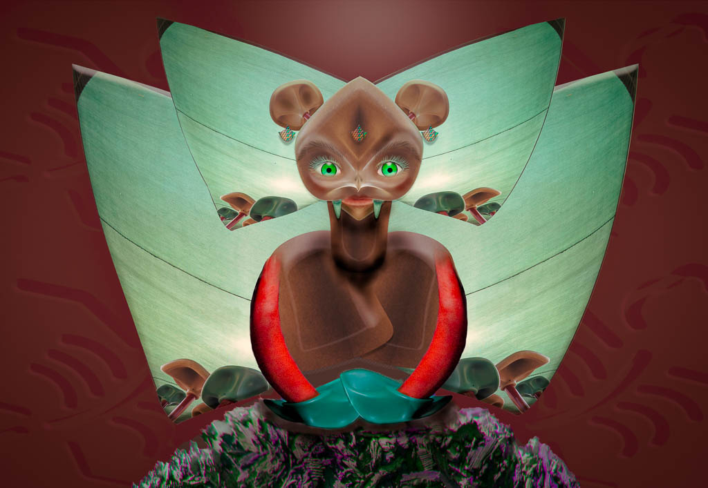
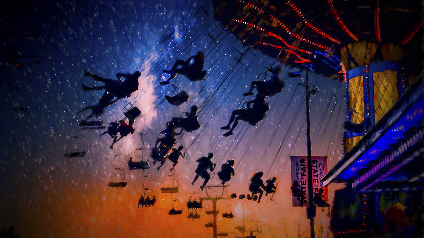
Jan,
I'm right with you in loving these opportunities to shoot and artistically create a beautiful final image. You've certainly done that here.
I really like how you've handled the light and added the texture which enhances the overall look. |
Nov 19th |
| 41 |
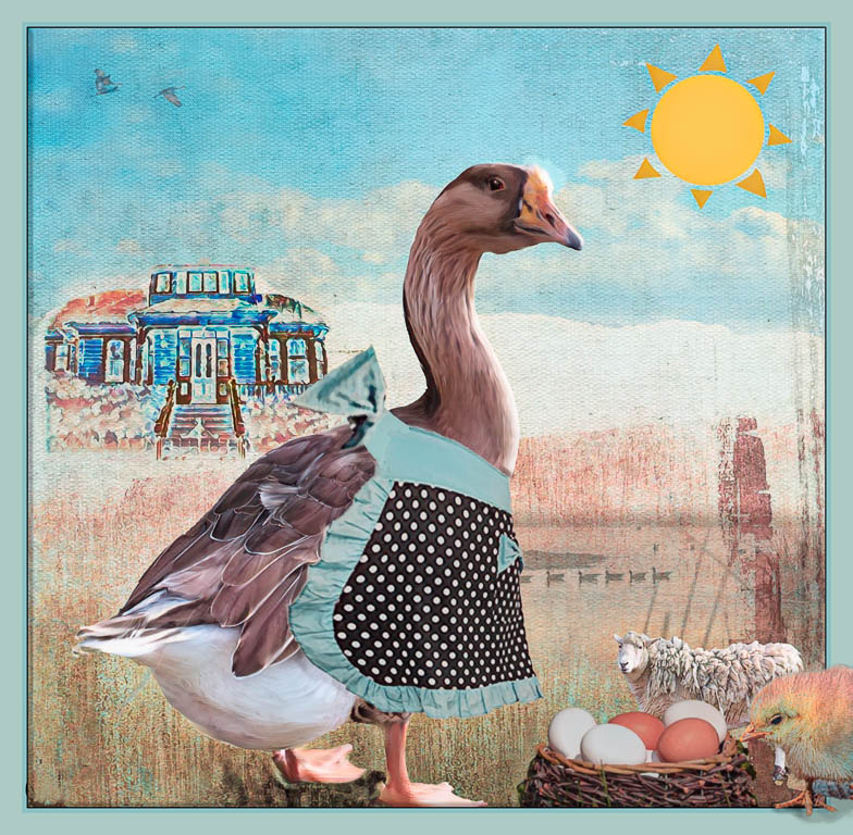
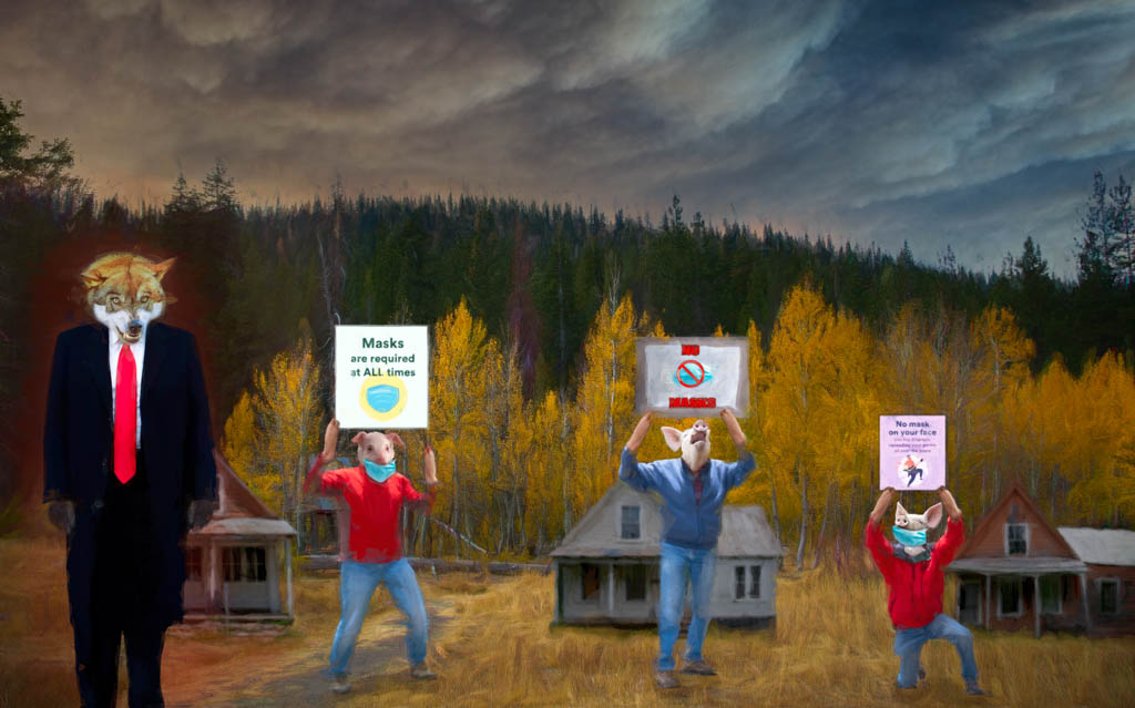
Nov 21 |
Comment |
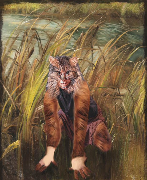
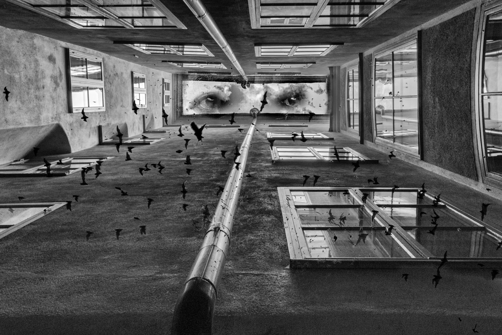
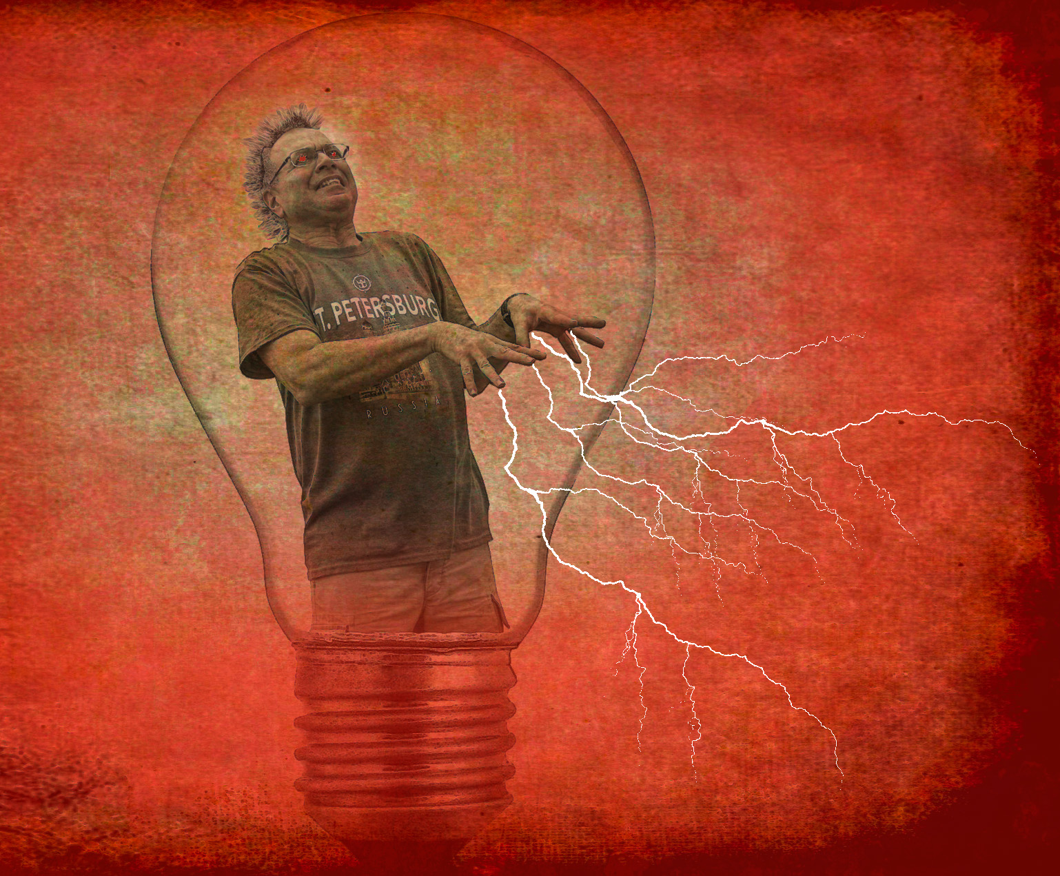
Henry,
I'm with Lisa in praise of your goal! Kudos!
I also agree with Brad about making a bigger crop. Perhaps a square might look good with this image?
Overall, a standout job with the new colors! |
Nov 19th |
| 41 |
Nov 21 |
Reply |
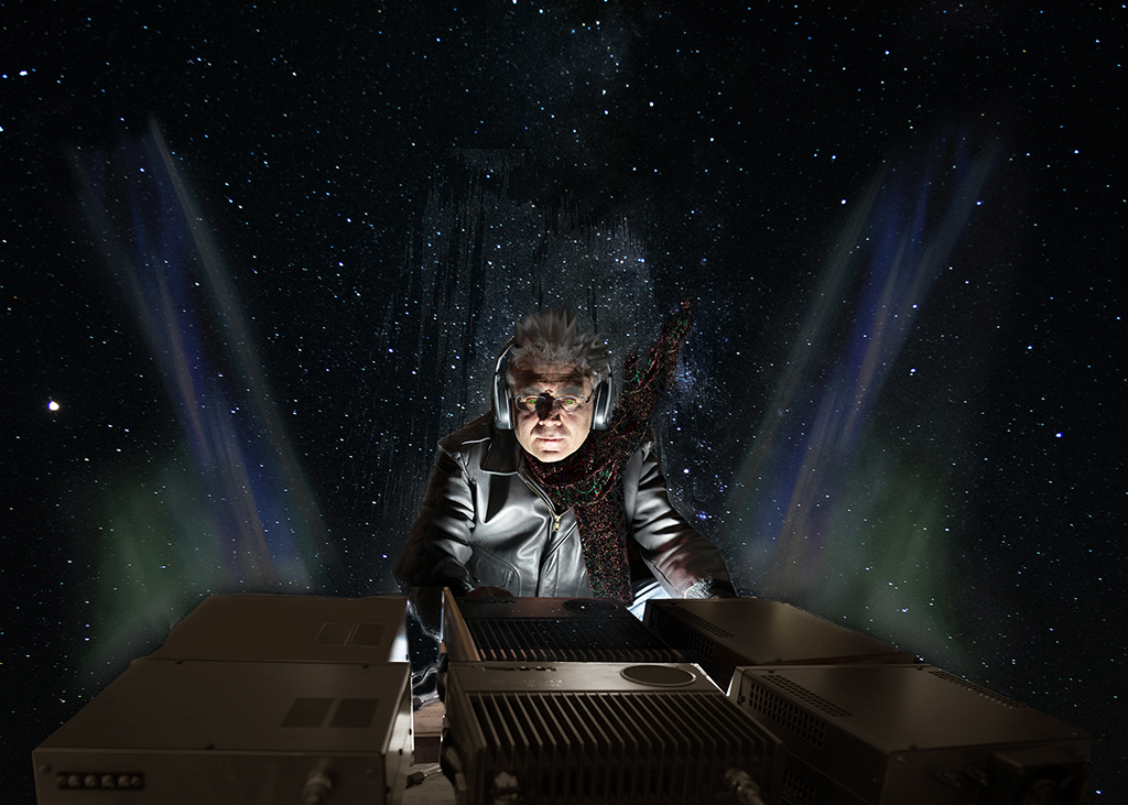
Thanks Jan! After Image Comp this past week, I'm going back to square one, hah hah!!
Good suggestion on the eye color. I think I used more of the yellow but green would be a standout for sure!
|
Nov 19th |
| 41 |
Nov 21 |
Reply |
Thanks Henry! Good suggestion about the eyes! |
Nov 19th |
| 41 |
Nov 21 |
Reply |
Thanks Brad and I agree with you about Tom and Lisa's suggestion. |
Nov 19th |
| 41 |
Nov 21 |
Reply |
Thanks for the redo Lisa!!
Definitely agree that it reads better! |
Nov 19th |
| 41 |
Nov 21 |
Reply |
Thanks Tom. Great idea! I'll do that on my next one. |
Nov 5th |
| 41 |
Nov 21 |
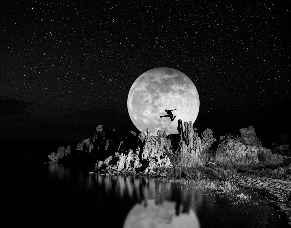
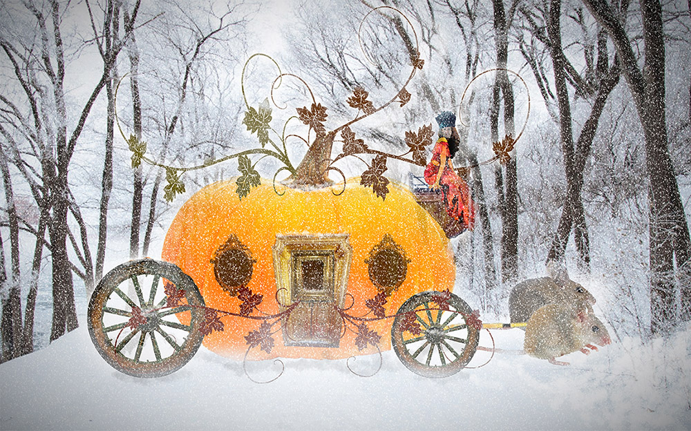
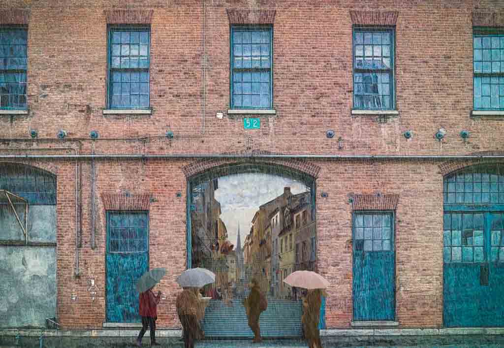
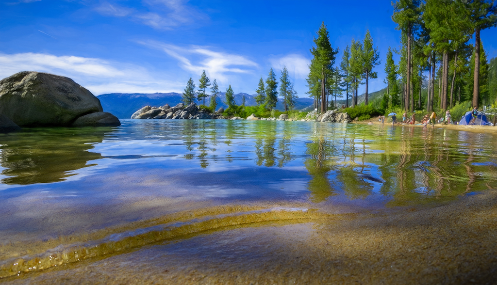
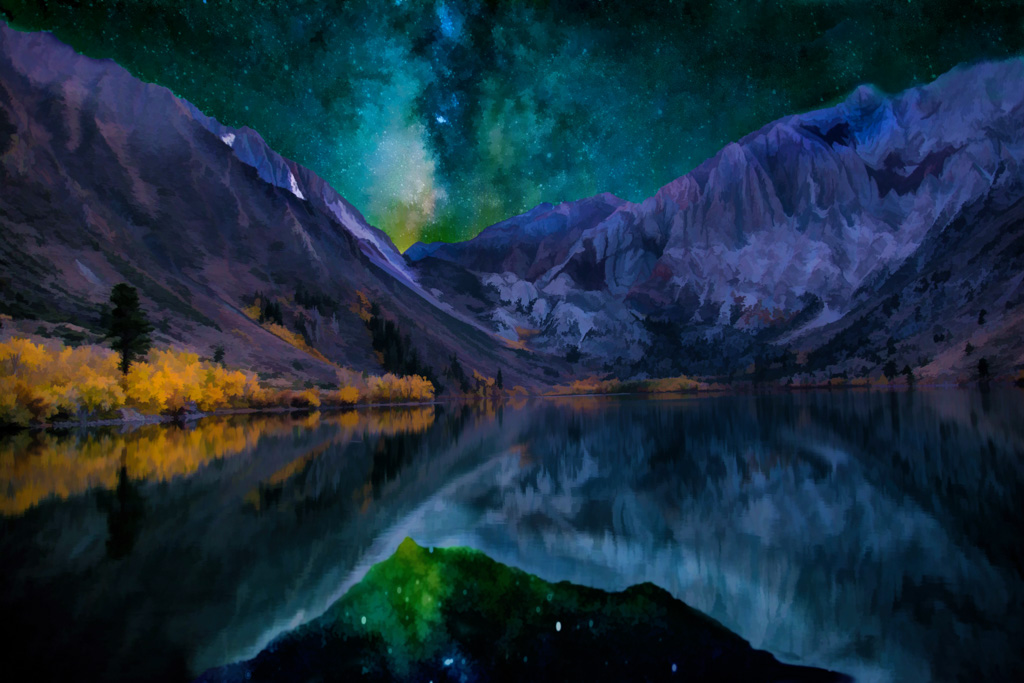
Comment |
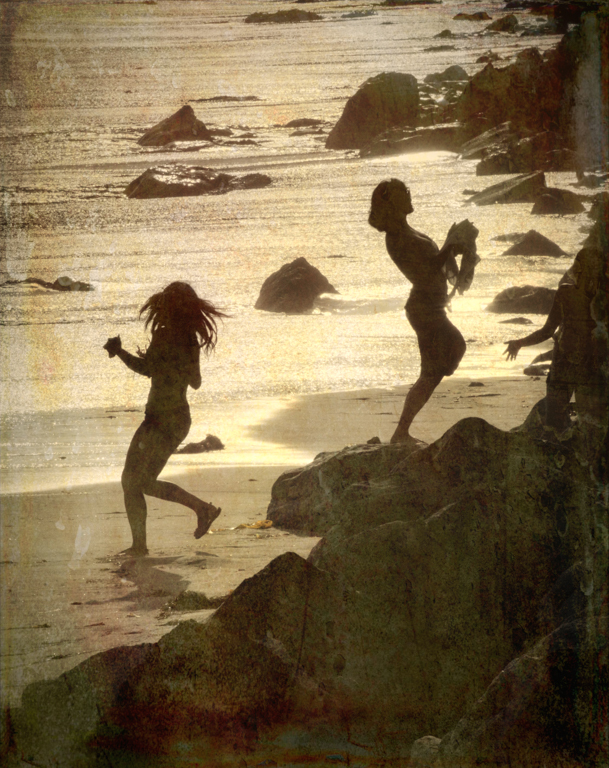
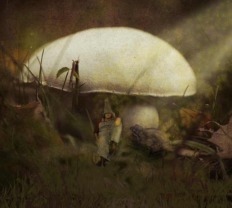
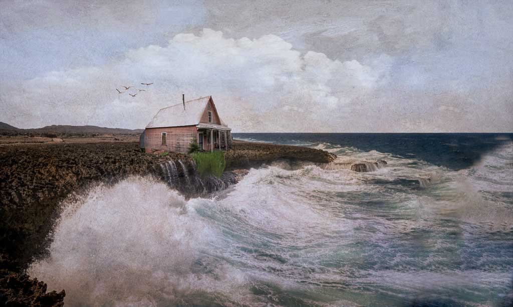
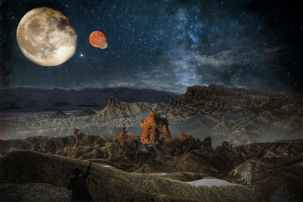
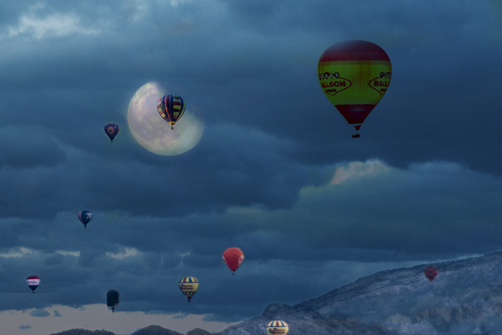
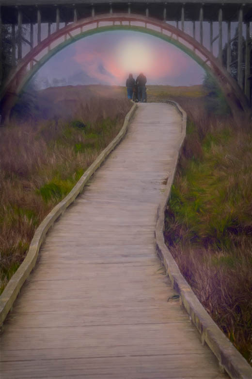
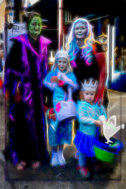
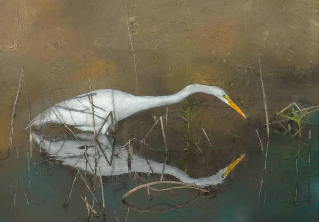
This is great and effective!!
Just a few comments Tom.
I almost missed your granddaughter because she blends into the flowers so much. Maybe just make her brighter than the surrounding area. If you meant to keep her low key, then you succeeded.
There are two areas that catch my eye unnecessarily. The black blotch on the upper left and the bright spoon shaped cloud in the upper right. If you could balance those so they fit more into the tone of the photo, to my eye, this will be more super! |
Nov 3rd |
| 41 |
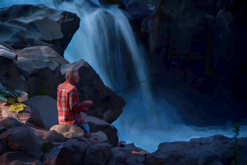
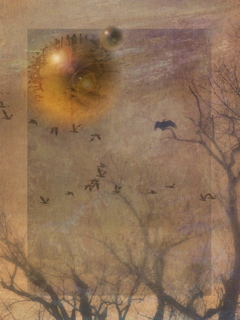
Nov 21 |
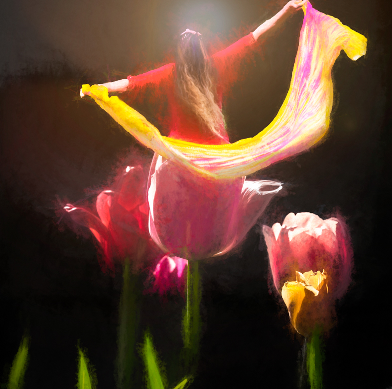
Comment |
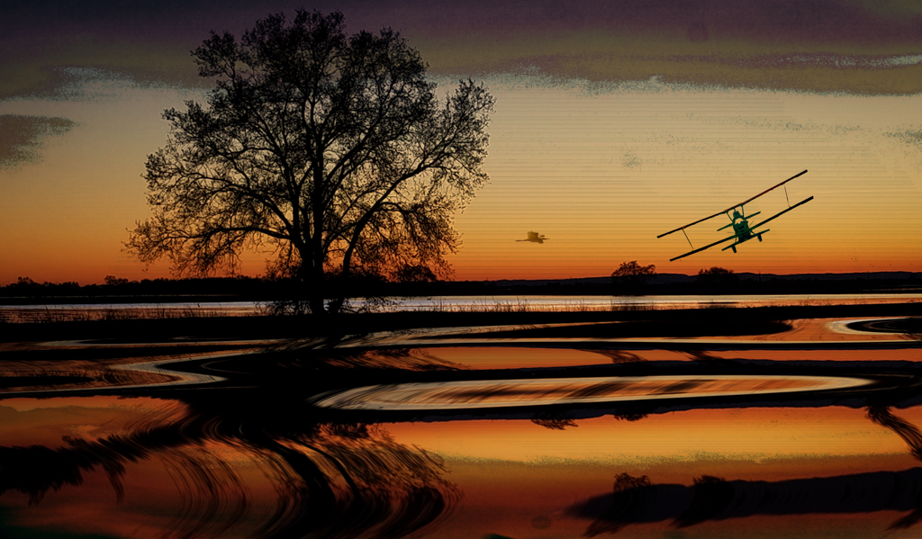
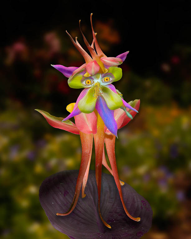
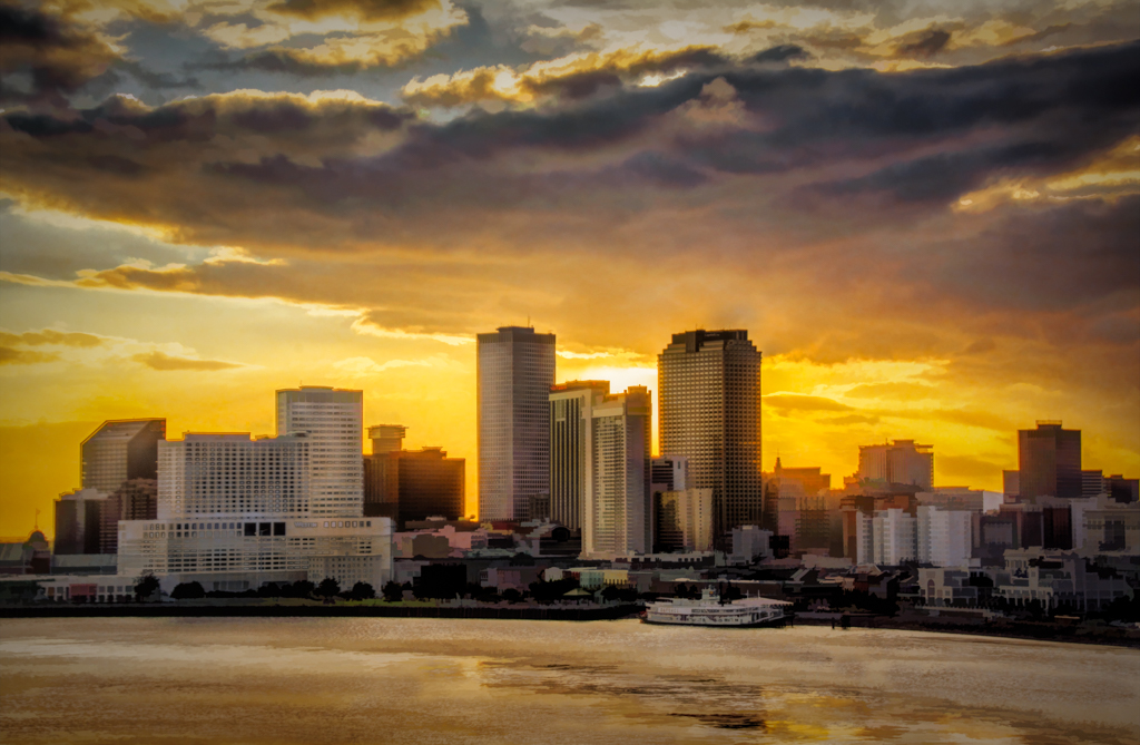
I love this Brad! Topaz Filters are so much fun, aren't they?
My only suggestion is to tone down the white area in the bottom center as it keeps attracting my eye.
Otherwise, very good composition and color on this! |
Nov 3rd |
5 comments - 5 replies for Group 41
|
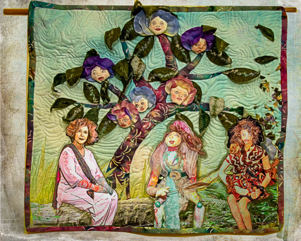
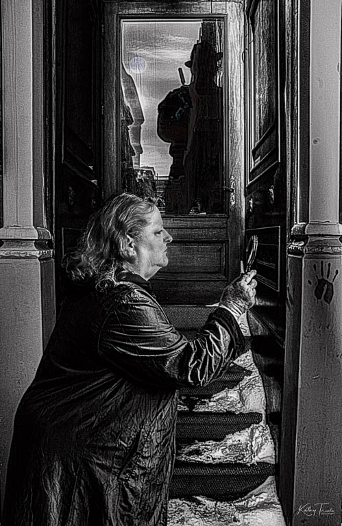
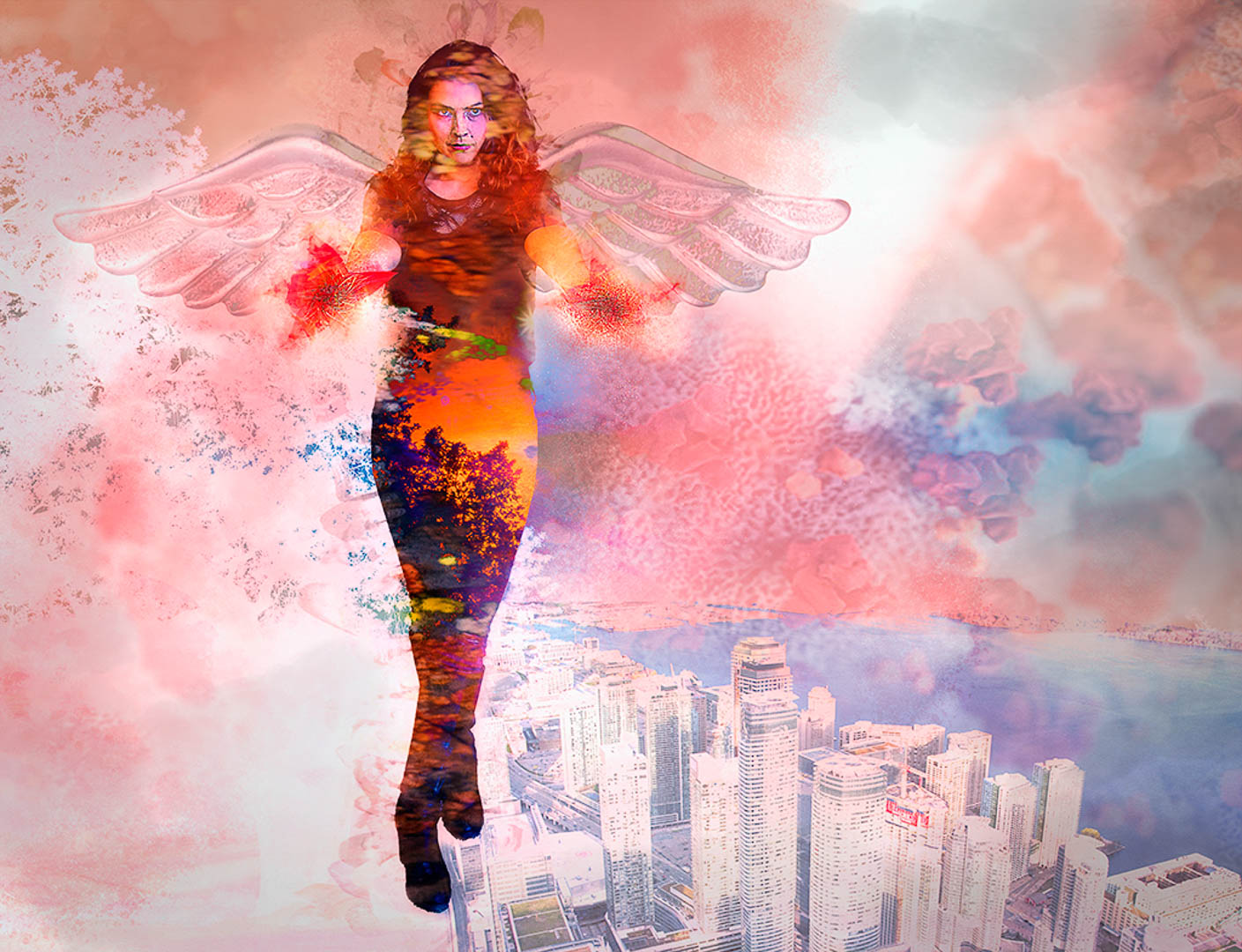
| 54 |
Nov 21 |
Comment |
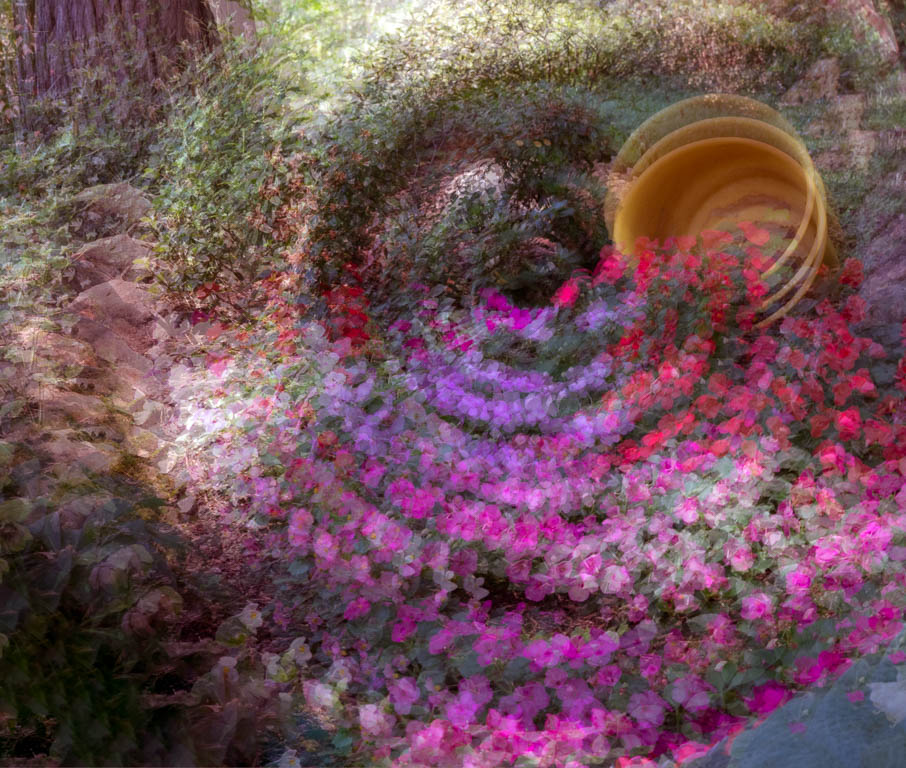
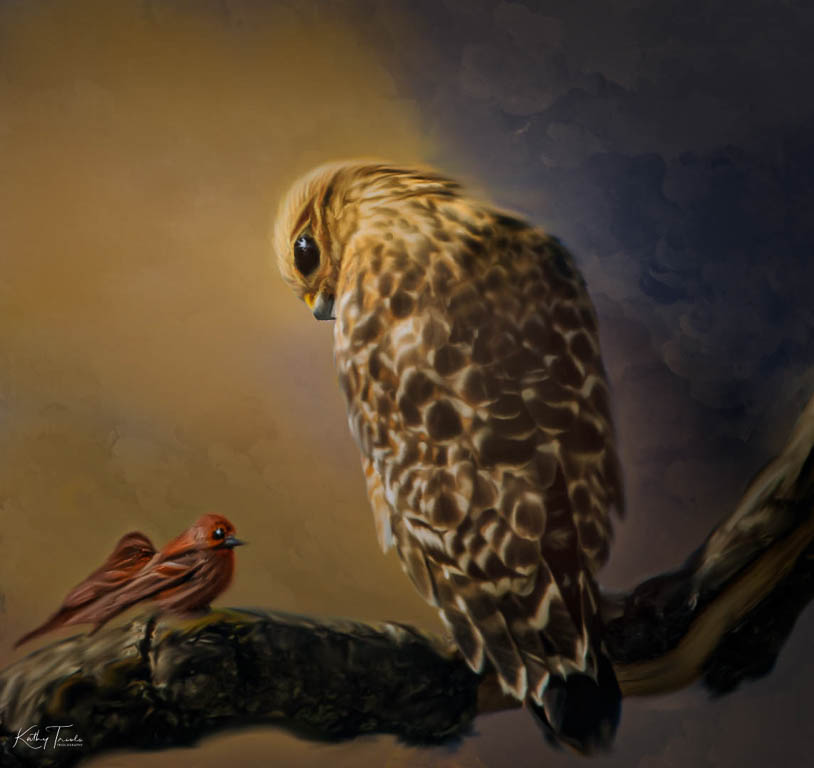
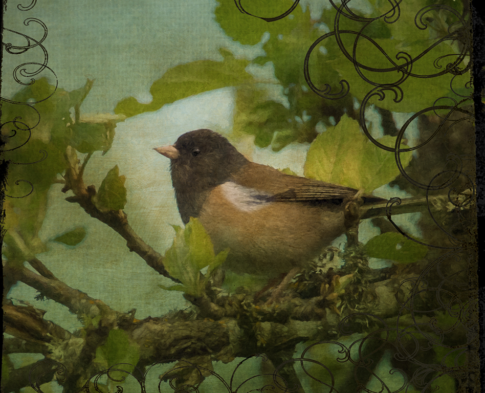
Maria,
I love the mood, the texture and the wonderful lighting you've applied to this image.
I agree with the others that simpler is better and that taking a few elements out will make it more impactful.
You have lots of suggestions but this is your vision so whatever you do with it will only enhance an already lovely scene. |
Nov 19th |
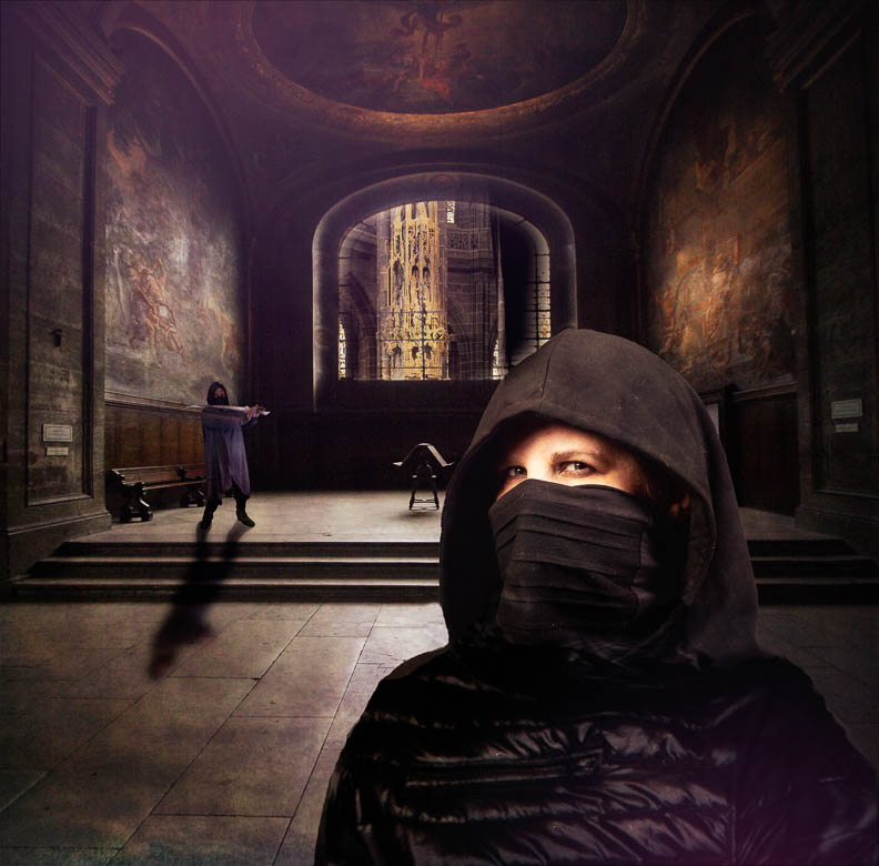
| 54 |
Nov 21 |
Comment |
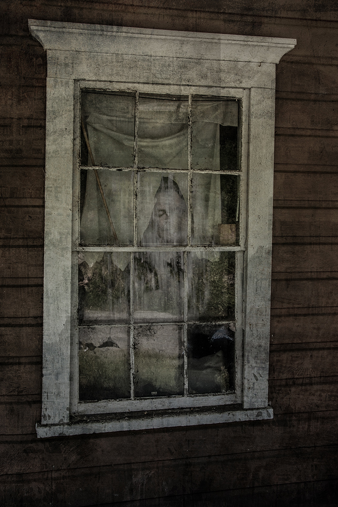
Welcome to Group 54, Peter!
I like your blend of the three photos here. Nicely done!
I agree with Brad that it would be great to see some people walking.
Beyond that, just a suggestion about the black area near the church base... it seems to be a hole that my eye falls into and I wonder if it would look better lightened a bit so the tone matches more of the overall image.
|
Nov 19th |
| 54 |
Nov 21 |
Reply |
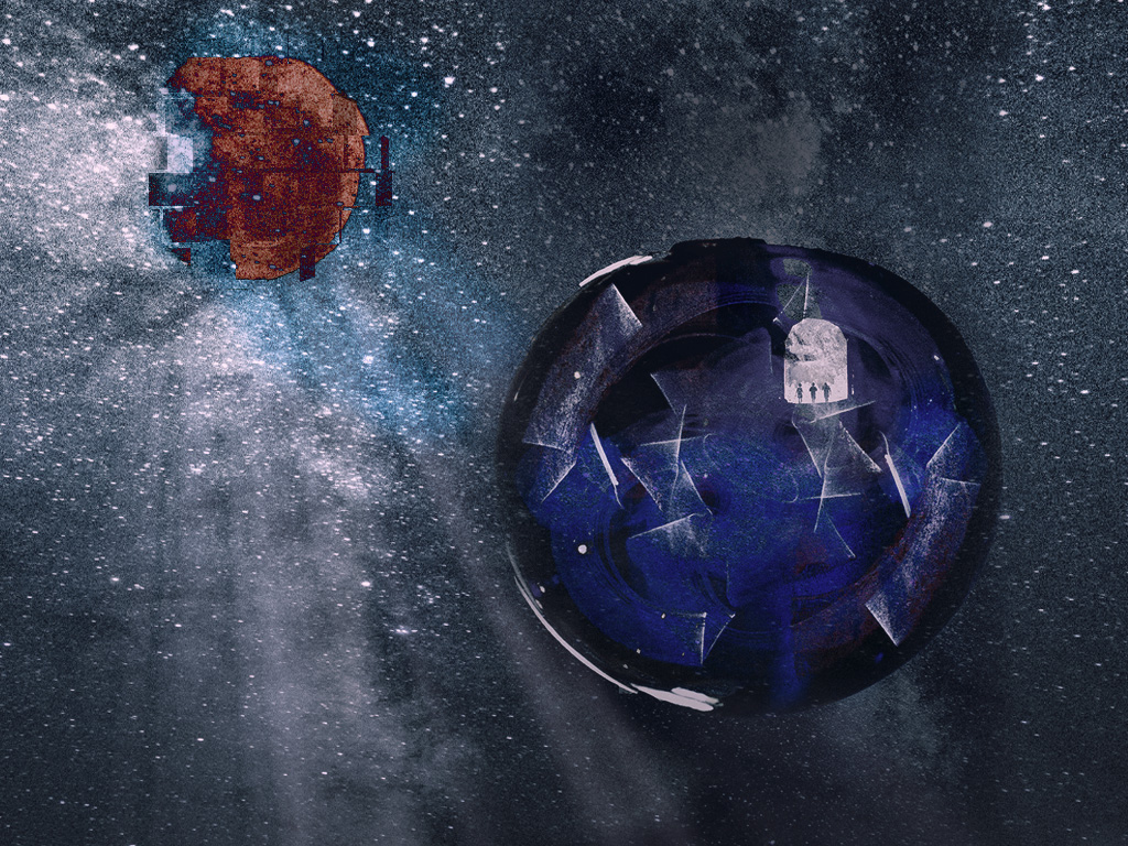
Thanks Brad!
I tried sharpening it in Topaz Sharpen but I certainly can work on it some more.
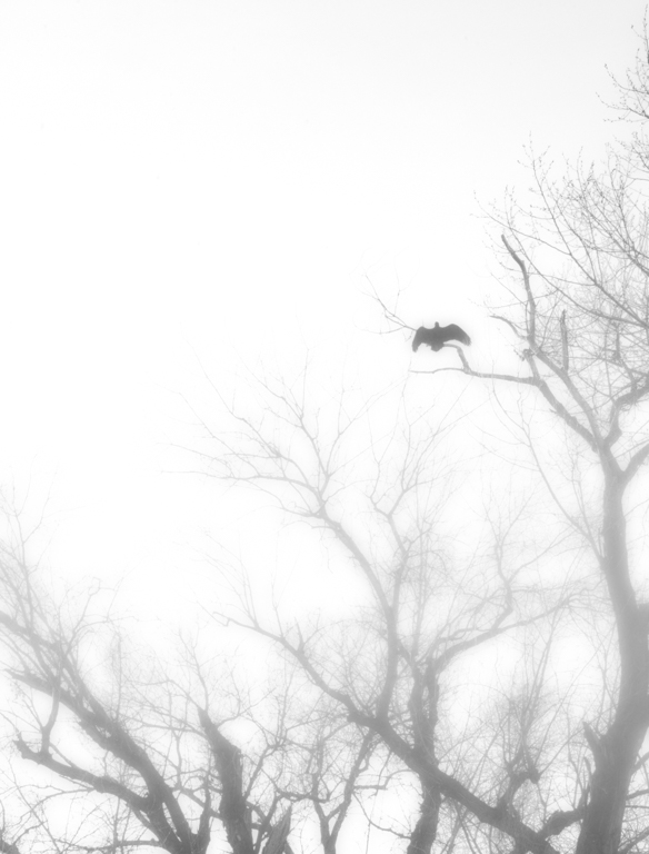
They DO have such piercing stares! We have an old oak tree in my backyard that hosts at least one local hawk looking for prey and it's always fun to watch it and catch the "stare". |
Nov 19th |
| 54 |
Nov 21 |
Reply |
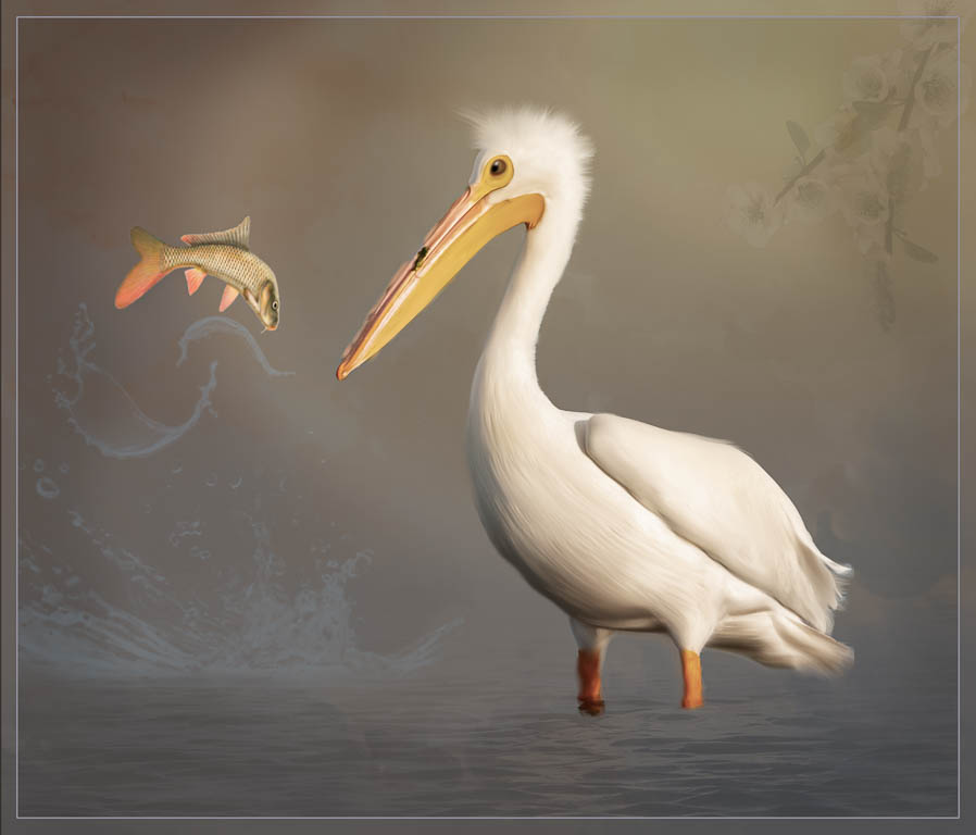
Thanks Peter! Welcome to the group!
Yes, those darn birds came out too dark with my overlays but an easy fix.
I'm playing with old fashioned type postcards so for now, the text stays in the photo but thanks for the good suggestion.
|
Nov 19th |
| 54 |
Nov 21 |
Reply |
Thanks Aavo! Yes, I agree, needs to be lighter for sure. |
Nov 19th |
| 54 |
Nov 21 |
Reply |
Thanks Alan! |
Nov 19th |
| 54 |
Nov 21 |
Reply |
Thanks Maria! Yes, It's a bit too dark on that side. Easy fix.
Good luck with your bird images. I never used to think I was a "bird" kind of person but I've found that I love to take photos of them, especially Pelicans these days. |
Nov 19th |
| 54 |
Nov 21 |
Reply |
I'm glad it made you laugh!! Love that reaction Peggy!
Yes, I agree that it came out darker than I intended... Easy to fix I think. |
Nov 19th |
| 54 |
Nov 21 |
Comment |
Aavo,
I agree with the other comments and find I have nothing to add.
They've given you plenty to consider with great suggestions.
Thanks for sharing your creativity!
|
Nov 19th |
| 54 |
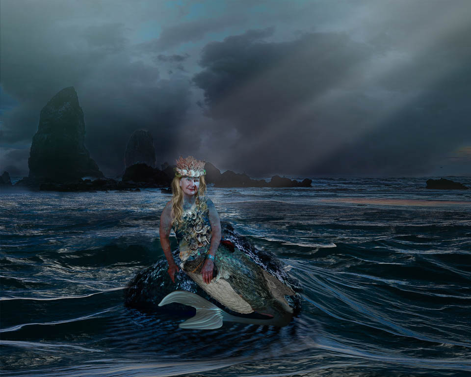
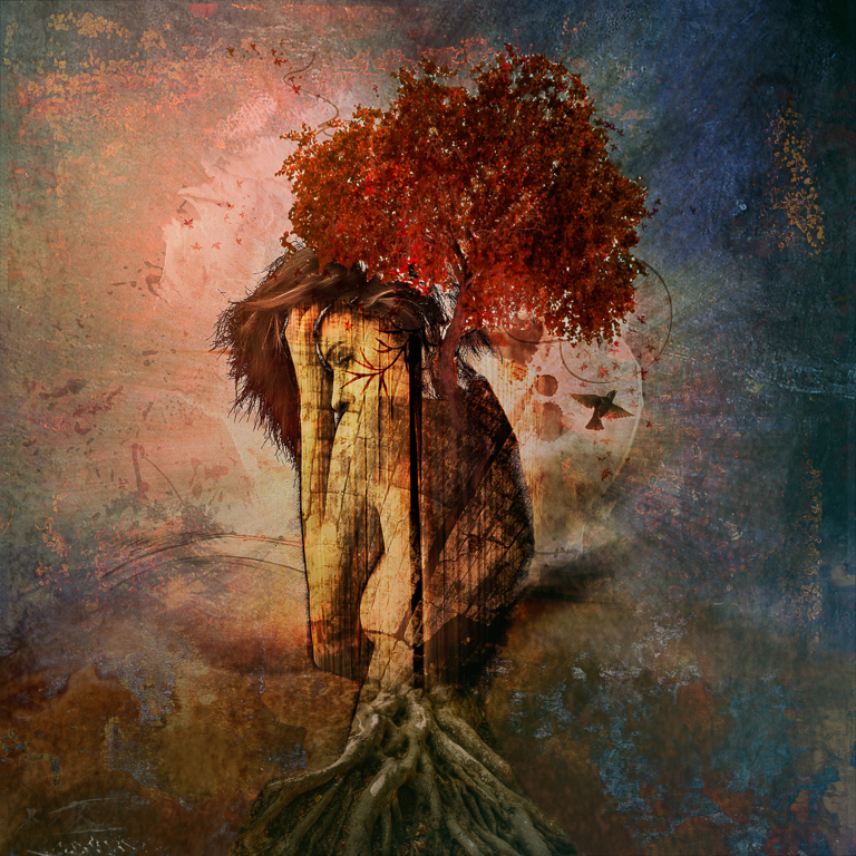
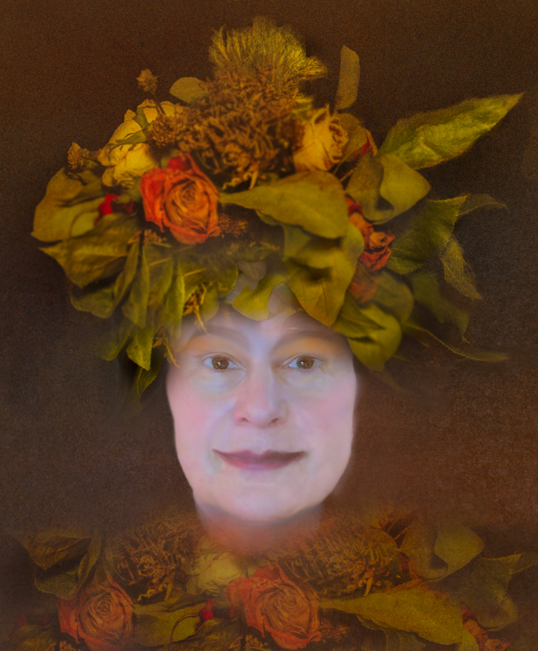
Nov 21 |
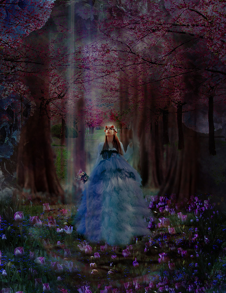
Comment |
Peggy,
I love this and join the others in celebrating what you have created here.
Another take for you might be to replace the white with darker, more autumn type colors and then have a shaft of light trickle down to her face through the leaves.
Not a criticism but a different way to play with this image.
It has lots of potential! |
Nov 19th |
4 comments - 6 replies for Group 54
|
9 comments - 11 replies Total
|