|
| Group |
Round |
C/R |
Comment |
Date |
Image |
| 41 |
Oct 21 |
Comment |
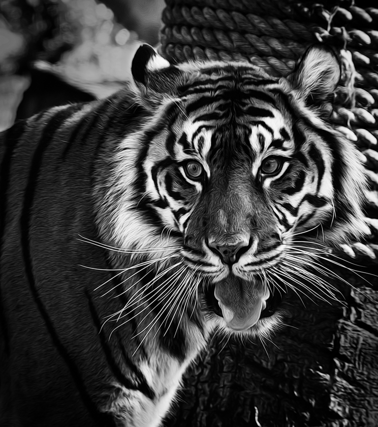
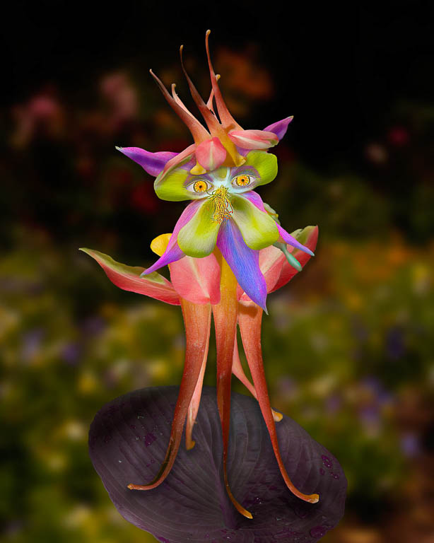
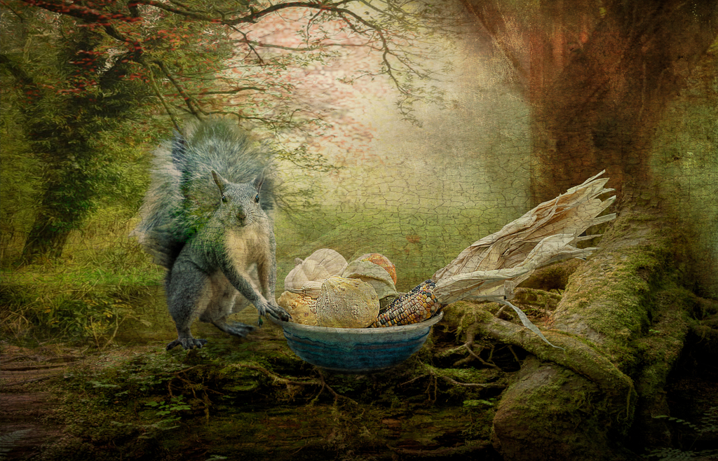
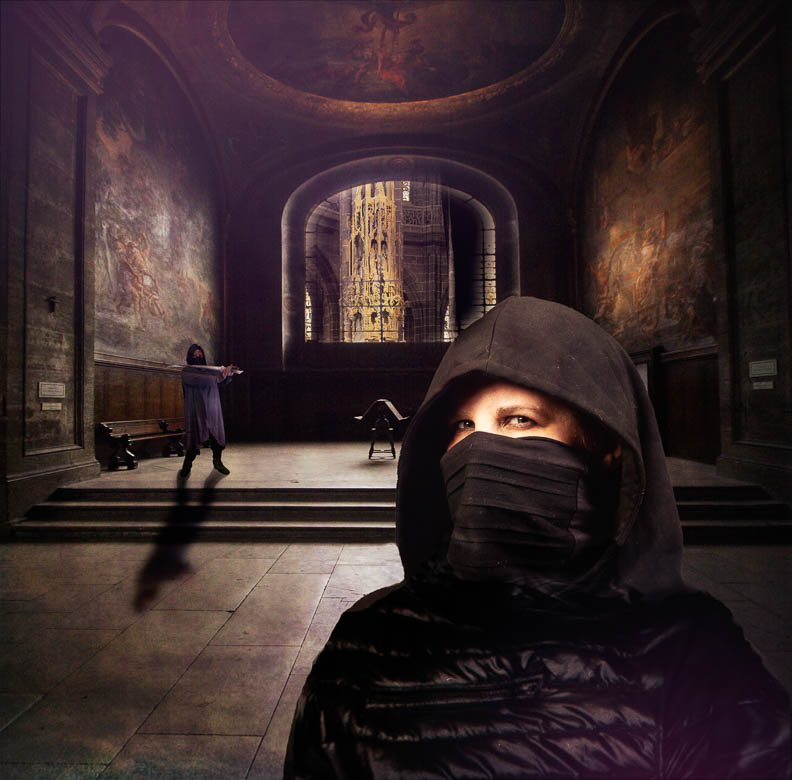
Lisa,
I'm with Brad... I'd love to know more about what you did here.
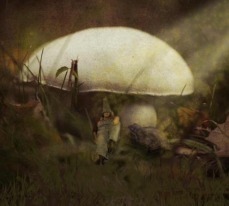
Is that really an eye in the log hole? If so, I'd love to see more definition since I wouldn't have figured it out without your description. |
Oct 16th |
| 41 |
Oct 21 |
Comment |
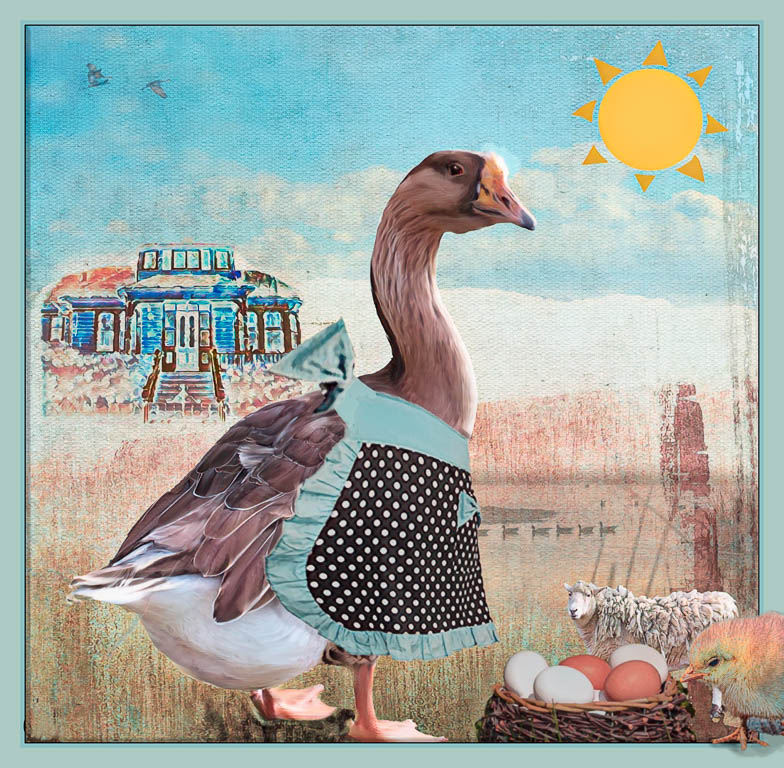
You crack me up, Jan!
I love that you're having fun and throwing mashing images! |
Oct 16th |
| 41 |
Oct 21 |
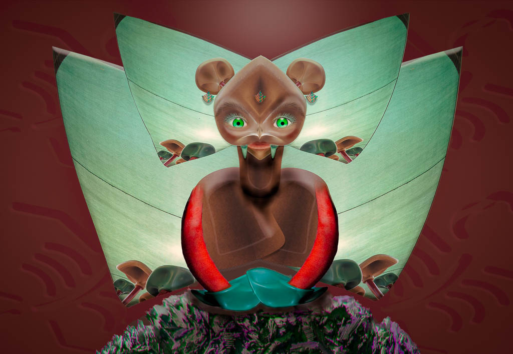
Comment |
Another wonderful Tom Kredo composite!! I'm a big fan!
Suggestions:
1. Look at your legs. You're apparently standing in shadow but your legs are reflecting light that's not corresponding on the ground shadow.
If you move the subject to one of the lighted grids, then the leg light will match.
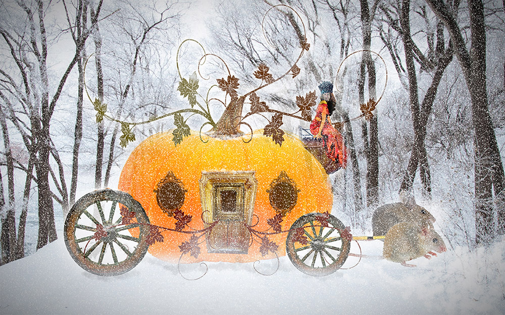
2. Your body is much taller than the transport car. You'd never fit into it, hah hah! Maybe you want it to feel a bit distorted. Most people won't notice consciously but they'll feel that something is wrong. |
Oct 16th |
| 41 |
Oct 21 |
Comment |
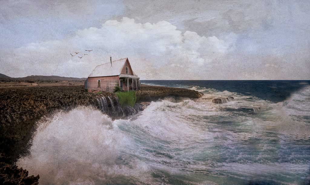
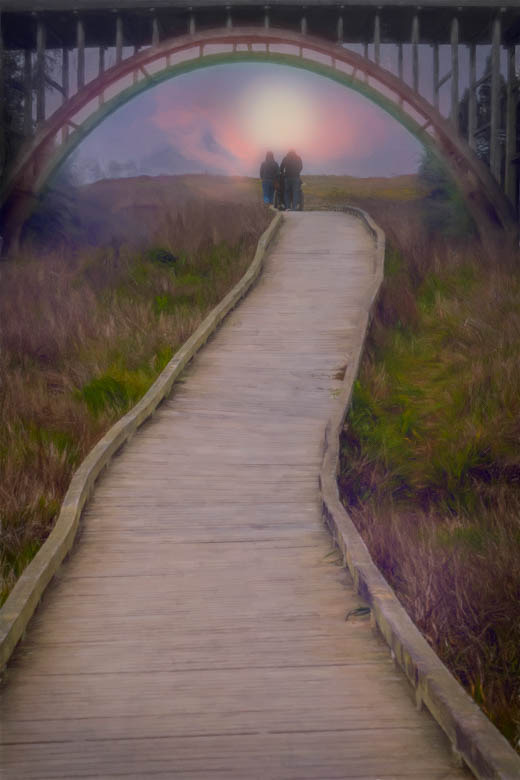
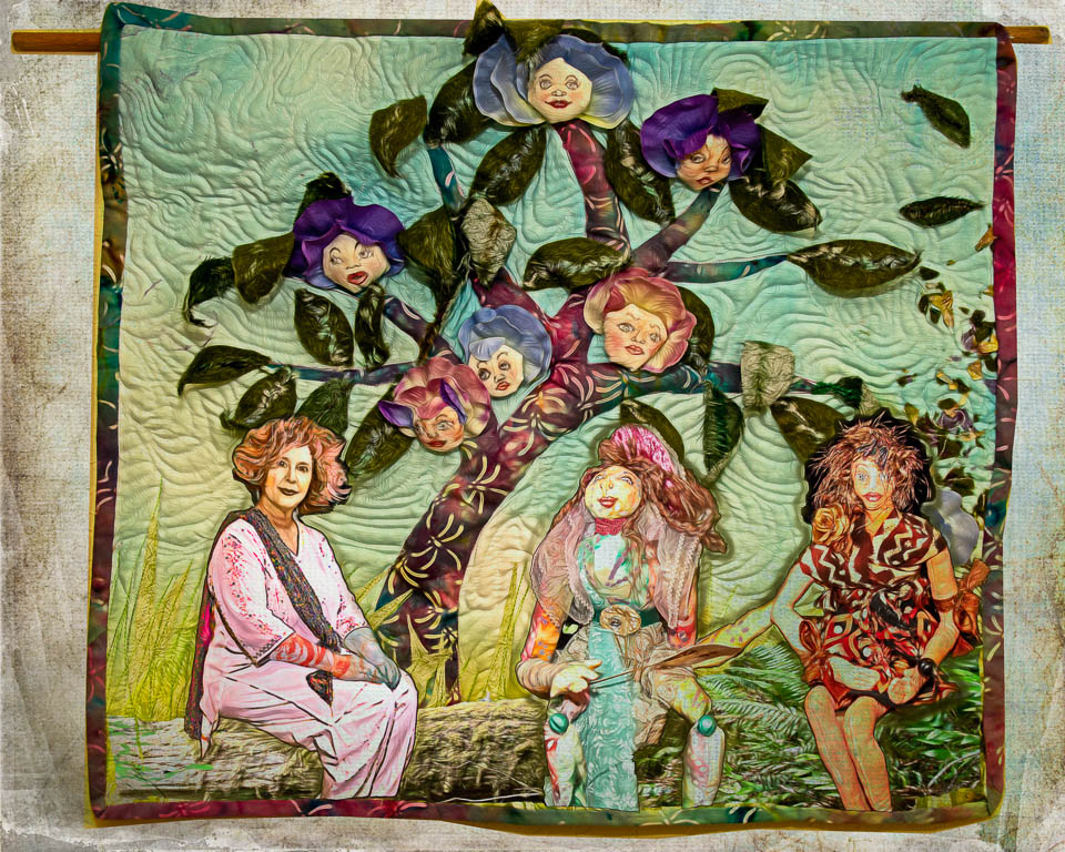
Henry, I love the composition, textures and the colors in your image!
My only suggestion might be to lighten the dark patch in the middle of the path. It stops us traveling from foreground to background. Illustration below..
|
Oct 16th |
 |
| 41 |
Oct 21 |
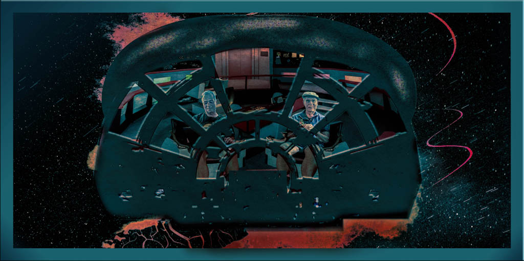
Comment |
Bravo Brad!! Love the creative concept and the execution. My only suggestion is that you might want to get rid of the the green blob in the foreground. It's distracting because of it's different color, blurriness and size.
Here's an alternative look without the blob. |
Oct 16th |
 |
| 41 |
Oct 21 |
Reply |
Thanks for visiting us Michael and for your nice complement!
The fact that it gave you a chuckle and a smile is the best! |
Oct 12th |
| 41 |
Oct 21 |
Reply |
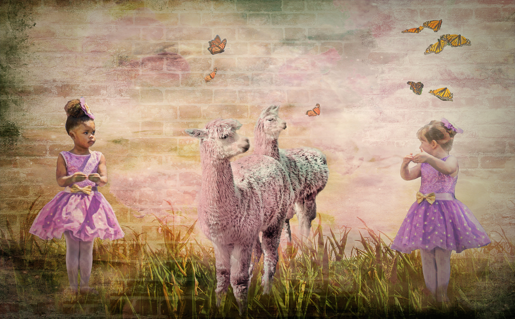
Thanks Brad! I really love how this turned out... kinda country store...
I never know when I take random photos... where they're going to show up, lol! But cows really ARE fun to play with, who knew? |
Oct 8th |
| 41 |
Oct 21 |
Reply |
Absolutely anytime. Brad can share my email or you can send through the PSA website.
|
Oct 8th |
| 41 |
Oct 21 |
Reply |
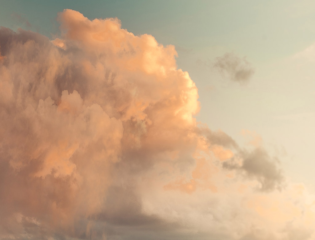
Here's the cloud image |
Oct 4th |
 |
| 41 |
Oct 21 |
Reply |
Thanks Tom!
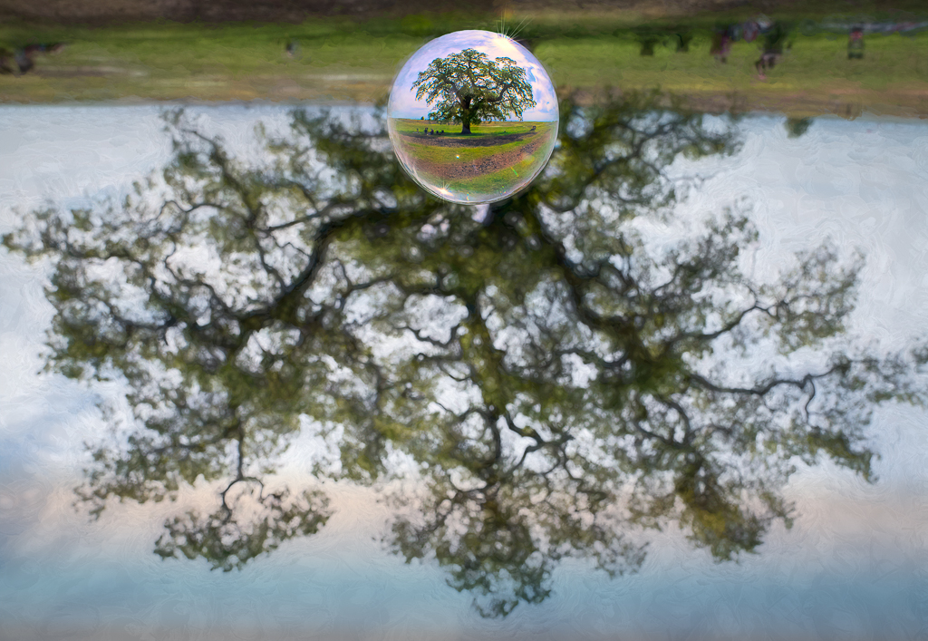
Because I didn't save the layered file, (I'm always trying to save space) I can't remember exactly what photo I used. I know it's a composite of one of my photos and a painterly background that I got from a subscription. I'll look around and load it when I find it, lol!
I'm happy to Zoom with you and chat about how I make my backgrounds. Is that something you'd like to do? I did that with Henry a while back.
Okay, here's what I found. The cloud photo is not the exact one, but in that family. I took the other photo a couple of weeks ago at a local bird refuge. |
Oct 4th |
 |
5 comments - 5 replies for Group 41
|
| 54 |
Oct 21 |
Comment |
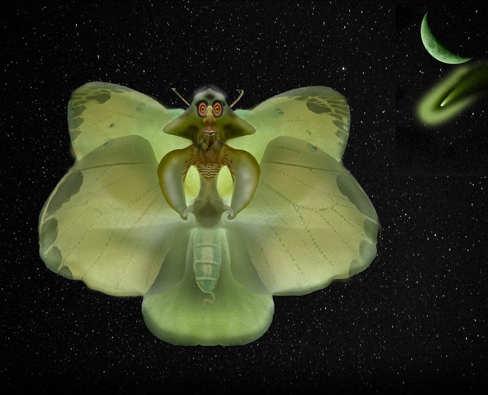
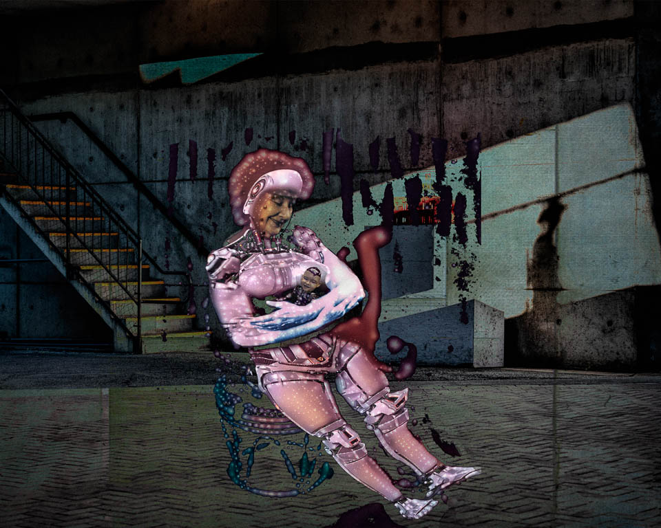
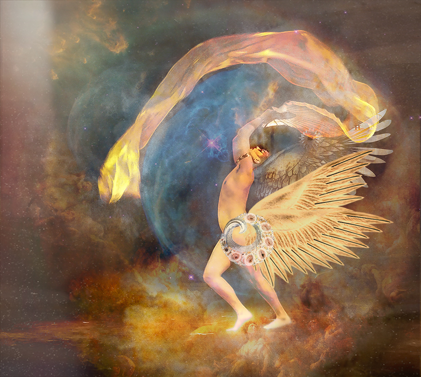
I love that you are playing in another playground with this one Brad!
Besides the suggestions above, I'm distracted by the variety of sharpness and blur in the entire image. If you want the bee to be the main subject, you might want to replace the face with a sharper bee face or something like a dog face or a flower, etc. that equals the sharpness of the body.
If you want, I'll send you my bee face to use as a replacement, lol!! |
Oct 16th |
| 54 |
Oct 21 |
Comment |
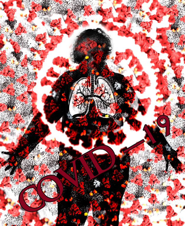
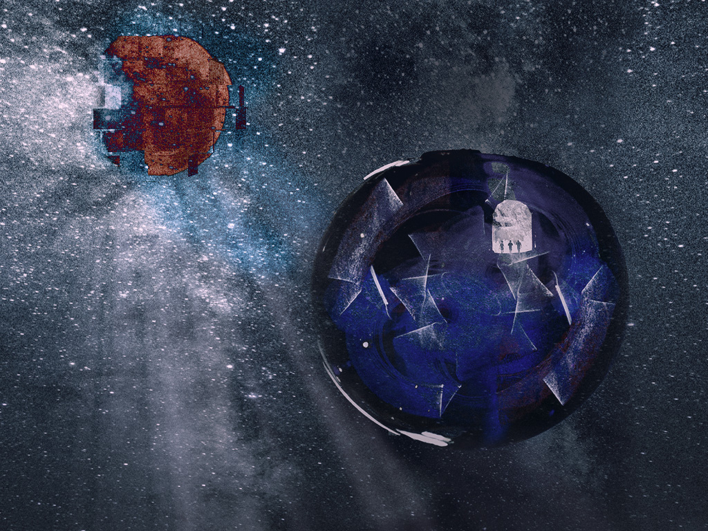
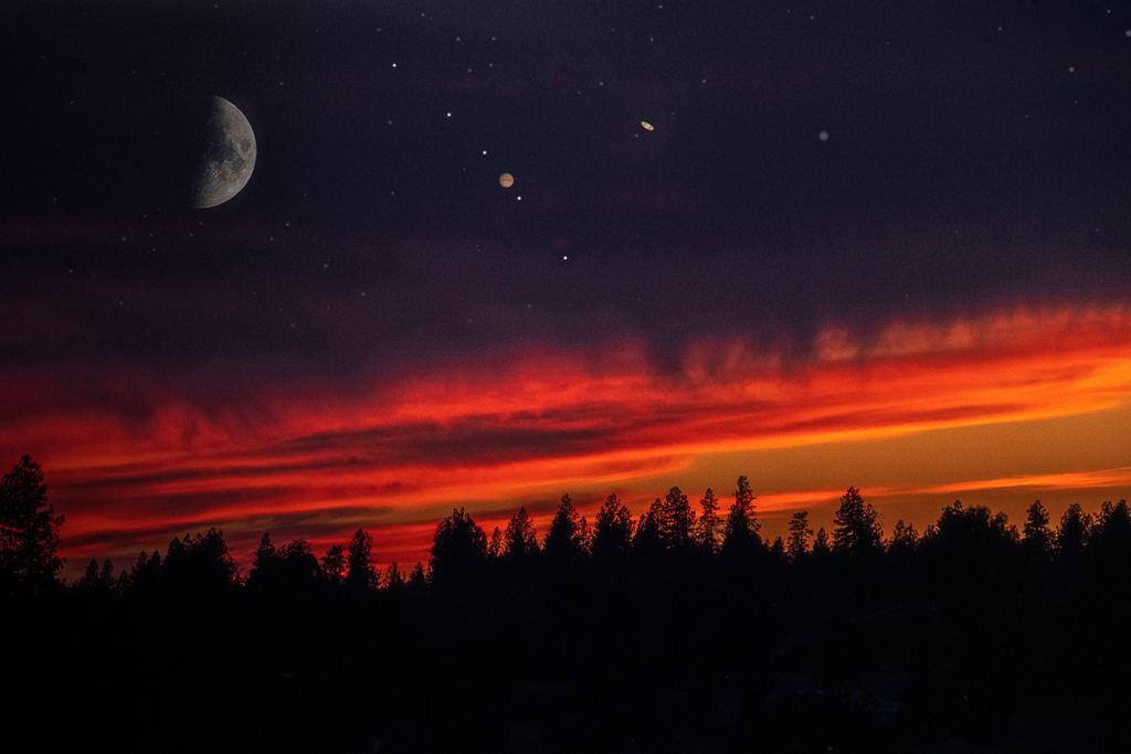
Interesting image.
It's quite a depressing image and certainly you hit the nail on the head as it reflects our current situation out west.
I have no technical suggestions for you other than the boat looks pasted in the photo but maybe you meant for it to look that way.
|
Oct 16th |
| 54 |
Oct 21 |
Comment |
Maria, Lovely work and composition. I like all the elements that you've placed so well.
I wonder about playing with the toning to make it all come together a bit more. This could be more cohesive with some global toning.
I also agree with the above comments about the white spot and the white frame not quite fitting the image. If you really want a frame, I'd suggest selecting a color that doesn't detract from the image. |
Oct 16th |
| 54 |
Oct 21 |
Comment |
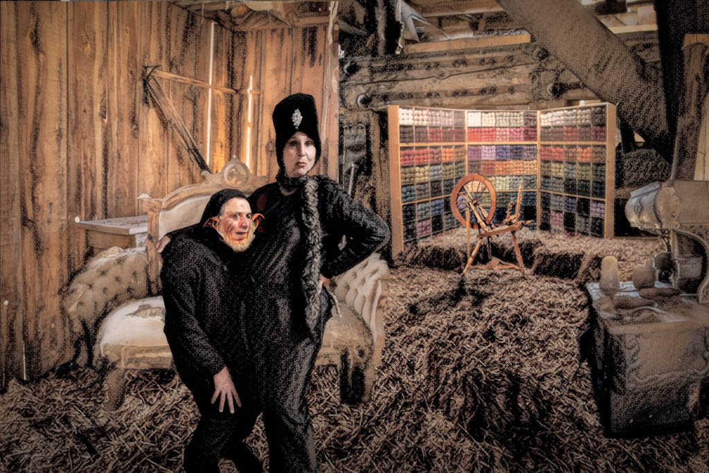
Aavo, Good on you for taking on quite a challenge.
I agree with all the above suggestions. |
Oct 16th |
| 54 |
Oct 21 |
Comment |
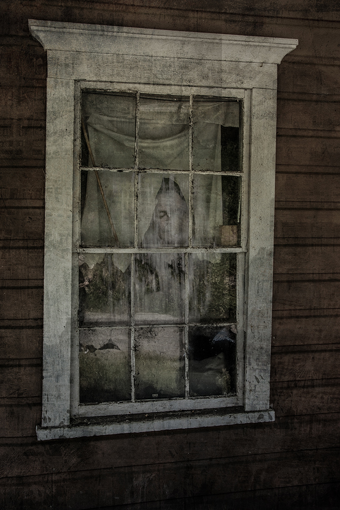
Such a fun image Peggy!! Perfect for the season.
I think because the swirly part is blurred, it might make sense for the ghosts to be a bit more swirly.
I also like the choice of Black and White for sure! |
Oct 16th |
| 54 |
Oct 21 |
Reply |
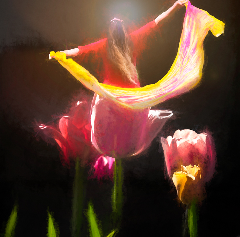
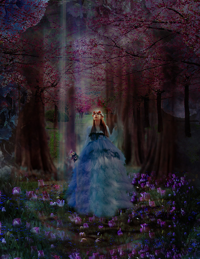
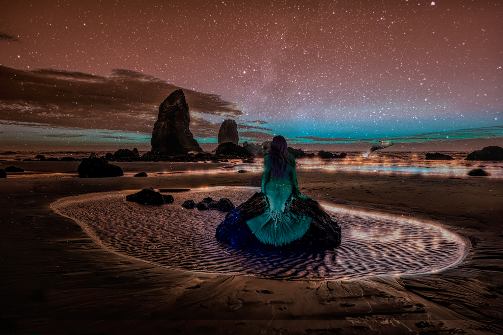
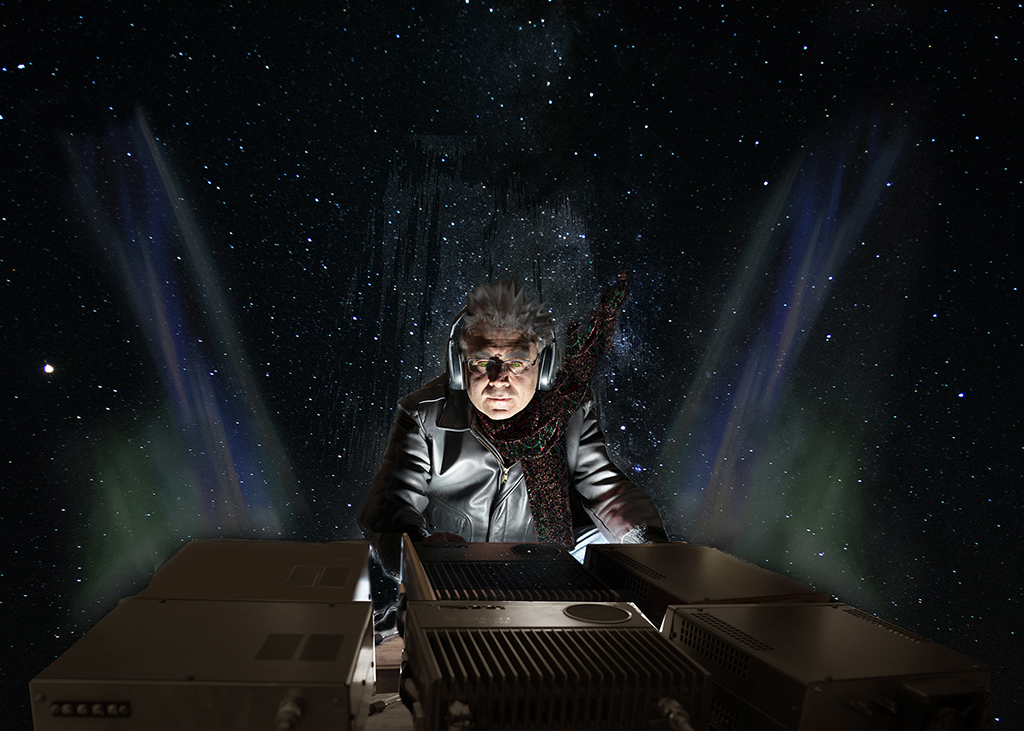
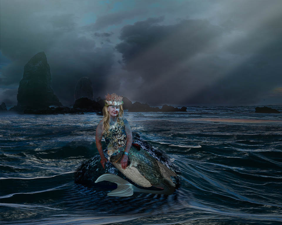
Thanks Peggy! I like your suggested changes. The interesting part is that the original image (#3 above) was taken at night. But it works to darken the sky as it enhances the tone of the model.
|
Oct 16th |
| 54 |
Oct 21 |
Reply |
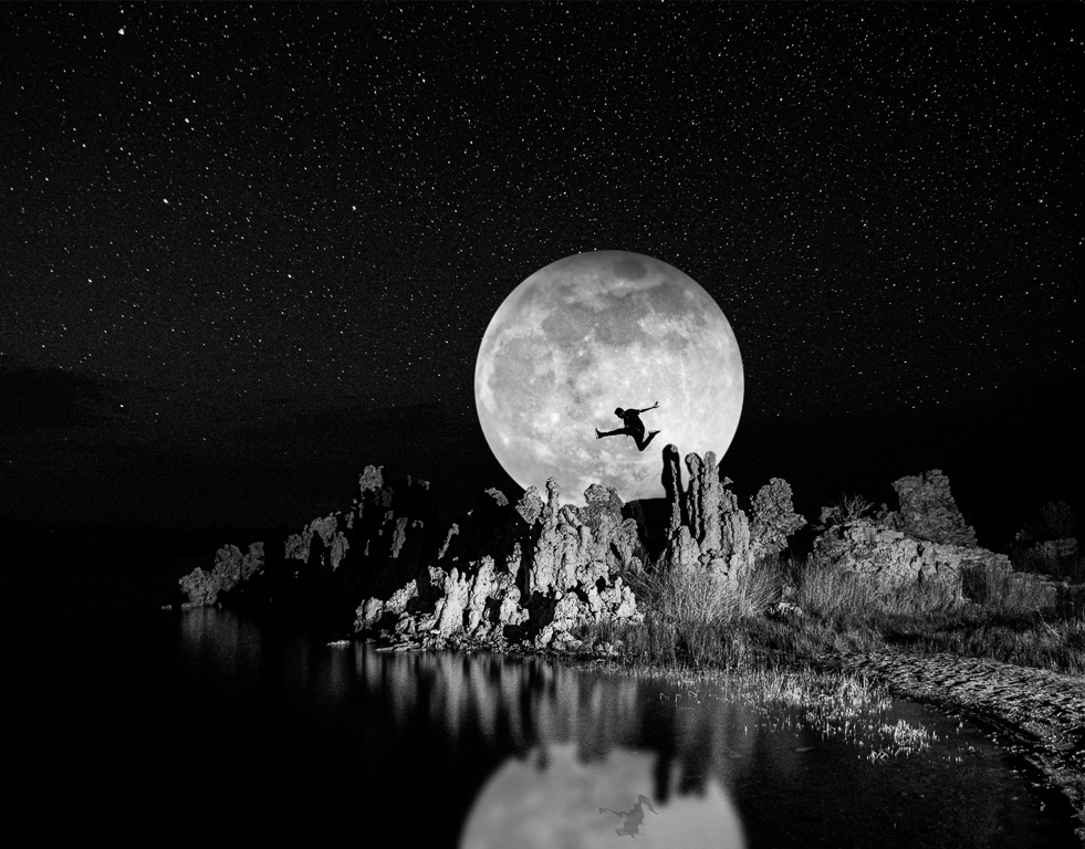
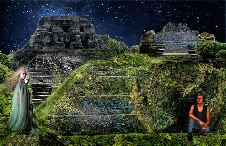
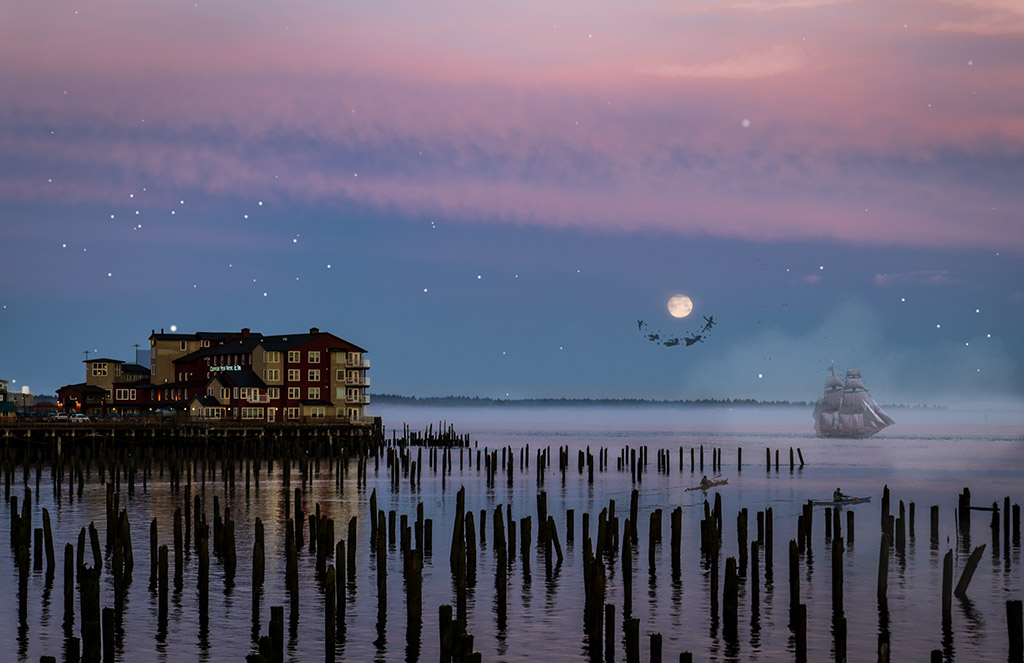
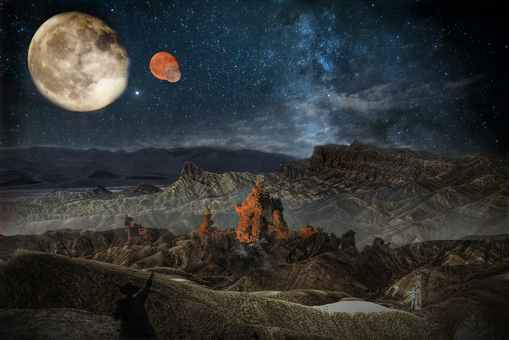
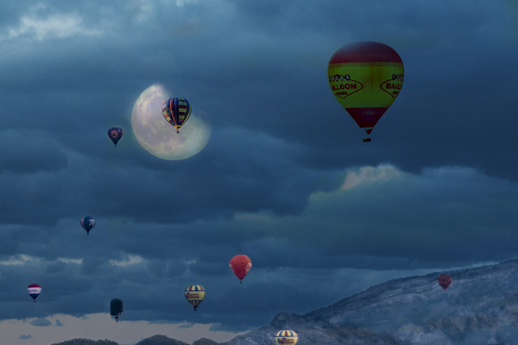
Thanks Brad! It's an interesting discussion because I belong to three different photography organizations with three distinctly different approaches to photo critique and judging. Depending on which organization, if you want to get a good critique, you make your image fit that particular group. In my case, I don't try to think about what the judges want, I work with what I want. That being said, I agree that I should have put the moon on the right side to balance the image now that I look at it more closely. But not because of rules, but because it balances the image better in my mind.
I think the "huntress" looks cut and pasted because of the lighting... it doesn't really fit the scene because we don't know what the source of the light is since the moon is behind her.
I also agree about loosing the dogs in the brush... lots to rethink and make anew. Thanks to both of you for your opinions and critical eyes. |
Oct 8th |
5 comments - 2 replies for Group 54
|
10 comments - 7 replies Total
|