|
| Group |
Round |
C/R |
Comment |
Date |
Image |
| 41 |
Apr 21 |
Reply |
Thanks for the feedback Jan! |
Apr 18th |
| 41 |
Apr 21 |
Reply |
Tom, a mixer brush is a brush in Photoshop that blends pixels like paint. |
Apr 18th |
| 41 |
Apr 21 |
Reply |
Thanks Brad! |
Apr 18th |
| 41 |
Apr 21 |
Reply |
Thanks Maryellen! |
Apr 18th |
| 41 |
Apr 21 |
Reply |
Love the name and the entire image! |
Apr 18th |
| 41 |
Apr 21 |
Reply |
Yep, that's definitely the challenge... I noticed as I was playing with it. But really great either way. |
Apr 10th |
| 41 |
Apr 21 |
Comment |
Too much fun Lisa!! Love this! I especially like the color scheme. |
Apr 10th |
| 41 |
Apr 21 |
Comment |
This is Soooooo Coool, Jan!!
Did you see the "Body Tree" in the PPC Image Comp? It reminds me of that..
Titles? I dunno... "Humanesque" "Family Affair"... hah hah..I'm not good at this. |
Apr 10th |
| 41 |
Apr 21 |
Comment |
I LOVE LOVE LOVE this Tom!!
It's really great as is...
If you want to think about the balance a bit, I think it's a bit weighted on the right side and maybe you can balance it by adding road cracks on the left slightly or more hanging strings on left.
Otherwise, it's a fav of mine! |
Apr 10th |
| 41 |
Apr 21 |
Comment |
Hi Maryellen,
This is a nice photo but since you didn't include the original or mention what you changed about it other than you maybe used Topaz, I don't know what to comment on..
|
Apr 10th |
| 41 |
Apr 21 |
Comment |
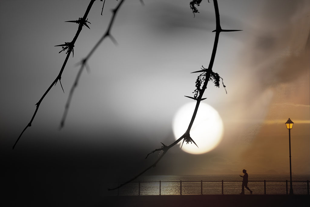
I really like this composite Brad!!
Nice job with the color transition.
The only think I wonder about is whether you want to clone out the branch above the walker...
Otherwise, great mood and story. |
Apr 10th |
 |
5 comments - 6 replies for Group 41
|
| 54 |
Apr 21 |
Comment |
Brad, I really like the mood and the tones in this piece.
To answer your question about the bird... I think there needs to be a better balance between the rocks and the birds so I added the entire original photo for you to compare and see if it makes a difference to you.
Not a technically good edit but just for you to think about the balance.
|
Apr 10th |
 |
| 54 |
Apr 21 |
Comment |
Neil, This is such a great art piece! So fun and perfect in black and white.
To me, the lighting isn't quite right and an easy fix. The lighting from the blackboard should be the main light/shadow... all the other elements should follow that lighting pattern in my mind.
|
Apr 10th |
| 54 |
Apr 21 |
Comment |
I like the concept!
Lisa Cuchara talks about that in her Wabi Sabi presentation.
In my opinion, I would like to see some clean up on the technical side. The grass has blurred and clear elements which pull my eye. The flower selections could be cleaner as it looks pasted into the photo. |
Apr 10th |
| 54 |
Apr 21 |
Comment |
This is so fun Peggy! I love the concept and what you've done here.
To me, the frog needs to be more clear. I had to look at the original to understand what I was seeing...
Otherwise, wonderful! |
Apr 10th |
4 comments - 0 replies for Group 54
|
9 comments - 6 replies Total
|