|
| Group |
Round |
C/R |
Comment |
Date |
Image |
| 41 |
Aug 20 |
Reply |
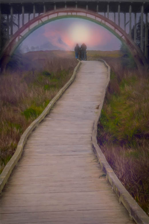
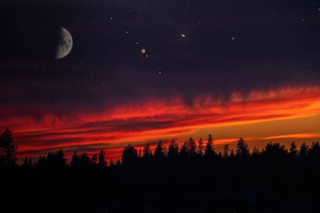
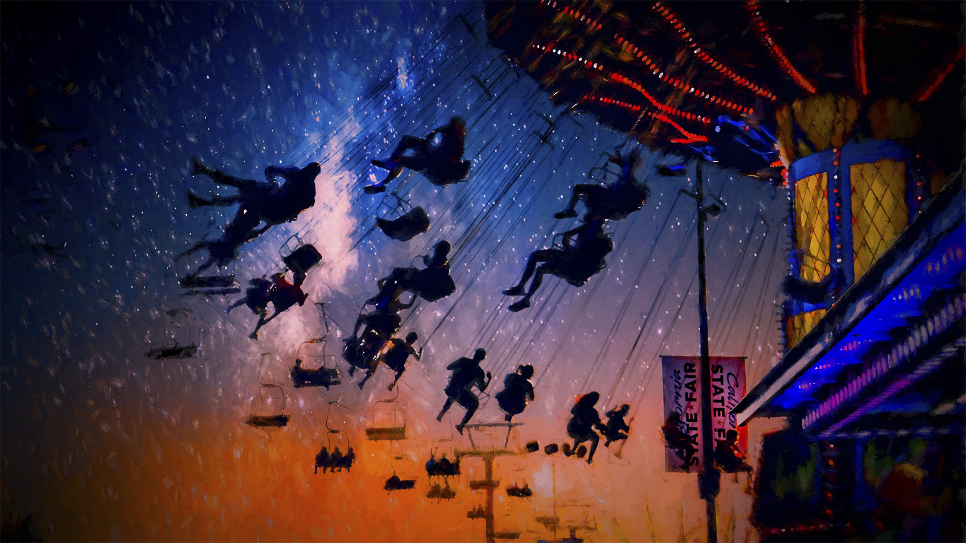
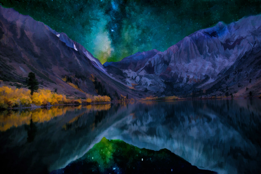
Lucky you Brad!! One of my favorite places is anywhere along Hwy 395.
I hope you had dark skies for your Milky way shoot? |
Aug 17th |
| 41 |
Aug 20 |
Reply |
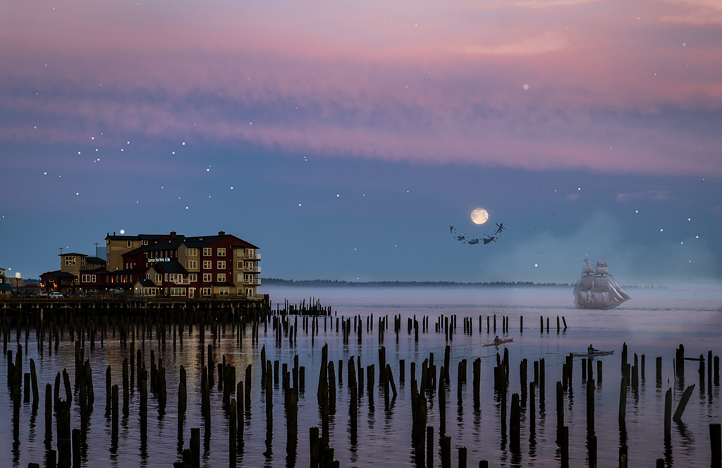
I get it Brad... that darned ISS is mucking up the photo... but I couldn't get rid of it. I waited too long for that darned space station to be in the right place, hah hah! |
Aug 16th |
| 41 |
Aug 20 |
Comment |
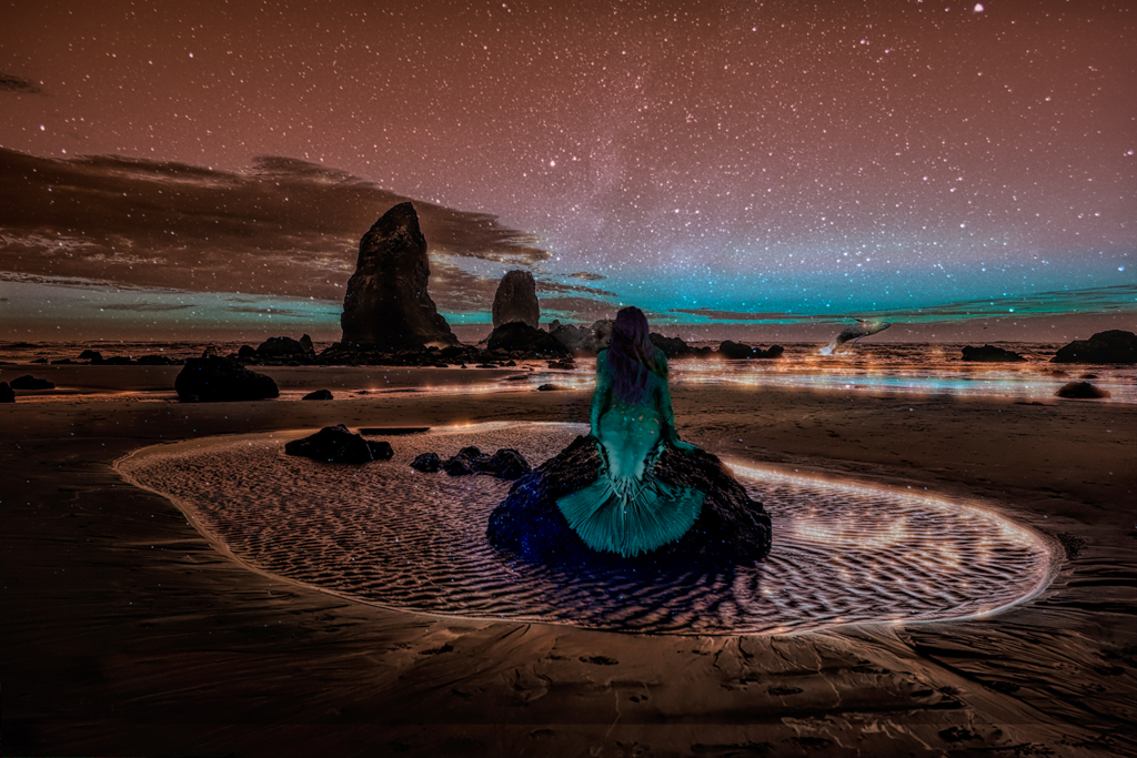
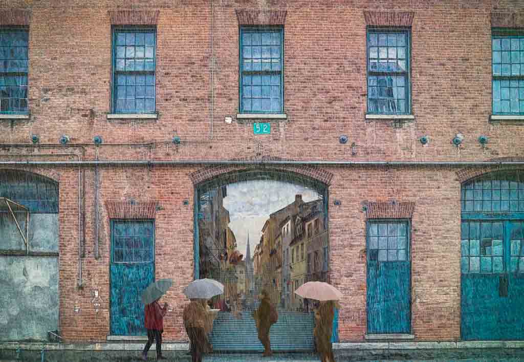
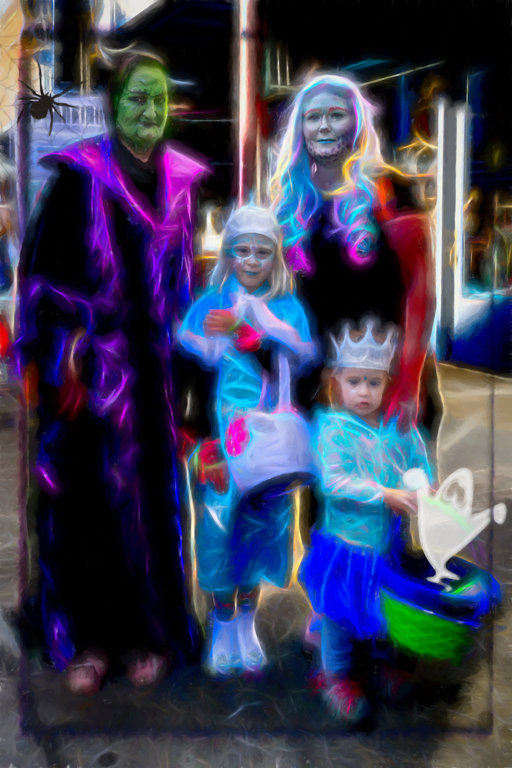
Lisa, This is a really nice conversion that shows off your art skills.
I like the balanced colors and that you left a lot of room in the sky.
|
Aug 16th |
| 41 |
Aug 20 |
Comment |
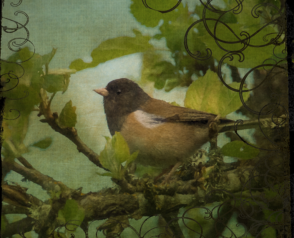
Love this Jan!
I really like the balance and the tones in your photo.
|
Aug 16th |
| 41 |
Aug 20 |
Comment |
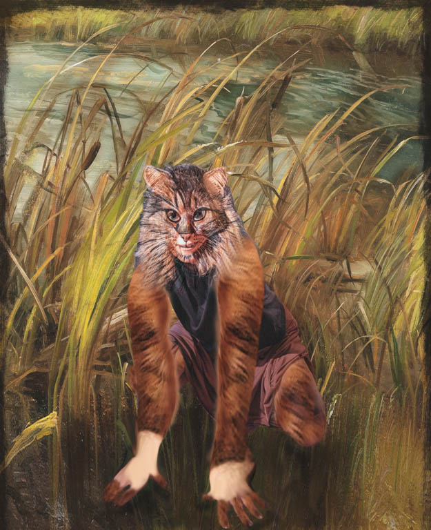
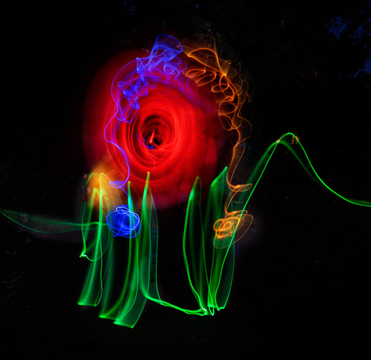
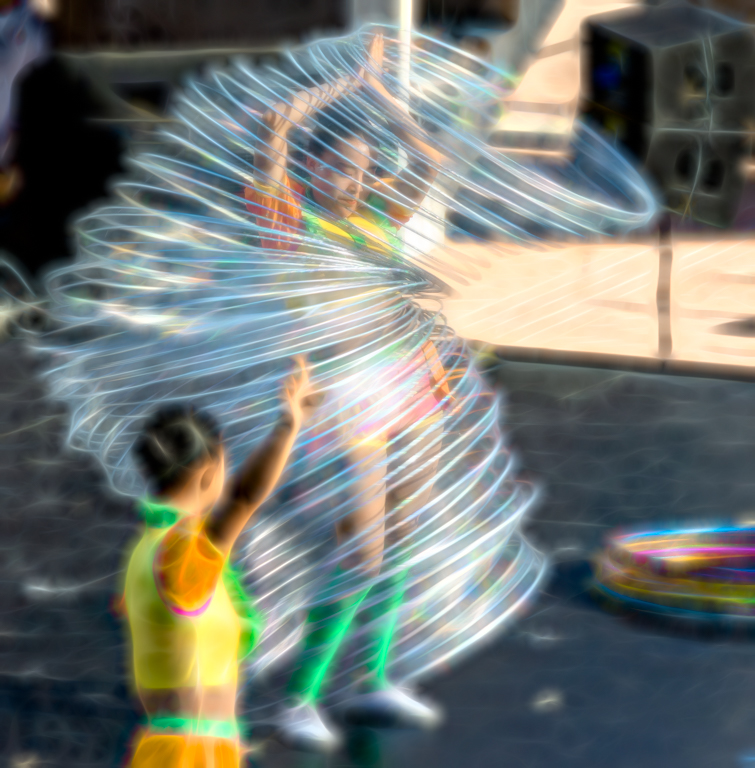
Maryellen, such a great concept for the twirls! Like you, I've played and enjoyed the fun of making these.
You photo of the cat is the best I've seen in a while!
It looks like it should be on a poster of "Cats". |
Aug 16th |
| 41 |
Aug 20 |
Comment |
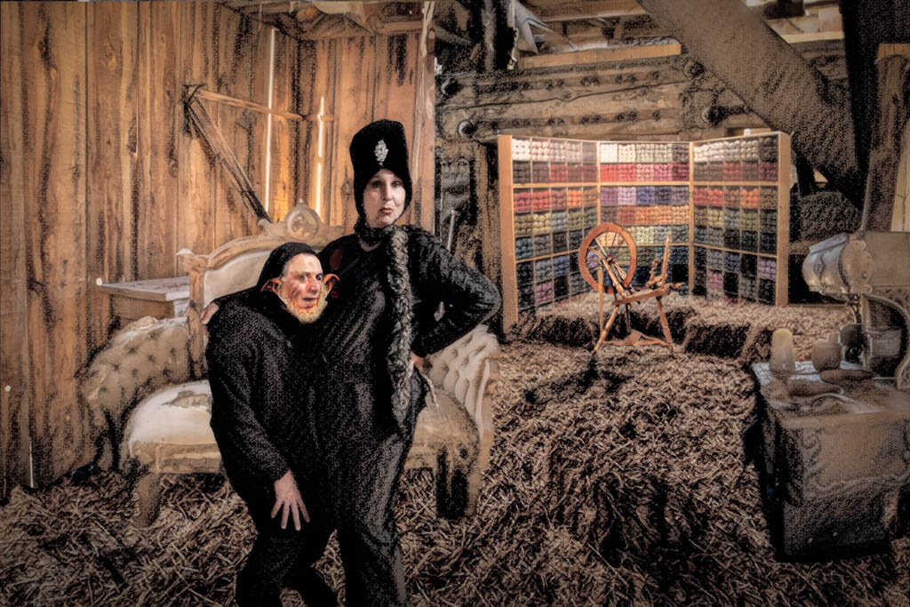
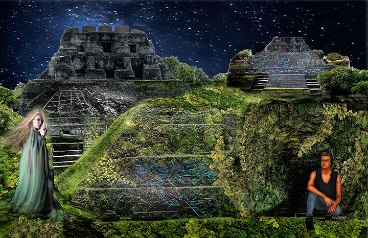
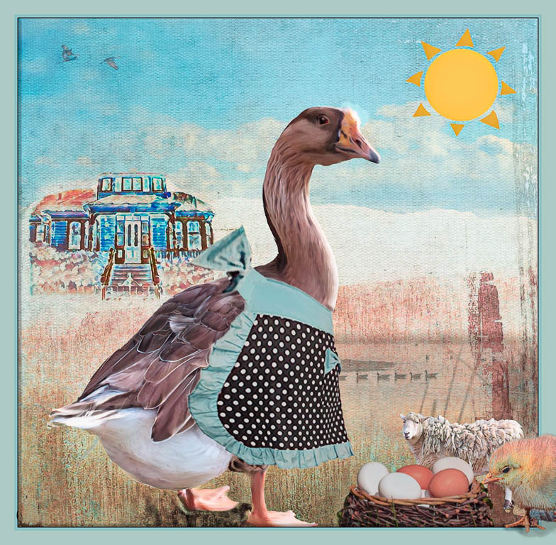
I love your Guatemala photos Henry!
I agree with Brad in that I'm not sure what story you want to tell here.
Why did you place the elements where you did? You wrote that you wanted to portray the immense diversity and I think that's a great goal. I think that because of how you placed the different elements, it doesn't quite meet your stated goal.
Perhaps having a people only theme or an art only them to tie together "diversity"?
I like this as a start and think you can develop the idea more because you have such rich material. |
Aug 16th |
| 41 |
Aug 20 |
Comment |
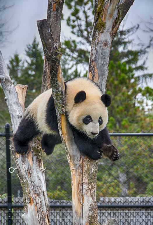
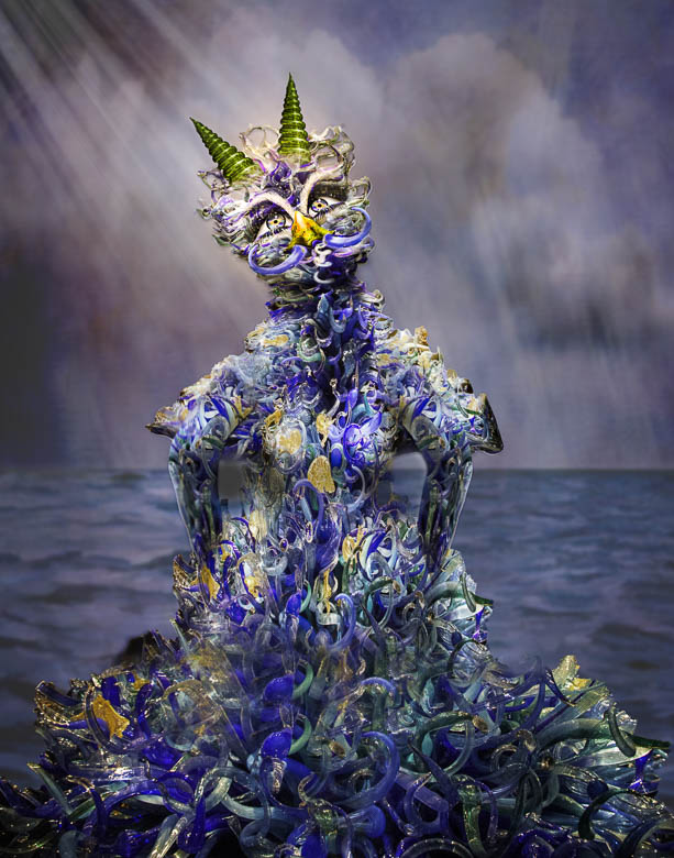
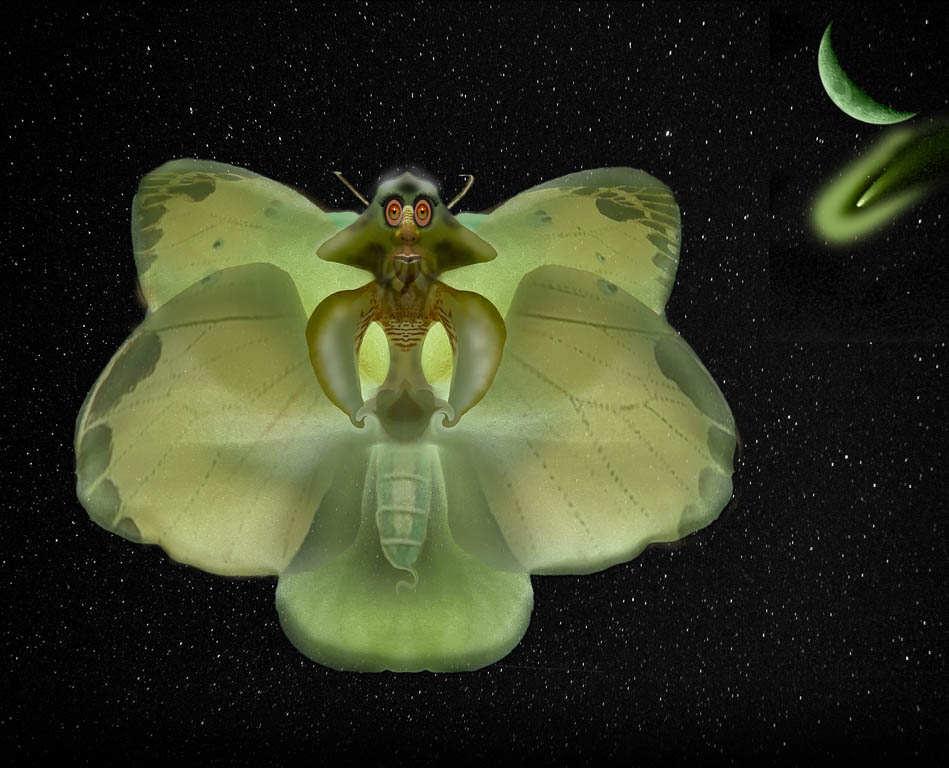
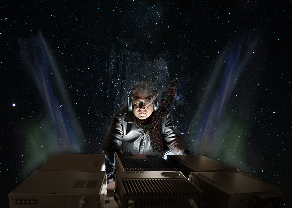
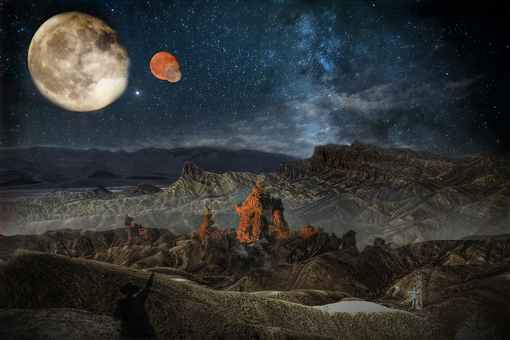
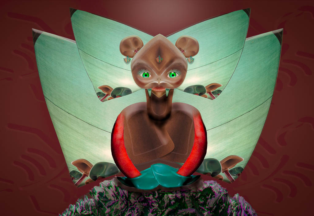
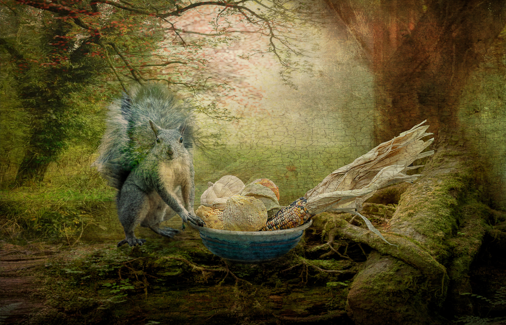
Brad, Love your dedication to getting those star trails! I tried staying up for the Pleiades and didn't make it so kudos to you!
I like your monster moth. It's a whimsical story and I can't think of anything other than adding a moth family, hah hah!
Good job! |
Aug 16th |
5 comments - 2 replies for Group 41
|
| 54 |
Aug 20 |
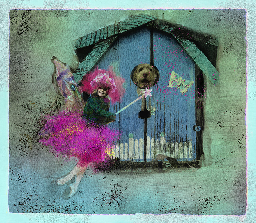
Comment |
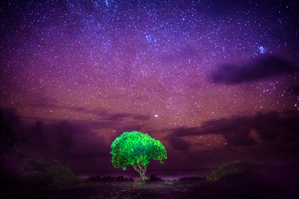
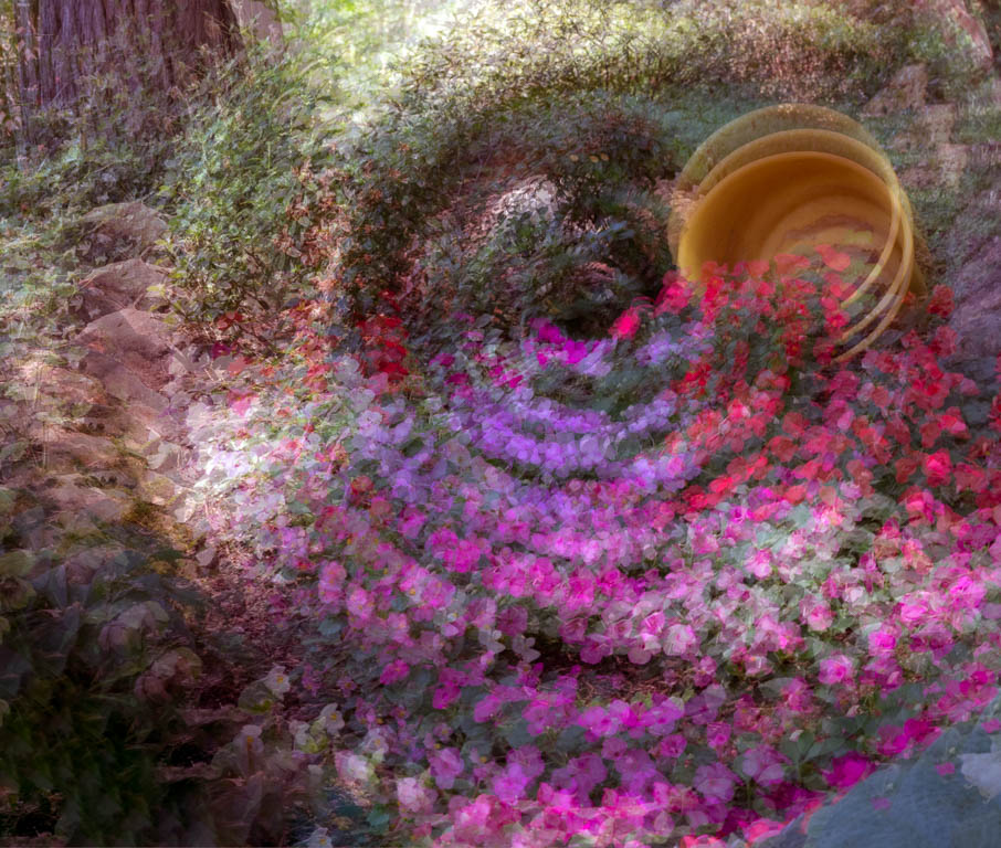
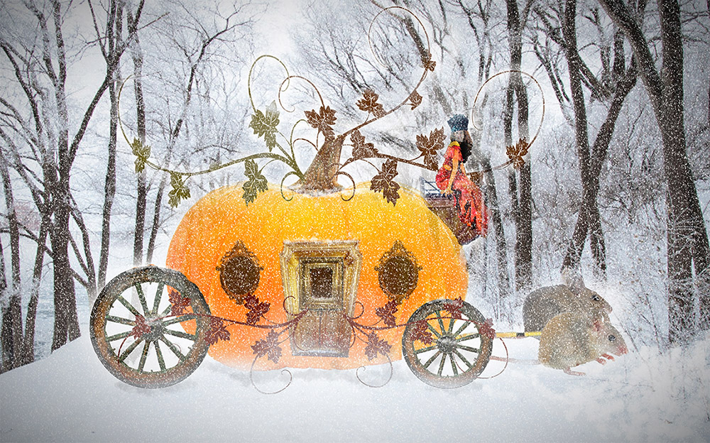
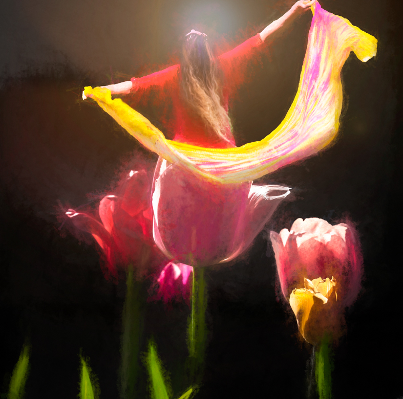
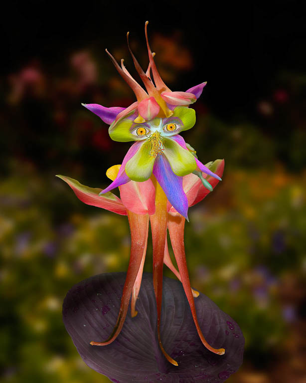
What a beautiful butterfly and flower. The flower actually looks like a birthday cake with candles. Wouldn't it be cool if the butterfly were "lighting" the candles on the flower?
I agree with Alan, that if you want it more realistic, (maybe you don't?) the flame would make more sense coming from behind the butterfly. This way, it's wings look like they're on fire... ouch!
I wonder if the composition would be stronger if you left the forest scene out? Or made it a faint background for the larger photo? Just some ideas for you.
|
Aug 17th |
| 54 |
Aug 20 |
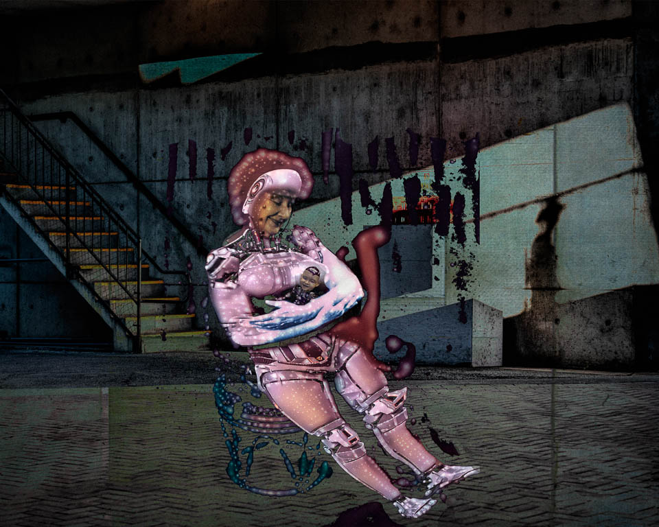
Comment |
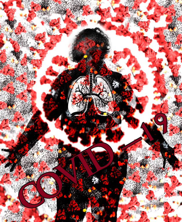
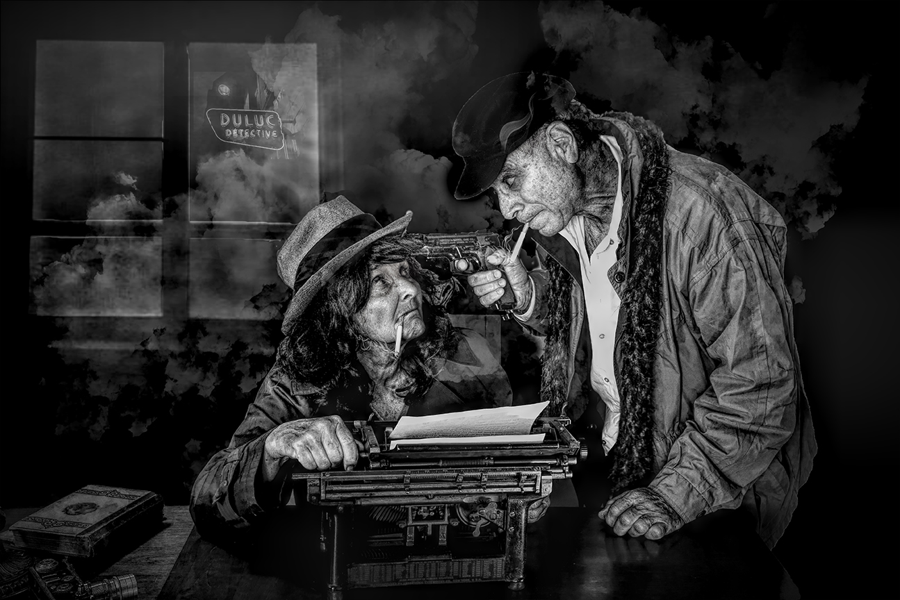
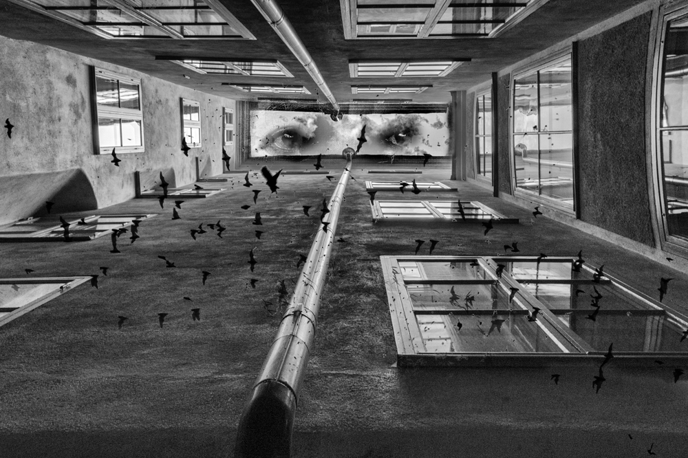
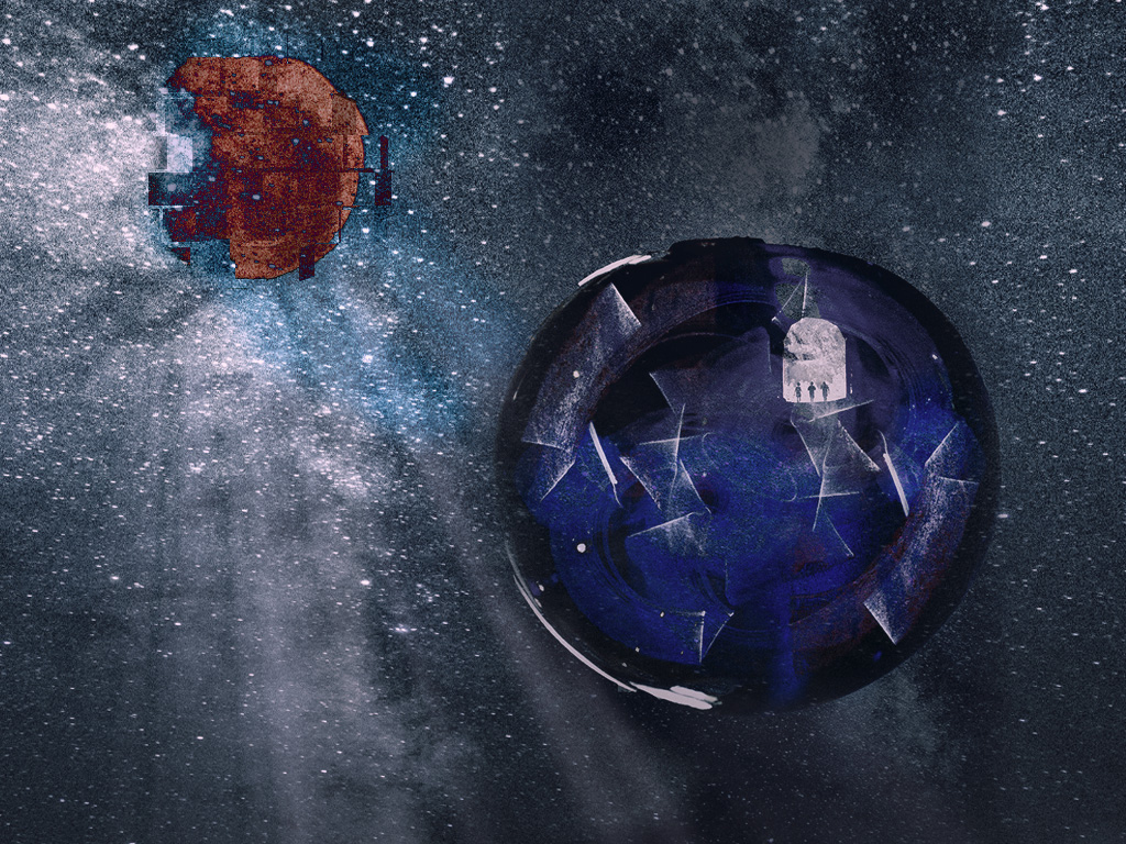
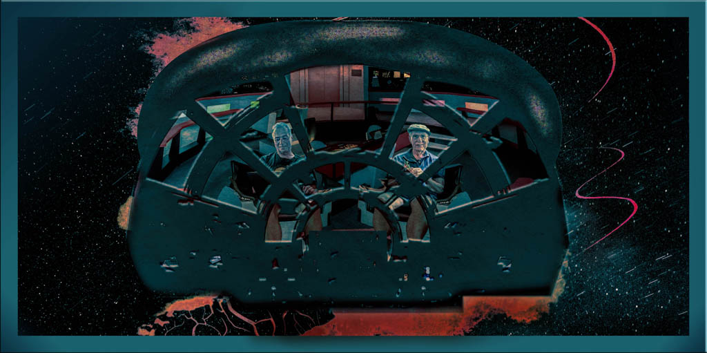
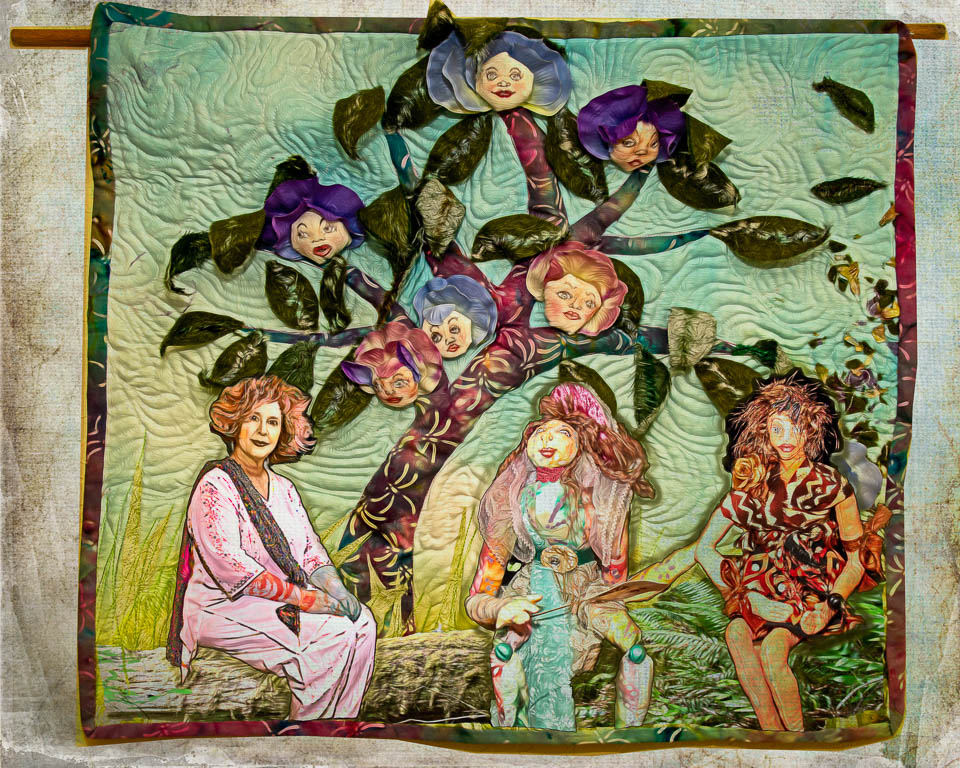
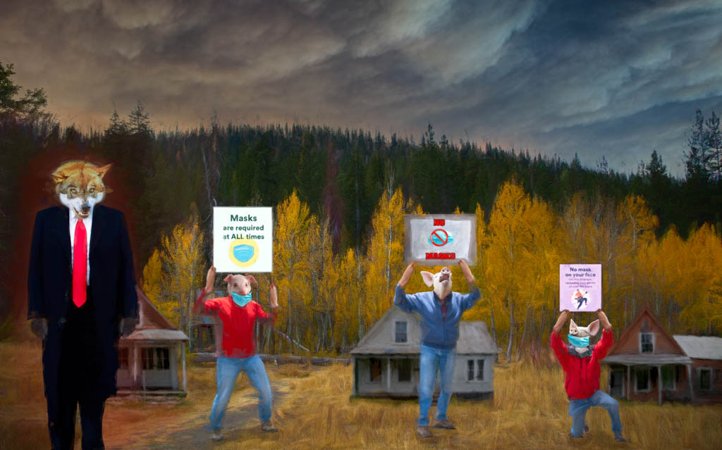
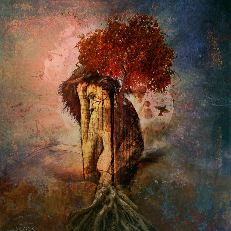
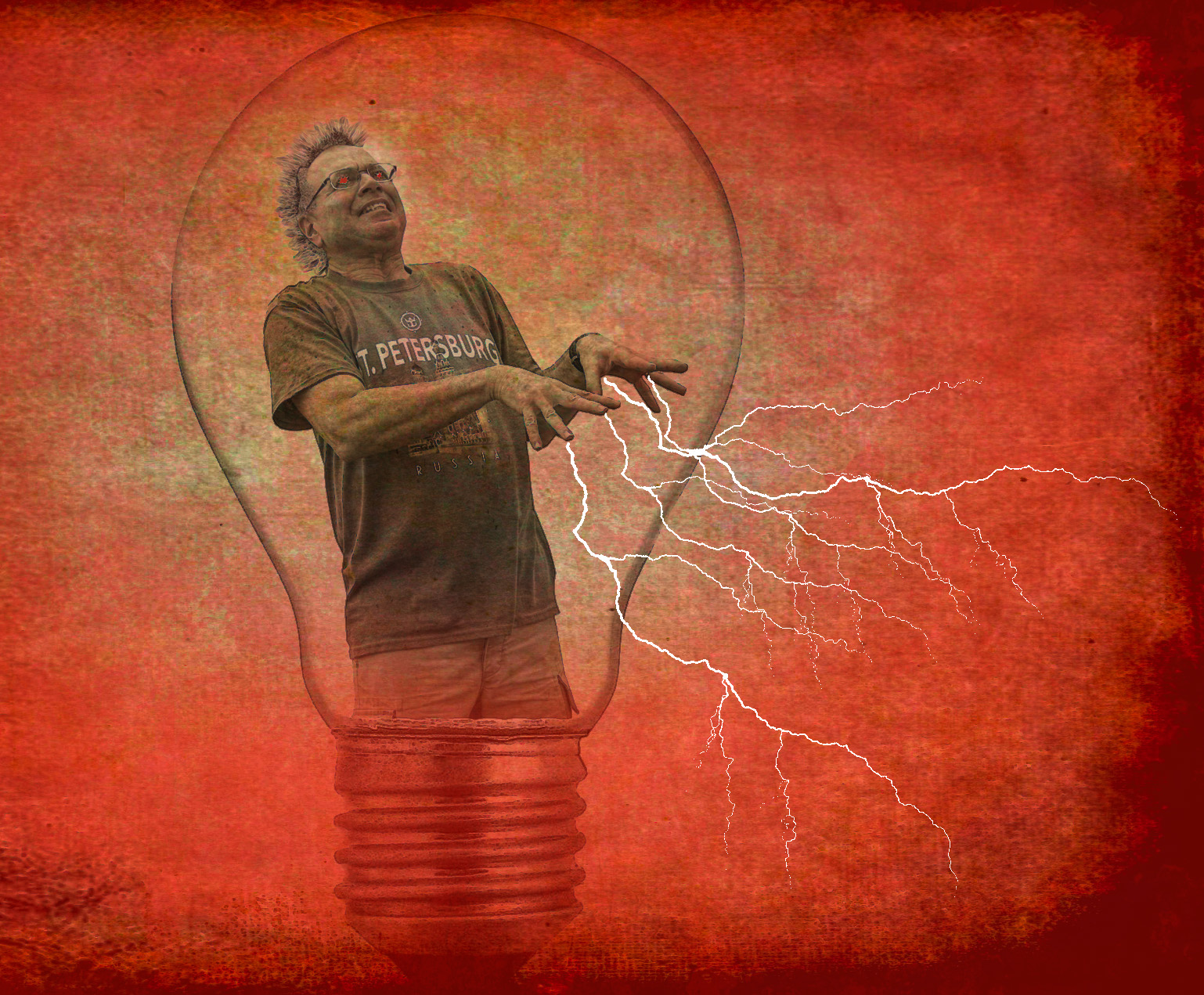
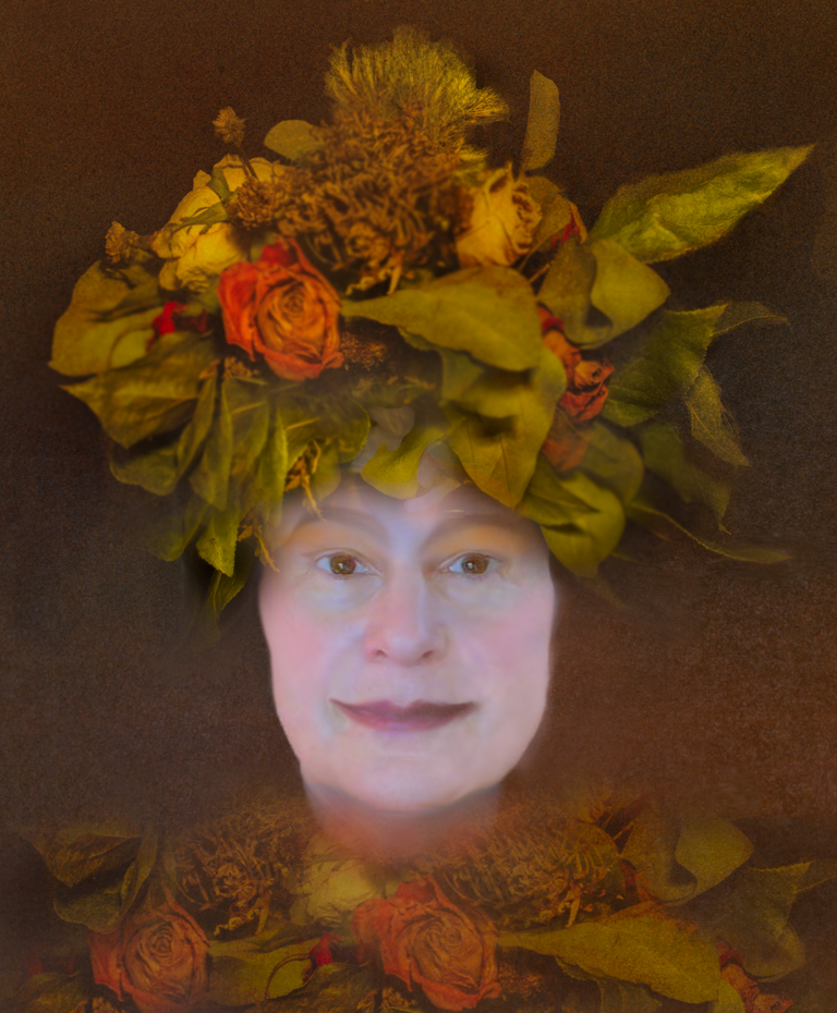
This composite reminds me of a story from the Twilight Zone... Interesting effects and a bit unsettling.
|
Aug 17th |
| 54 |
Aug 20 |
Comment |
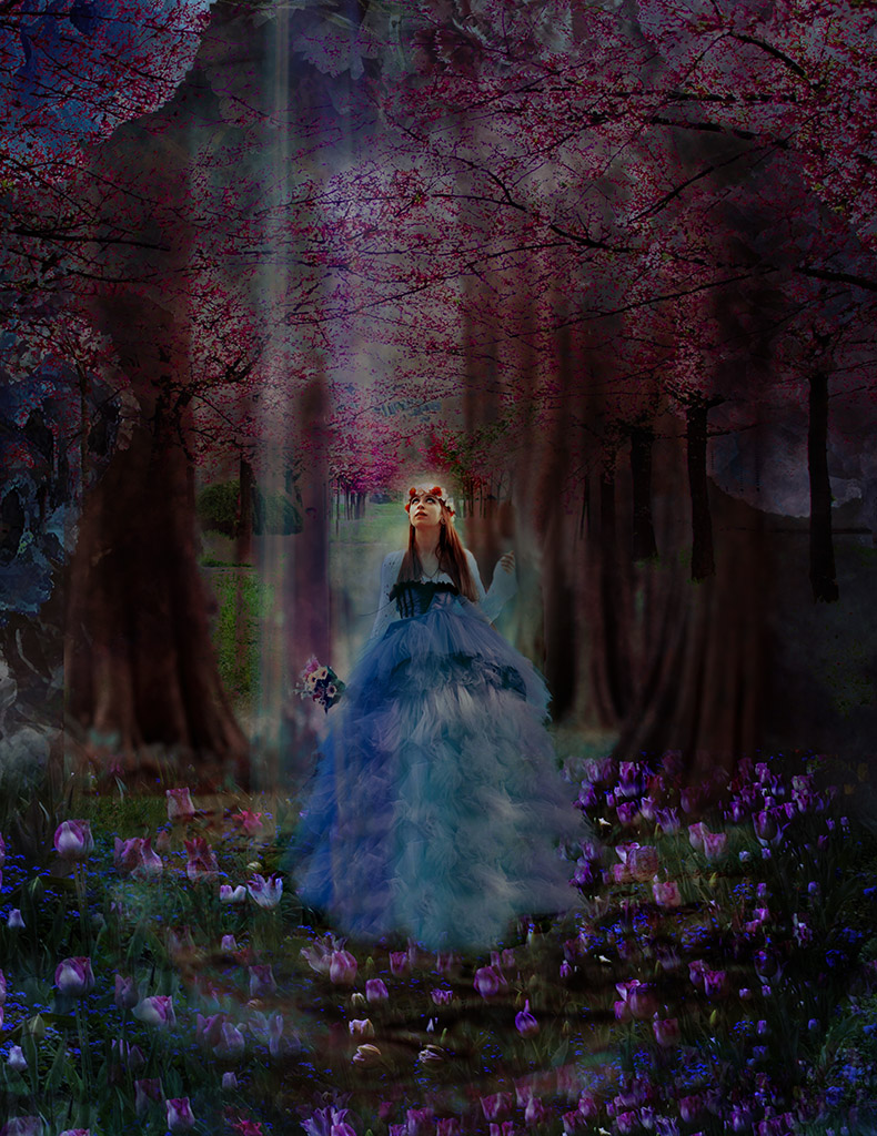
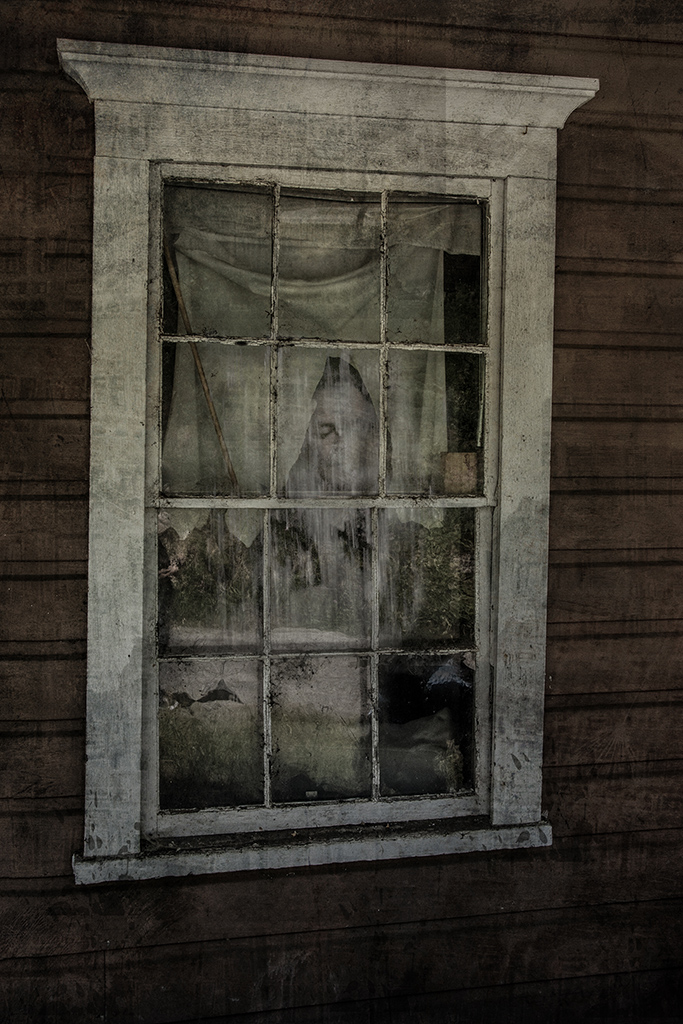
I agree with everything written so far.
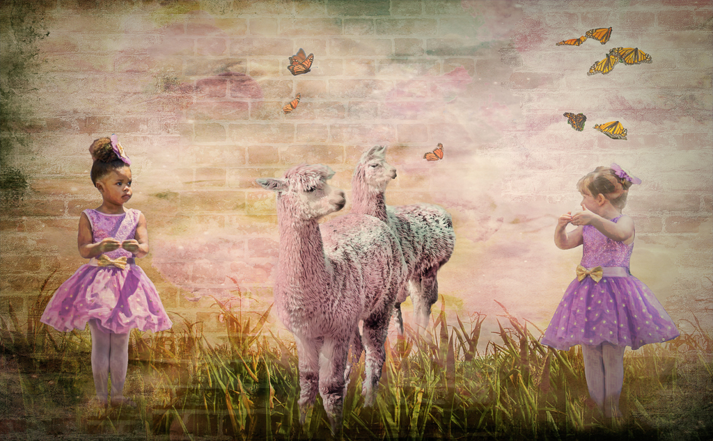
I would add that there is a brown piece of something sticking out below the girl that you may want to delete as it doesn't seem to fit the girl or the plant. |
Aug 17th |
| 54 |
Aug 20 |
Comment |
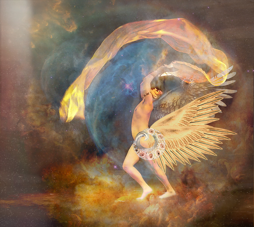
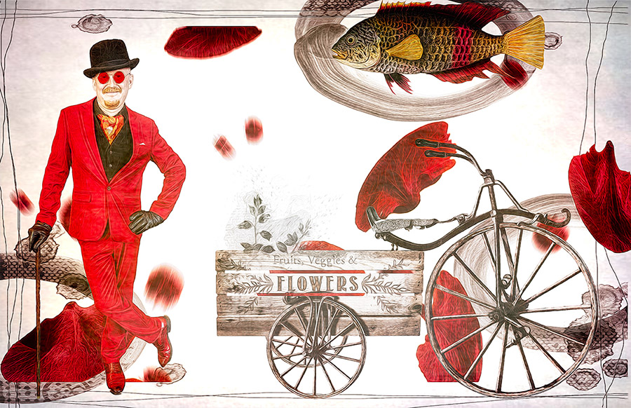
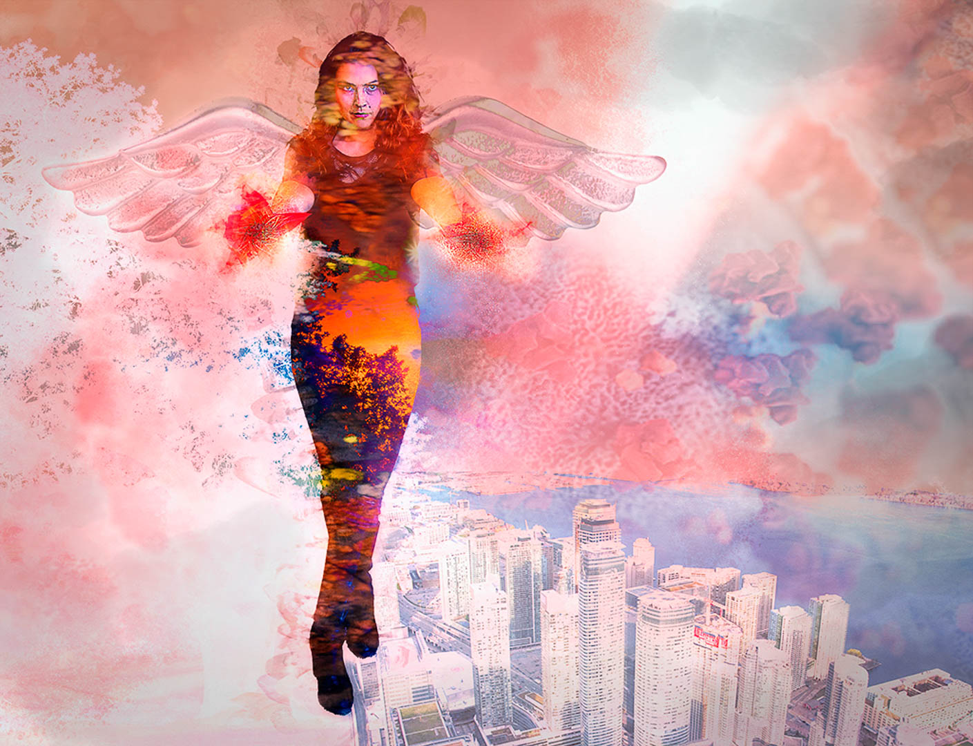
I agree with the comments about the orange man and like the blue adjustment Peggy made.
Your composition pulls me in and keeps me looking to make sense of what I'm seeing.
Of course, you've achieved your goal. |
Aug 17th |
| 54 |
Aug 20 |
Comment |
Peggy, I like the "op art" feel to your photo! And sunflowers are my favorite flower in the summer!
Even though we are told that three is a good number for items in a composition, to me, I think that the lizard isn't needed here. If you crop to just the crow and the flower, it seems that there's a relationship to each other. With the yellow lizard, the color feels unbalanced to me.
So mark me down for the crow, lol!
|
Aug 16th |
| 54 |
Aug 20 |
Reply |
Thanks for pointing out the strays Brad! I need to really do a better job of taking the photo to 100% and proof!
|
Aug 4th |
5 comments - 1 reply for Group 54
|
10 comments - 3 replies Total
|