|
| Group |
Round |
C/R |
Comment |
Date |
Image |
| 41 |
Nov 18 |
Reply |
thanks Henry! I'll rework the image with all the great suggestions! |
Nov 16th |
| 41 |
Nov 18 |
Reply |
thanks Lisa! |
Nov 15th |
| 41 |
Nov 18 |
Reply |
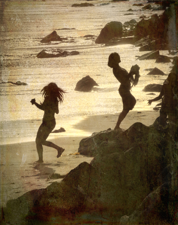
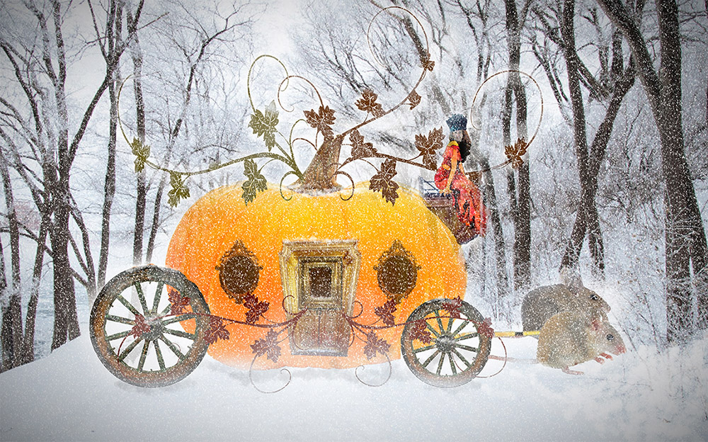
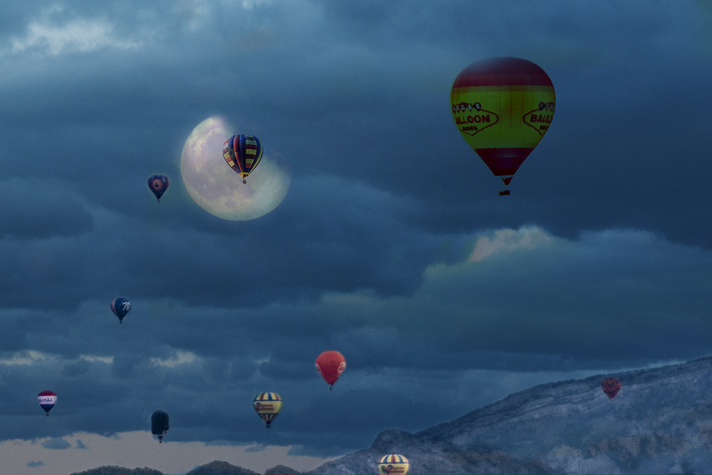
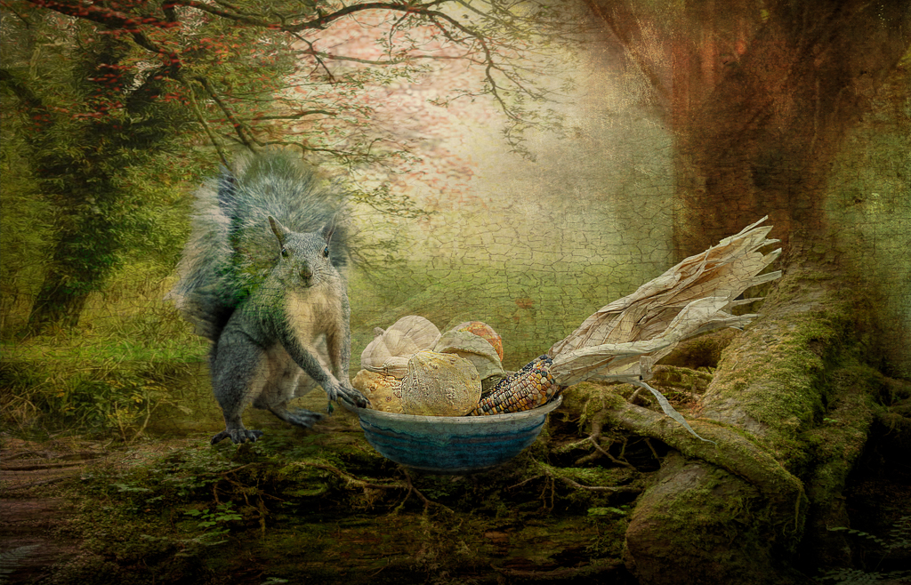
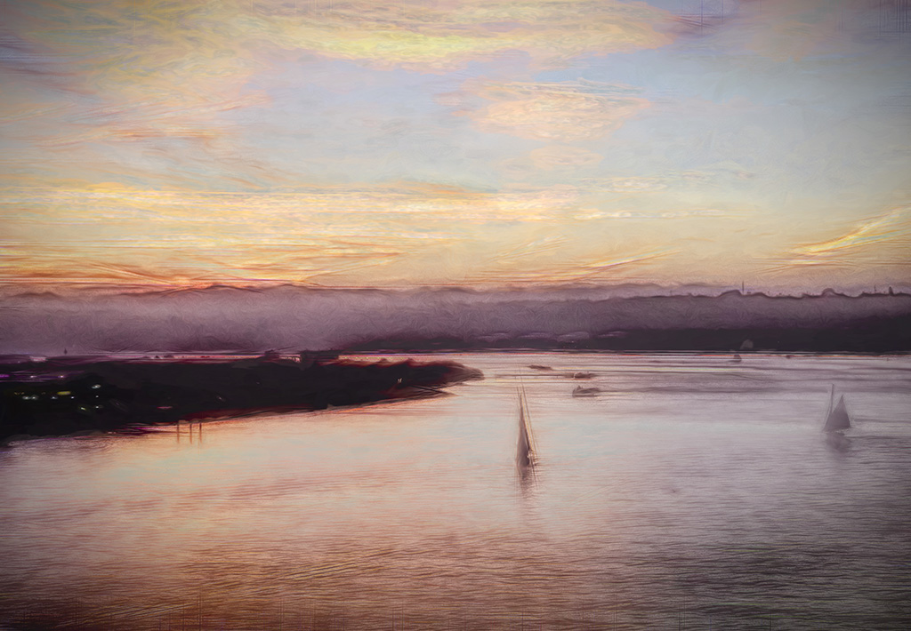
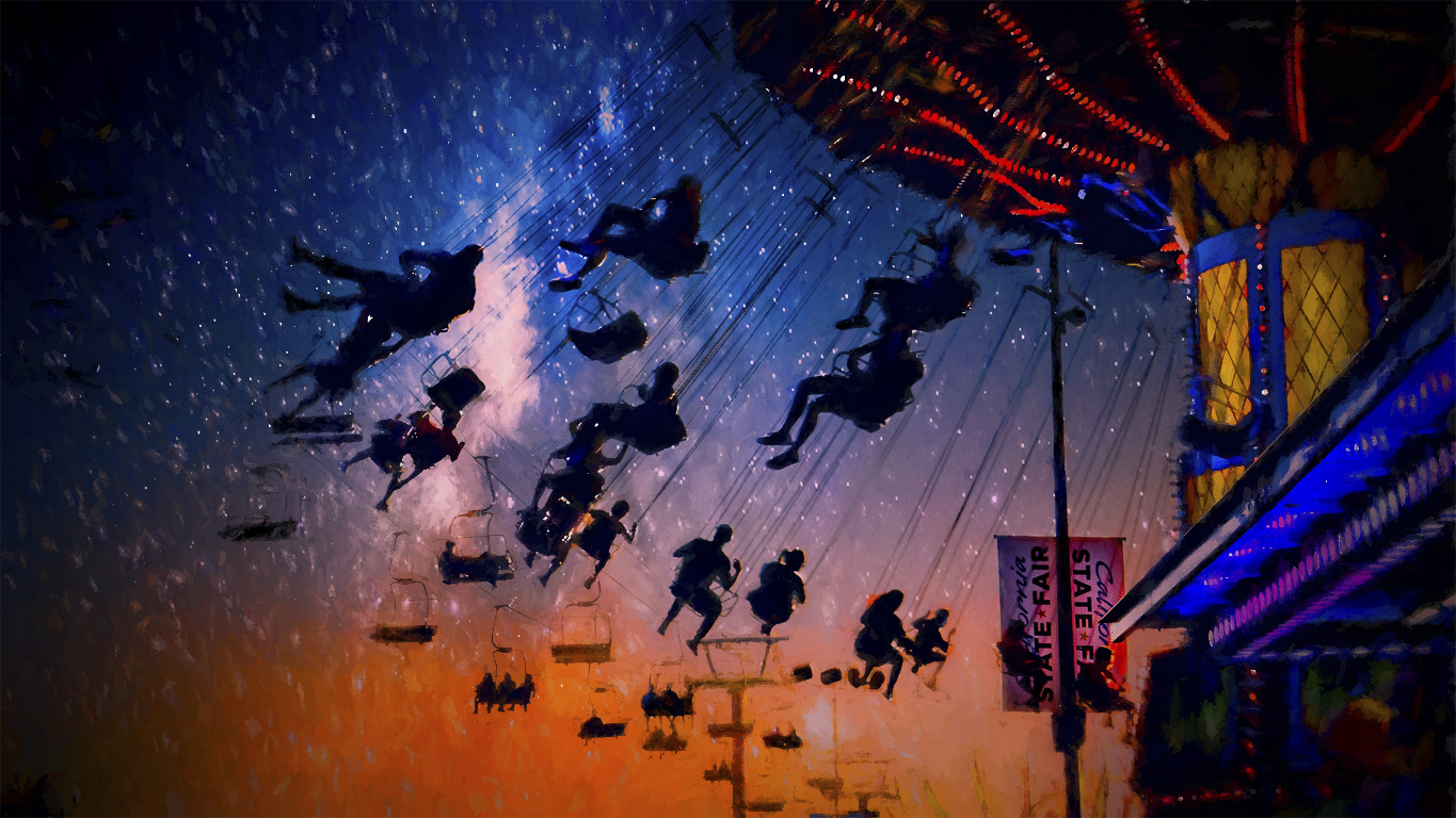
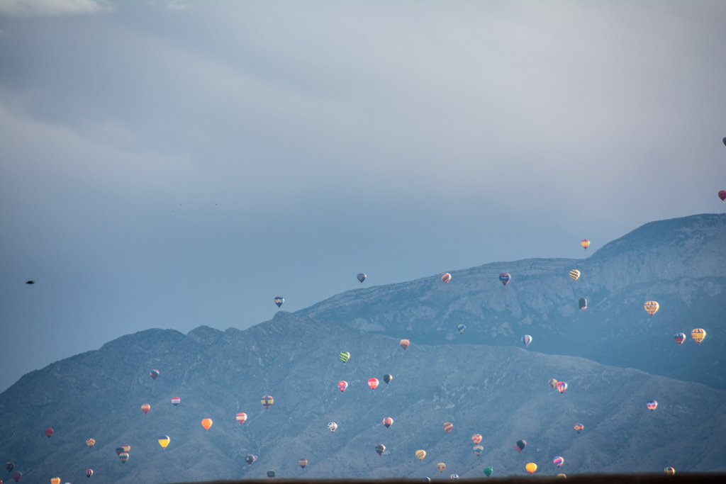
No Sue, all those balloons are real. Brad can't add more than three photos so didn't add the original. I'm adding it here so you see all the balloons in the air.
I added two different balloon shots to fill up the space. |
Nov 15th |
 |
| 41 |
Nov 18 |
Reply |
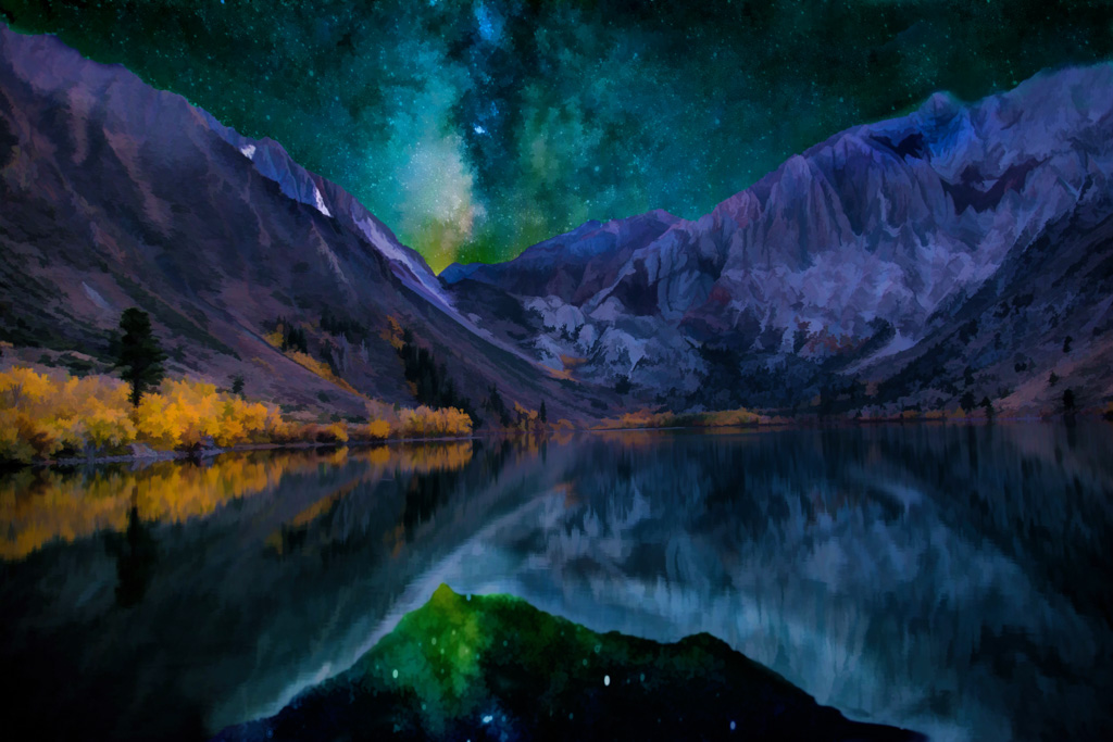
Thanks Brad! Yes, I agree that the color on that balloon is off and will work on it.
I would love to add more land but I don't have much more to add since I was standing behind a roof top that cut off the bottom of the hills. I could clone a bit in or take from another picture so I'll try that.
|
Nov 15th |
| 41 |
Nov 18 |
Reply |
Darn that compression!! thanks for checking and getting back |
Nov 15th |
| 41 |
Nov 18 |
Comment |
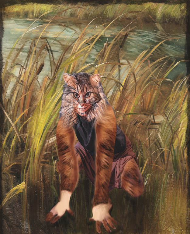
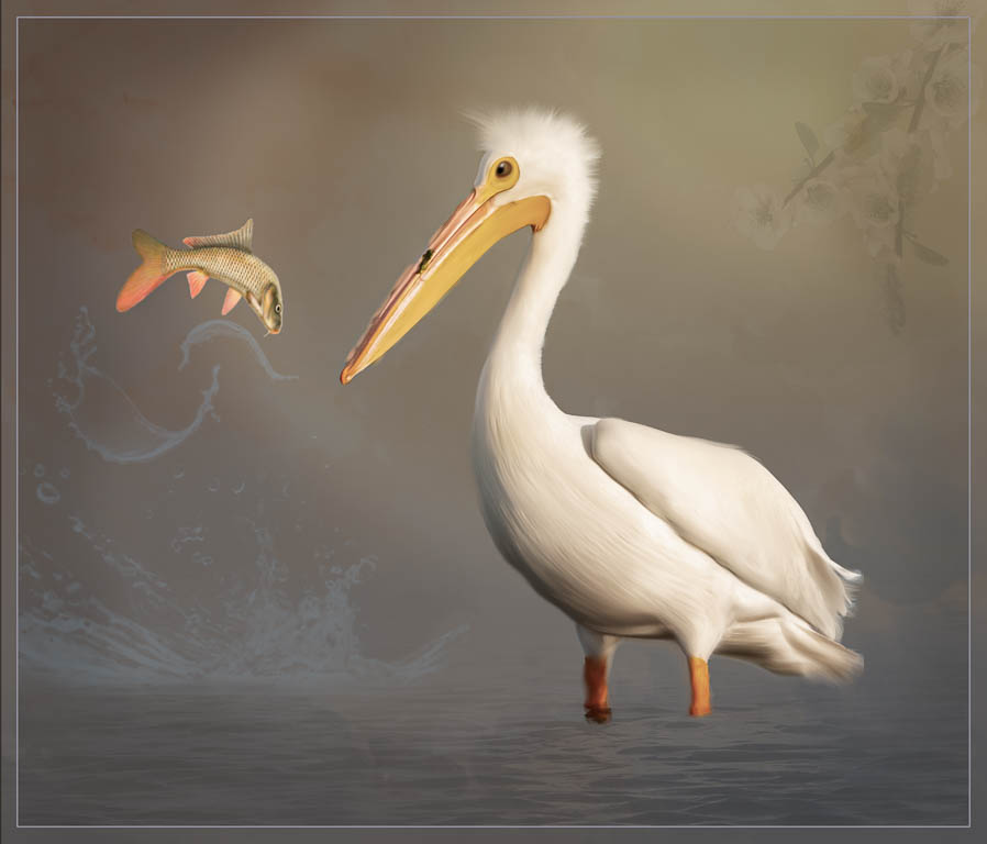
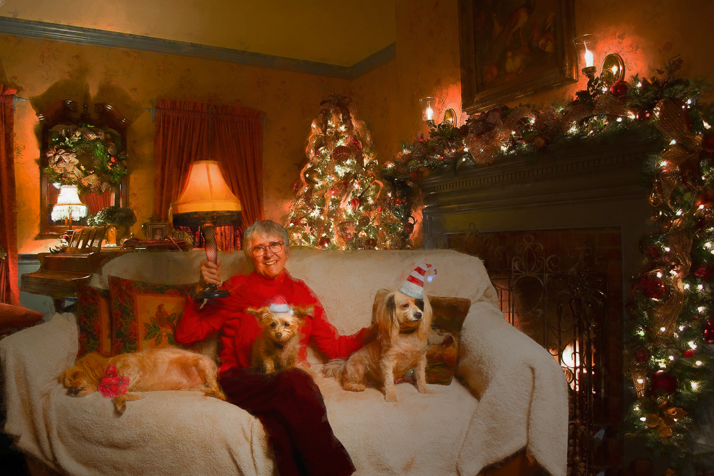
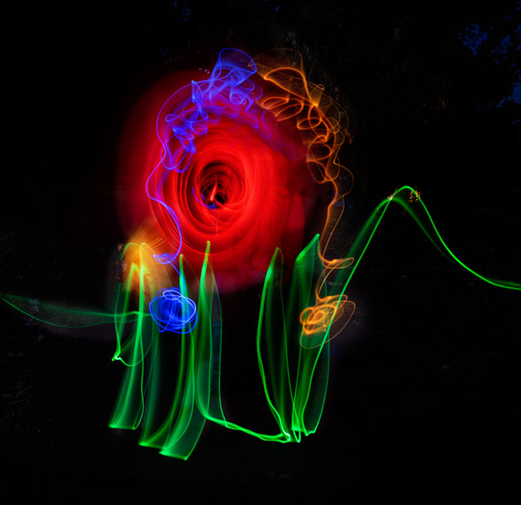
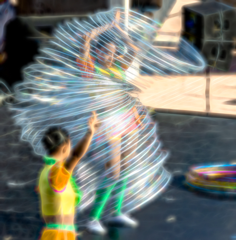
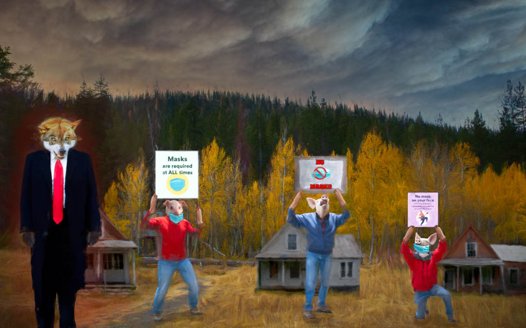
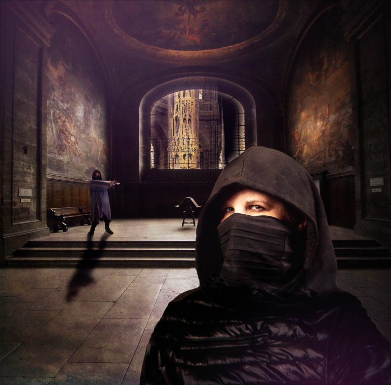
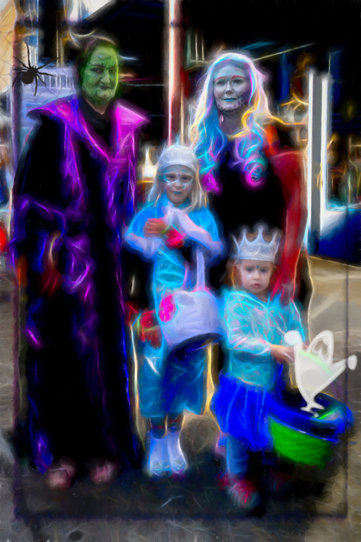
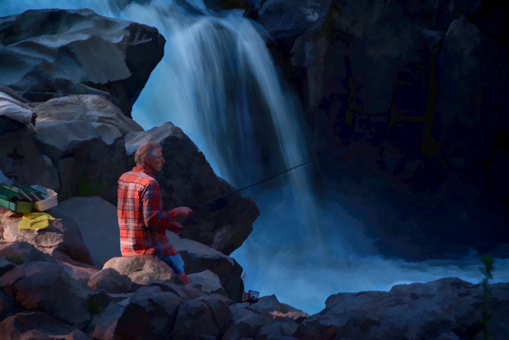
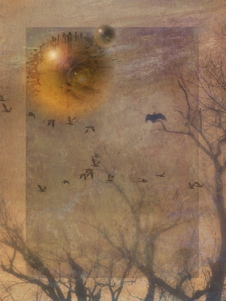
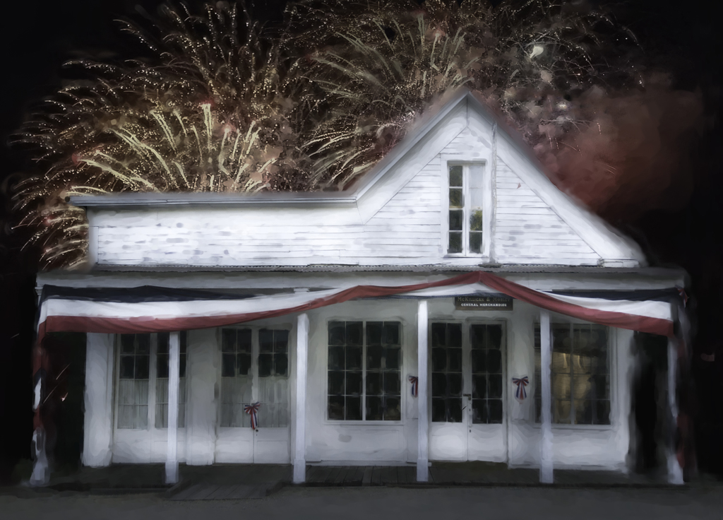
Very fun image and composition!
Any story about it? |
Nov 15th |
| 41 |
Nov 18 |
Comment |
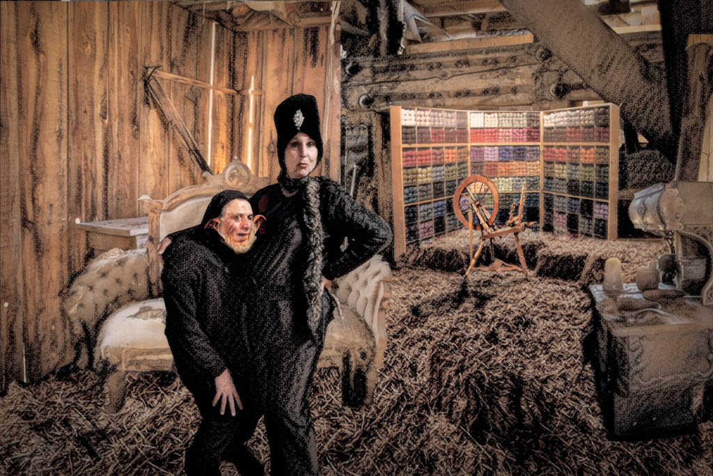
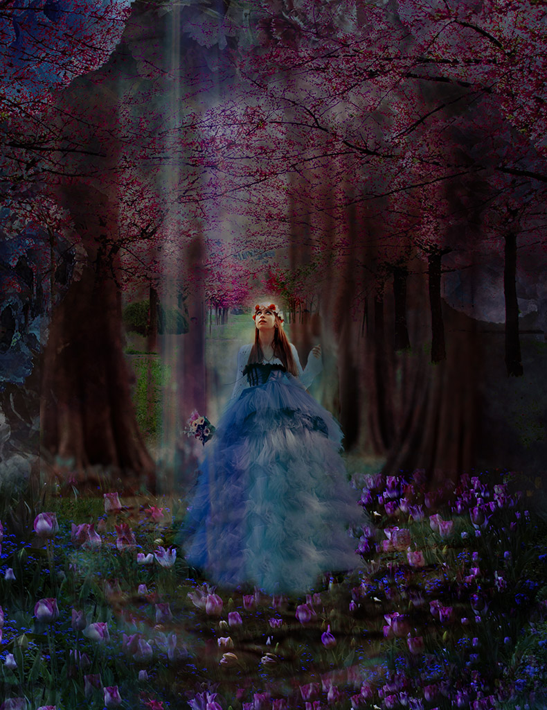
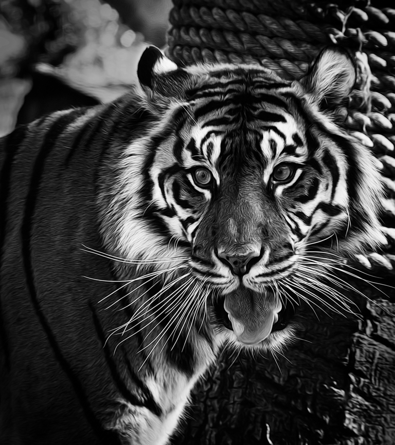
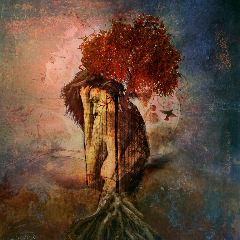
Jan, I really like your thought process and concept. Beautiful photo of the horse!
I would like to see the background on the entire horse instead of just the rump too. To my eye, the blending can be toned down or softer as it jumps out a bit too much as to make it jarring.
I also find that the background you've added is distracting and agree that either toning it down or using it as a texture without the color could work better. |
Nov 15th |
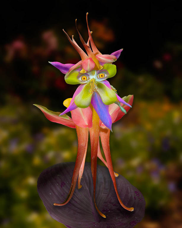
| 41 |
Nov 18 |
Comment |
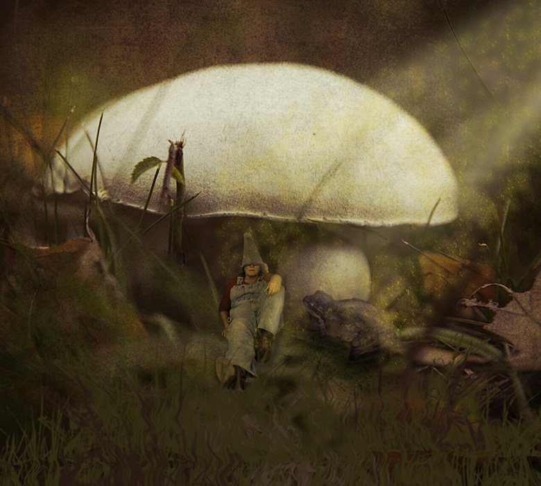
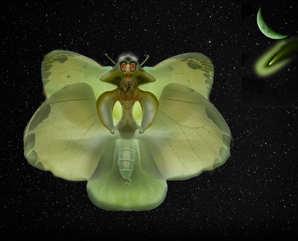
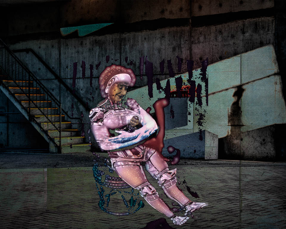
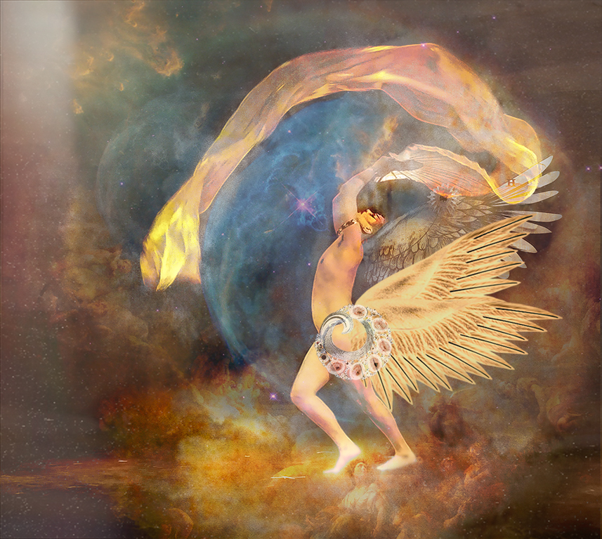
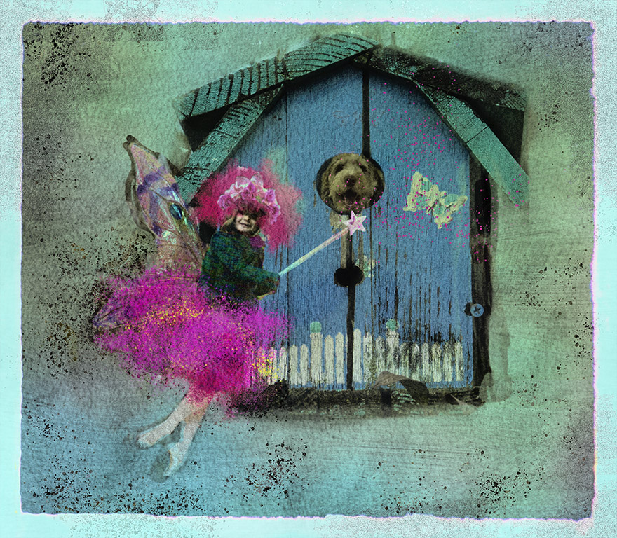
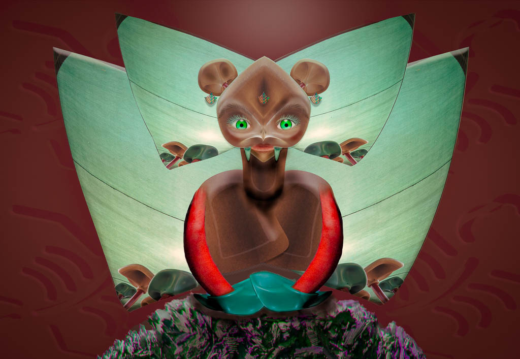
Sue,
I LOVE this! You have a wonderful imagination and are able to really tell a great story using all your elements.
I agree about the tail and think that's an easy fix.
I agree about the cigarette but if you want to keep it in, I'd recommend changing the proportion of it. It seems larger than it should be compared to Pixie.
I love the catch-light you caught on Pixie's eyes and wish those eyes were the brightest, sharpest area in your photo. However, my eye keeps going to the bottom of the ironing board - to the very bright blue disc's at the base and wishing you would tone those down as they really aren't important to your picture.
|
Nov 15th |
| 41 |
Nov 18 |
Comment |
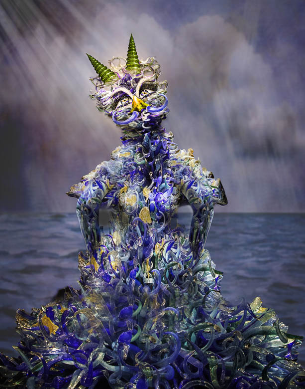
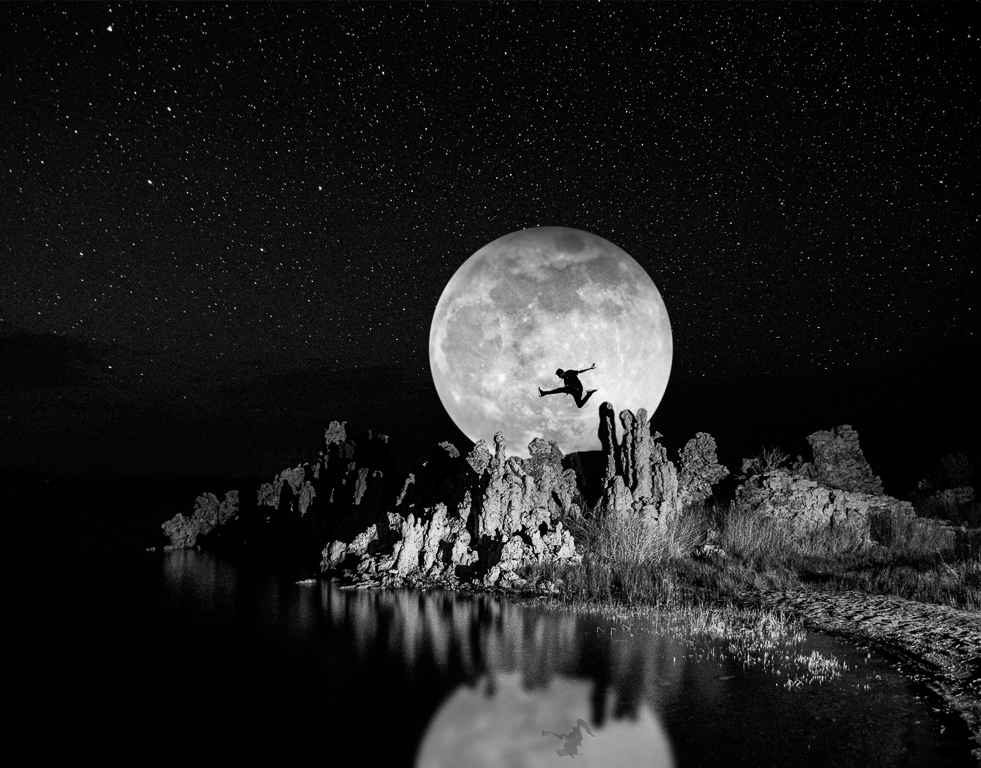
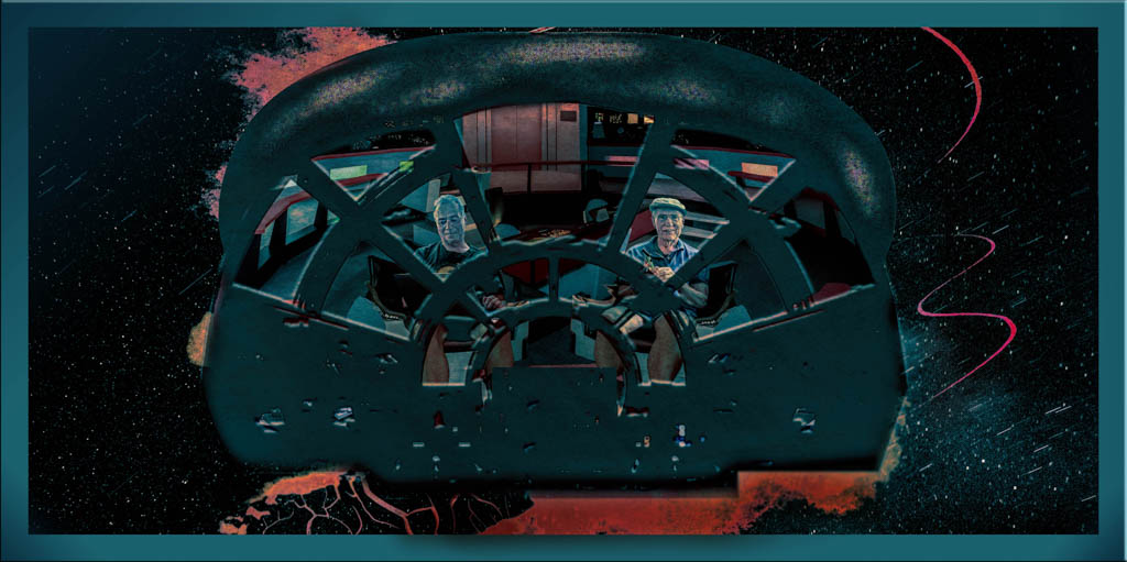
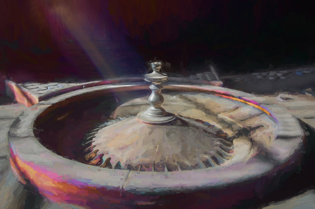
Henry,
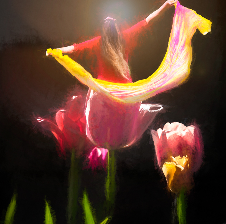
I love your sense of adventure and exploration in this piece.
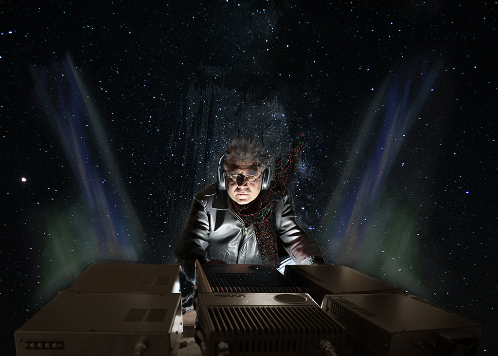
I like the Simplify filter on the lake scene and understand why you would want to make it more interesting by adding another visual. Both elements are lovely.
For me, though, this doesn't work. I'm not sure what story you are telling. The vase placement and "liquefy" doesn't make sense to me (unless you're trying to emulate Dali)
Perhaps a still life, using the vase on a table in the bottom left on a smaller scale could show a beautiful still life within a landscape? |
Nov 15th |
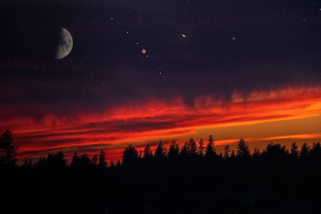
| 41 |
Nov 18 |
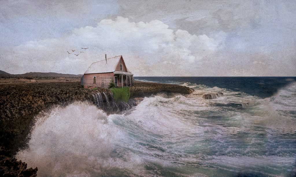
Comment |
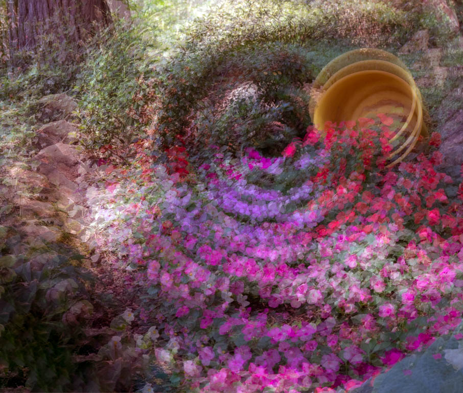
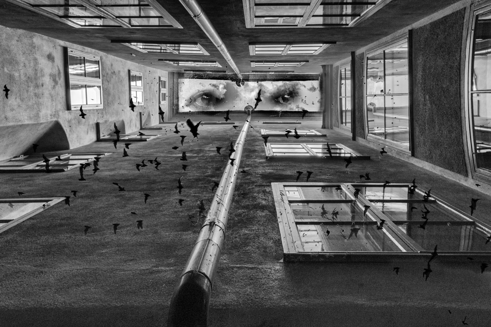
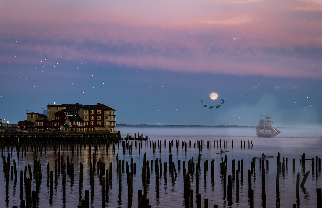
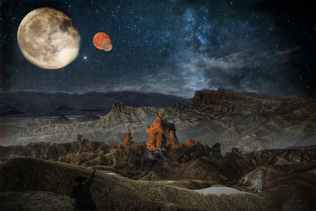
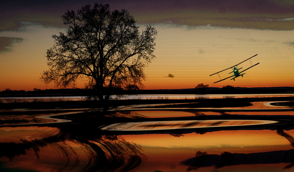
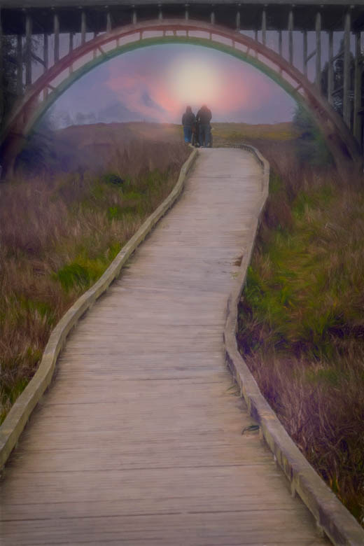
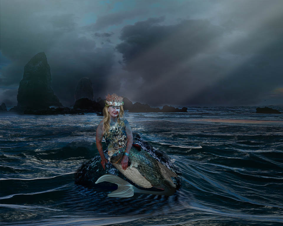
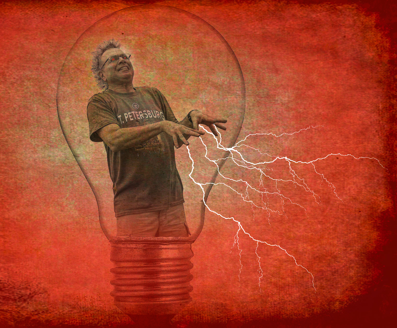
This is a great idea and definitely provides some needed drama and impact.
Picky comments:
Technically, I'd like to see you match up the shadows better so that it looks even more realistic.
There's a strange discoloration (kind of green) on the bottom left that isn't in the original wave photo. Perhaps you can clone that out.
|
Nov 15th |
5 comments - 5 replies for Group 41
|
| 56 |
Nov 18 |
Reply |
I agree Elinor. I want to use it very carefully and in this case, it fit the scene. |
Nov 16th |
| 56 |
Nov 18 |
Comment |
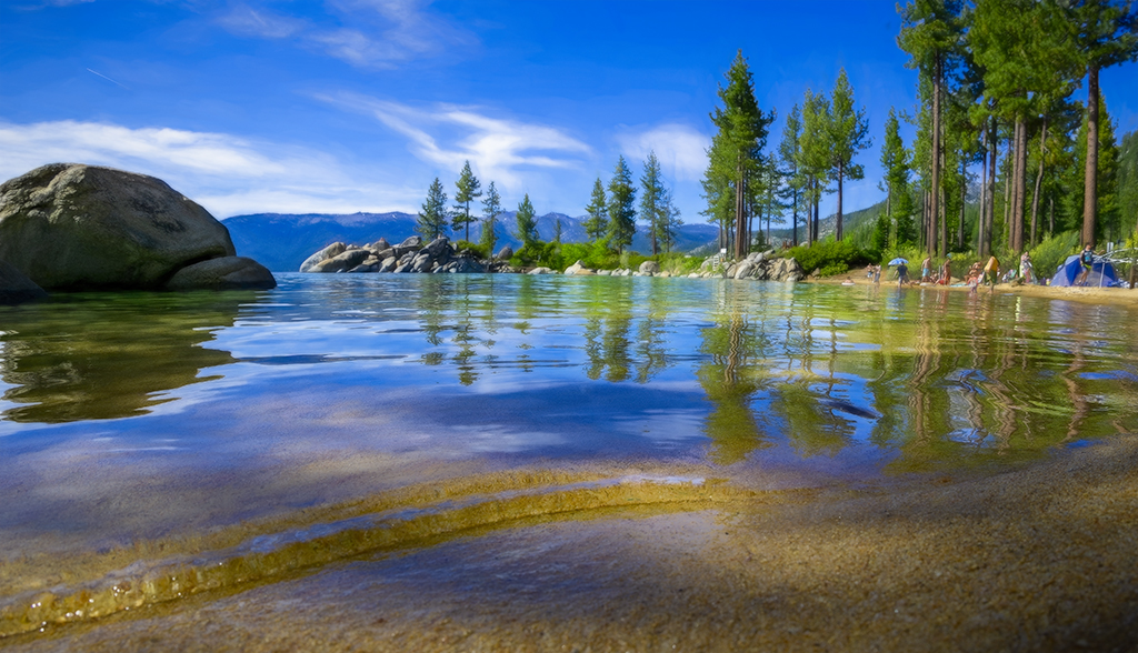
I think everything has been said! Lovely photo and painting.
I especially like the blue you added to the water! Everything else is so green that the contrast is a refreshing break for my eye to rest on. |
Nov 15th |
| 56 |
Nov 18 |
Comment |
Jeanine,
Very creative use of an interesting technique. I agree that it's not a painting but you can certainly use it in so many ways with a painting technique.
And thanks, Nancy, for the tips!! |
Nov 15th |
| 56 |
Nov 18 |
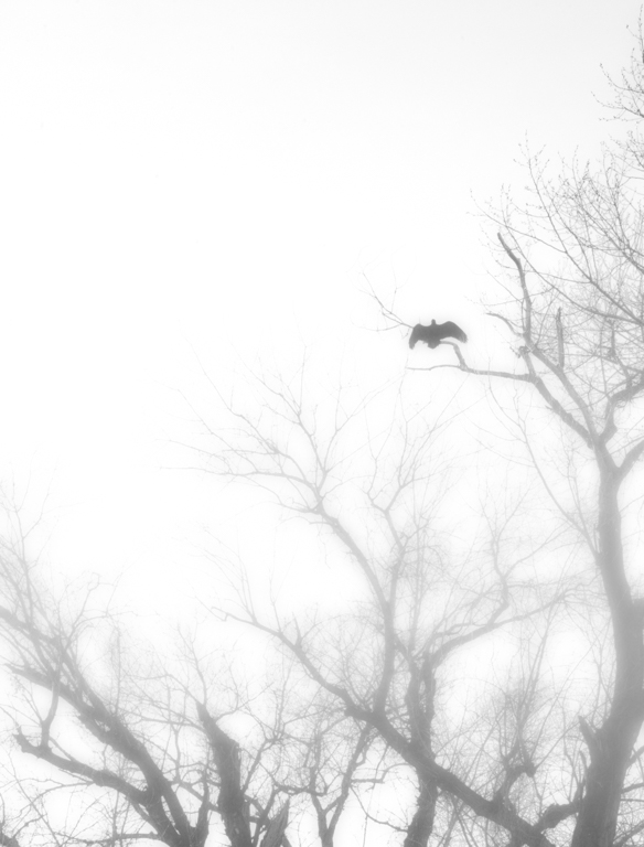
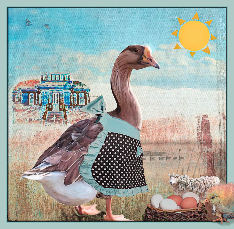
Comment |
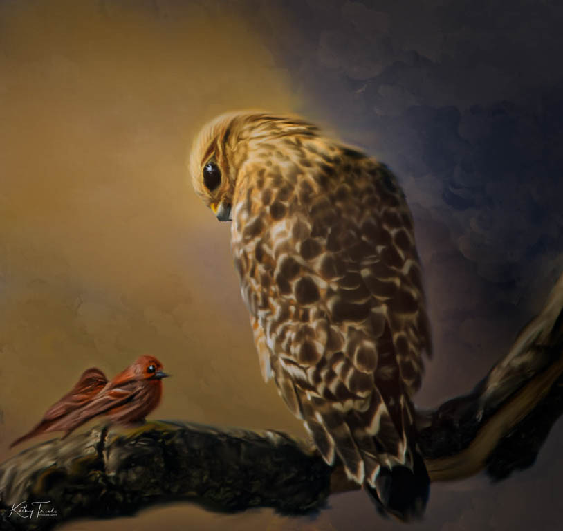
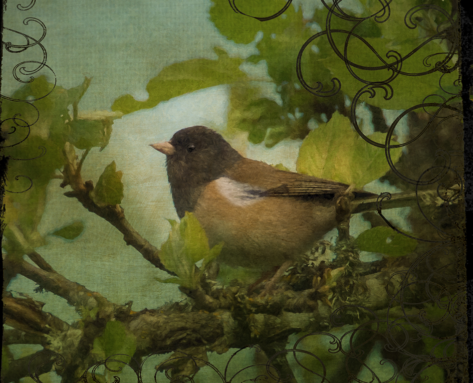
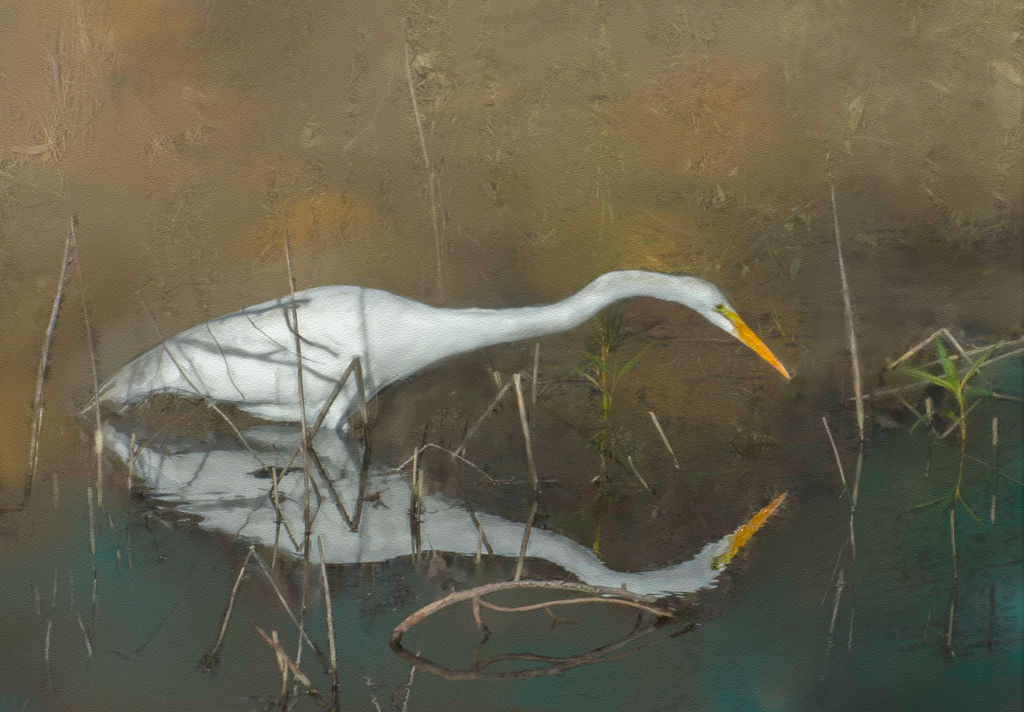
What a beautiful bird and such a great photo, Gerhard!
I like your color and painting choices.
I do feel like the bird is going to fall forward into the empty space because of your cropping choice. If you don't want to keep a bit of branch from the left, I'd suggest cloning a bit of branch where your signature is located to balance the photo as you still need the "look" room. |
Nov 15th |
| 56 |
Nov 18 |
Comment |
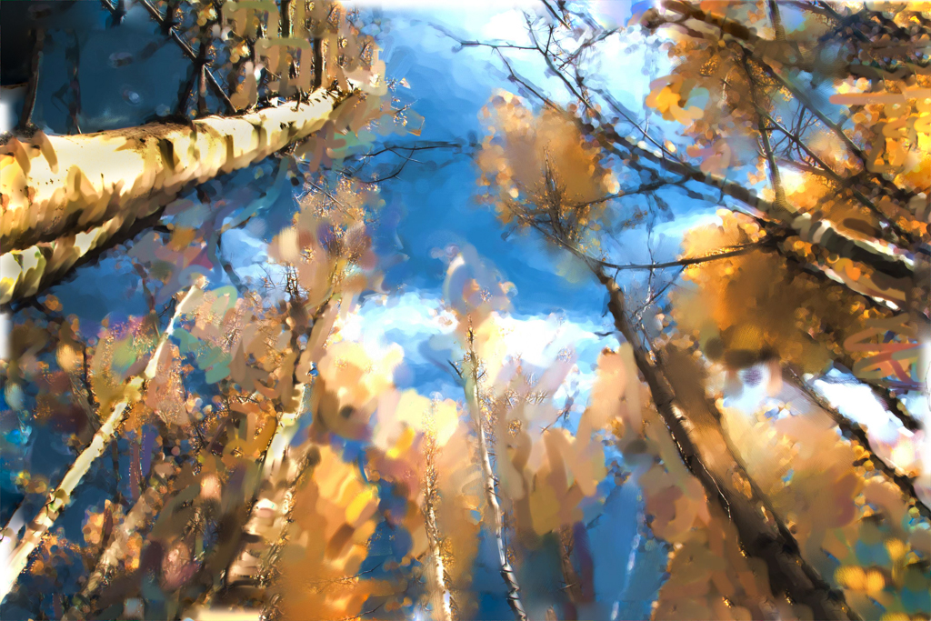
Love this rendition Nancy!
I really like the use of the complementary colors on the leaves and trunks.
Good use of cropping to focus our eyes on the more important areas and to eliminate the negative space on the top right.
I, too, like saturation and will always go for that rather than the flat, realistic approach.
I'm sure someone will want to purchase this! |
Nov 15th |
| 56 |
Nov 18 |
Comment |
I'm with Nancy and Gerhard! I really like both the original and the painted version Cyril!
I especially like the texture where you softened it towards the bottom where the fence starts it's journey and then added heavy texture to the sky to complement the natural business of the bottom half.
|
Nov 15th |
5 comments - 1 reply for Group 56
|
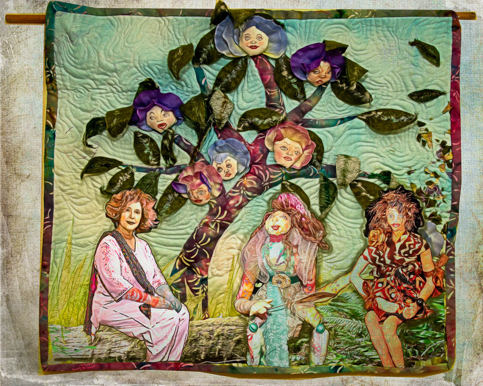
| 78 |
Nov 18 |
Comment |
Wow, great group!
I love the discussion that your photo and decision-making prompted. There are so many choices and none are wrong.
|
Nov 15th |
1 comment - 0 replies for Group 78
|
11 comments - 6 replies Total
|