|
| Group |
Round |
C/R |
Comment |
Date |
Image |
| 13 |
Mar 17 |
Comment |
Thank you all for your very kind comments! I can tell you all are a great group and I look forward to the coming months. |
Mar 13th |
1 comment - 0 replies for Group 13
|
| 50 |
Mar 17 |
Reply |
Ooh, I like that Cindy. Great suggestion! Thanks! |
Mar 6th |
| 50 |
Mar 17 |
Reply |
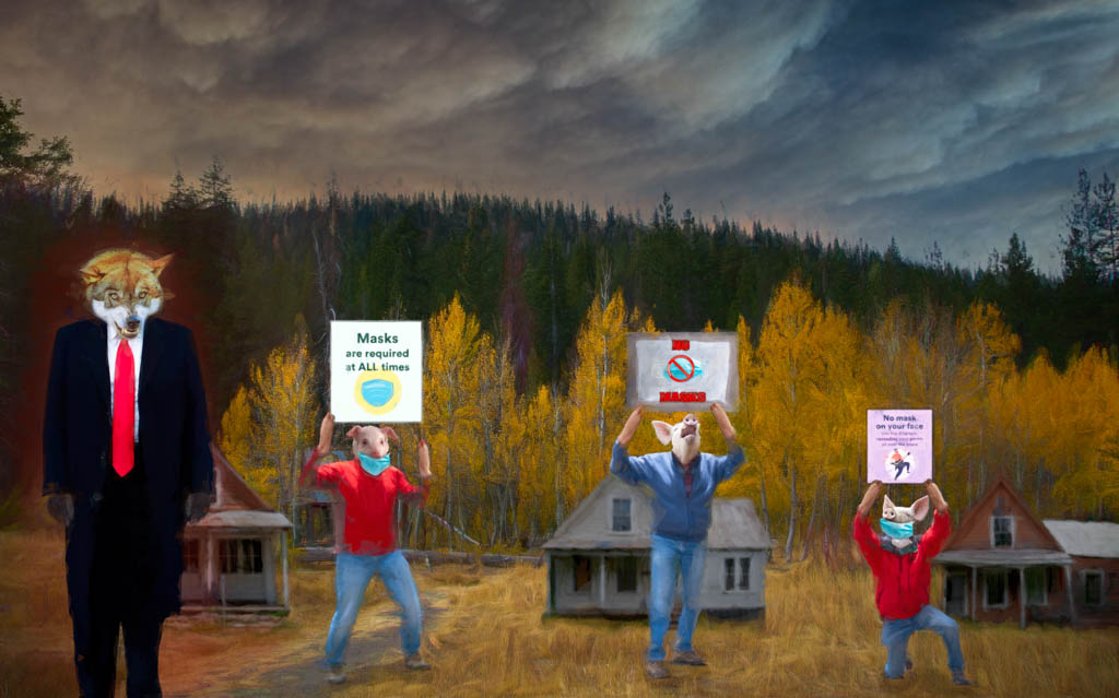
Thanks! I'm always curious about the thought process behind a "still life". It's not something I'm naturally drawn to photograph so I like to understand the perspective of someone who does. |
Mar 5th |
| 50 |
Mar 17 |
Comment |
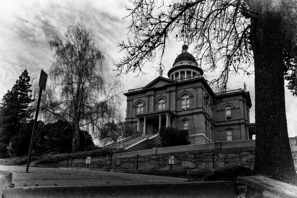
Interesting old truck and good for a mono perspective. I agree about the other truck and also suggest a tighter crop overall. The bright wall could be taken down and the street eliminated.
Perhaps, if you want to keep the original aspect, just a bit more dodging and burning to help the eye stay on the truck. |
Mar 5th |
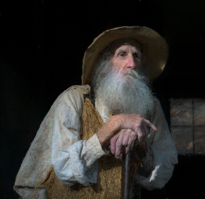
| 50 |
Mar 17 |
Comment |
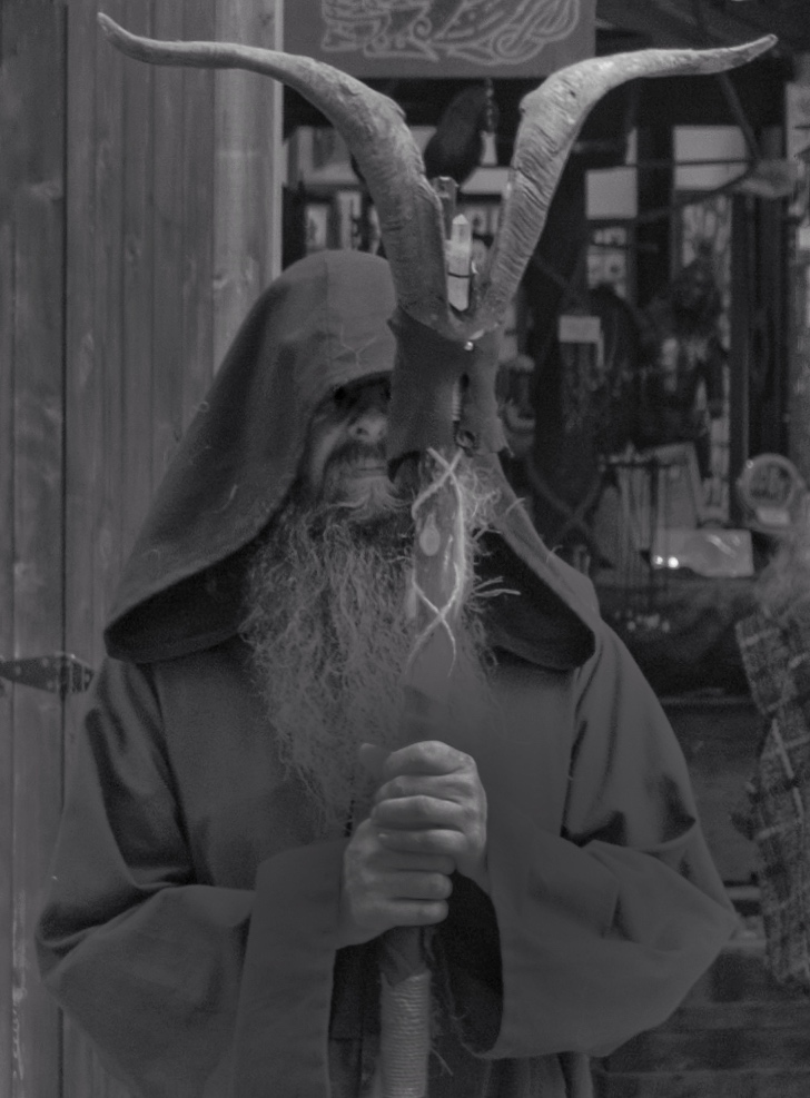
Yeah, those sunglasses, lol!
I agree that the sepia toned works the best of all.
One thing that is pulling my eye are the crooked lines of the building that he standing near. I feel like the entire picture is falling to the left.
I would have rather used the building as the straight line and left the man and his staff crooked.
I played a little to see if a bit of straightening would change anything. |
Mar 5th |
 |
| 50 |
Mar 17 |
Comment |
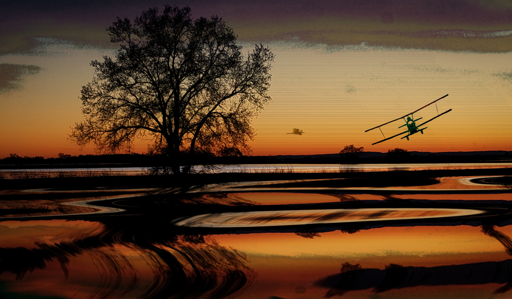
Great photo either way but I really like the color version better. For me, there is too much detail in the background of the mono photo that takes me away from focusing on the men and the plane.
The color photo really pops with that great blue on the plane and is set off by the green of the surrounding areas. I can really see the men and want to look closer in the color version. |
Mar 5th |
| 50 |
Mar 17 |
Comment |
Really like this one in mono better than the original. There's not enough color in the original to preserve. But there's so many great angles and lines that are enhanced by your conversion to mono that it makes the shot pop.
Your crop really improved it by bringing the focus more to the train and the circular steam that keeps us in the photo.
|
Mar 5th |
| 50 |
Mar 17 |
Comment |
Both photos are appealing and well done but I prefer the warm tones of the color photo.
I really like the warm light coming from the cab and can see the icicles easy differentiated from all the other tones better.
|
Mar 5th |
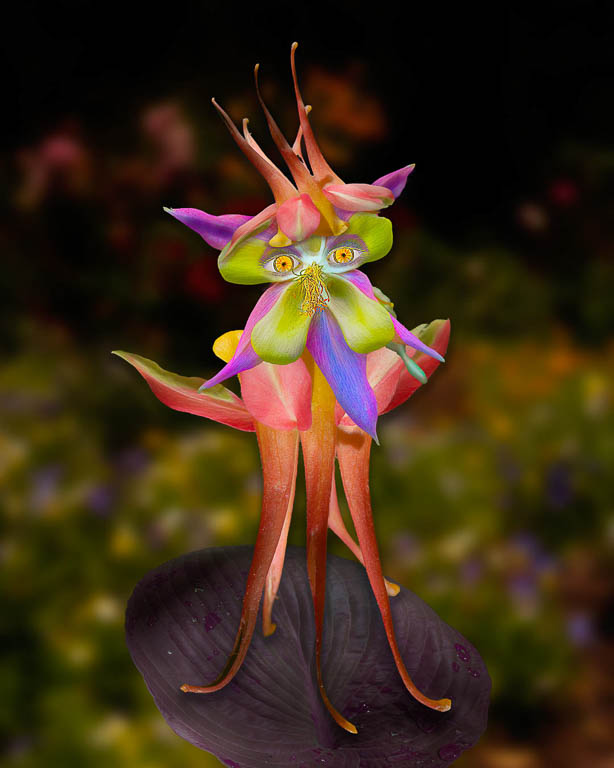
| 50 |
Mar 17 |
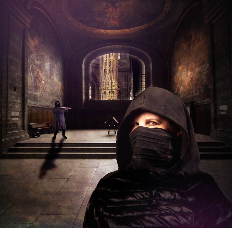
Comment |
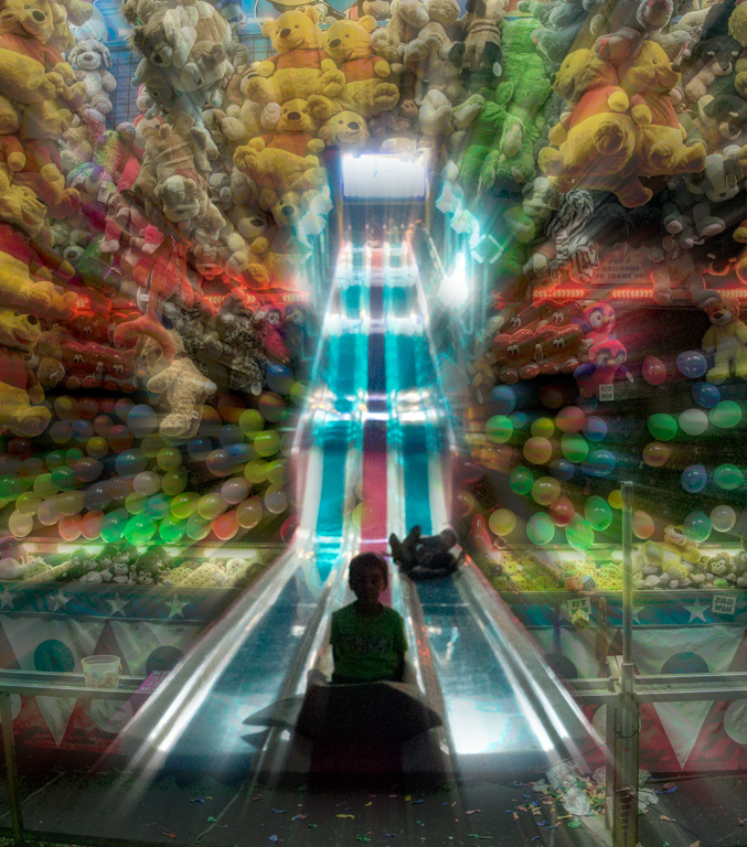
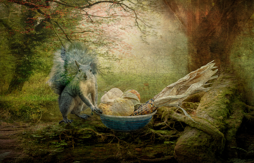
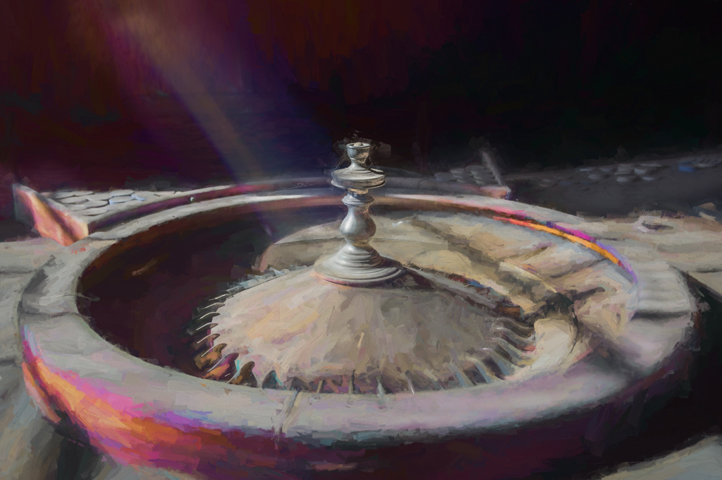
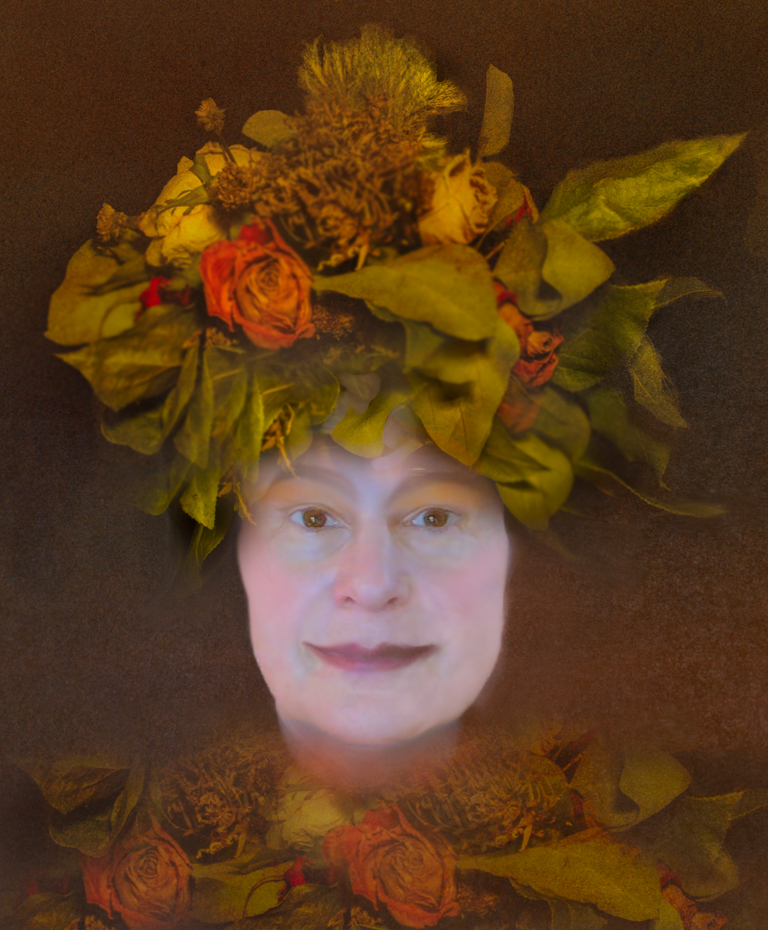
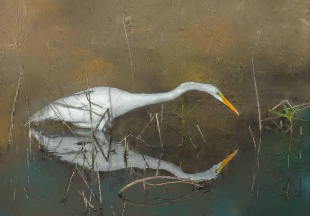
Nice still life photo Cindy. You photos are always technically excellent!
Do you have a goal in mind for your "still life" studies?
Is there symbolism to the flowers on top of Shakespeare? |
Mar 5th |
6 comments - 2 replies for Group 50
|
| 55 |
Mar 17 |
Comment |
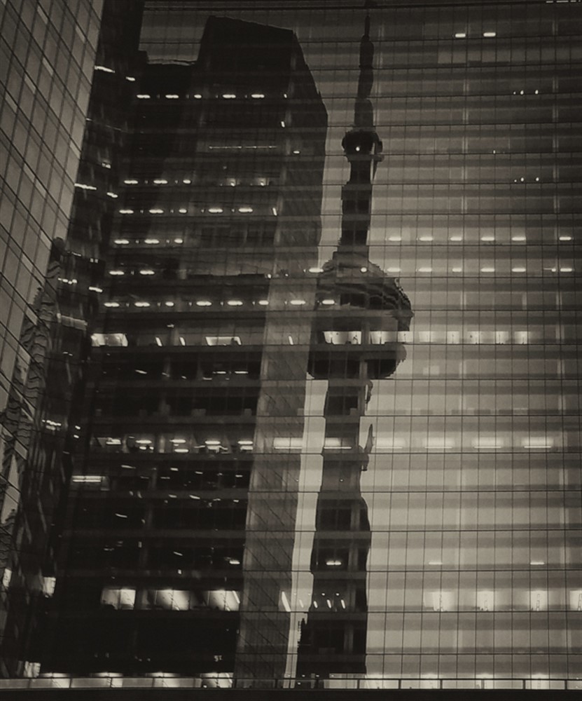
Striking photo with such wonderful detail and color!
I agree that this is a "wall" photo! |
Mar 12th |
| 55 |
Mar 17 |
Comment |
Interesting image with lots of potential for further play. I could see isolating parts of the photo for a different view.
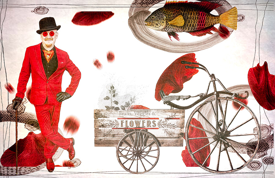
I do agree about it being busy and the cart could be removed if you want to simplify it a bit.
Did you try to take the photo from a "head on" perspective with the wood in the background? That would be a different photo but there are lots of possibilities here. |
Mar 12th |
| 55 |
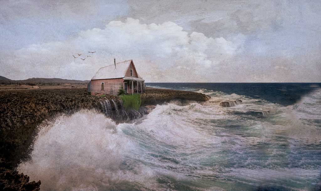
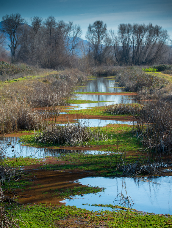
Mar 17 |
Comment |
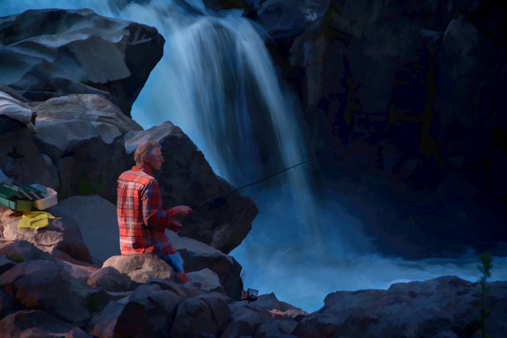
Nice morning photo and especially like the bubbles in the foreground conveying that the water is receding.
Its a nice long exposure that shows the spray lingering a bit around the rocks for more atmosphere.
Cool blue mood! |
Mar 12th |
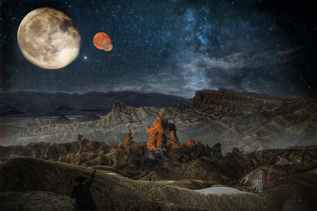
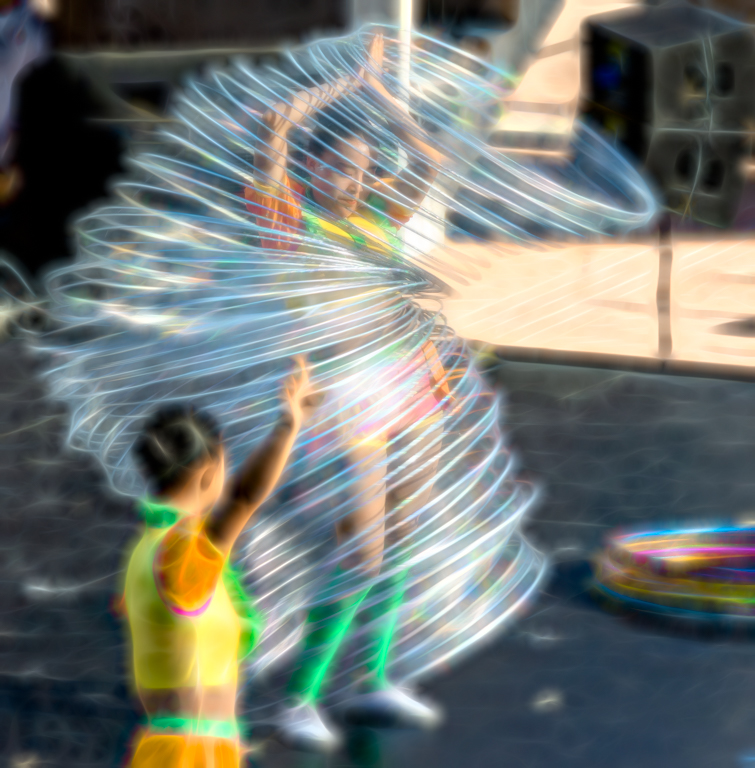
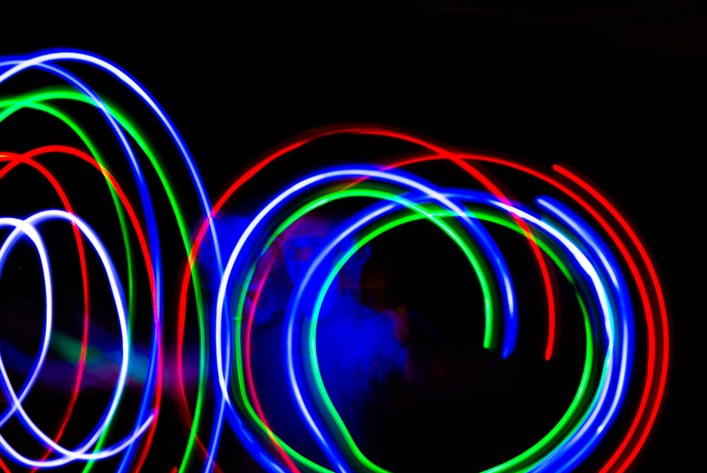
| 55 |
Mar 17 |
Reply |
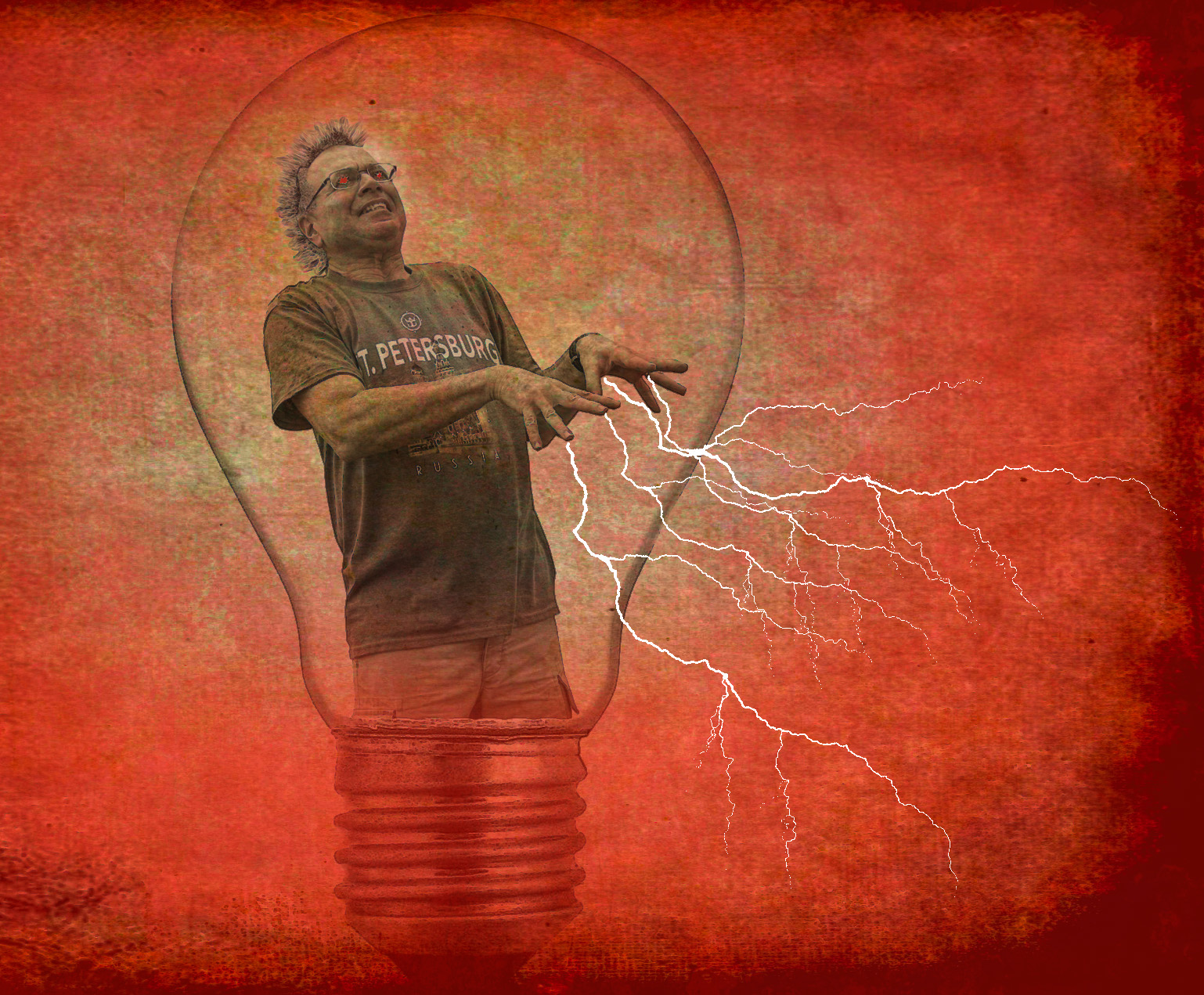
The person standing in front of the camera was holding three of those color wands. (The ones you break to light)
He just stood there and waved them in circles while we shot away.
|
Mar 5th |
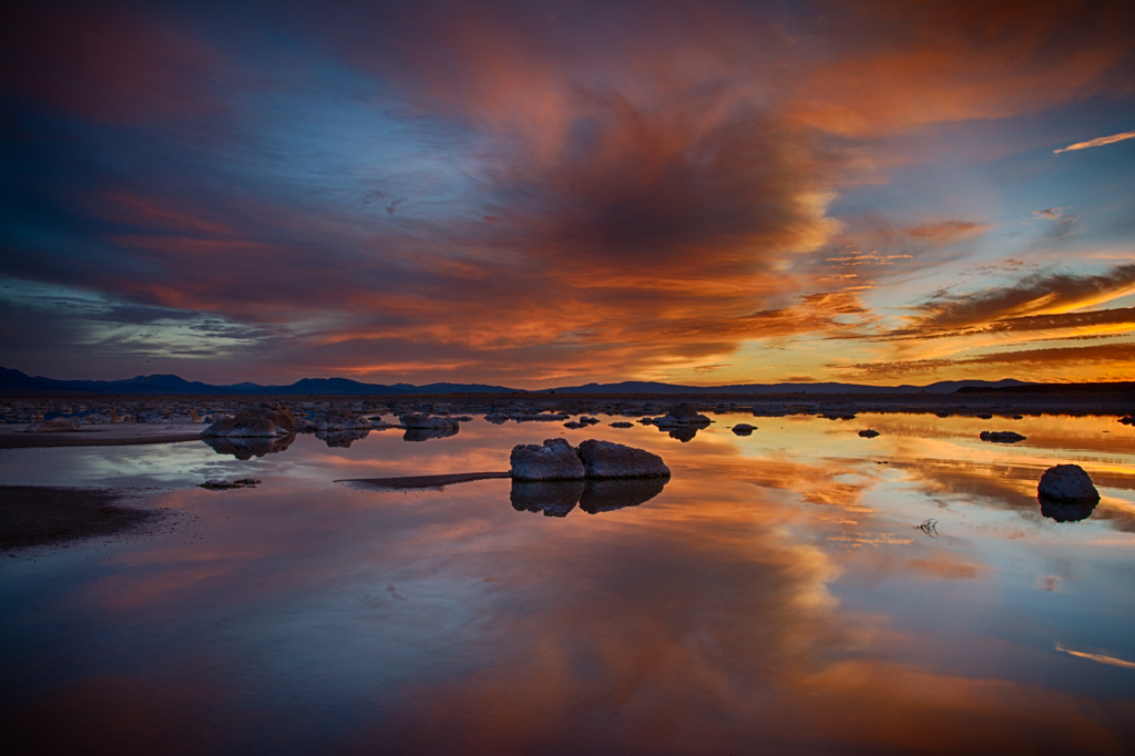
| 55 |
Mar 17 |
Comment |
This is a great photo! I've never used a fisheye lens but can appreciate the difficulty and patience that it took to get this shot!
Love the lines, color, perspective, shadows and the sun star effect! |
Mar 5th |
| 55 |
Mar 17 |
Comment |
Lovely still life! I like everything about this photo.
I especially appreciate your background wall texture. It helps support the rich colors and interesting detail in the reflections of the glass. |
Mar 5th |
| 55 |
Mar 17 |
Comment |
Thanks for the info on Helicon!
Great focus and technique here. Lighting is great and color balance is super.
Just a personal desire to see a bit of texture in your green background to really add dimension and make the flower pop even more. |
Mar 5th |
6 comments - 1 reply for Group 55
|
| 56 |
Mar 17 |
Comment |
Beautiful interpretation of the original photo! You balanced all the elements nicely and really brought us to the main story.
I really appreciate all your artistic decisions in this piece! |
Mar 12th |
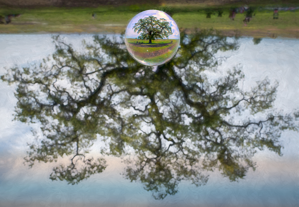
| 56 |
Mar 17 |
Comment |
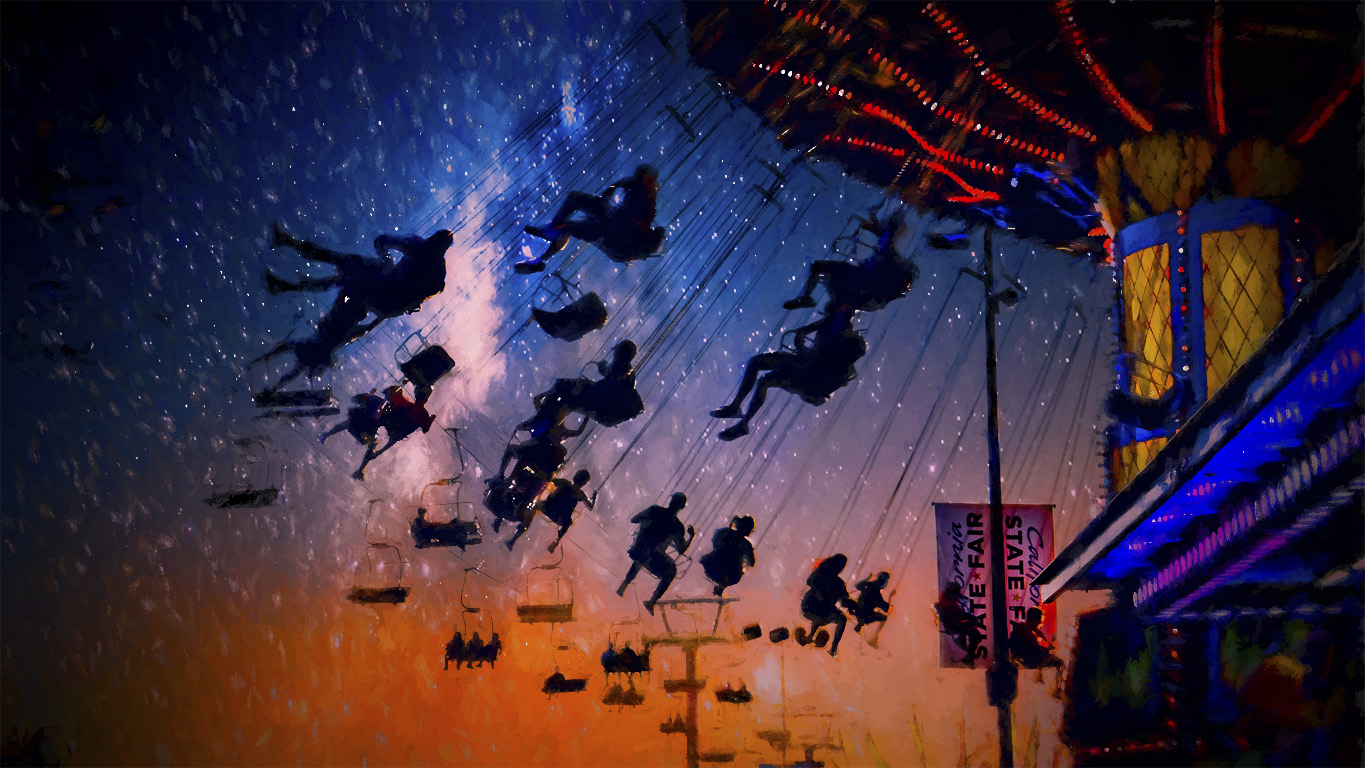
Really love this and appreciate all the work it took to get it just right in your eyes!!
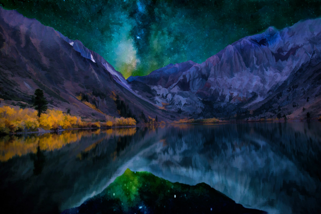
I think this could be a very marketable photo. Love the colors, the interest, the invitation to gaze into the pond.
What a great transition from an okay pond picture to a piece of artwork! |
Mar 12th |
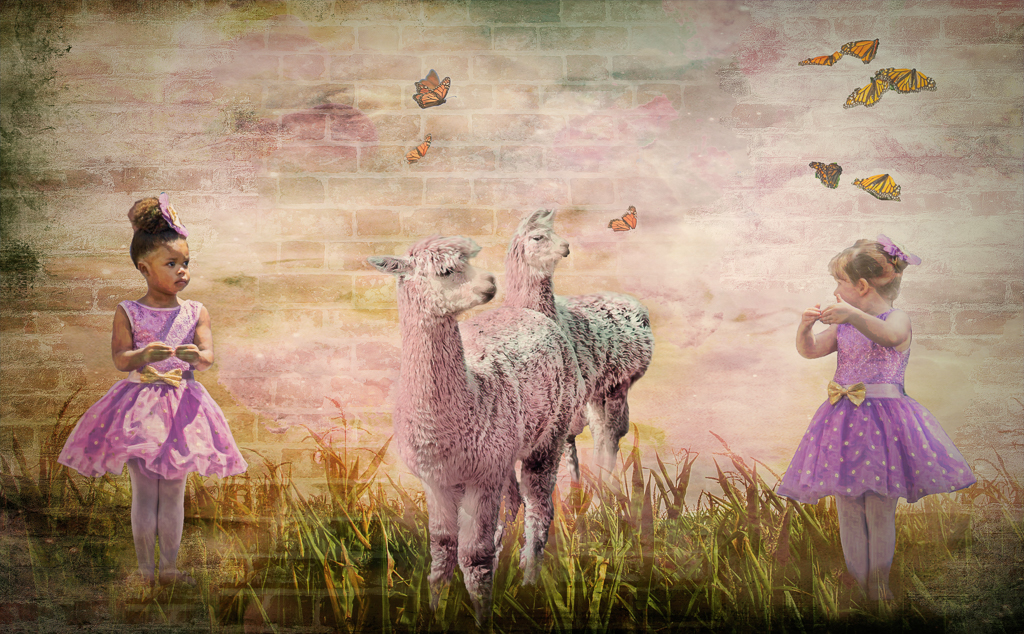
| 56 |
Mar 17 |
Comment |
Great photo of the little girl with a very distressed look on her face.
I agree with Nancy about the texture on her skin. I think it detracts from the main focus on the girls expression. |
Mar 12th |
3 comments - 0 replies for Group 56
|
16 comments - 3 replies Total
|