|
| Group |
Round |
C/R |
Comment |
Date |
Image |
| 63 |
Mar 26 |
Reply |
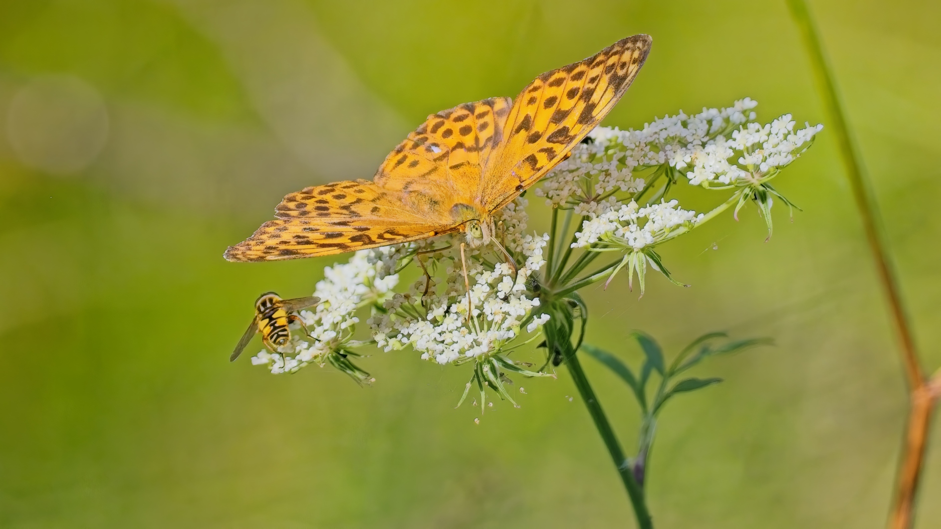
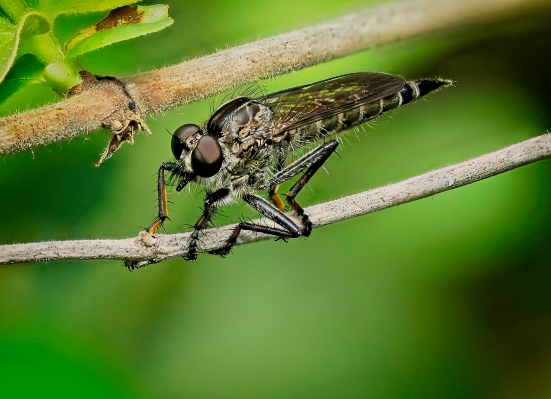
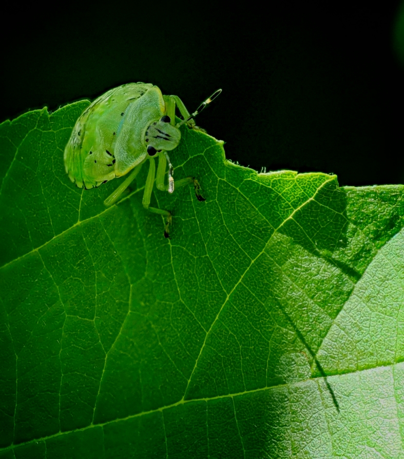
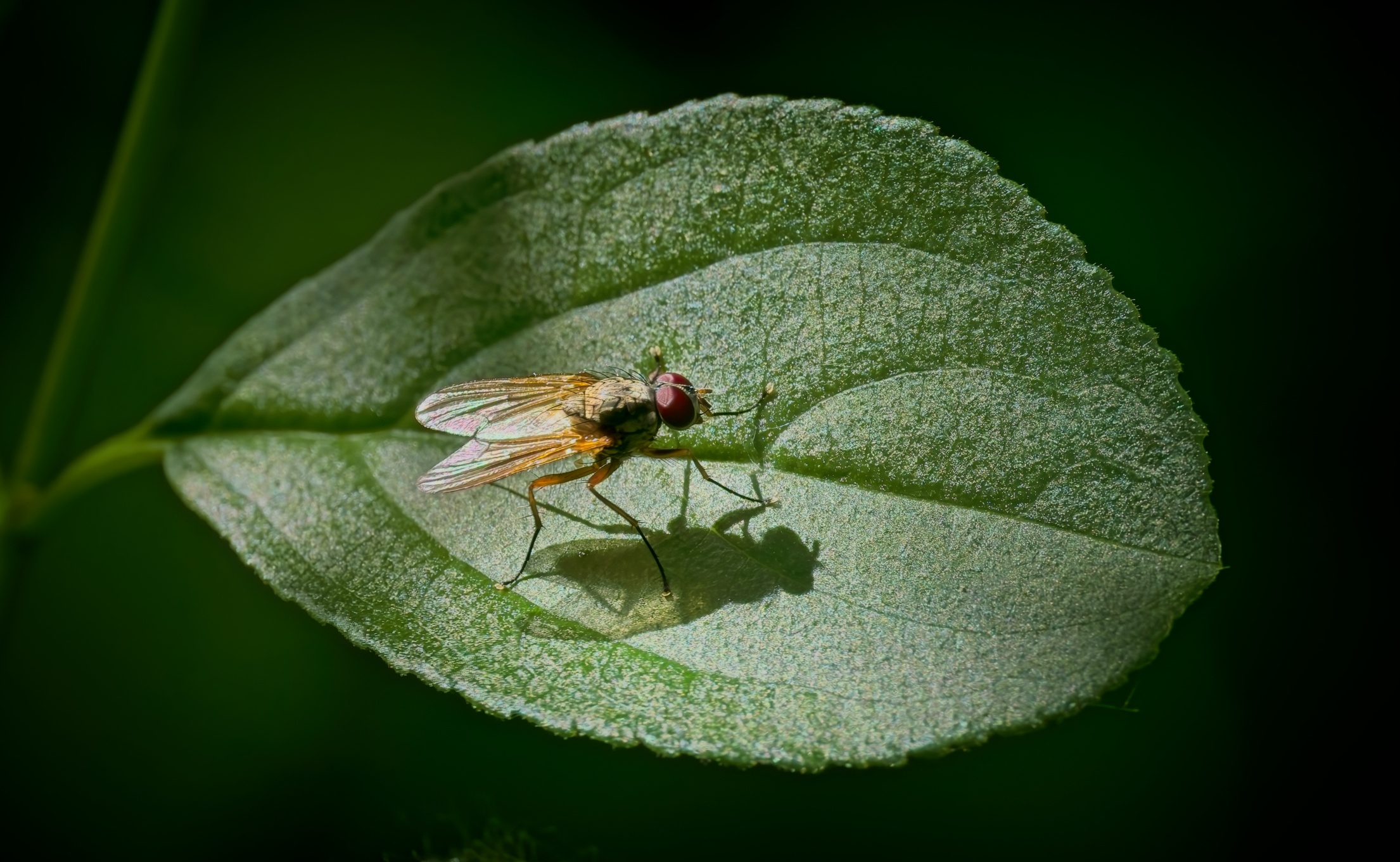
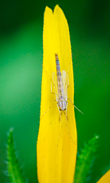
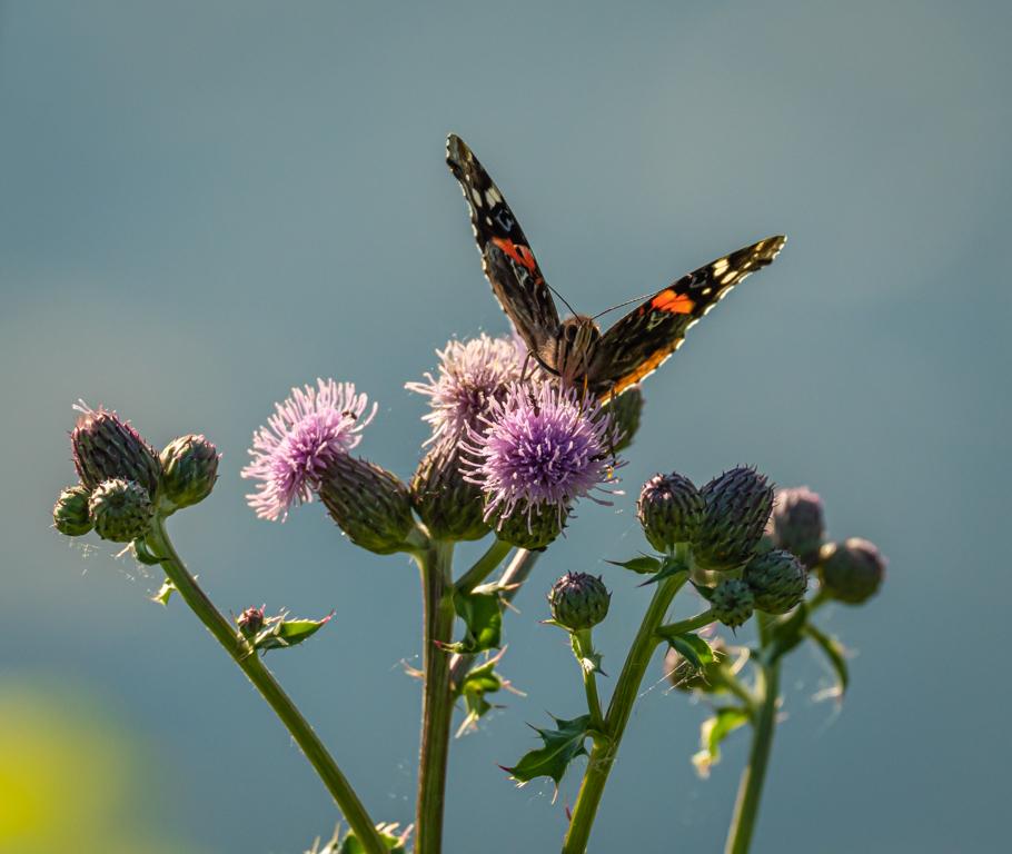
Thanks for these suggestions. Appreciated. Yes! I was lucky to heave these 2 insects in the same plane of focus. As you might expect, this was one of 20 or so images that capture them. This one had the 2 in the best focus. |
Mar 31st |
| 63 |
Mar 26 |
Reply |
Thanks Charles. All great points for improvement. I agree and like your final result. |
Mar 28th |
| 63 |
Mar 26 |
Reply |
Thanks Norman. Lovely. |
Mar 17th |
| 63 |
Mar 26 |
Reply |
Hi Ruth,
Thank you for your constructive comments.
|
Mar 17th |
| 63 |
Mar 26 |
Comment |
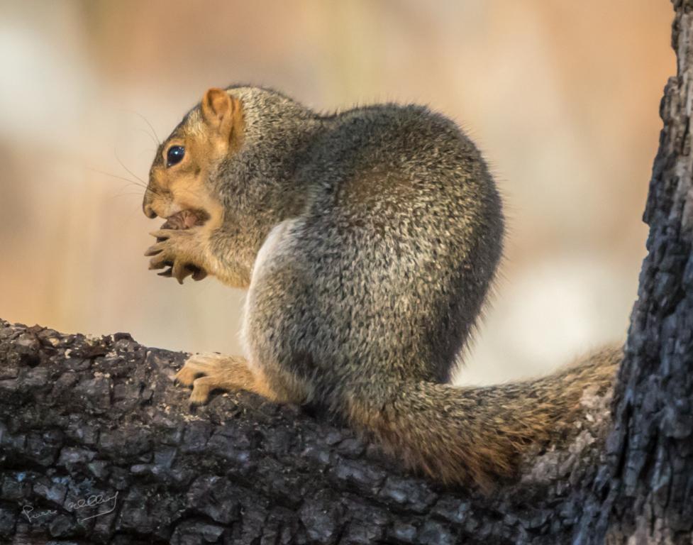
Wow. I really like it. I never tried to super-impose multiple images of the same subject. Everything is tack sharp. It must have taken you some time to process these images.
A keeper. Congrats. |
Mar 16th |
| 63 |
Mar 26 |
Reply |
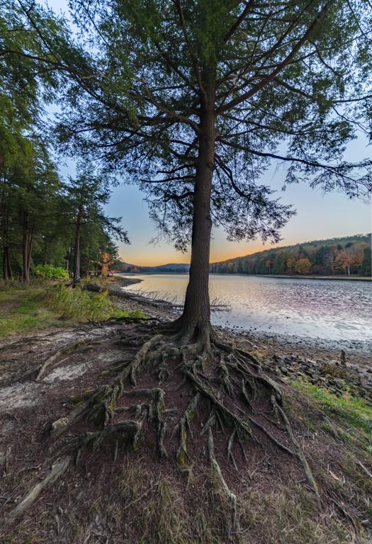
Thanks Murphy. I completely agree with the branch. It is so obvious since you pointed to it! |
Mar 16th |
| 63 |
Mar 26 |
Comment |
Hi Murphy,
This is a very nice abstract spiral. Very colorful and live.
I have no suggestion for improvement, or perhaps, a slight vignette. |
Mar 15th |
| 63 |
Mar 26 |
Comment |
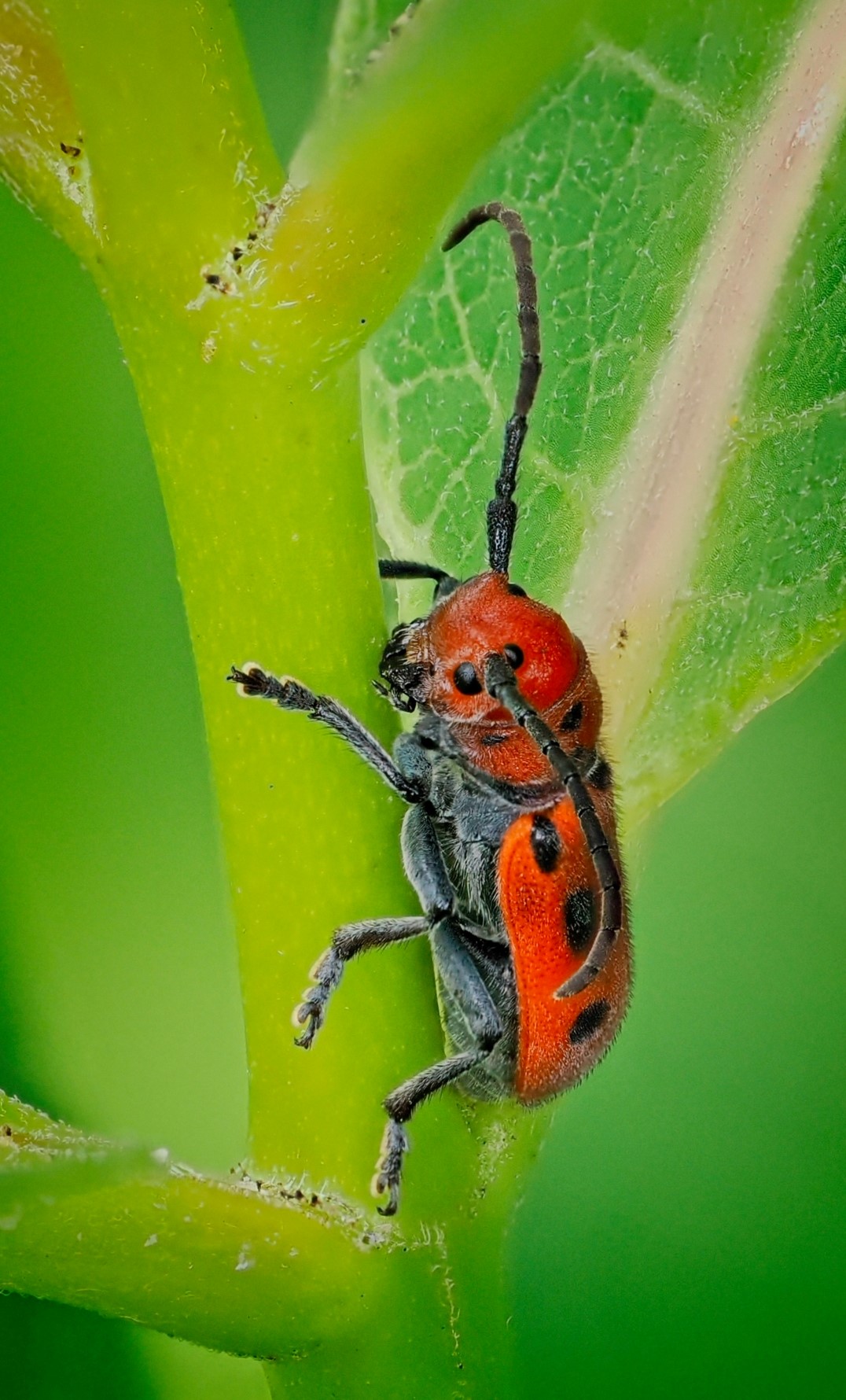
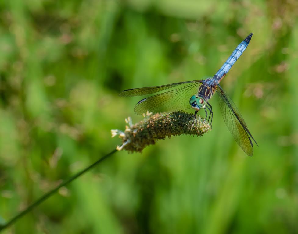
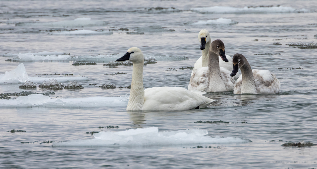
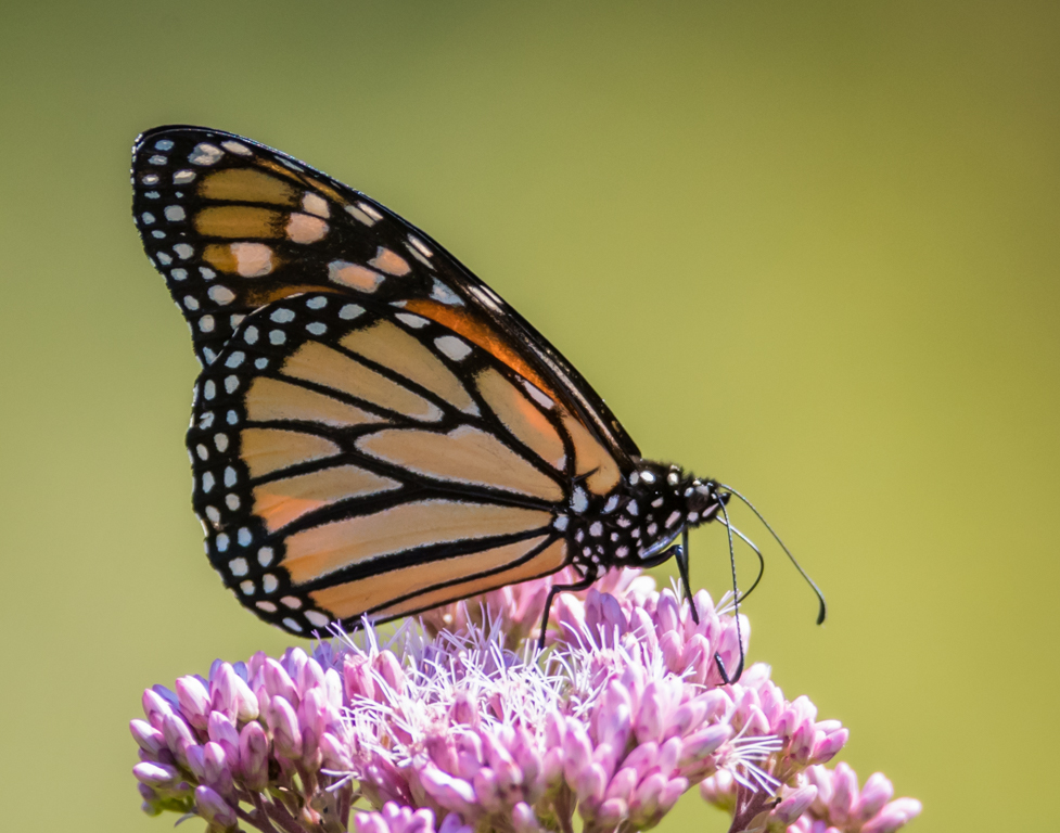
Hi Charles. Beautifully done, especially with the non-competitive "painterly" background. Your four subjects are all in perfect focus (in the same plane).
Lovely. |
Mar 15th |
| 63 |
Mar 26 |
Comment |
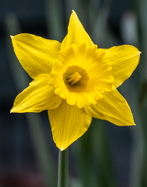
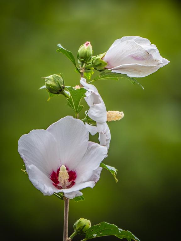
Hi Alane,
Nicely done. All sharp and nice droplets of water adding some texture to your flower.
My only suggestion would be to "erase" some of the small bruises on the petals. |
Mar 15th |
| 63 |
Mar 26 |
Comment |
Very nice fountain pen! The background is not competing with the subject. The angle of view works very well with strong guiding lines.
On my screen, it looks like the tip of the pen is slightly off-focuc despite that your f stop was at 11. I would suggest to either increase the f stop with a pin-point focus at a 1/3rd of the way in the field, or, using the focus stacking technique.
Beautiful image. |
Mar 15th |
| 63 |
Mar 26 |
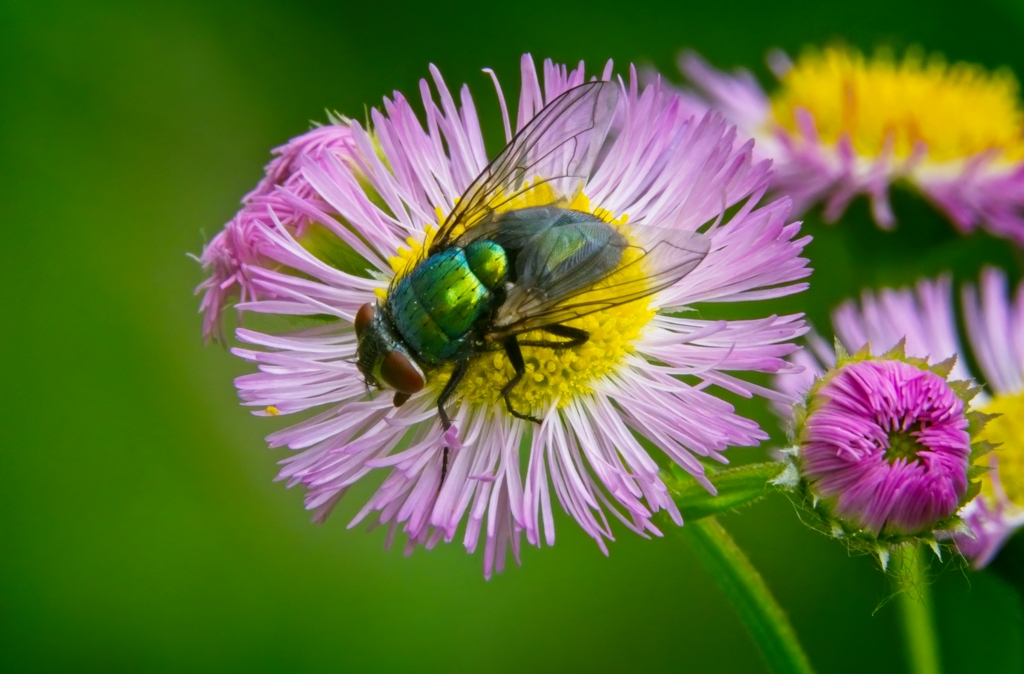
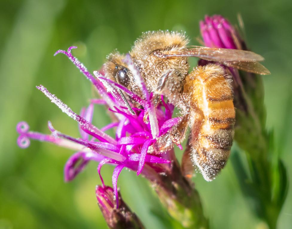
Comment |
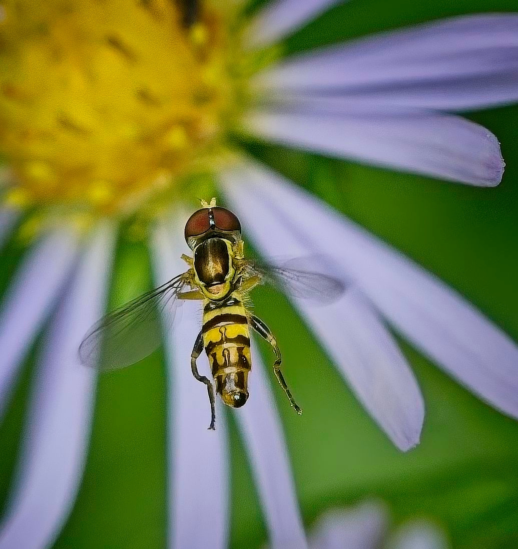
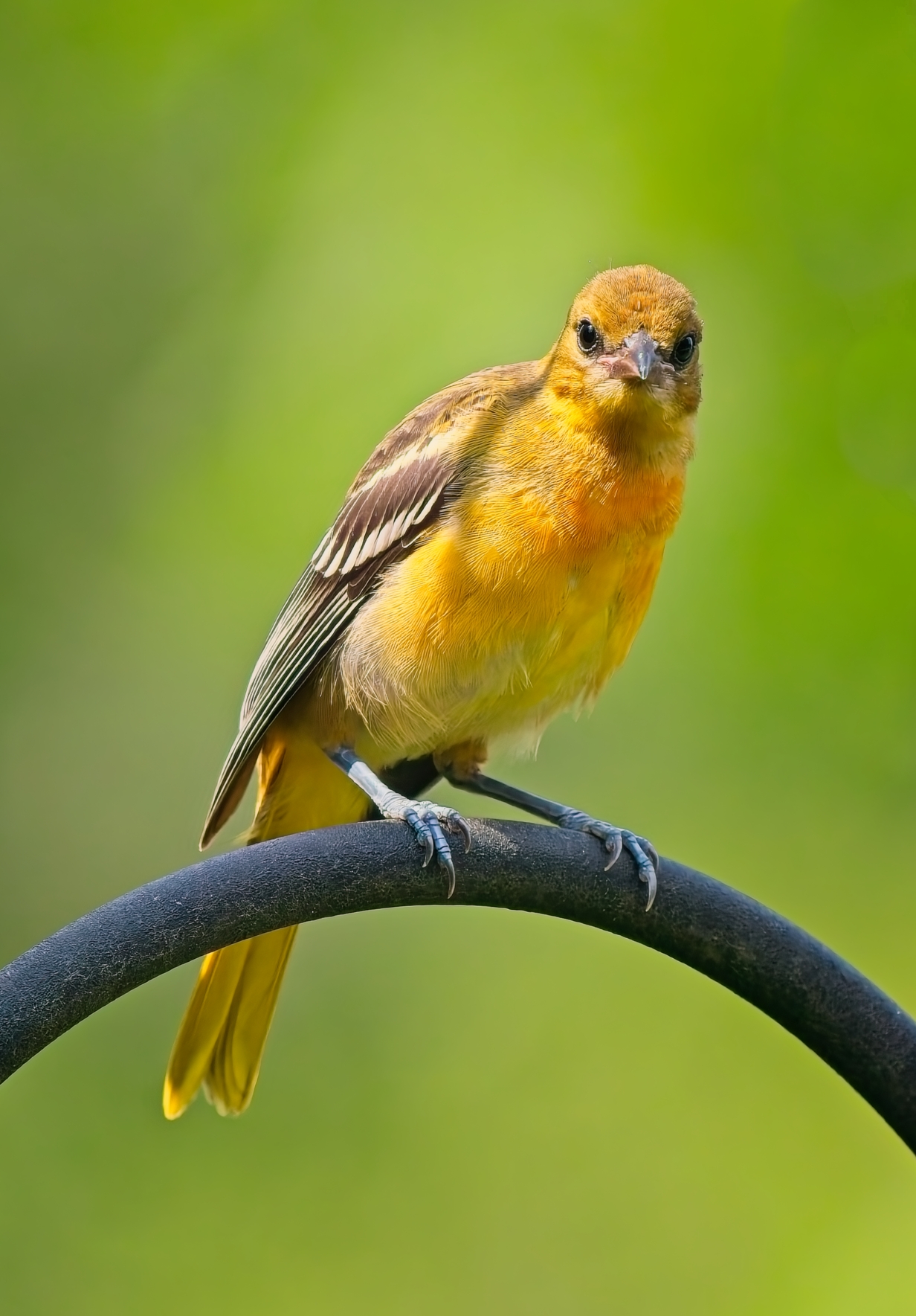
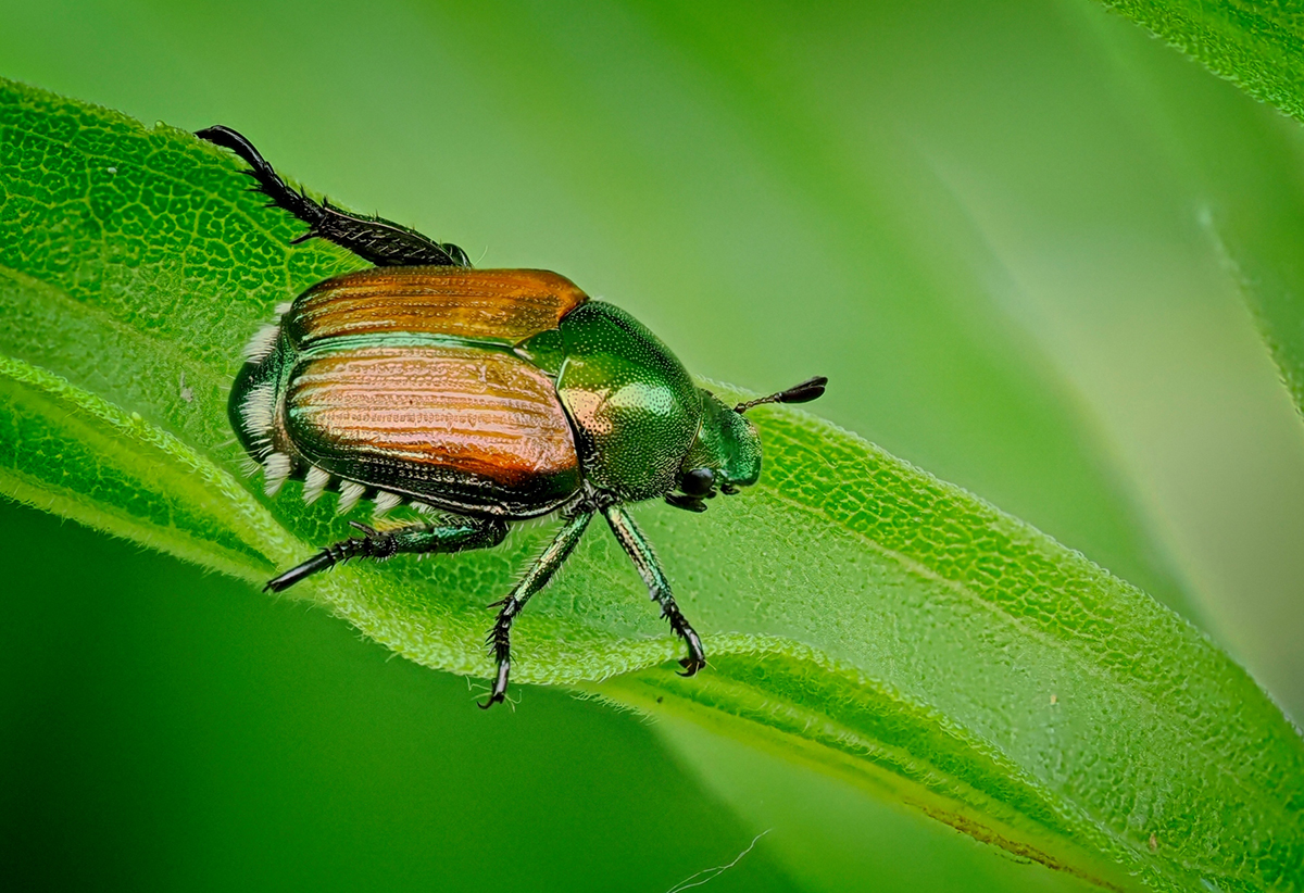
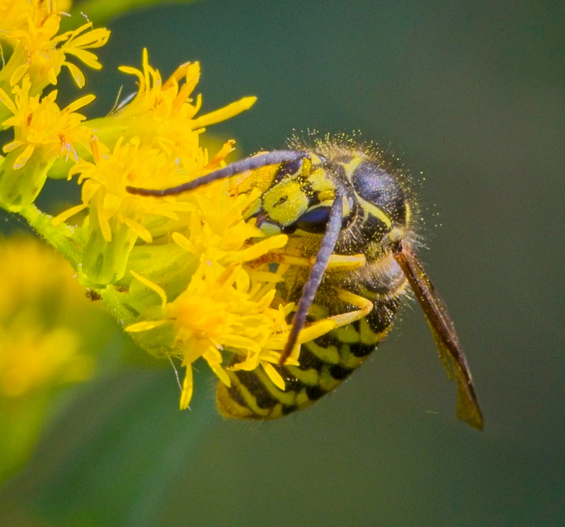
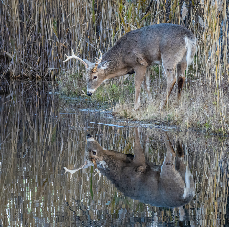
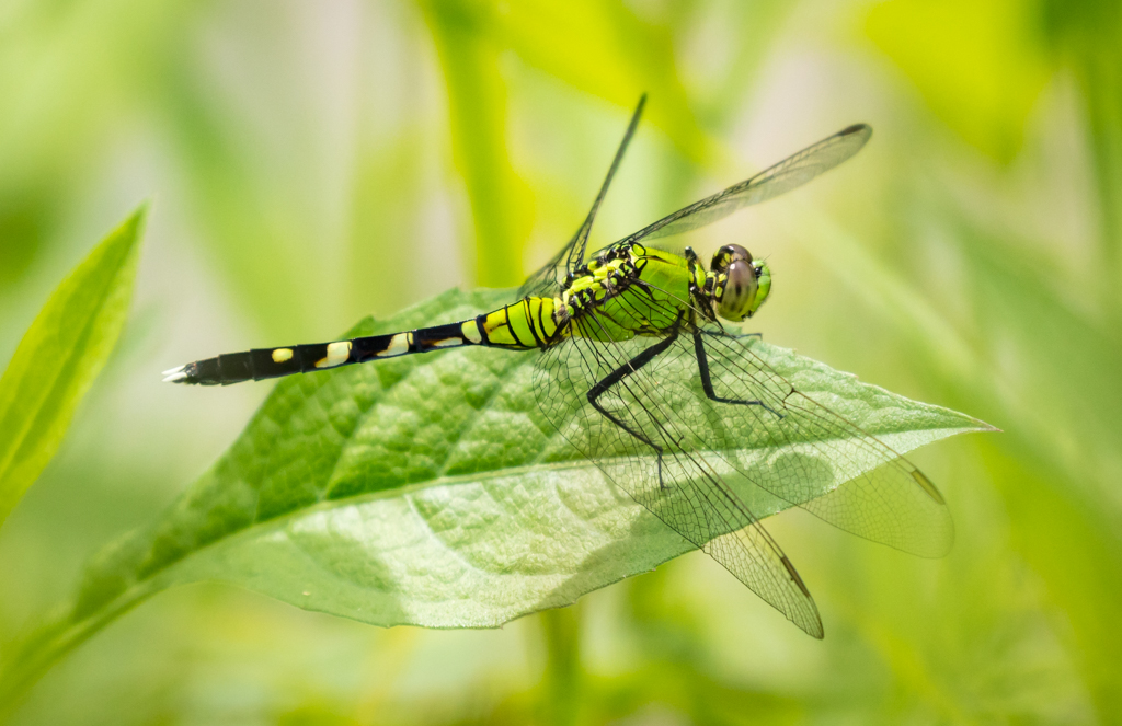
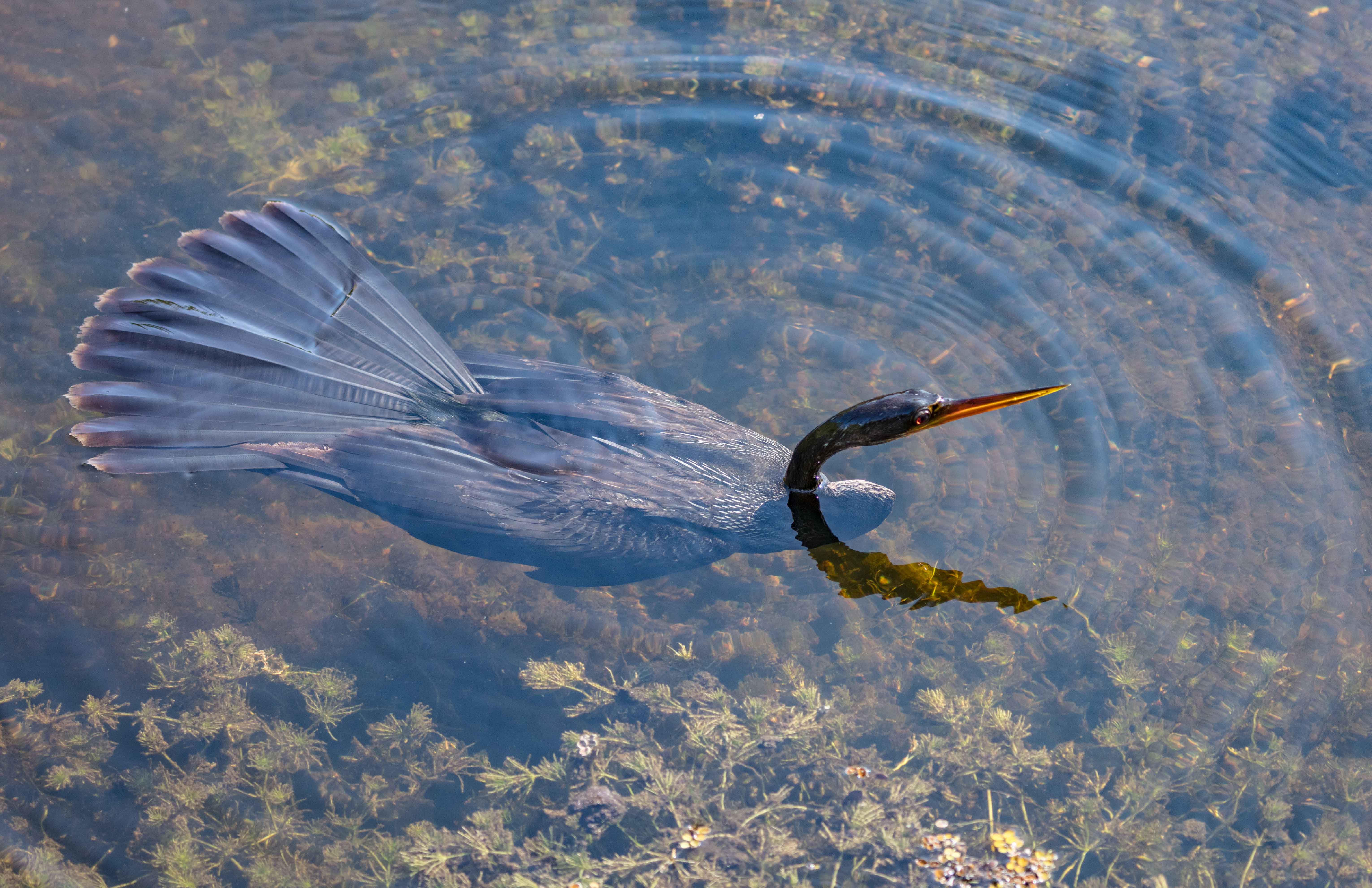
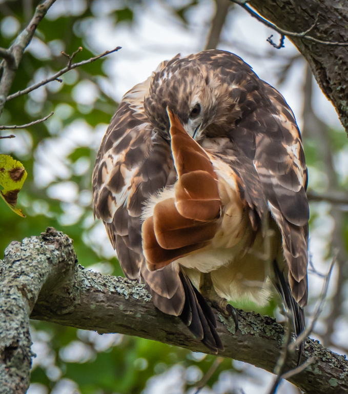
Hi Barbara. Lovely macro-image of a bee feeding on/and pollinating a flower. The bee is sharp with plenty of details. Unfortunately, the tip of the left wing is cut off (although the shadow on the petal is not). (if is was not cut off on the original, I would recommend to reduce slightly the top crop.
I would also suggest to decrease the "shadows - Black" either globally or selectively under the bee.
Very nice capture.
|
Mar 15th |
6 comments - 5 replies for Group 63
|
| 69 |
Mar 26 |
Reply |
Thanks Jacob. |
Mar 15th |
| 69 |
Mar 26 |
Comment |
Hi Jacob,
This is a great image, especially considering the issues with the plexiglass.
I believe that one of the easiest way to prevent the glare through glass and plexiglass is to use a rubbery flexible lens hood. You just applied flat on the window and get some flexibility with the lens orientation.
Another issue is the double image that can occur from the reflection between the 2 layers of the window. This can reduce the sharpness of the image (a double edge).
I like your cropping, but feels that the image is a little dark. I applied some light adjustments. I also like Deans suggestion, unfortunately the very small size of your image prevents significant cropping. |
Mar 11th |
 |
| 69 |
Mar 26 |
Reply |
Thanks Diane |
Mar 11th |
| 69 |
Mar 26 |
Reply |
Thanks Cindy
|
Mar 11th |
| 69 |
Mar 26 |
Comment |
Hi Jaswant,
Very nice capture. I love the artistic B/W portrait, such as with models. I also like the color version. Both versions are great. Tough choice.
Both are keepers.
|
Mar 5th |
| 69 |
Mar 26 |
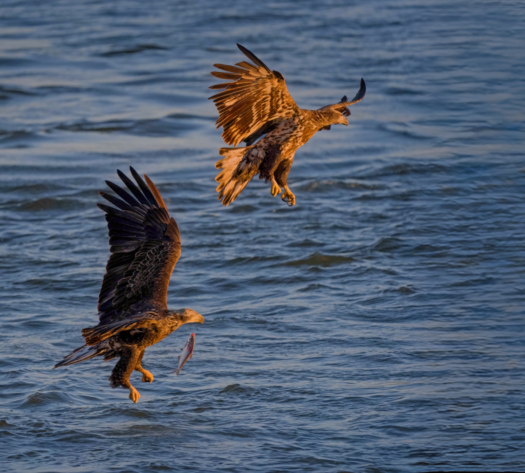
Comment |
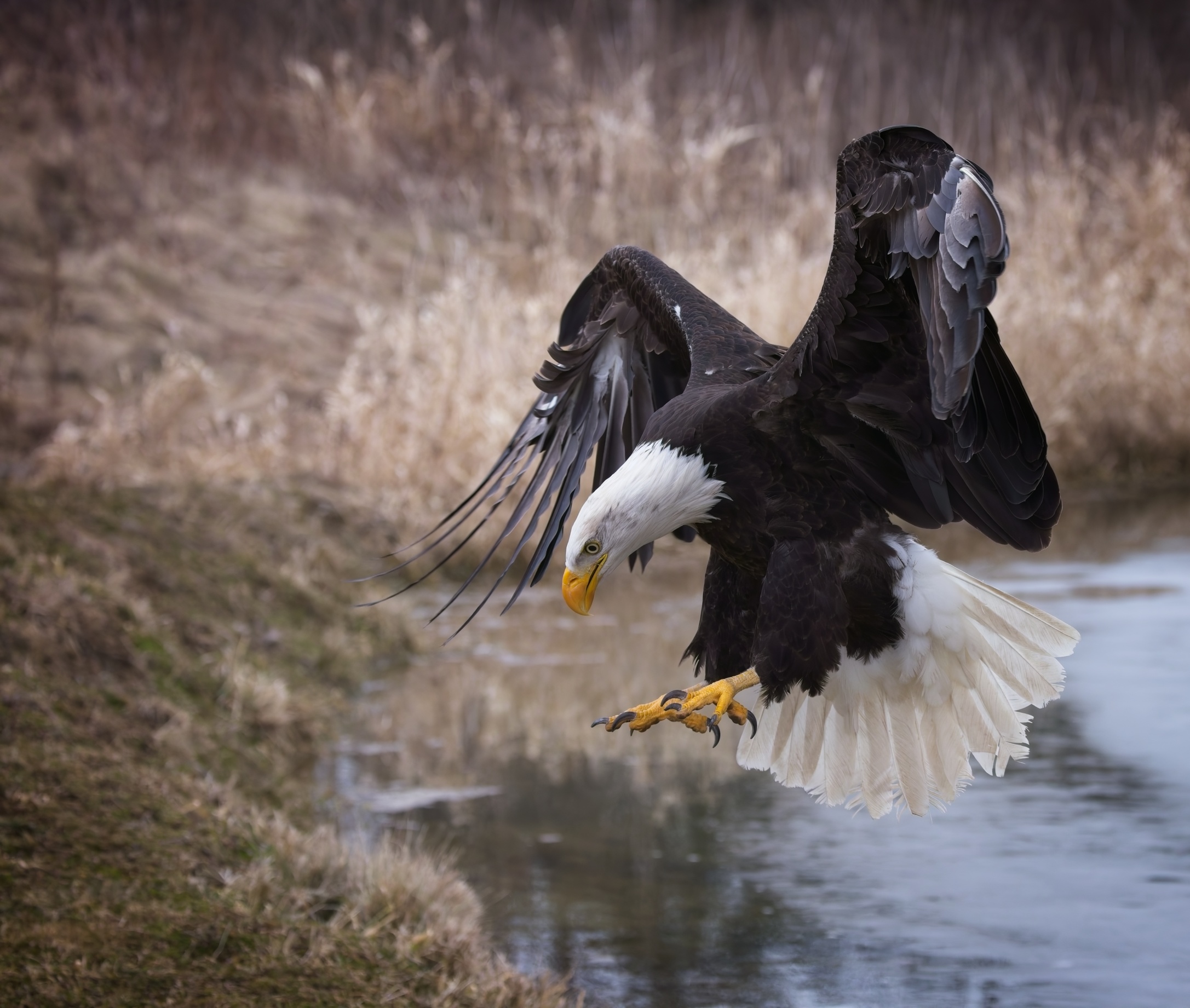
Hi Cindy,
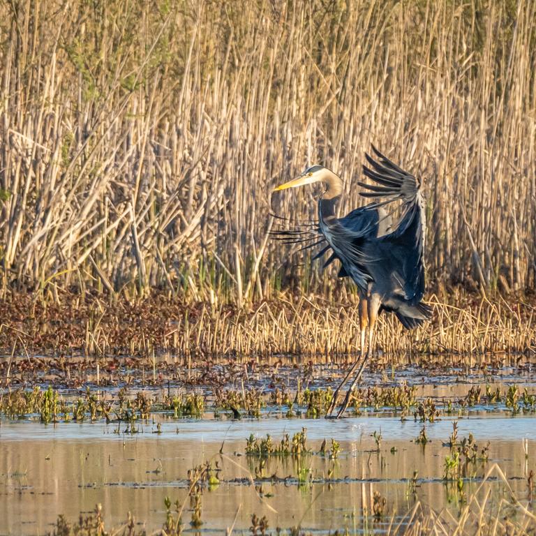
Very nice capture that tells a story. Both eagles are fairly sharp.
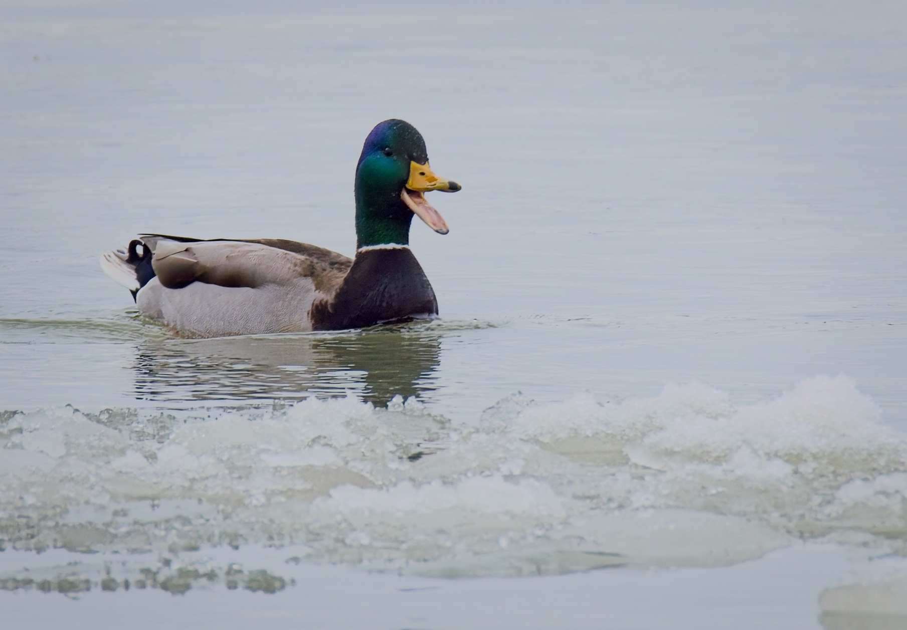
How to improve: It would be nice to have more room on the right side of the image (so the Eagles are not flying out of the frame). It would also be nice to have more details on the lower left eagle.
I realized that on your original, the right side was also close to the top eagle.
It is now possible, using regenerative AI, to increase the size of this right side. I also slightly decreased the highlights and the shadows. Although not perfect, this is what I was able to come with:
|
Mar 5th |
 |
| 69 |
Mar 26 |
Reply |
Agree. I was told that it is better not to have completely blacked out areas. Also, when you took this image, you were used to the darkness and saw lots of details - when you look at the image in a bright room, it looks severely underexposed.
This is the reason why I have tendency to make it brighter, but in would be interesting to ask for comments from the other members of the group.
|
Mar 5th |
| 69 |
Mar 26 |
Comment |
Hi Dean,
Lovely capture. Great stitching and white balance (sometimes tricky).
I agree with Jaswant re Portrait orientation of the camera for Horizontal stitching. I also overlap the images by 1/3 to 1/2 for better results.
I felt that the image was altogether too dark. I decided to try to "tweak" it a bit. I used only global adjustments: decrease highlights, increase black, decrease shadows, and crop top and bottom (the bottom was "fuzzy" once the shadows were decreased). This is just a suggestion. |
Mar 4th |
 |
| 69 |
Mar 26 |
Comment |
Lovely capture. I particularly like the Left zebra touching the back of its neighbour. I have no problem with the cropping nor the slightly high viewpoint. I agree with Jaswant that a soft vignette would decrease the background distraction (a little too bright due to the time of the day).
A keeper for sure. Well done. |
Mar 4th |
| 69 |
Mar 26 |
Reply |
Thanks Mervin. I agree. |
Mar 4th |
| 69 |
Mar 26 |
Reply |
Thanks Jaswant
|
Mar 3rd |
| 69 |
Mar 26 |
Reply |
Thanks Dean. You are right. It was not captured in my backyard, but at the Canadian Raptor Conservancy in Vittoria, Ontario, Canada.
|
Mar 3rd |
5 comments - 7 replies for Group 69
|
| 70 |
Mar 26 |
Reply |
Thanks Geoff |
Mar 26th |
| 70 |
Mar 26 |
Reply |
Thanks Jerry |
Mar 22nd |
| 70 |
Mar 26 |
Comment |
This image is the original high quality jpeg image that my camera, captured and saved on the SD card along with the RAW image file. It was not edited in camera. The only change to it was to down-sample it in Adobe Photoshop to 2160 pixels vertical to fit on a UHD screen and save it at jpeg compression quality level "10". |
Mar 21st |
 |
| 70 |
Mar 26 |
Reply |
Thanks Frans. I agree with all the suggestions. |
Mar 20th |
| 70 |
Mar 26 |
Reply |
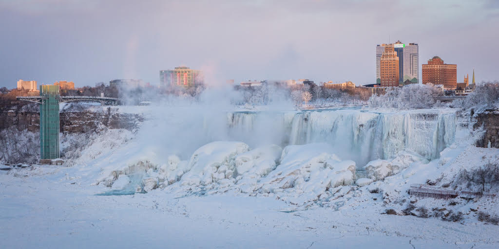
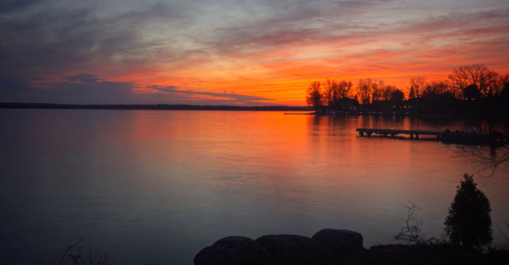
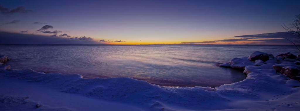
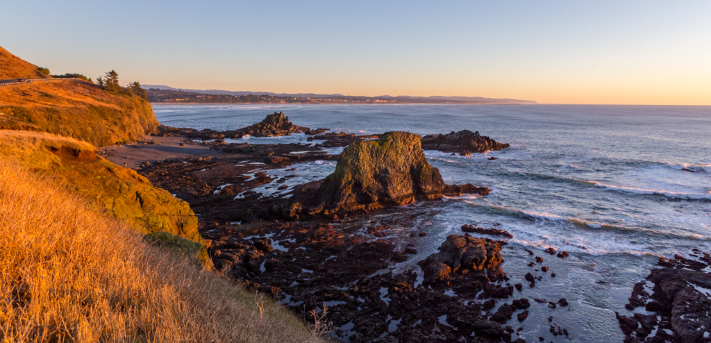
Hi Kirk,
Great suggestion. I agree.
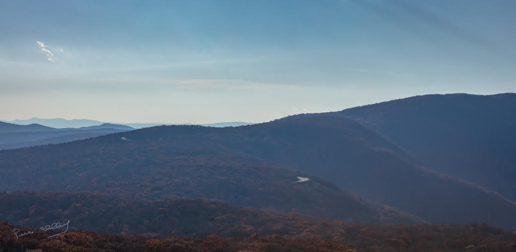
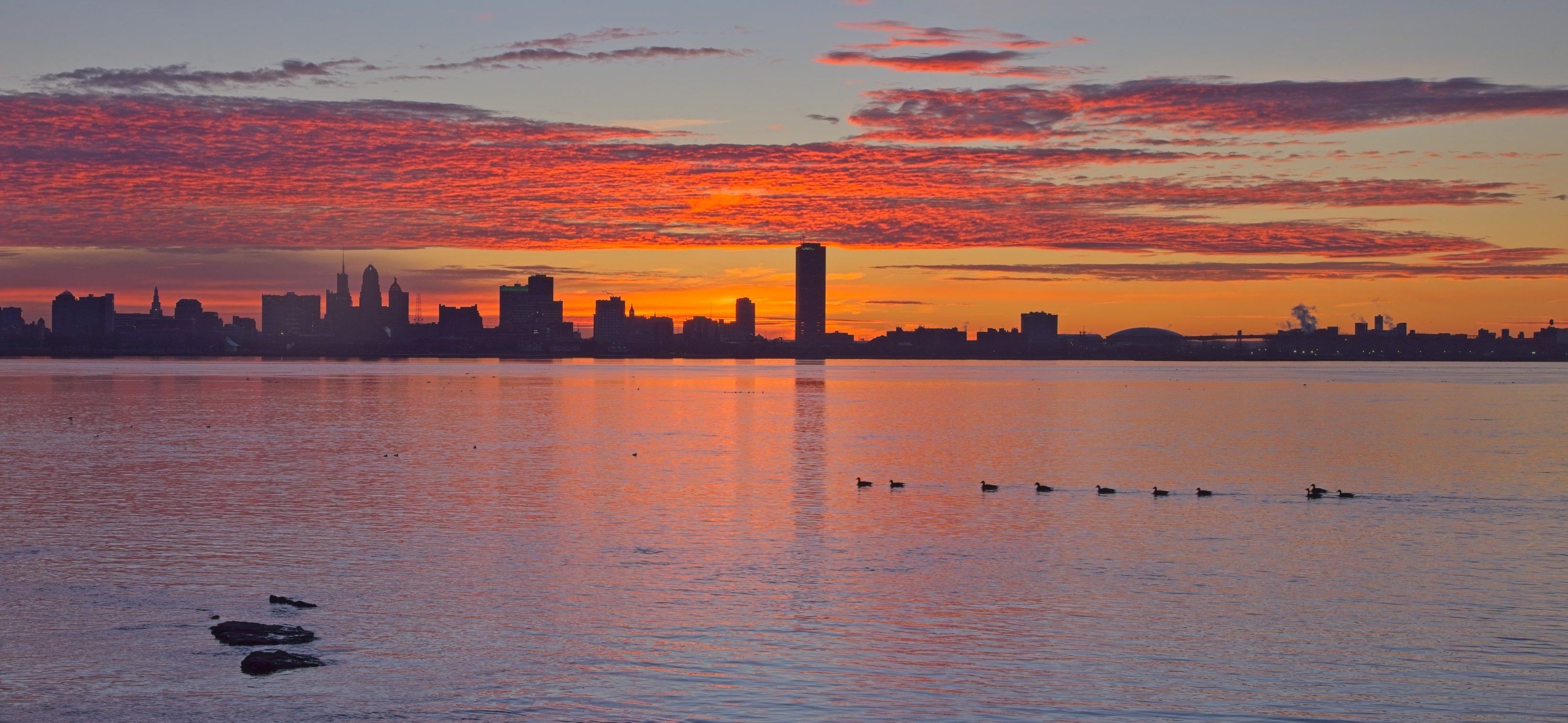
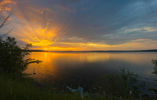
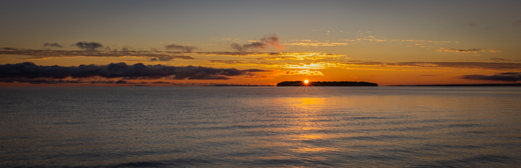
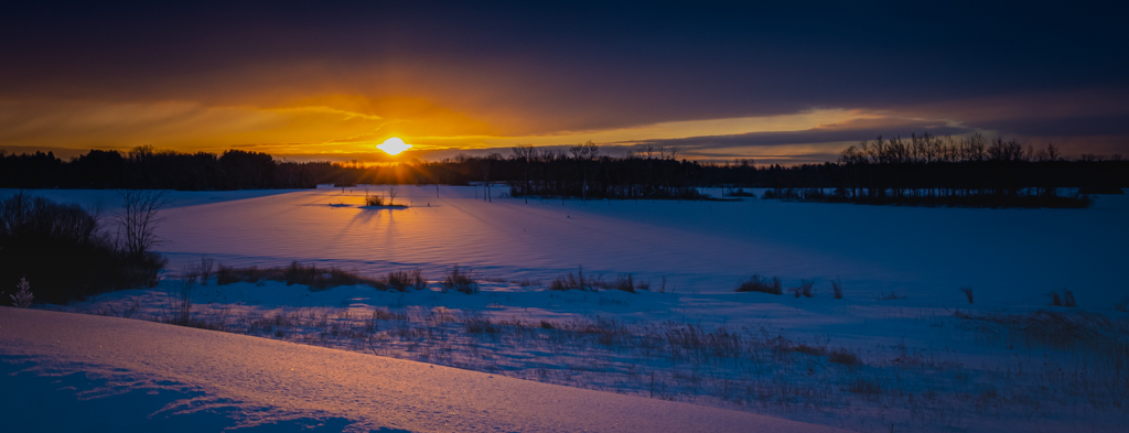
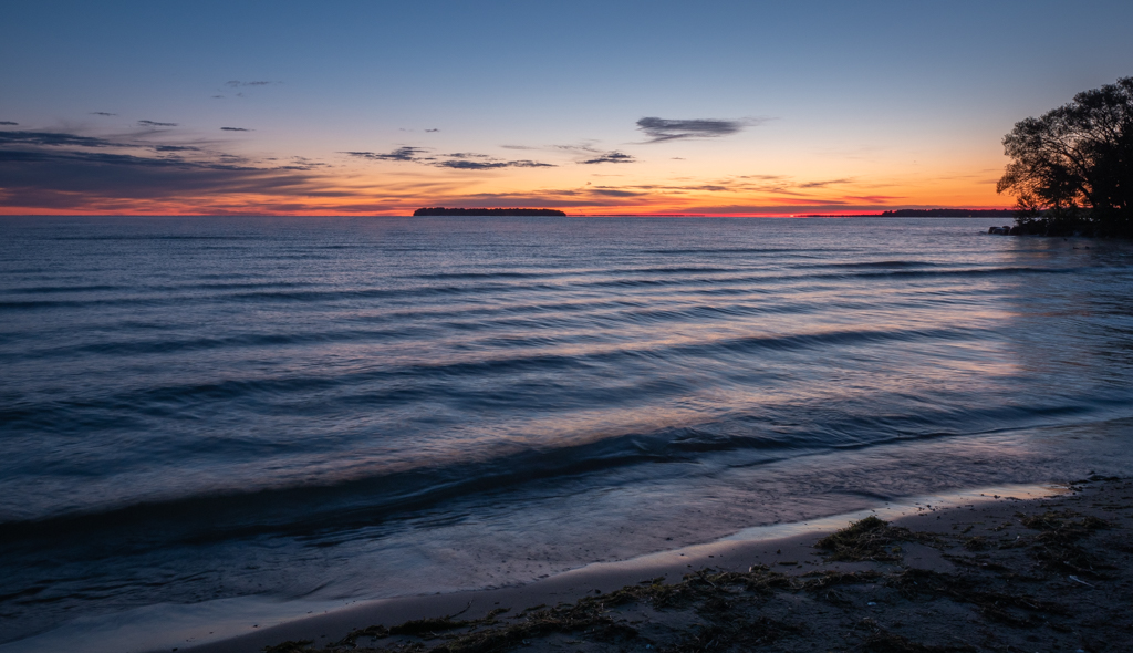
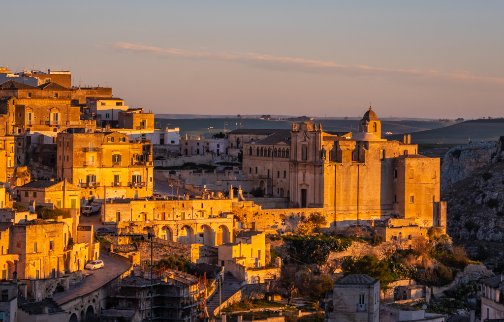
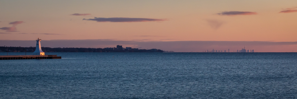
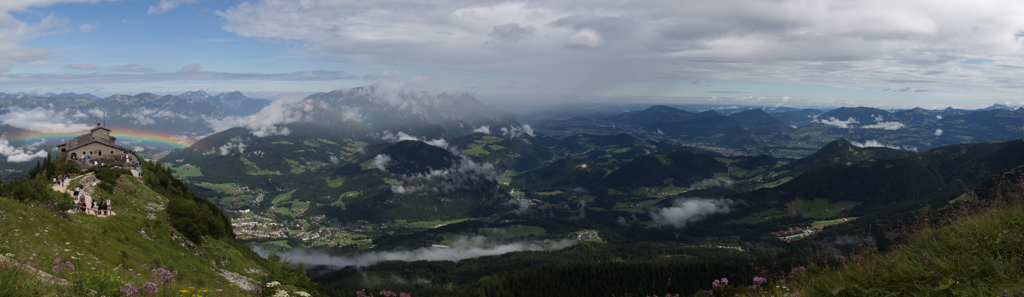
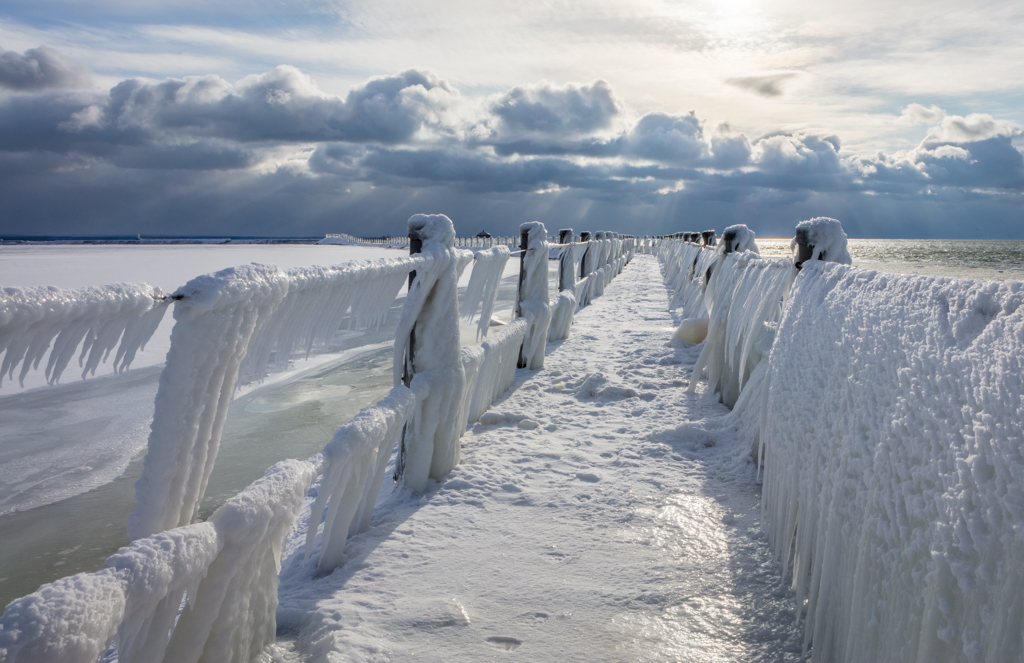
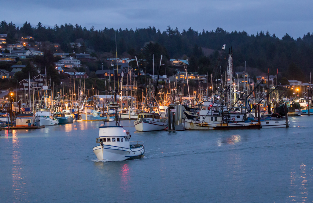
This is a view of a small bay of Lake Erie, between Crystal Beach and Point Abino. Lake Erie is the shallowest of the 5 Great Lakes, and its surface can freeze during a cold winter, preventing maritime transportation. These Ice Caves and Mounds are close to the shore. |
Mar 14th |
| 70 |
Mar 26 |
Reply |
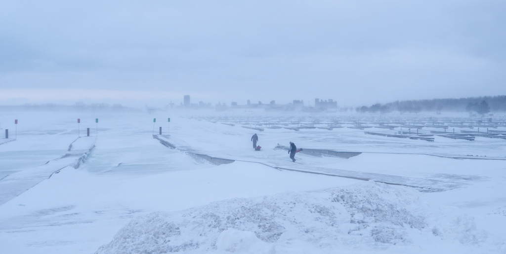
Hi Kirk and Frans
Now that you mention it, I agree that there might be some barrel distortion to the image. These distortions could be decreased by applying the "lens correction" in the post-processing phase.
It is possible that the lens was pointing downward, although this specific lens is not prone to this problem. I have a Canon EF 11-24 mm where this issue is quite obvious - unless the lens is perfectly horizontal with no vertical tilt.
I also wonder if the image is a little tilted.
I tried to apply a perspective correction. I am not sure that I have nailed it, but I tried. |
Mar 13th |
 |
| 70 |
Mar 26 |
Comment |
Hi Kirk,
Very nice scene. I agree with you that the fence is providing strong lines, and fantastic depth to the scene.
I realize that it is not easy to respect the perspectives, especially when on the lower side of a hill. Here, I have the impression that your camera was pointing down a little (see the pickets of the fence). I also felt that the main subject was the rocky formation, and not the grass on the hill.
I took the liberty of slightly adjusting the perspective and cropping some of the lower aspect on the image.
I also saw that lady, likely taking a "selfie" between the rocks. Funny, but also can tell a story. |
Mar 13th |
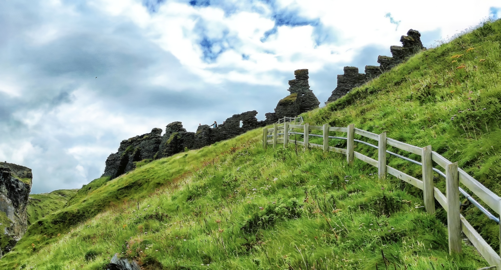 |
| 70 |
Mar 26 |
Comment |
Hi Frans. Very nice re-editing of your image.
I agree with you re bracketing. Although I normally use 5 images at 1 stop intervals, most of the time I have one shot without "burned" pixels nor completely "black" areas. The sensors are getting progressively better.
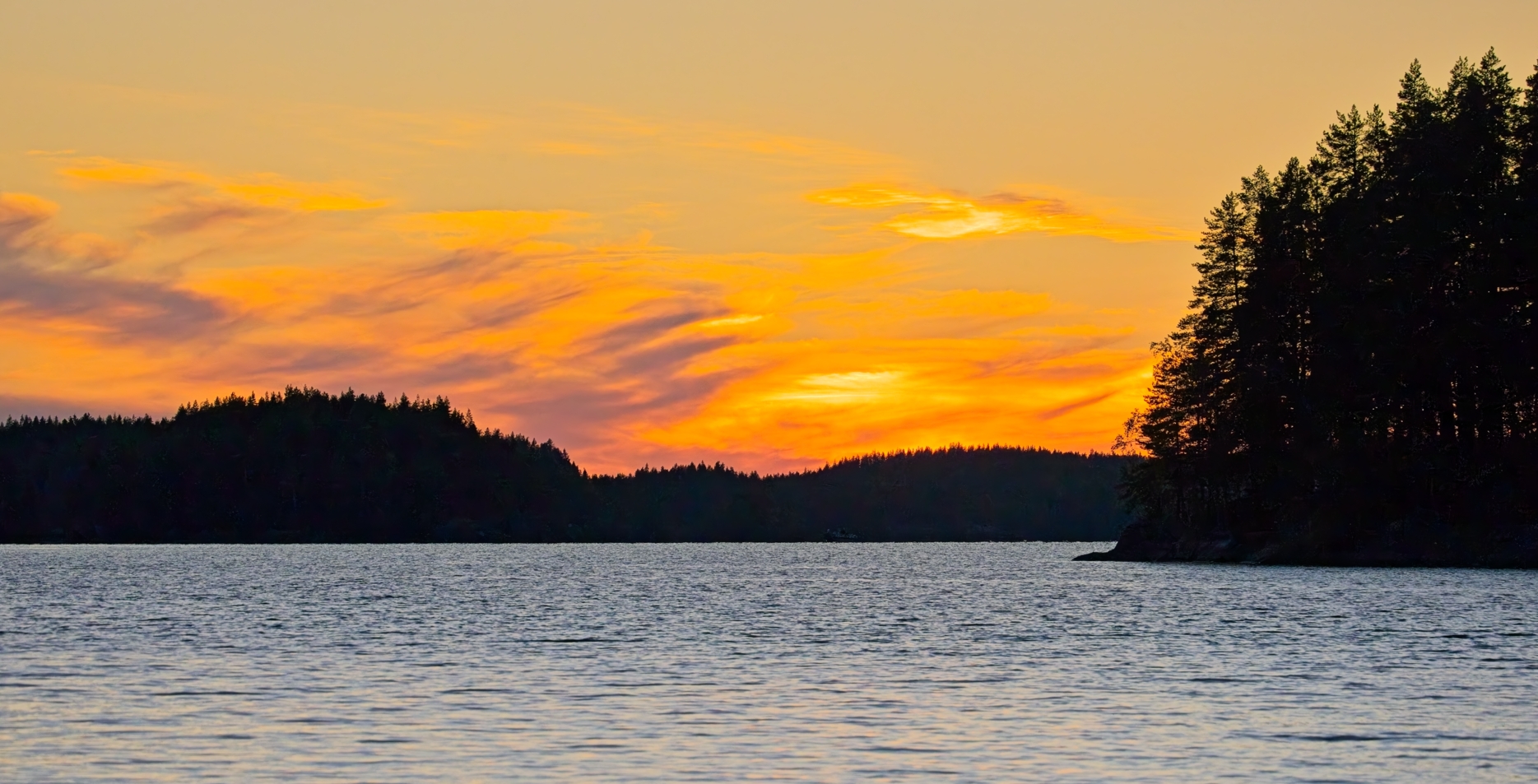
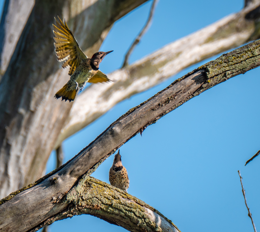
In the context of a scenery without strong highlights and deep shadows, blacketing is probably overkill. In situations where one is pointing the camera towards a very bright area, like the sun, I find bracketing quite useful in bringing up details on both ends of the spectrum. I also love bracketing my captures for sunsets and sunrises, especially if the moon is in the image, as it would be very bright compared to the rest of the image. In this situation, I normally put my camera on "manual" mode, to allow very significant underexposure to keep the details of the moon surface (sometimes EV down to -7 or -9). |
Mar 13th |
| 70 |
Mar 26 |
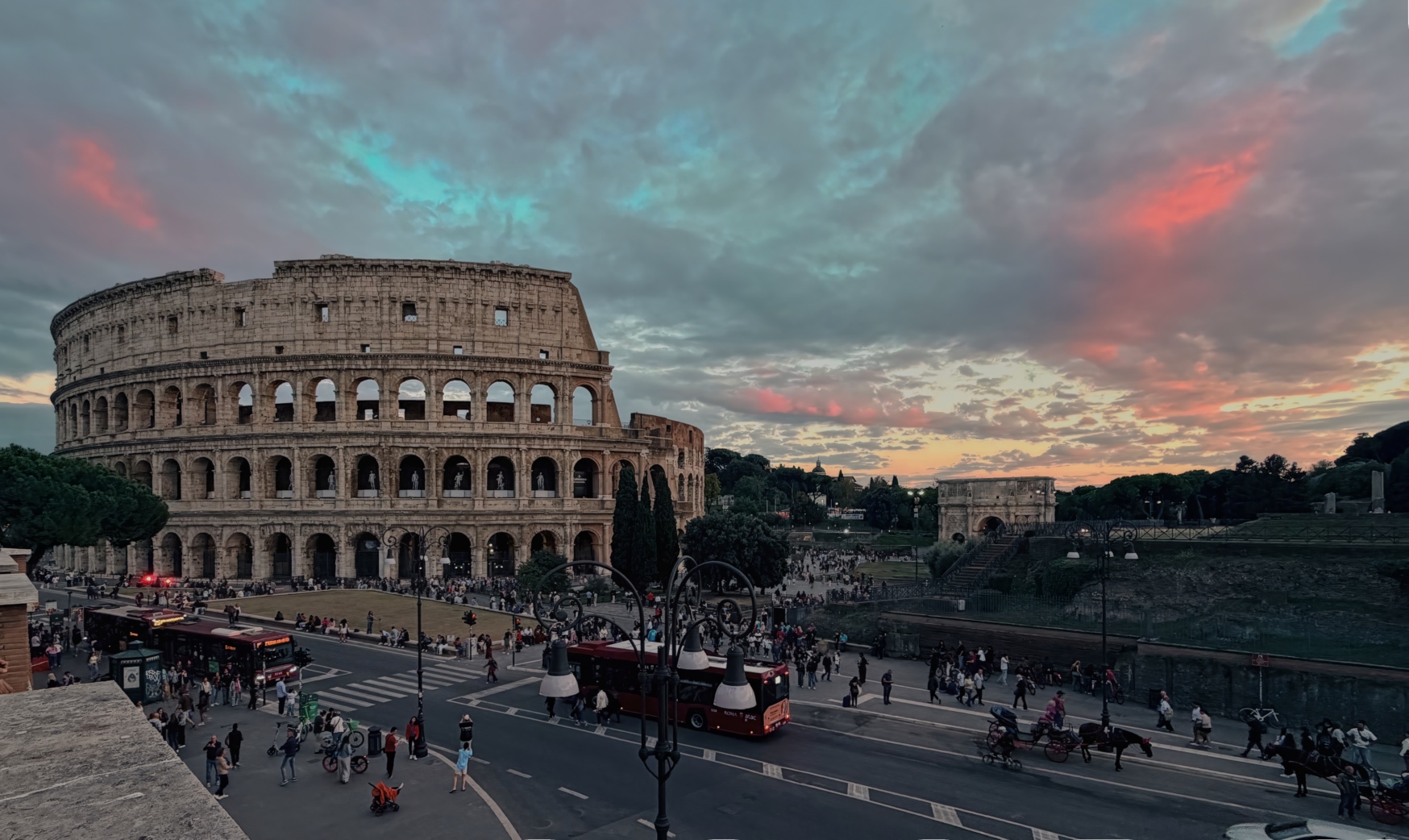
Comment |
Hi Bradford. Interesting subject. The 3 sculptures are quite entertaining, well framed, and in perfect focus. I found the background distracting and fairly bright, especially in the center of the image.
A few suggestions: I believe that the image would have a stronger impact if you would have moved a few feet to your left. This way, the street space between the skyscrapers in the center of your image. This was likely captured in mid day as the shadows are quite harsh. A fill flash would have been useful in improving your subjects exposure.
|
Mar 13th |
| 70 |
Mar 26 |
Comment |
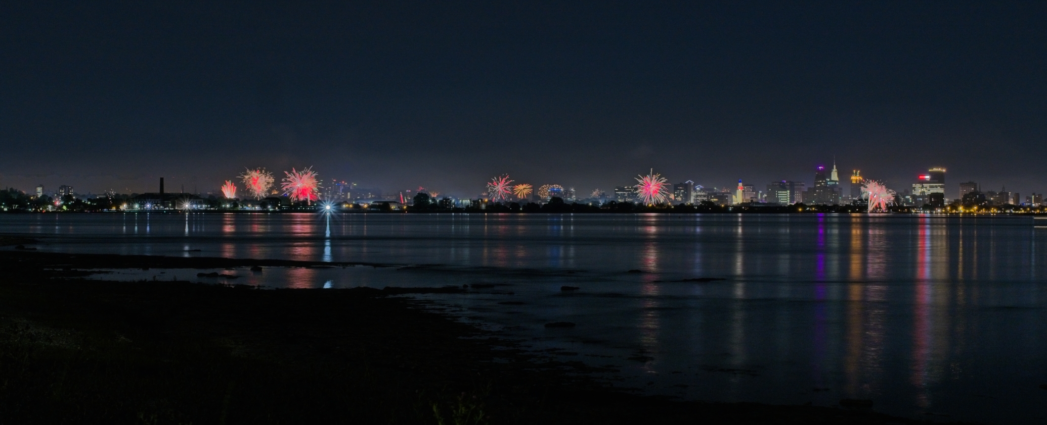
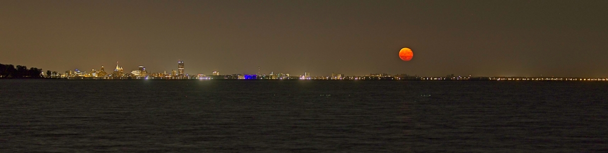
Really nice moon eclipse. You were likely on a tripod and with high ISO setting.
The moon is sharp with nice gradation of light intensity.
Nice. No suggestion for improvement. |
Mar 6th |
| 70 |
Mar 26 |
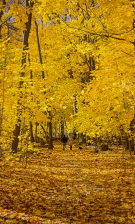
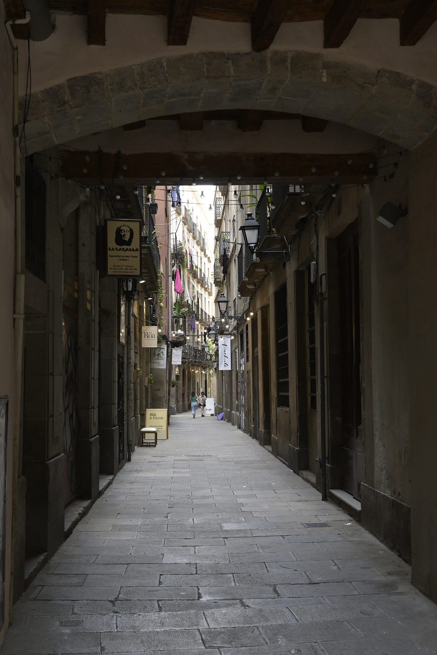
Comment |
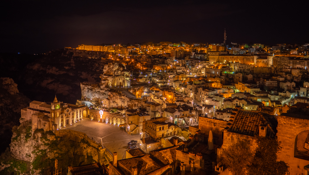
Very nice image. Great depth of field with the arch framing the alleyway. Nice and strong directing lines from the shadowy area towards the light. Great seeing pedestrians providing a nice perspective and horizon point.
I do not have any suggestions for improvement. Well done. A keeper! |
Mar 6th |
6 comments - 5 replies for Group 70
|
17 comments - 17 replies Total
|