|
| Group |
Round |
C/R |
Comment |
Date |
Image |
| 12 |
Oct 18 |
Comment |
very nice. Il pleut, vielleicht :-) |
Oct 8th |
1 comment - 0 replies for Group 12
|
| 18 |
Oct 18 |
Reply |
I suspect it is going that way with most graphics software. Hence the large range of official videos put out on YouTube etc. It makes you appreciate that one piece of ancient software that is barely compatable that always did that odd irreplaceable effect no other does.
|
Oct 19th |
| 18 |
Oct 18 |
Reply |
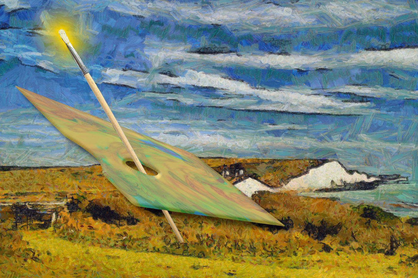
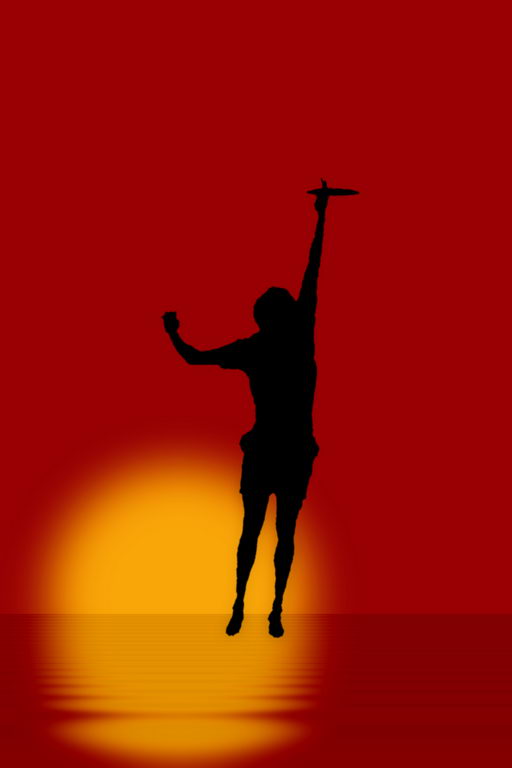
Its not the construction that appears not as a fish out of water, but the strong association in perception that a fish would be in water. To break that would need equally strong association, but with air. Maybe relace the rocks with clouds, and background of blue? If the fish had a vapour trail too, it could be seen as potential ariel food. |
Oct 19th |
| 18 |
Oct 18 |
Comment |
Simple and effective. The muted colours suit the calligraphic subject well. Its definitely an M&S, but that is using a third multinational icon. |
Oct 13th |
| 18 |
Oct 18 |
Reply |
Likewise for me with PS :-)
|
Oct 13th |
| 18 |
Oct 18 |
Reply |
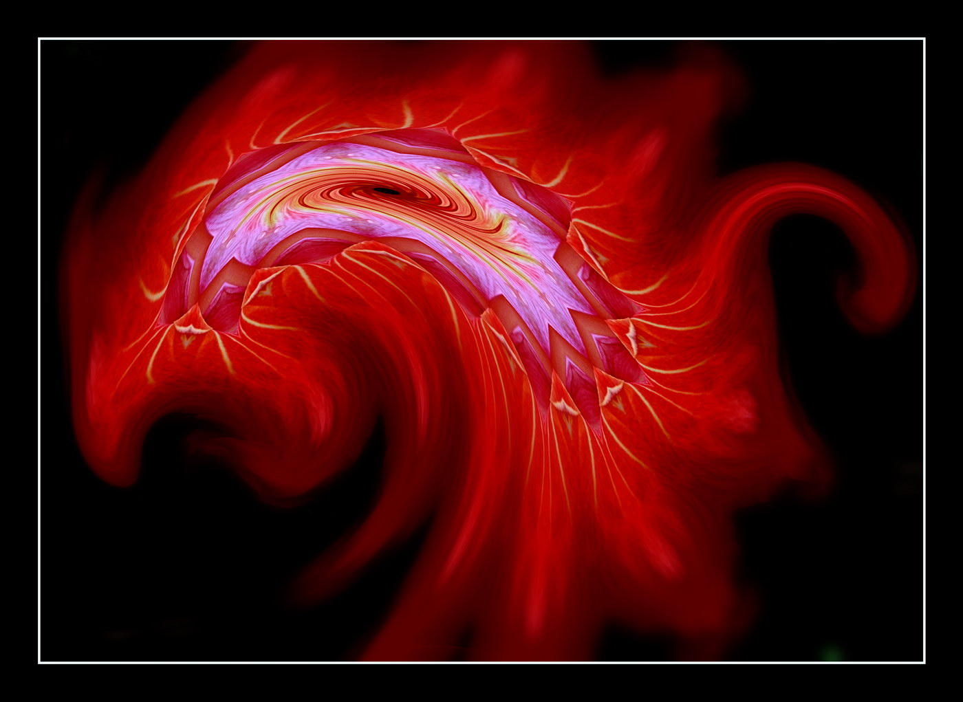
Thanks, Ian. The feedback filter is one of the Reflection Effects filters in Paint Shop Pro. It (assumably) produces multiple resize layers with frequency and XY offset at user selection. |
Oct 12th |
| 18 |
Oct 18 |
Reply |
Or maybe a background to stand against? |
Oct 10th |
 |
| 18 |
Oct 18 |
Reply |
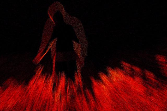
With the work complete, and thinking of pulling dangerous tails, maybe you can cut out the man and rat from the background, and place them somewhere that might enhance the element of danger :-)
|
Oct 8th |
| 18 |
Oct 18 |
Comment |
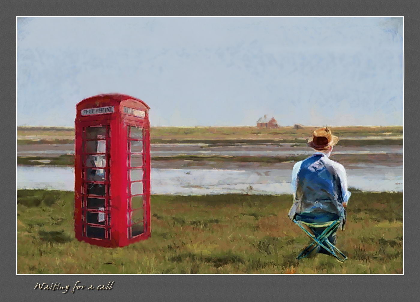
One thing is for sure, there's little of natural material to leave it as a straight record shot. The person looks like the artwork is appearing Happy Potter style, which works well. I feel the rat's head works, and is fitting though a little indistinct. The rails, though minor, serve to keep a sense of reality. |
Oct 8th |
| 18 |
Oct 18 |
Comment |
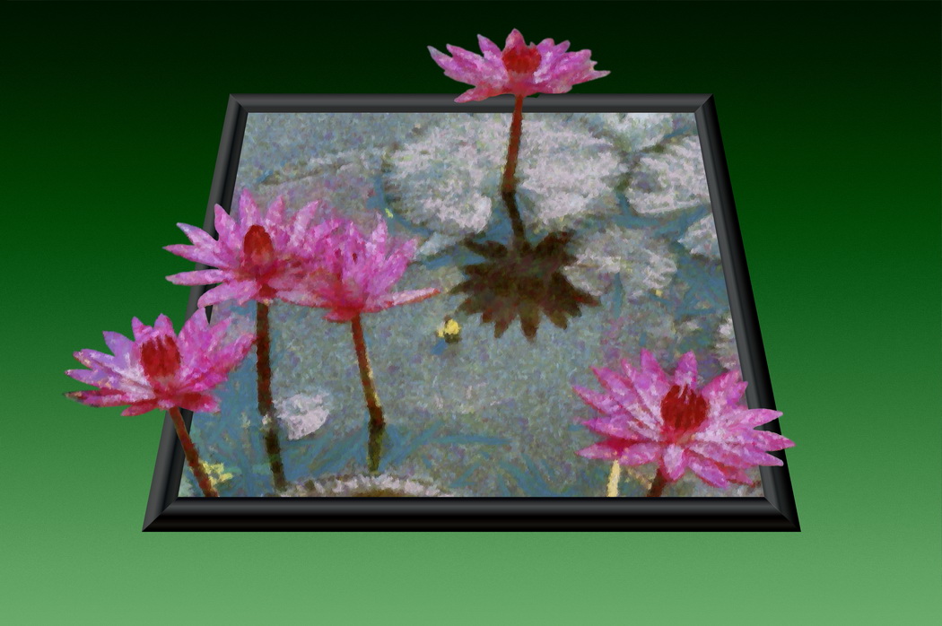
I like the idea, and feel it could work very well. After thinking about it, I decided it was the lack of figures standing out from the surroundings that did it. Maybe a little softening of the rock walls will make it more 3D.
|
Oct 8th |
| 18 |
Oct 18 |
Comment |
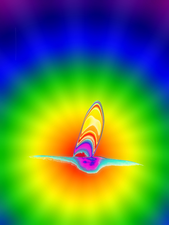
I was thrown by the original until reading the "how I did it". I can see the idea behind it, but the pose of the figure suggests a disconnection. For a dream, the clock works (as expected), but I wonder if the cut etc. could have a little distortion, or touches of transparency. Maybe to fit with the Dali theme, the chair could be emerging from a frame instead of hanging in mid air. |
Oct 8th |
| 18 |
Oct 18 |
Comment |
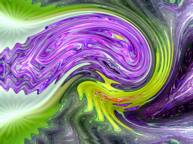
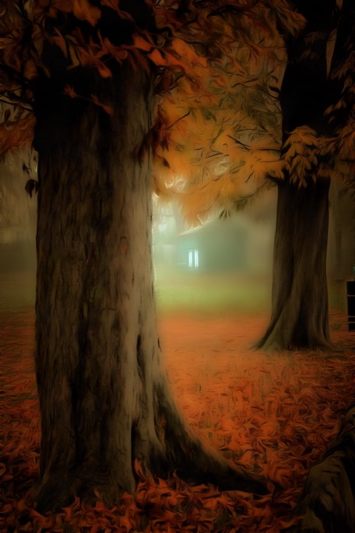
The filter works well to enhance the line and colours in reduced detail, without loss of the likes of the reflections in the water. The effects on foliage I particularly like. The left hand path, with loss of detail, tends to look like a distracting smudge. mayybe a colour change to foliage green? |
Oct 8th |
| 18 |
Oct 18 |
Comment |
The applied filter works well to convey the effect of a dull day. More through the looking glass than Renoir, unless you overlay the figures the figures with detailed originals. I prefer it as is, in that respect, with the frosted glass appearance.
The white bag bothers me not, being and and between strong reds as it is. But that point did make me think that a local desaturation filter might be usefully applied to put the colourful figures into relief against a monochrome background to reflect the dull day. |
Oct 8th |
6 comments - 6 replies for Group 18
|
7 comments - 6 replies Total
|