|
| Group |
Round |
C/R |
Comment |
Date |
Image |
| 18 |
Sep 18 |
Comment |
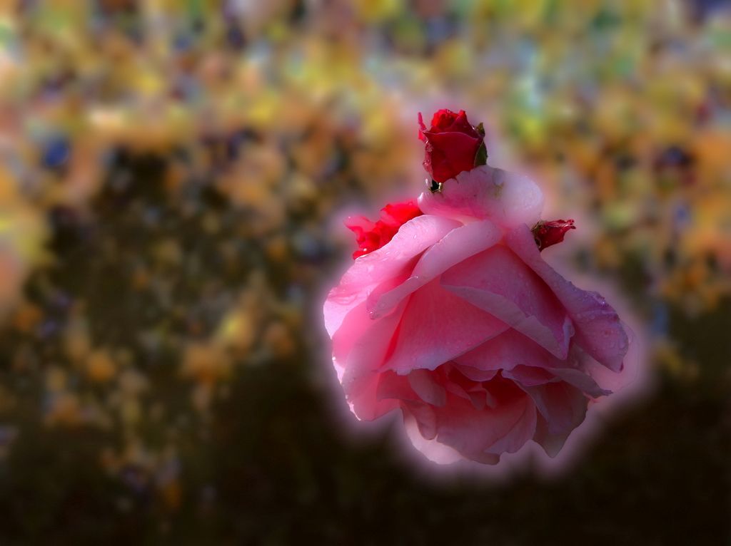
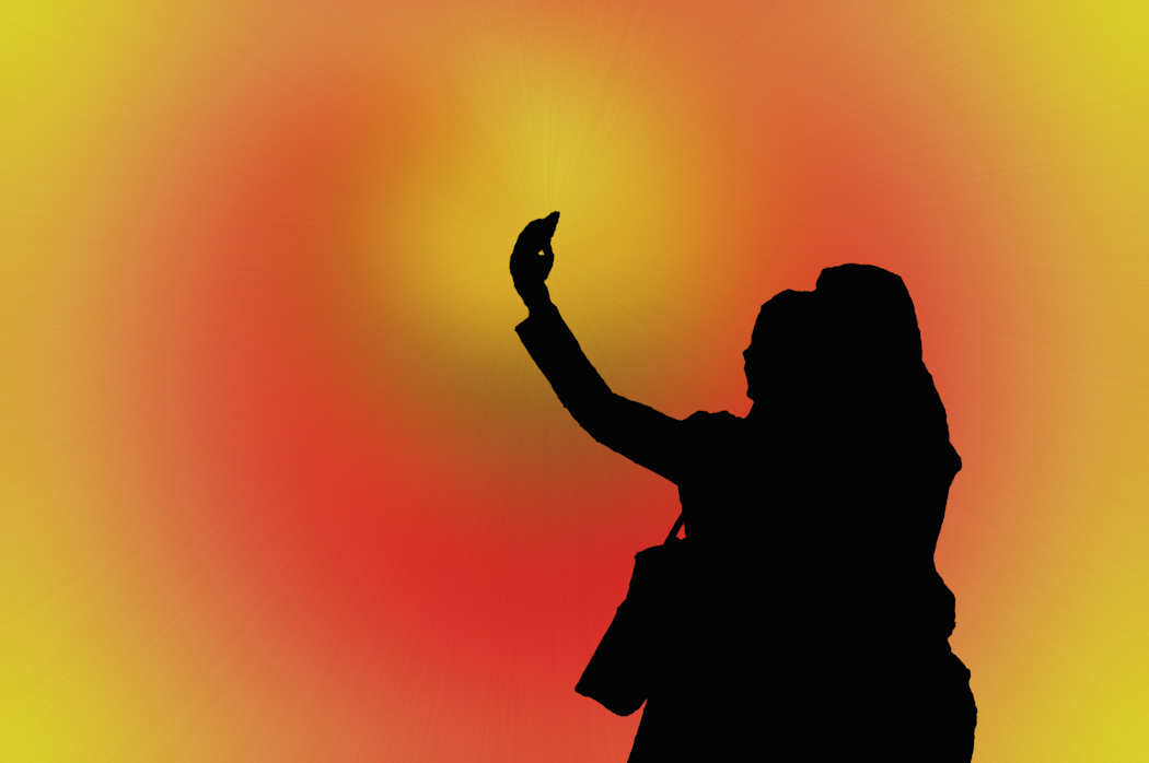
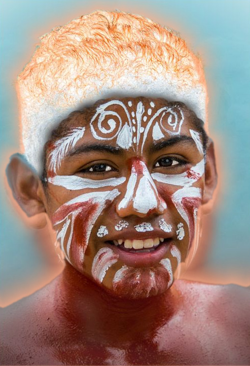
The orange would be a warm glow, to disguise the out of focus flesh.. The negative hair looks like a hat, given the black hair poking through underneath. I assumed that was the intention.
|
Sep 15th |
| 18 |
Sep 18 |
Comment |
The orange would be a warm glow, to disguise the out of focus flesh.. The negative hair looks like a hat, given the black hair poking through underneath. I assumed that was the intention.
|
Sep 15th |
| 18 |
Sep 18 |
Comment |
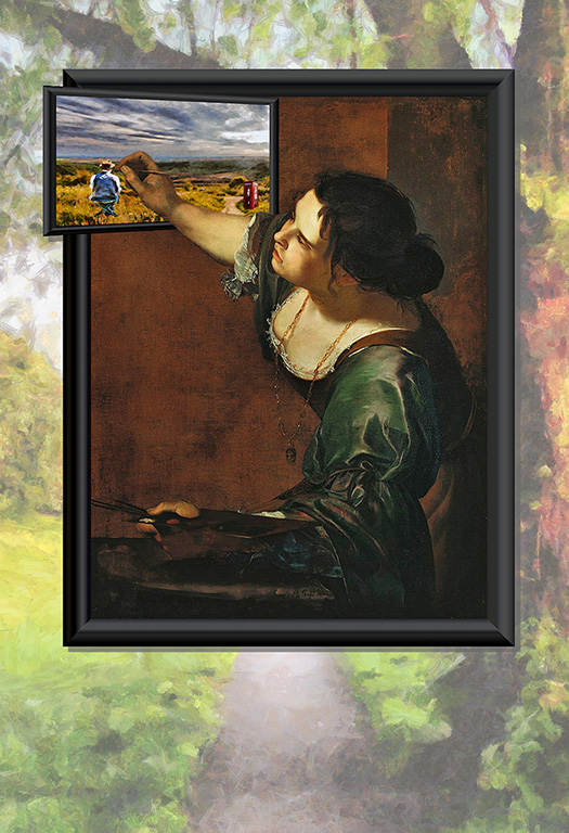
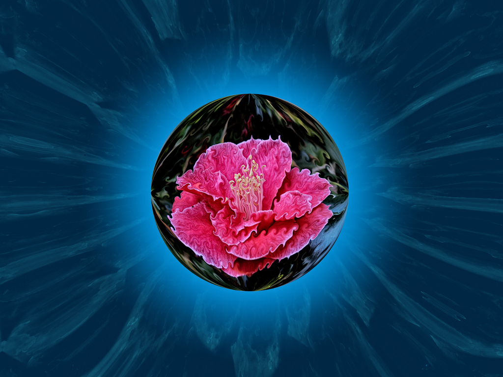
My first impression was a lovely photograph. Then comes the portrait idea. I too wanted to see the image in the glass brighter, more of an element than incidental in the picture. To keep the good photographic aspects, and make more surreal, use the same masking to introduce an image of something completely different but connected to the lady for a matching pair, in spectacles and life. |
Sep 15th |
| 18 |
Sep 18 |
Comment |
It is very nice indeed, lending that Alice in Wonderland feel. The surreal appositions and disproportate elements make it real yet unreal. I would have been inclined to be rid of the leaf, leaving the cockchafer on the dog's own turf, eying up lunch of an "innocent" while the river flows on in uncaring. |
Sep 15th |
| 18 |
Sep 18 |
Comment |
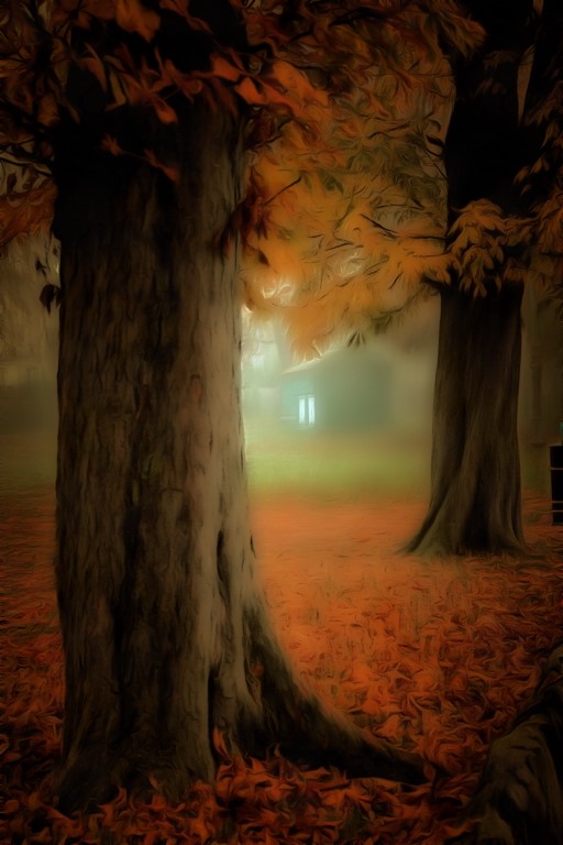
Tried and trusted and still working well. The grisaille colouring and the diagonals, birds and background dry the eye with this creation.
|
Sep 15th |
| 18 |
Sep 18 |
Comment |
I like the hat, which certainly has a negative appearance. Any changes to the face markings? I too worry over the soft ears, and outline to the neck which looks like a figure behind. Additional edge filters could, for example, have incorporated that into the creative process in the final image. |
Sep 15th |
 |
| 18 |
Sep 18 |
Comment |
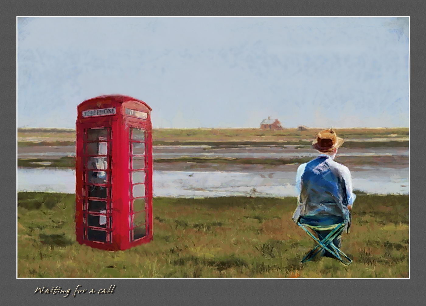
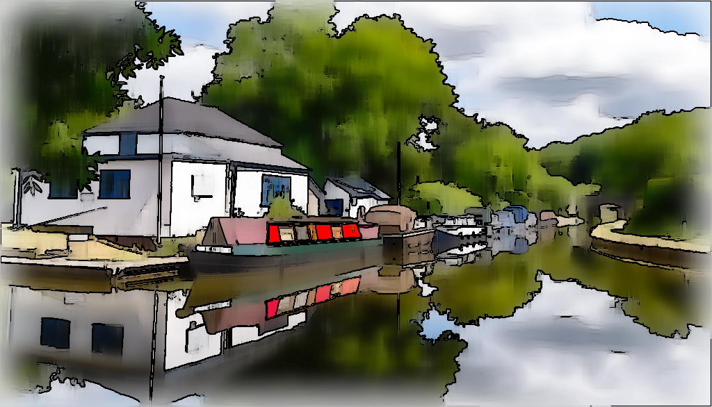
Very pleasing as both an origianl, and the editing. Taking the print paper idea further, I can see it would make an excellent Line & Wash study. Putting it through a cartoon filter simplifies it, and removes worries over telephone lines, leaving an image that would be very art paper friendly. |
Sep 15th |
 |
| 18 |
Sep 18 |
Comment |
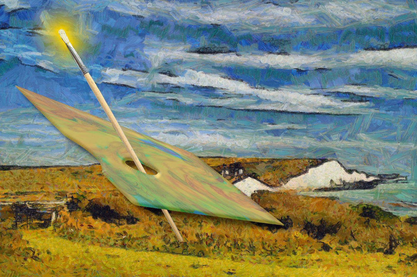
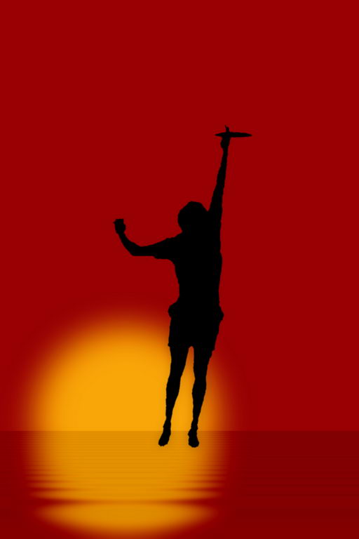
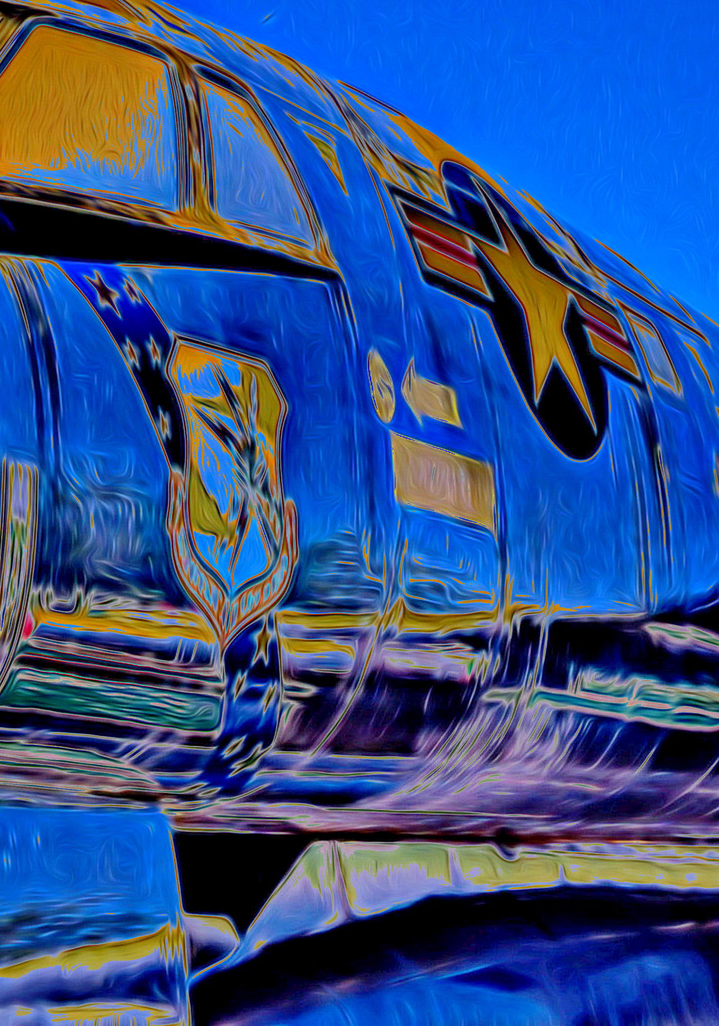
It works well with the painting filter, but in view of comments above, would it be better with a tight crop to remove some sky? A trim to vertical concentrates the eye on the emblems, with a diagonal from winscreen to engine. A touch of solarization to take it more into the creative realm leaves it looking like a sunrise, and ready for action at any time. |
Sep 15th |
 |
| 18 |
Sep 18 |
Comment |
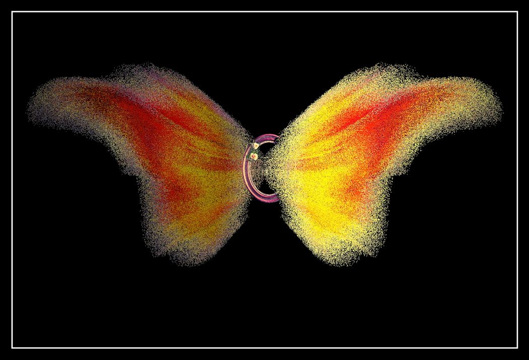
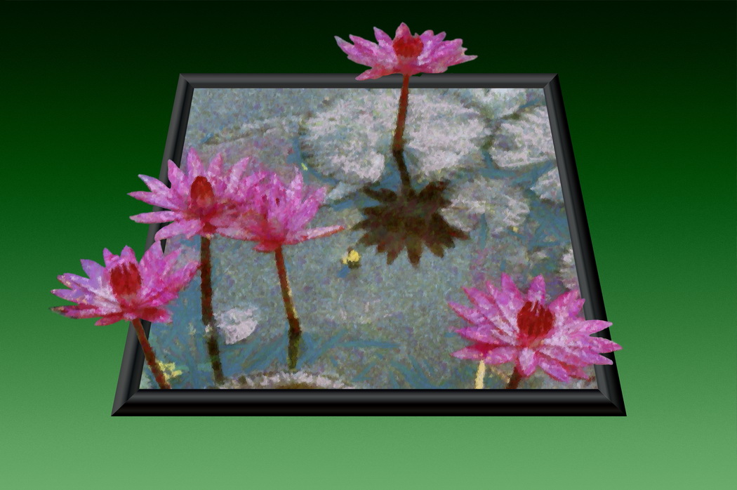
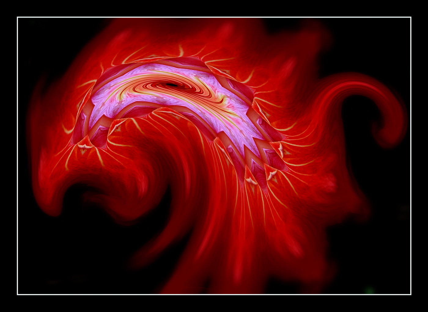
The ring and the butterfly format came before the egg, so to speak. It was an out-of-bounds, with the mirror image darkened to look like a reflection, or negative form of the other. Thus the ring was reduced to give it the constricting source appearance. The butterfly came as an idea from the wing shape when rotated. With the image already flattened it thus was born a hybrid. In retrospect, a wreath of flowers might be more appropriate. |
Sep 15th |
| 18 |
Sep 18 |
Comment |
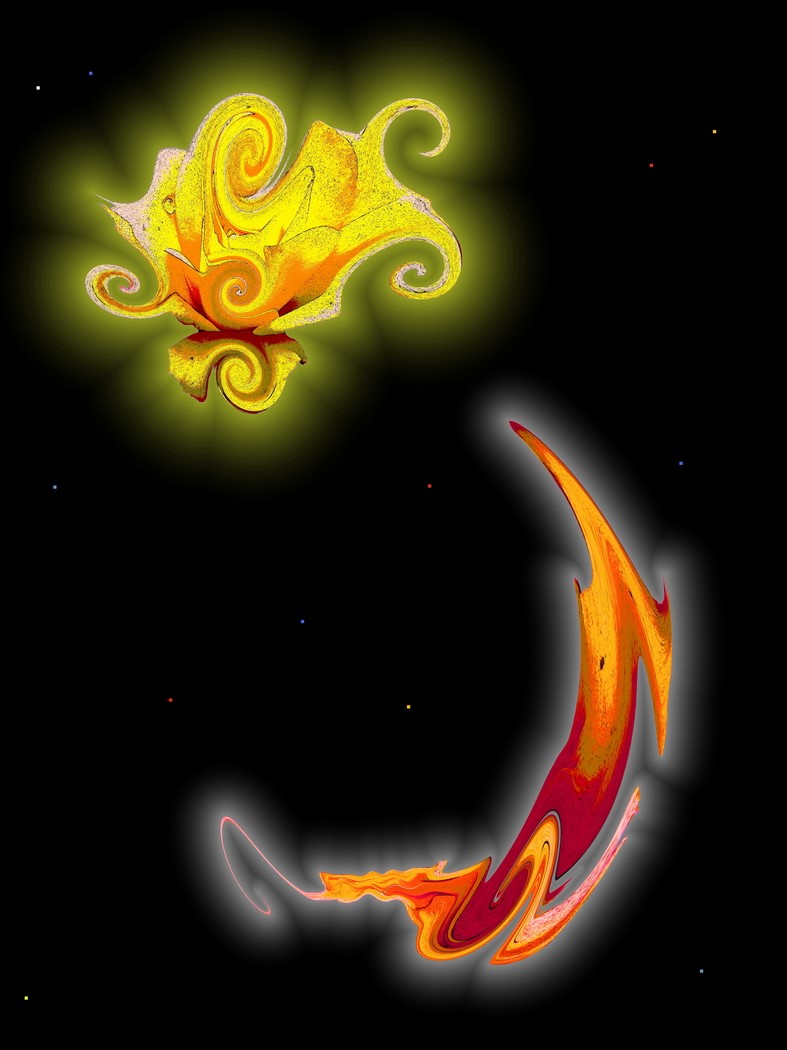
I should mention that the pixelation and solarization filters were added in ACDSee Pro10, while the layering to produce the mirroring, and the central frame were done subsequently in Paint Shop Pro X8.
|
Sep 12th |
10 comments - 0 replies for Group 18
|
10 comments - 0 replies Total
|