|
| Group |
Round |
C/R |
Comment |
Date |
Image |
| 18 |
Aug 18 |
Reply |
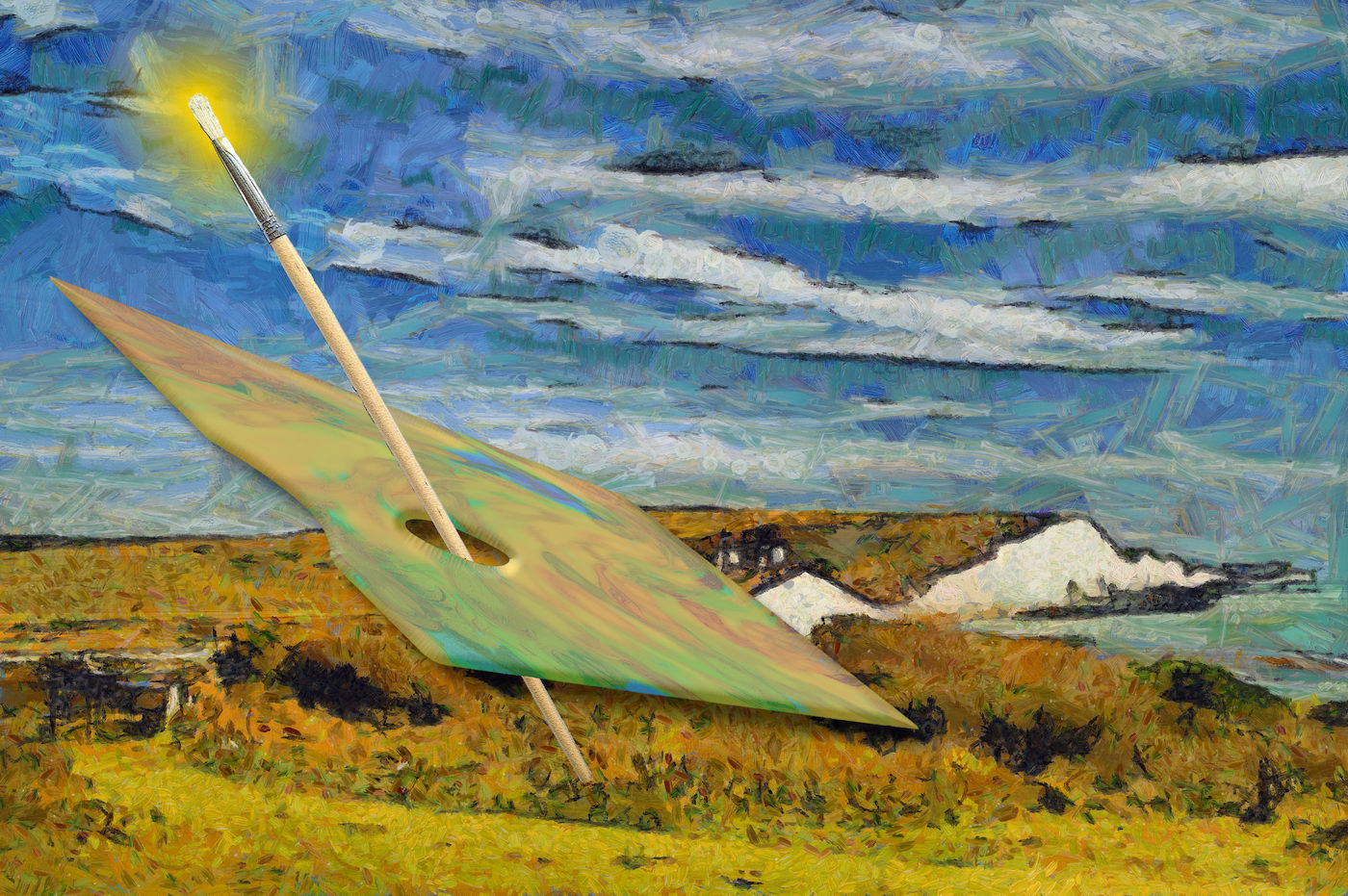
I think it works much better. The captain looks in charge now as if sailing a petal was his / her natural environment. |
Aug 25th |
| 18 |
Aug 18 |
Comment |
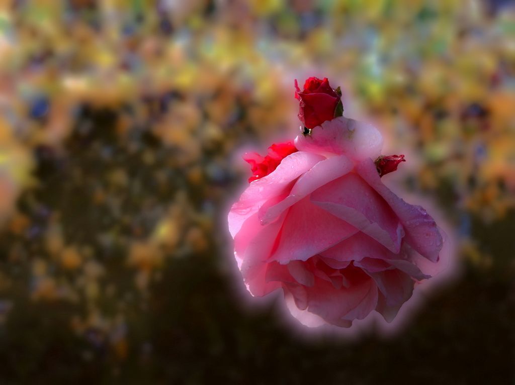
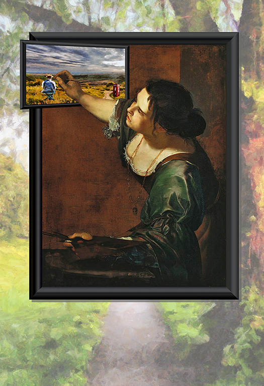
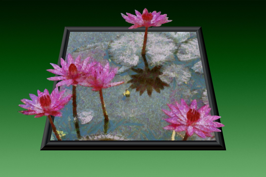
I like it very much. Often people go to much effort to remove grass before taking the picture. You have added it to this creation, leaving grass and water as layers to be wandered through with the eye. I certainly feel the crop of Ian's work, but I also enjoy the extra room of the left in the original, leaving feeling there is more to add. |
Aug 16th |
| 18 |
Aug 18 |
Comment |
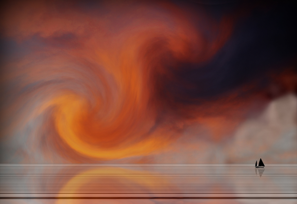
My favourite this month. I like the concept and the ingredients to it. It has something of "the owl and the pussy cat" to it. I wonder if the image might be stronger for laterally reversing the horse, leaving him / her looking out to see. Maybe if the horse - petal composite was a little smaller, as if further out, and the bottom edge cut a lttle more sharpley it could be ploughing those more distinctive waves. |
Aug 16th |
| 18 |
Aug 18 |
Comment |
It works well for me as a painterly image result. The strokes work well, as do the sharp edges to the buildings. Colour saturation adds to the impressionist feeling. |
Aug 16th |
| 18 |
Aug 18 |
Comment |
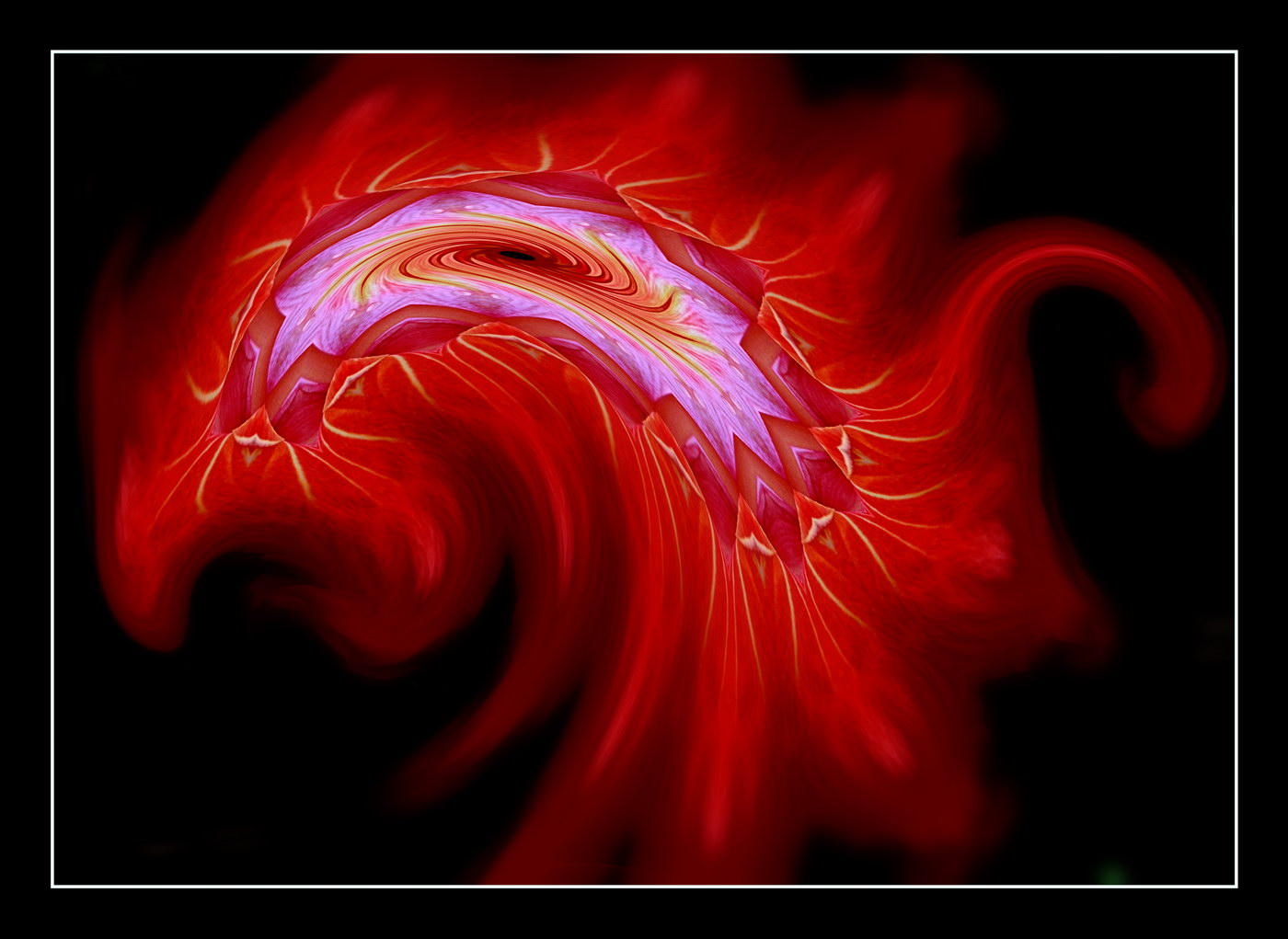
Certainly not creative in post production, but the creative effects in the original make it a fine abstract. On that basis I am not so sure that more would be better. You might be able to make layers of gradually reduced sizes and use the edges, cut and pasted in to give a sense of something moving like a helter skelter, or other concept. Otherwise leave as is. |
Aug 16th |
| 18 |
Aug 18 |
Comment |
It certainly brings out more of the details than the original. Maybe reality could be twisted more if the clouds were made to be emitted by the funnel. maybe rainbow graduation to the tracks too? |
Aug 16th |
| 18 |
Aug 18 |
Comment |
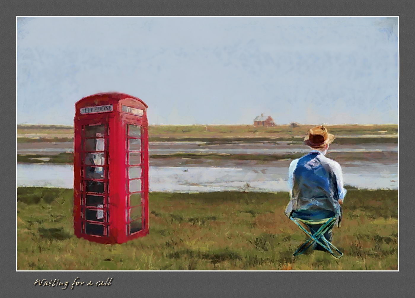
I too am left wondering about what to do further with the image created. The painterly effect certainly works well, but I feel it was not right with that subject. I agree with remarks about the writing legibility, but that could be seen as less creative rather than more. I think Mike has an improvement, with the saturation and contrast increase. I would be tempted to trim the top down below the lifebelt, and maybe use other software on the final image to add effects like wavy water in the wake of the boat. |
Aug 16th |
6 comments - 1 reply for Group 18
|
6 comments - 1 reply Total
|