|
| Group |
Round |
C/R |
Comment |
Date |
Image |
| 18 |
Jun 18 |
Comment |
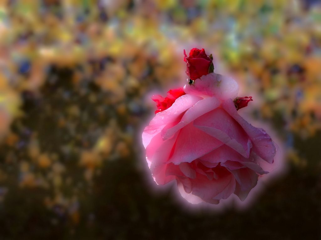
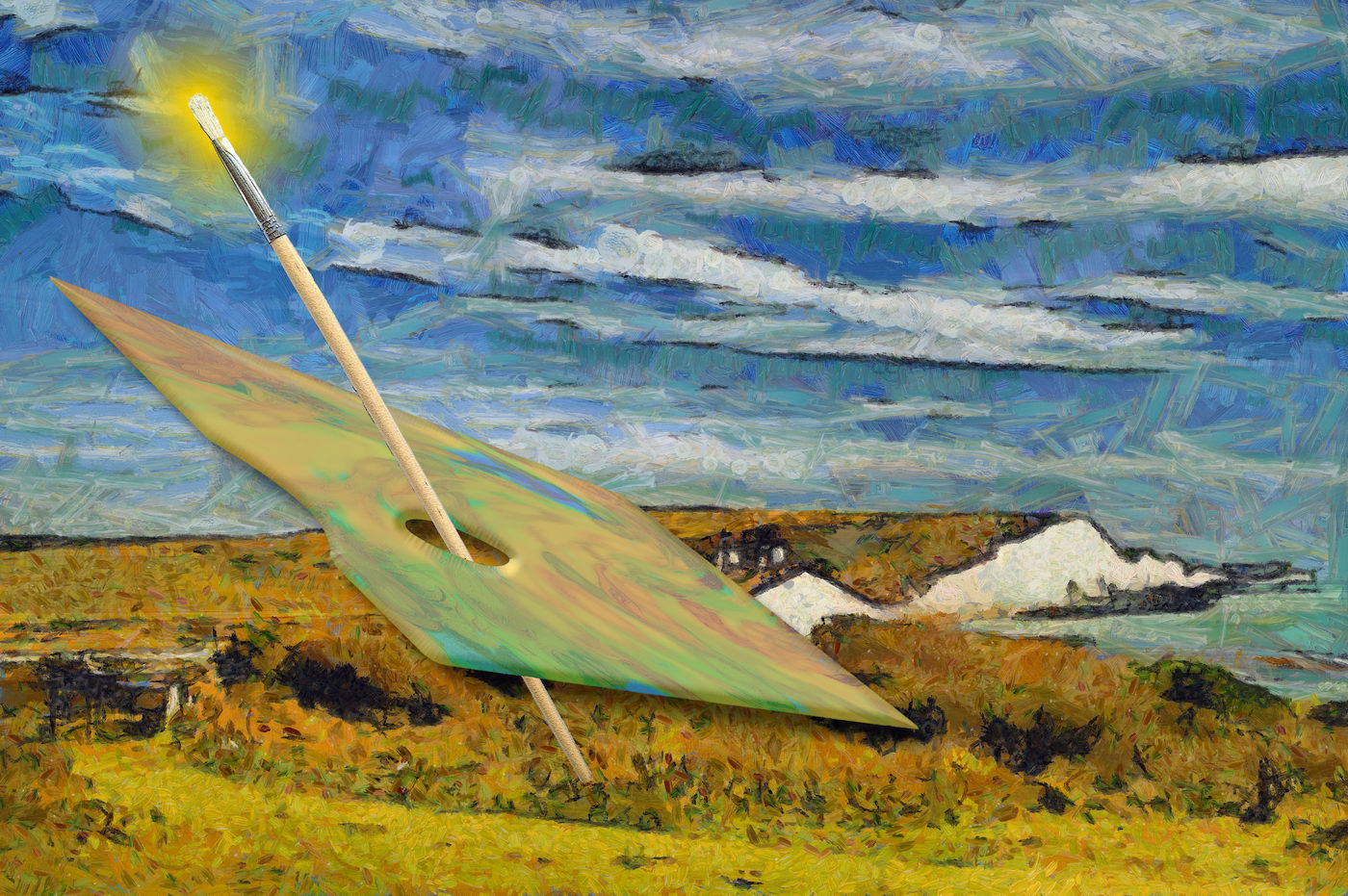
Maybe a plain colour background? |
Jun 17th |
 |
| 18 |
Jun 18 |
Reply |
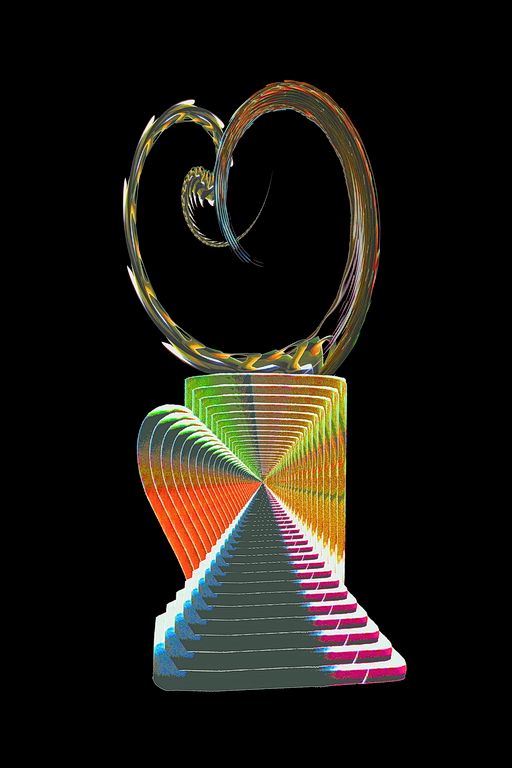
I think I like both. Perhaps the lines in the original lend more of a mechanical construct appeal. |
Jun 15th |
| 18 |
Jun 18 |
Reply |
With Dr. Mania Row.
|
Jun 15th |
| 18 |
Jun 18 |
Reply |
Thank you, Marie. Its the art classes that are producing creativity (off canvas) :-) |
Jun 12th |
| 18 |
Jun 18 |
Comment |
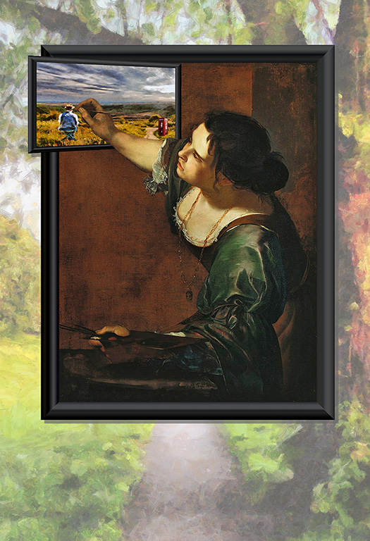
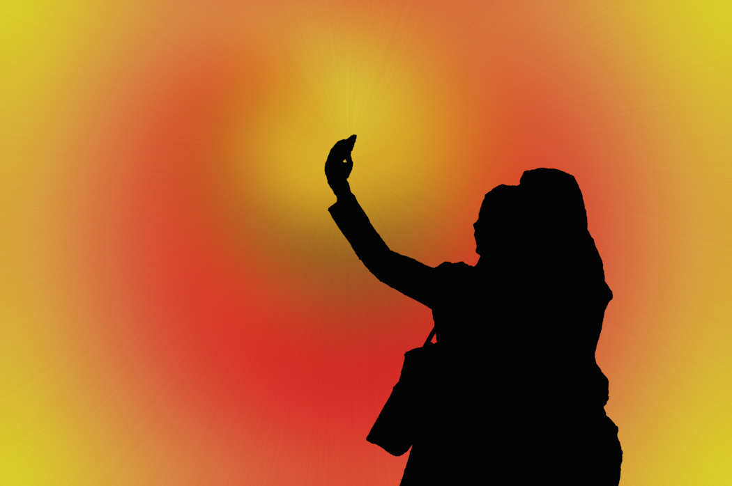
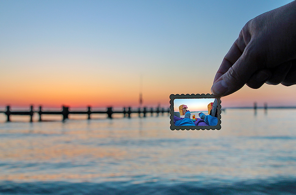
It took me a while to interpret it. I downloaded the image to magnify it, and compare with original (hurray for originals!). Only then was I able to see the concept of "a day in the life" layered into the postage stamp.
I lightened a version, and saturated colours (straightening the horizon. I thought that even though a little contrast between the background and composite image, the lighting of the fingers with stronger colours works well. |
Jun 3rd |
 |
| 18 |
Jun 18 |
Comment |
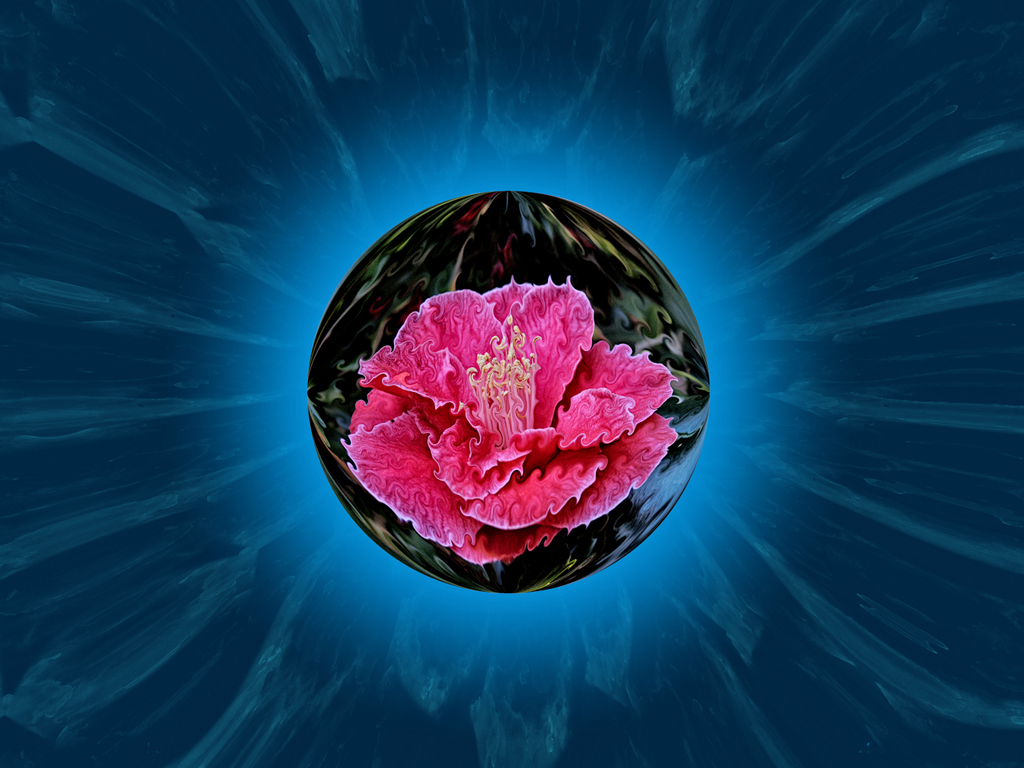
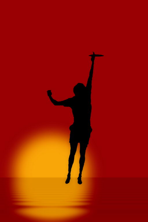
I had much the same thoughts as Kerstin, having played with the colours on a copy. I found readjusting colours I could get a nice purple, and lose much of the fleshy pink background. The "grey" background with purple moon works for me.
I would certainly add space arounf the globe, Taking it in towards the thirds, left and top.
|
Jun 3rd |
| 18 |
Jun 18 |
Comment |
It looks very close to the original, but the discrete outlines do leand it a degree of 3D. |
Jun 3rd |
| 18 |
Jun 18 |
Comment |
The reproduction of this certainly makes it your own creation. The negative colours serve to add a surrealt touch. My feeling is that the legs of the dragonfly are lost on the white background. Perhaps pasting it as a layer on a background of discrete colour may bring them out a little better while complementing the colouration of chameleon and prey. |
Jun 3rd |
| 18 |
Jun 18 |
Comment |
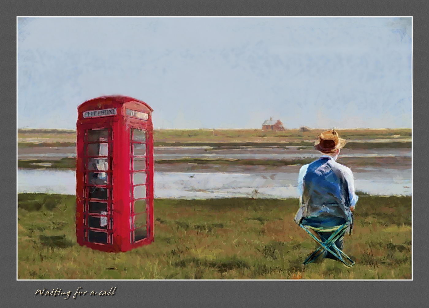
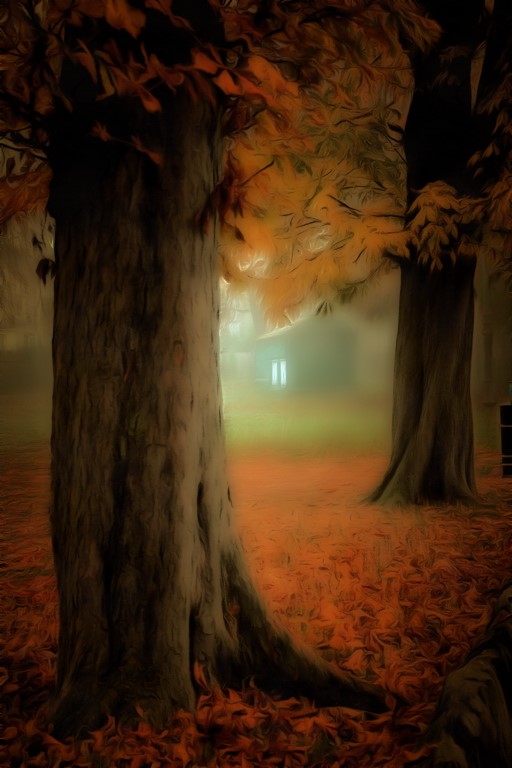
The treatment improves on the photograph in loads. It does, as Kerstin says, give likeness to a photograph. The orange colouration lends an air of mud and rust to these fine old machine. The cropping certainlt pays off, and the darker sky blends nicely with the main subject. |
Jun 3rd |
| 18 |
Jun 18 |
Comment |
I like the look as is, and don't feel it needs to be lighter. The greyness adds to the mystique of the person with the medussa hair, outlined in black with lines of many colours. |
Jun 3rd |
| 18 |
Jun 18 |
Comment |
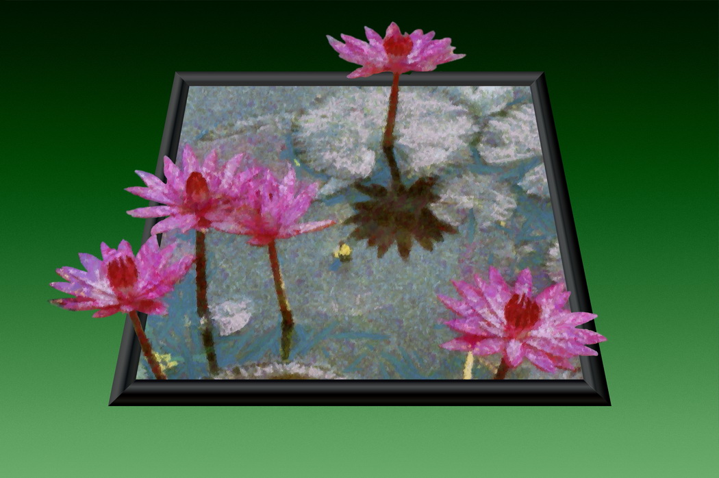
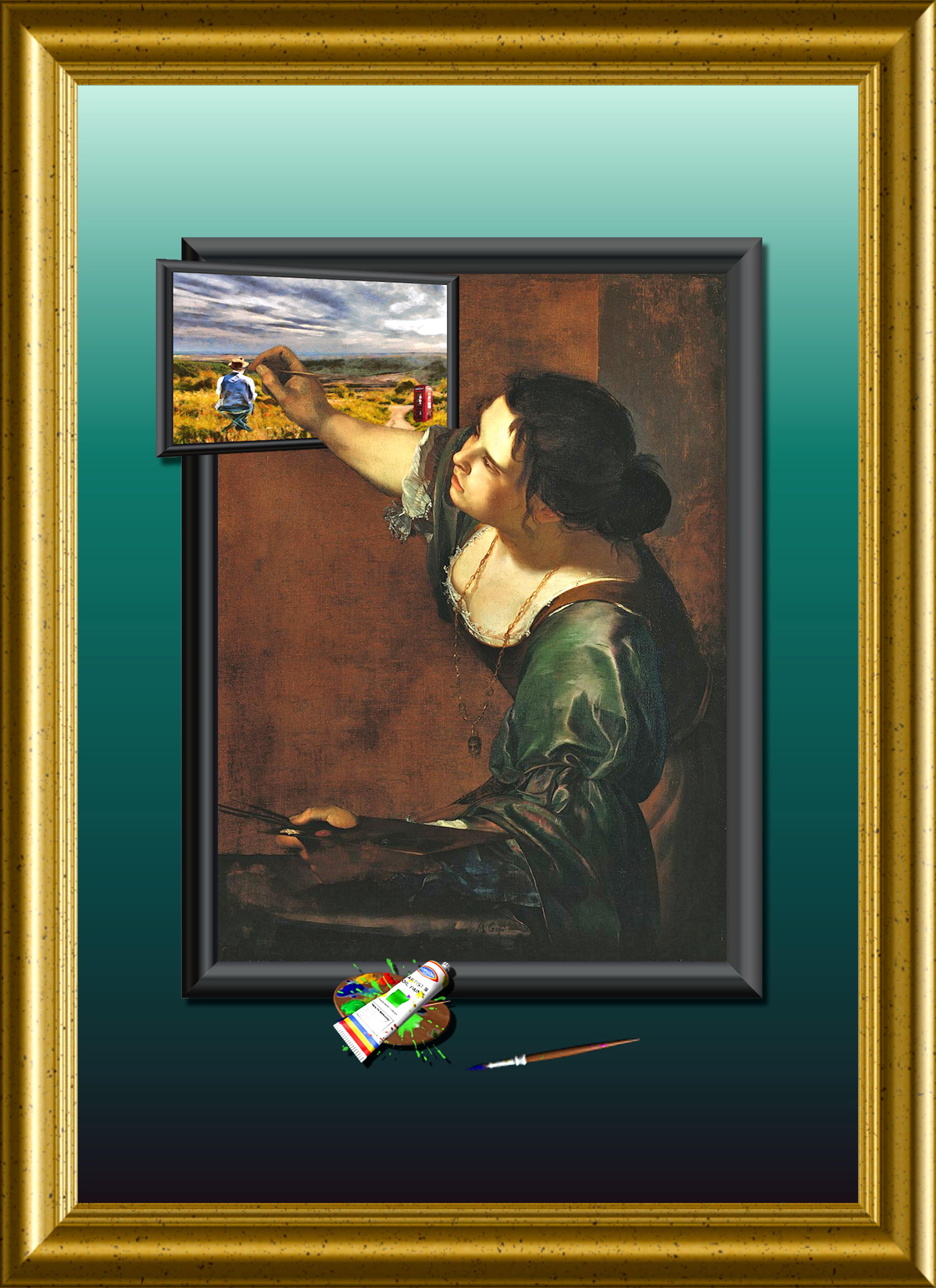
I wonder what people would think if the walls of gallery rooms had ink jet prints of semi-transparent paintings, upon which the exhibits were hung.
|
Jun 3rd |
8 comments - 3 replies for Group 18
|
8 comments - 3 replies Total
|