|
| Group |
Round |
C/R |
Comment |
Date |
Image |
| 18 |
May 18 |
Reply |
Sequences of posterization / extremes of solarization and negative imaging. Sometimes a redicle shift in hue will do it too. Whatever works (which is why I cannot remember what and when) |
May 13th |
| 18 |
May 18 |
Reply |
I just heard the same from a member of my art class. It is a story I have often heard in the past. It reflects the attitudes of many "teachers" in my primary school, where the reason for inventing the ruler was to rule, not measure. Perhaps they thought it the emperor's stick, especially when wielding the edge on palms or legs. Identical sardines to be forced into standard cans. |
May 13th |
| 18 |
May 18 |
Reply |
With a purple nose, or is it tongue, perhaps?
|
May 13th |
| 18 |
May 18 |
Comment |
Some might prefer an impasto style. |
May 10th |
 |
| 18 |
May 18 |
Comment |
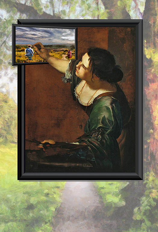
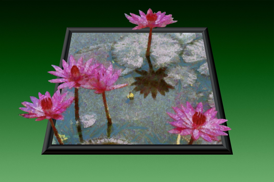
It is a nice collectio, putting as it does a variation on a theme in the one frame. I agree with Mike, both with orientation, and also the background, which lends a smoother look without distraction. |
May 10th |
| 18 |
May 18 |
Comment |
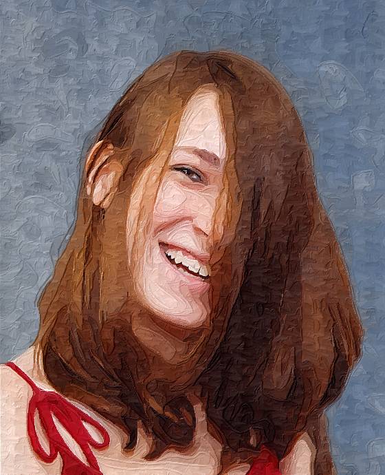
I find the initial processing works well, removing as it does the extraneous background, leaving the focus on the face. Likewise, I find the painterly effect is artistic, with well resolved facial features, but a periphery of coarse strokes which complement the initial processing in concentrating the focus on the face.
|
May 10th |
| 18 |
May 18 |
Comment |
I like the effect of the Nix Silver. It combines with the low angle for the subject well. I wonder if the waves might merge better with the thoughtful boy if they were softened / brurred? I agree that monochrome works well for it. |
May 10th |
| 18 |
May 18 |
Comment |
The simplicity makes for a winner in this composition. The limited palette of pastel shades works well, with the combination complemented well in the background. Would a different colour / value of final edging set out the content better? |
May 10th |
| 18 |
May 18 |
Comment |
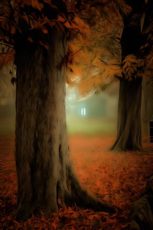
I love line effects in both photography and in painting. It can be very difficult to get it to work well in digital, but sometimes the awry is pleasing in its own rite, as this is. The monochrome linework gives a pleasing effect, but the mass of extraneous spidery lines fits with the eternal pottering of the gardener, as if twigs and branches were growing everywhere. The monochrome suits the era too. |
May 10th |
| 18 |
May 18 |
Comment |
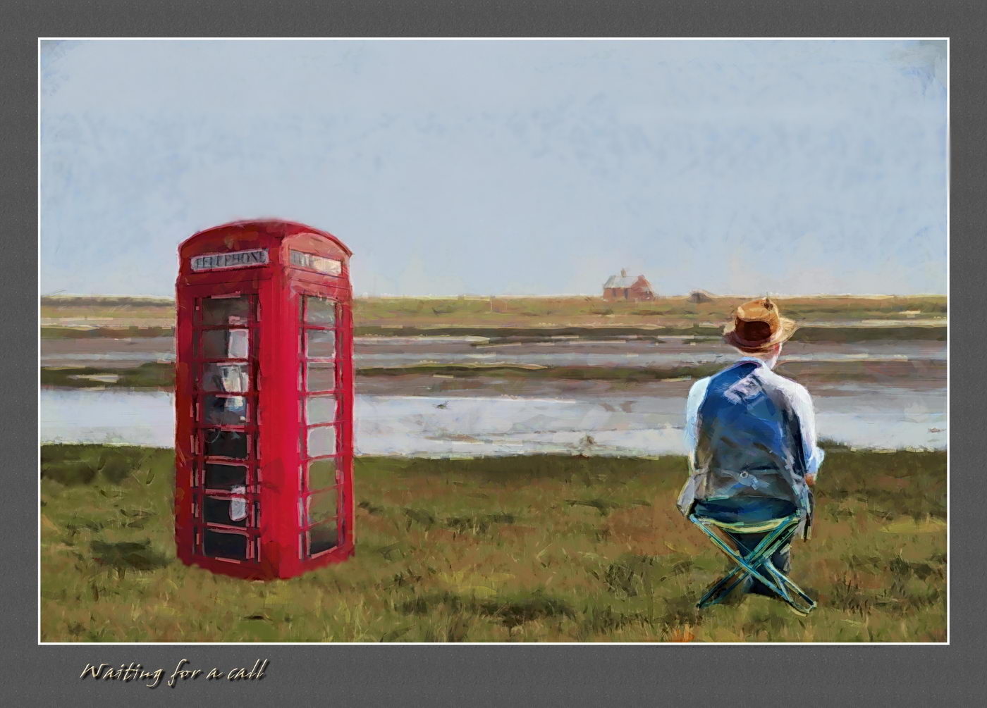
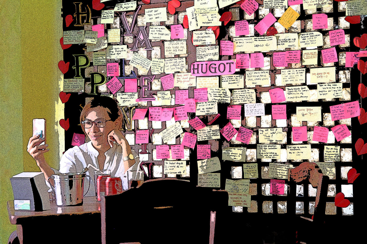
I would say more documentary than creative, but I like the image and the creative message it sends out. Maybe a little added creative gaffiti layered to the bare board that would fit the suggested comment on fast cars revealed on their demise? |
May 10th |
| 18 |
May 18 |
Comment |
Still left handed, but the acrylic painting is improving left-handed. I cannot offhand remember the details of what was done. Generally, when saving in layered format I put abbreviated filter names as a string of hyphenated terms in the name to indicate the sequence of processes, resulting in some pretty extreme titles.
Ian, the server is still sending out incorrect email address format (terminal dot). |
May 10th |
8 comments - 3 replies for Group 18
|
8 comments - 3 replies Total
|